Colors are important for any type of logo design. But you bring the abstract logos into the equation and the odds multiply. What with the unique psychology of every color, their different moods, established cultural connotations, and whatnot, the colors pose a serious dilemma for designers who are working on abstract logo designs.
The reason the stakes become so high in abstract logo images is that these logos are all about shapes that are not immediately clear and understandable to an average person. True, some designers do try to keep the shapes on the simpler, basic level to gain maximum logo recall and understanding – the fact is, to create truly memorable abstract logo designs, you have to introduce some challenge to the thing.
That’s when colors become such an important player in the field. With shapes being somewhat hard to understand, colors have to make sure that they’re doing their best to make the abstract logo icon as clever, easy-to-grasp, and entertaining as possible.
Which brings us to today’s discussion.
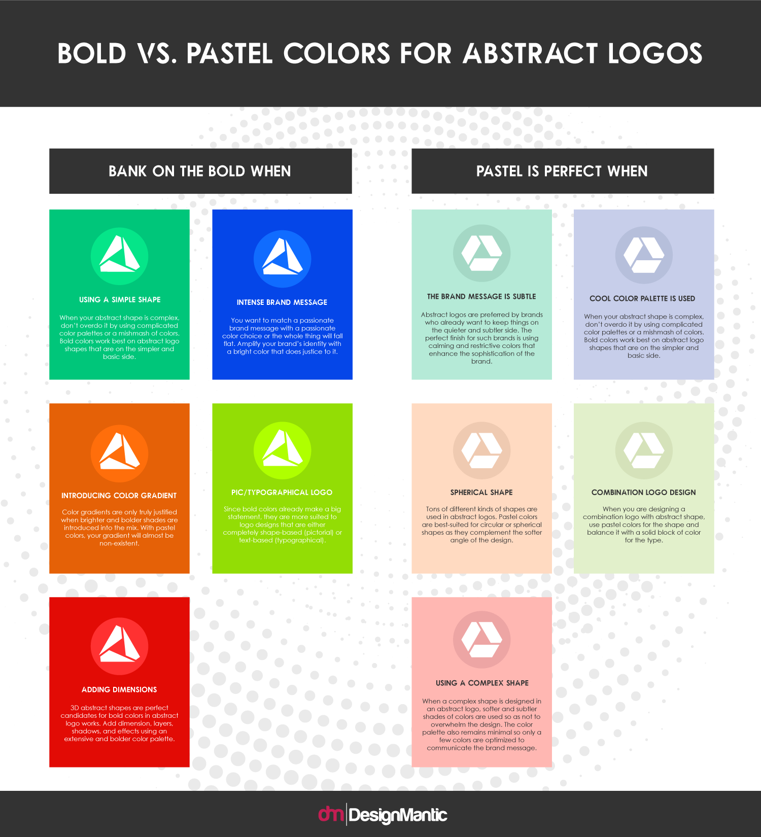
Though you will see a disproportionate amount of abstract logos in bright colors (to maximize the brand understanding for the audience) there is no dearth of businesses that choose a subtler shade to say what they have to say.
Related: 20 Marketing And Advertising Logos In Creative Abstract Styles
And so the question is: should you go the popular route and select a bright color, or take the risk of making a statement with a lighter shade instead? Let’s discuss, with just a heads up: a lot of your design decisions – including colors – will depend on your art brief and the brand standards. Therefore, use the following discussion only as a foundation to understand some best practices. You are free – and encouraged – to make creative decisions based on what works for your brand.
Embed in your site:
Check Out Our Personalized Logo Maker Tool:
Logo Maker For Pattern Based Logos


