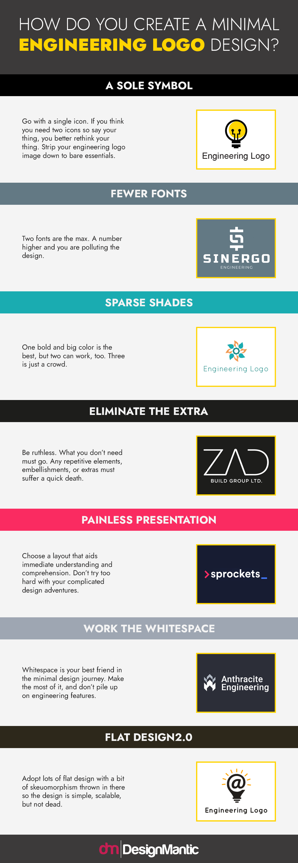
Nobody wants the gaudy, heavy, and bulky engineering logos that are rampant in generic brand identity symbols. Your modern engineering firm needs a sleek and sophisticated look; consider using a minimalist engineering logo to make the maximum impact.
If you are a novice designer, it can be difficult to choose a minimalist approach without depriving the design of elements that make it beautiful or unique. Remember, minimal design is about making the graphic simpler, not plainer. You hit the jackpot when you can understand this difference.
In this quick logo design guide, we are going to give you pointers on how to achieve a minimalist look for your new engineering business logo.
Before you set out for the task, here are a few things to jot down:
- If you are choosing the minimal design approach for a logo redesign, it must accompany some change at the business level, too. Change for the sake of change has no depth. Even something as simple as a new HR policy can turn into an opportunity to rebrand your business.
- Make sure your preference for minimalism is merit-based. If it doesn’t work for your brand, do not do it just because everybody else is doing it. Jumping on a bandwagon does not have a nice ring to it.
- Creating something simple is arduous. Your understanding of the product needs to be cellular, the thought process must be clear as crystal, and your research complete. The gods of minimal design favor those who sweat for it.


