You must have seen those elaborate typographic posters on the internet that just make you follow the breadcrumbs. It’s like a designer behind those typeface-laden posters knows how to grab your attention and point it at the right direction.
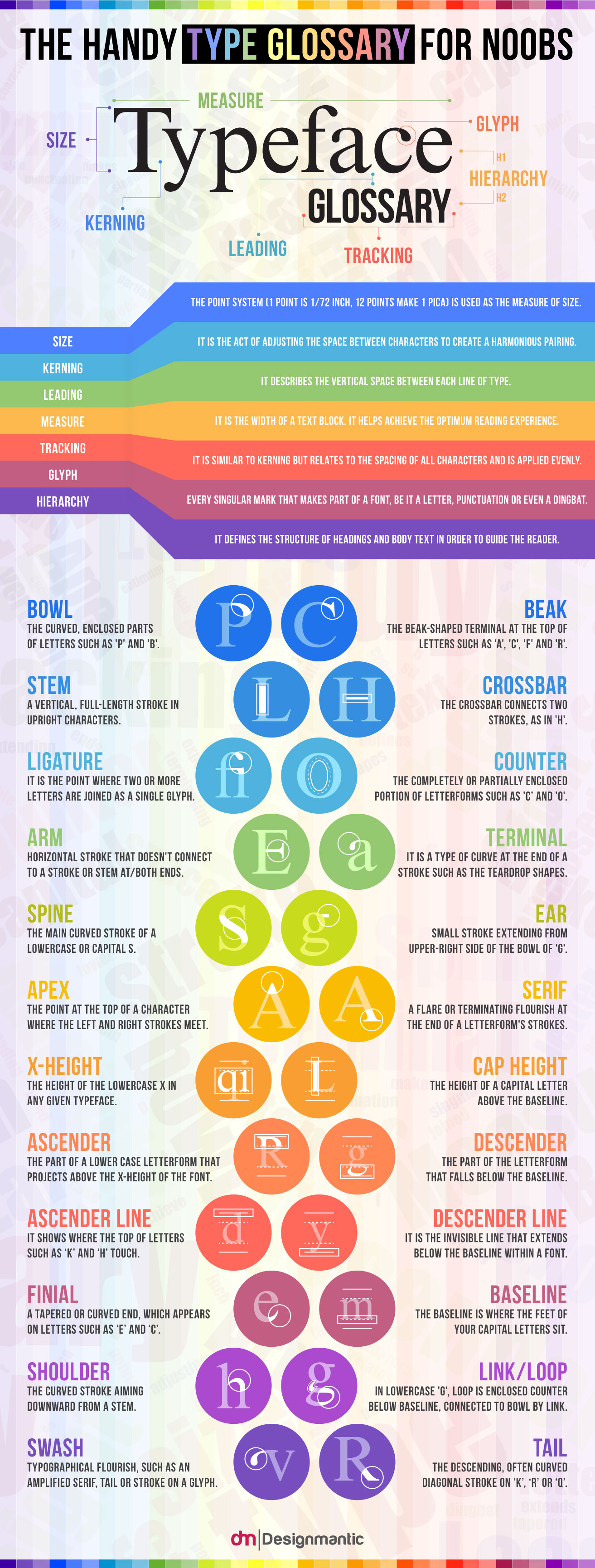
Wonder how they do that? That’s because they understand typefaces inside out. They know their ligature from their stem and their bowl from their beak (all typographic speak to the newbs who are reading this). A strong and intimate understanding of the typeface glossary is the first thing that prominent designers rely on as they work their magic. They also prove helpful in making new fonts and typography trends happen. Combined with the color glossary, typography can be a pretty potent tool for designers.
So if you’ve often wondered what terms like kerning, tracking, glyph or measure meant in the context of the fonts we use in design today, look no further than this infographic. Its time you too understood the ins and outs of the typefaces.


