Typography is a complex animal. An art form reserved for those who understand the deep intricacies of crafting stylish yet readable text. With zillions of different fonts out there, typography might seem daunting to the average person out there. Making typographic elements blend seamlessly in your website, brand name, logo design, marketing collaterals, etc. is a finely honed skill that the design community relies on. As a component of the design process, typography trends come and go as people discover new ways of mixing and matching enticing typefaces together.
In this knowledge economy, where content is king, readability and quality assumes greater importance as people consume online media more than ever before. There are blogs, social networks, brand websites, e-commerce portals and more that need to convert potential leads into recurring customers. That’s why typography is important. It plays an almost invisible yet crucial role in the whole process. How you write is one thing. And how you present your words is another. No wonder typography is part and parcel of the complete package.
All this being said, typography is a vast ocean. Though typography, like design, doesn’t conform to any limits, there are some tried-and-tested techniques that every design wizard can employ to make typographic elements super-effective. The type of font you use, the spacing, the personality, the positioning, all these aspects are tweaked and reworked to ensure that your messaging succeeds on a subliminal and subconscious level with your target demographic.
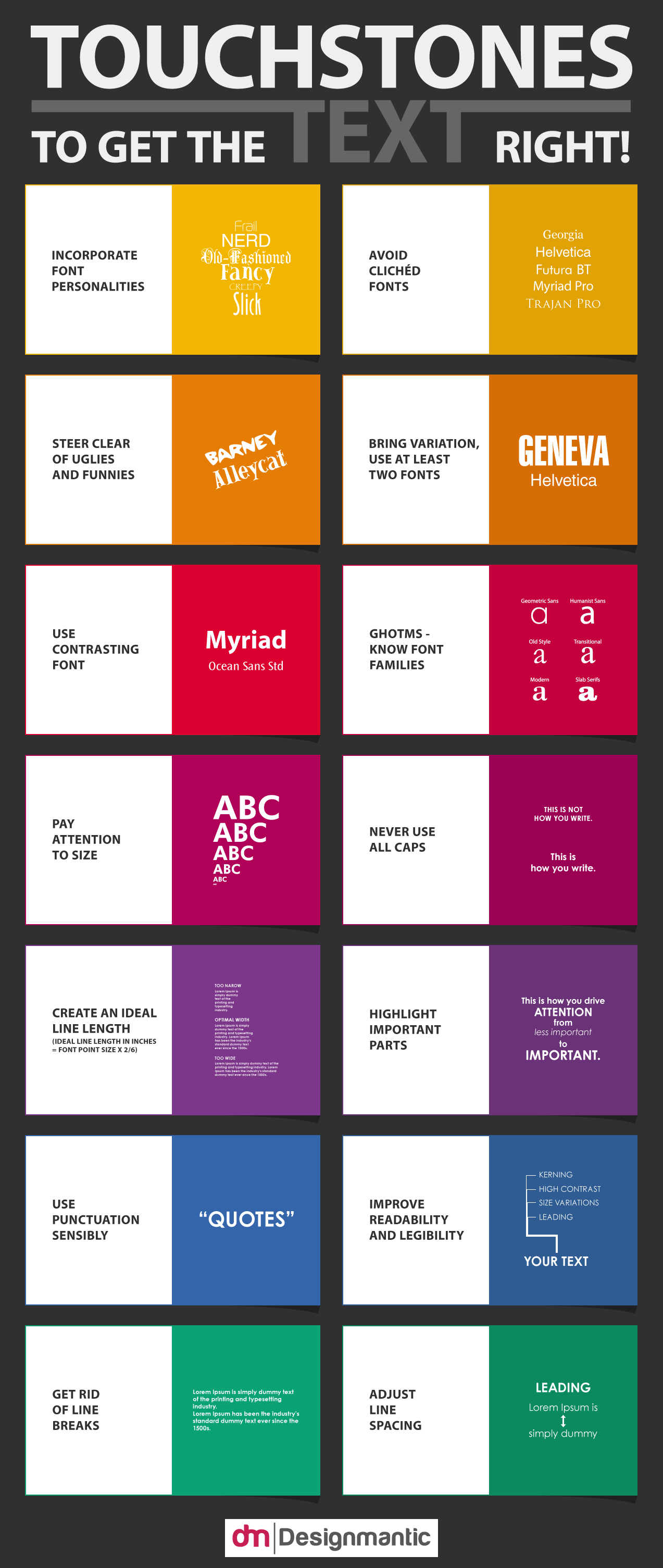
This infographic is for the typography enthusiasts as well as those who want to learn the ropes when it comes to making textual elements work for you:


