There really is a science to creating memorable logos. Even though generally people confuse logo designing with art, the truth is there’s a method and hierarchy to adhere to as designers go about constructing that logo. There’s colors to choose, fonts to sift through, psychological aspects to ponder and so on.
Getting the visual fidelity right is one thing. Then there are technical aspects to consider as well. Your logo design needs to look svelte in any size or format. It needs to exude a sense of balance from all sides, and avoid becoming a hodge-podge of negative commentary from the observers.
Like we said earlier, logo design really is down to a science. And just like design is a science, being productive as a logo designer is also down to a science.
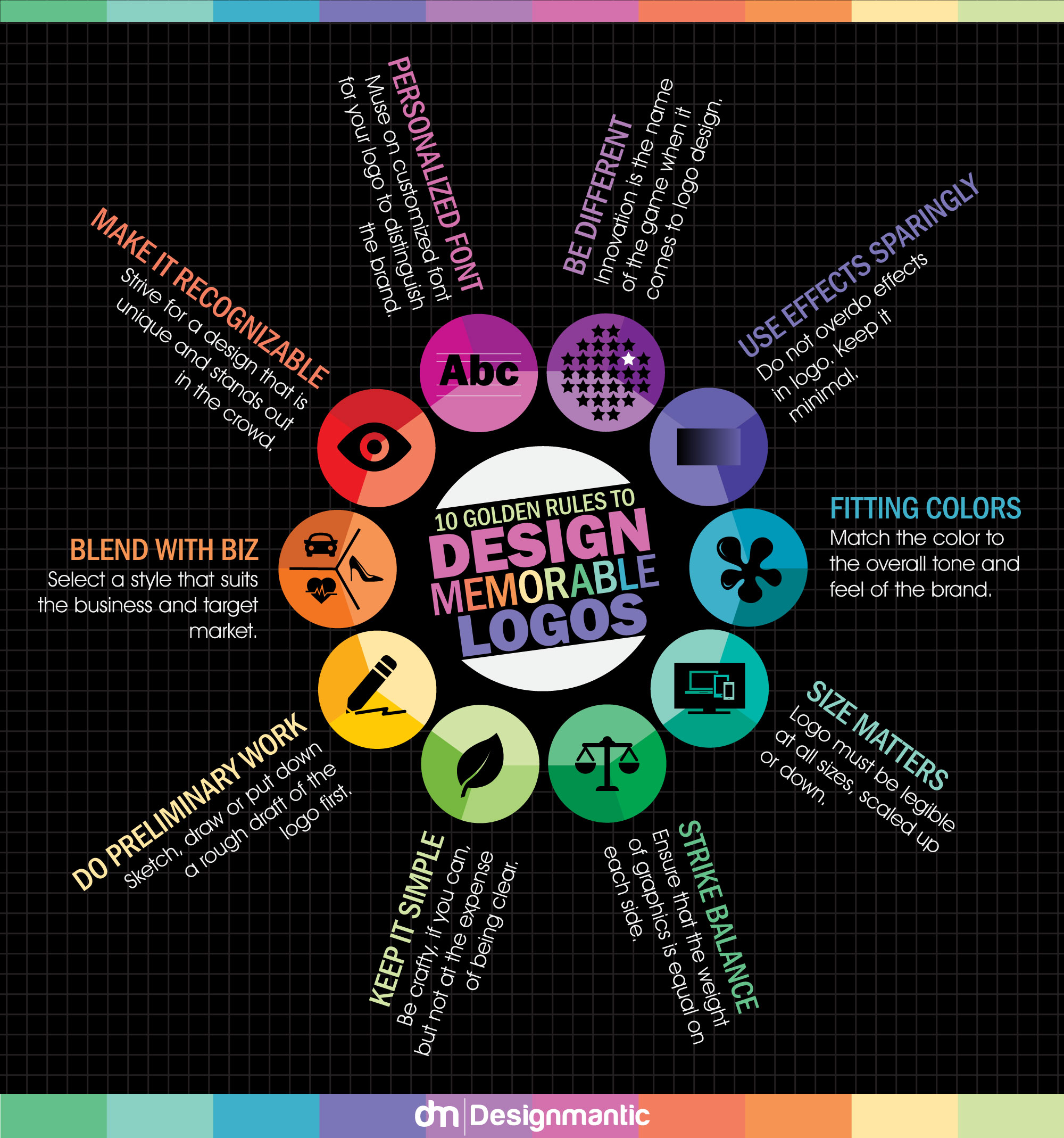
Here are some proven, tried-and-tested 10 golden rules to designing memorable logos serve as an excellent reference for newbie designers. Check out the infographic below:
Icons: Flaticon


