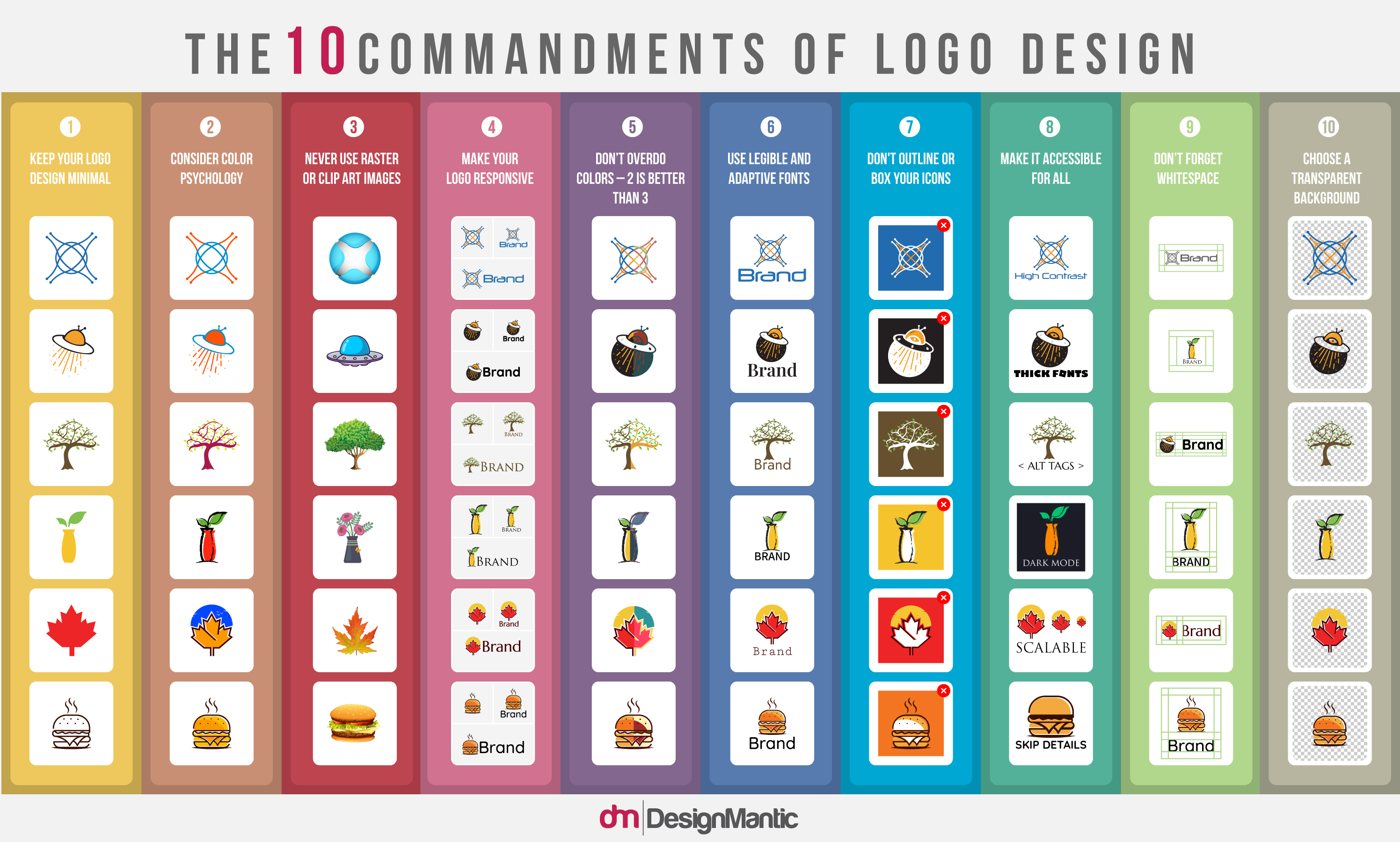
Identity design has come a long way. Gone are the days of elaborate badges and descriptive company names. Today it is all about simplicity and meaningful representations. And this renaissance has been supported by the shifting standards of what is considered contemporary and reflective modern graphic design.
However, the trends may have continually changed, the basics remain as constant and solid as ever. There are foundational structures for creating great logo designs that you do not mess with. These rules and best practices have been perfected over the years, and back in 2014, we distilled and shared the 10 commandments of logo design that govern all kinds of identity design projects. That infographic became an instant hit and got featured on blogs such as CreativeBloq, UCreative, MakeUseOf and more.
Now, as we await the dawn of 2022, we bring you a refined, recent, and revamped version of logo design decrees that’ll help you create logos that align with modern times and modern brands.
1. Keep Your Logo Design Minimal
Choose only the elements that are critical for the logo. If it isn’t necessary for the design, it ‘gots to go’.
2. Consider Color Psychology
Colors affect our moods and we attach certain meanings to every shade and hue. Be conscious of these attachments as you choose colors for your project.
3. Never Use Raster Or Clip Art Images
The logo design needs to make sense in every size and every dimension. Therefore, only use vector logos so your design doesn’t get pixelated when you manipulate the size.
4. Make Your Logo Responsive
Making responsive logos allows your identity to remain independent of any restrictions on medium or format. A responsive logo retains its scale no matter which surface or size it is displayed on.
5. Don’t Overdo Colors – 2 Is Better Than 3
Modern graphic design requires simplicity. Choose fewer colors to avoid clutter. Two shades are ideal but three is the limit.
6. Use Legible And Adaptive Fonts
A modern logo needs to make sense whether on a billboard or an app icon. Using legible fonts helps keep the logo identifiable as it moves across multiple media.
7. Skip Outlines And Excessive Details
Outlines are a no-go for modern identity designs. Skip unnecessary details and keep your brand identity open and inclusive.
8. Make The Logo Accessible
Creating accessible logos gives you a wider audience to work with. It ensures that your brand is visible to people with varying levels and types of disabilities and provides them with an equivalent UX.
9. Don’t Forget Whitespace
Keeping the logo clean and minimal allows you to play with the white space. You can use it to create Easter eggs in your design or just to let your logo have ample space to exist.
10. Refrain From Using Backgrounds
Opt for transparent backgrounds so your logo retains its recall and identity no matter where it is placed.

![[INFOGRAPHIC]: 10 Commandments of Logo Design [INFOGRAPHIC]: 10 Commandments of Logo Design](https://www.designmantic.com/blog/wp-content/uploads/2014/08/10-Commandments-of-Logo-Design.jpg)


