If you are an advertiser, marketer, or work with a brand, you probably know the importance of ‘making it’ on YouTube. As the most impactful video platform, YouTube helps your brand expand its reach across the globe. It receives 1.7 billion unique users every month, meaning your brand has a chance to be discovered by a whole lot of potential new consumers on YouTube every time you post a video. But it’s also a pretty busy neighborhood. Your channel can get lost in the crowd of ever-popping ads, auto-playing videos, and impatient users. An outstanding YouTube logo for your channel can help you cut through the clutter.
In this article, we will look at platform-specific design considerations for a YouTube channel logo. For that, we’ll have to assume an initial logo design understanding on your part so we can move on to the next step of discussing the specifics of a YouTube channel logo.
Design Considerations for an On-Brand YouTube Logo
An on-brand YouTube channel logo is one where there’s a perfect alignment of the brand’s outward expression with its internal character. A logo where all the design elements — colors, shapes, fonts, and more — are consistent with the brand’s core ideas and its message.
When an on-brand logo image is achieved, the next step is to look for design guidelines that apply to how images work on YouTube. For this article, we’ll keep the focus on YouTube’s guidelines regarding profile image standards for individual channels.
1. Size and Format
YouTube displays channel logos/profile images in a circular format. But did you know that they are uploaded in a square shape?
To comply with YouTube’s design guidelines, your logo must be in a square file format, but keep all the necessary elements right in the center so the circular cropping doesn’t remove any important details.
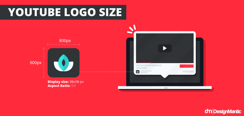
The ideal image size for the logo file is 800px by 800px (a 1:1 aspect ratio) but YouTube will resize it to be displayed at 98px by 98px. Therefore, once again, all the essential elements of your logo, the main icon or the wordmark, must be within this safe area so the automatic cropping doesn’t result in any loss.
Remember that your YouTube profile image is directly linked to your Google account profile image if both the accounts are connected. Changing the YouTube channel profile picture will automatically change the Google account picture to match.
2. Mobile-friendly
According to the Hootsuite report linked above, more than 70% of YouTube watch time is on mobile.
Since mobile users are your biggest consumer groups on YouTube, make your logo responsive to smaller screen sizes include mobile phones and tablets.
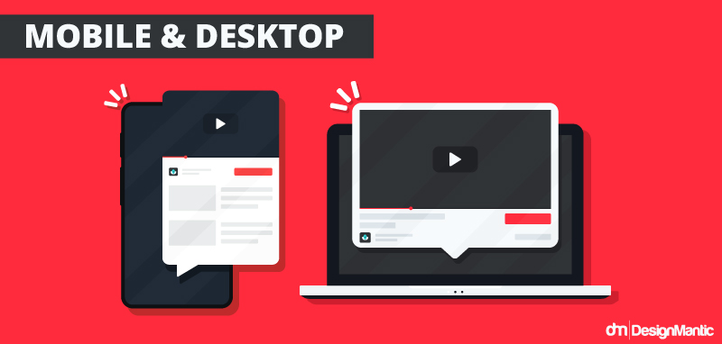
A versatile logo design for your YouTube channel, along with how you create a thumbnail, will ensure that your channel is recognizable all across the platform. Whether people stumble upon it in searches, comments, or related channels, a mobile-friendly logo will lend your channel icon the readiest recognizability.
3. Consistency with Channel Art
Your YouTube channel art consists of things like your banner, video thumbnails, and other visual details. The primary job of the channel art is to grab user’s attention and communicate what the channel is about.
There needs to be a harmony between the visuals of your channel art and the logo design. Even if you aren’t using the exact same font style, for example, in all the places, strive to work with variations that are closely related to each other. The consistency will pay off in the long run as you build your follower-base. The visual cohesion on your channel will translate into a polished and professional look, helping you gain user trust and an authoritative status.
4. Consider YouTube’s Dark Theme
The golden rule of design is that you must start creating your logo without color. See if you can communicate your brand intent and identity without colors giving it any meaning.
This rule comes in handy when you have to create a versatile logo that works in light and dark themes, both. If you have done your due diligence in design and created your logo in black-and-white, you’ll have an easier time adjusting your YouTube channel logo to render perfectly in the dark theme as well.
The two things that will be significant in the next stage are
- The color palette for your logo, and
- The background color you’ve chosen.
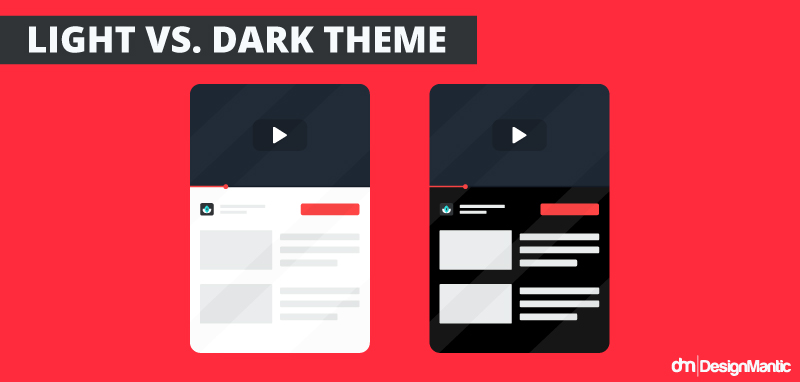
A dark background in the dark theme will give your logo extremely poor contrast. It won’t be so bad with the light theme and a white background. The circular outline for your profile image won’t be visible, which may not be the best, but at least the logo visibility won’t hurt.
So what’s the ideal thing to do:
- When uploading your channel icon, choose its background wisely.
- Pick a background color that’s visible on light and dark themes both; and,
- Gives perfect contrast to your logo design so it’s clearly visible and recognizable.
That’s how you create a YouTube channel logo perfect for both desktop browsers and the mobile app.
5. Prefer pictorial elements
Millions of YouTube content creators and countless brands put their faith in beautiful wordmarks as their official channel logos. While wordmarks are in a design league of their own, smaller icons deliver the most visibility in constrained spaces.
Unlike wordmarks, they are easy to understand at a glance, recognize immediately, and even recall when you’re looking for them in a crowded search results page.
However, this preference for pictorial elements isn’t a universal law. Few factors must be considered:
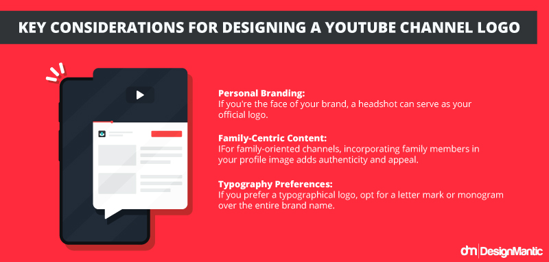
- If you are the face of your brand, like a solo content creator, your headshot as the official logo will do the job.
- If your channel is all about your family, include them in your channel profile image for enhanced appeal and authenticity.
- For those of you who insist on a typographical logo, a letter mark logo or monogram will be better than an entire brand name.
Lastly, never resort to using a generic image that conveys your ‘brand vibe’. Insist on a distinct visual mark that gives you a unique brand identity, whether in icons or words.
6. Print Design For Merchandise
As a brand channel on YouTube, you need to factor in the possibility of merchandising your brand content. If you plan to use your logo on merchandise or in other contexts, consider how it will look in grayscale or a single color, as this may be necessary for certain applications.
What if you include print products in your merchandising, such as custom stickers or clothing items? Does your channel logo look good in print?
In situations where full-color printing is not available or where your desired exact shade isn’t working, you’ll need to come up with alternatives in your branding style guide. If A isn’t available, does B work as the closest replacement?
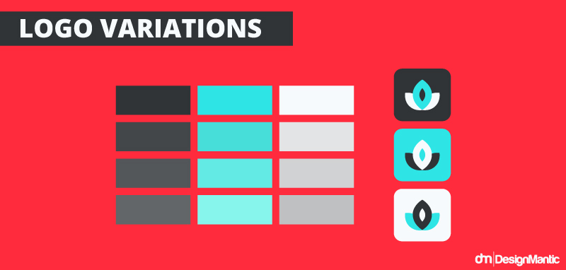
To address things like these, test your YouTube logo in a variety of environments. Make sure that the key elements of your logo design remain visible and recognizable even when the color is removed or the specific shade isn’t available.
7. Play Button Integration
This isn’t a must but adding a subtle play button icon into your logo can reinforce the association with video content.
While on the YouTube platform it won’t matter as the content type will be obvious, but if you show up in social media search results or decide to do paid marketing, the little detail will tell potential viewers that you are a video channel.
8. Brand Watermark
YouTube allows you to add a branding watermark to your videos. On one hand watermarks protect your video content in the lawless land of the internet, and on the other, it shows your brand as professional and authentic.
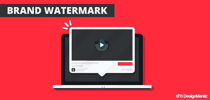
You can set up your videos in a way so that both your watermark and the logo can play on the videos. Content creators usually prefer this arrangement because even if the watermark is overtaken by related video suggestions, the logo can still show possession and brand identity.
Use an AI Logo Maker to Create Your YouTube Logo
Creating a YouTube logo from scratch can be a daunting exercise.
Simplify the design process by using our free YouTube logo maker. Generate multiple YouTube logo templates that match YouTube image guidelines so you can have a logo that looks good all across the platform and beyond.


