Want know the secret to good design? Every designer worth their reputation has indulged their inner child. And in doing so, they have discovered that unique perspective that lends itself nicely to problem-solving and creating new things. One would say the most powerful inspiration is the result of viewing everything with a child-like wonder.
It is important for designers of yore and today to ensure that the world isn’t a boring place to live in., to keep this wheel of inspiration turning. They need to keep this sense of discovery and curiosity alive. They need to do for today’s kids what the previous generation did for them – pave the way forward via excellent design. Be it cartoons, paintings, posters, comics and what not, content creators of the day break new ground by making their art appeal to kids, inspiring them to do the same for future generations. Because lets face it folks, our cognitive learning facilities are at the peak when we are younger and theres no time like the younger years to pick up a trick or five.
Web Designers need to Indulge their Inner Child
For today’s designers in dominant media such as websites, blogs, mobile apps, etc. experiences should be designed around kids too. Aspects of design such as colors, visual communication, graphics, text and images should be carefully chosen to make them appealing for children. Especially in the realm of web design, as one study postulates that children spend the majority of their day browsing online.
Designers need to understand certain physiological characteristics about the mental growth of children. It is widely observed that the average kid starts using the web browser at age 7, making this figure a significant starting point for designers dealing with web design. Touchscreens like those on a tablet are more easy to use, with kids as old as 2 year olds learning to use it. As kids grow older, they start using the web in a more traditional sense.
So fellow designers, if you want kids to be exposed to more quality and less crap, make these observations central to your web design philosophy:
Typing is for the Big Uns. Not the Little ‘Uns.
Simple input does it. (Source: Ask.com)
As designers, it falls upon you to design a whole user interface for the website. That makes your role similar to one as a deity, so your focus should be on making things easier for users. Take data entry on websites. Then consider a kid no younger than 7. Mostly these kids would be using one finger to type so make your website very simple to use. Don’t make the little ‘uns type more than needed.
Giant Buttons are in. Squishy little Text Links begone.
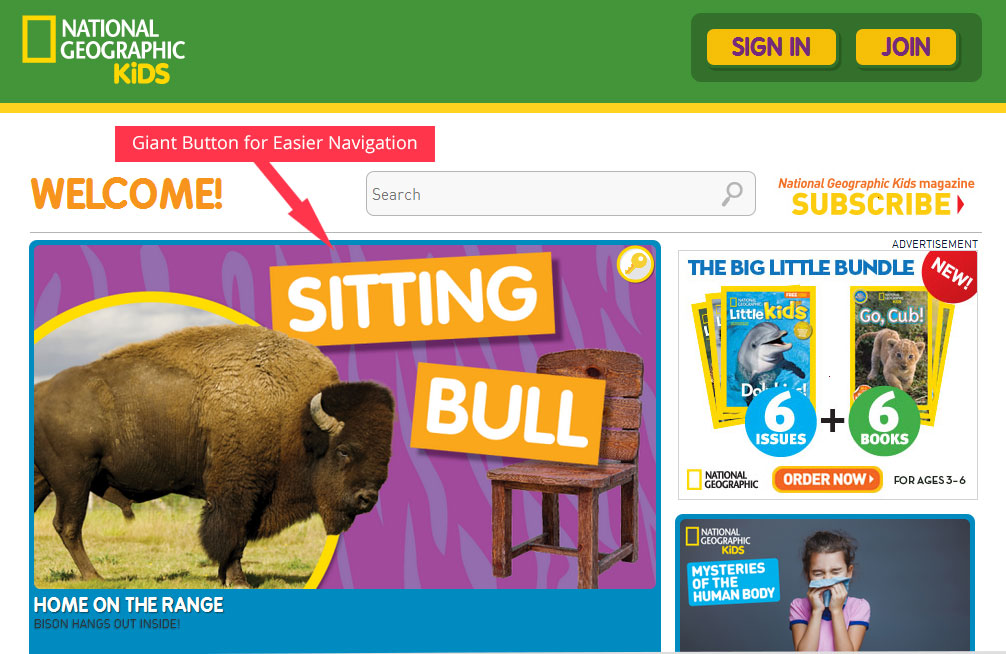
Buttons are a natural fit for being main navigation triggers. (Source: National Geographic kids)
Kids are most likely to browse your website on a tablet or smartphone, since they can’t use a mouse from a younger age. So why not use attractive giant buttons instead of queasy and measly looking text links. That would take care of the still-developing and limited motor skills that young children have at their age.
Remember those big picture story books for kids?
Kids can easily navigate through links with a picture or icon on it. (Source: discoverykids)
Content is king they say. And nothing screams king like images and icons that help kids form the right mental connection with the content. This is because there’s no telling how proficient the kid is with reading and writing, especially at their young age. Color theory is also relevant here, as bright and flashy colors are more likely to attract kids into taking action on your website.
Kids are social animals too.
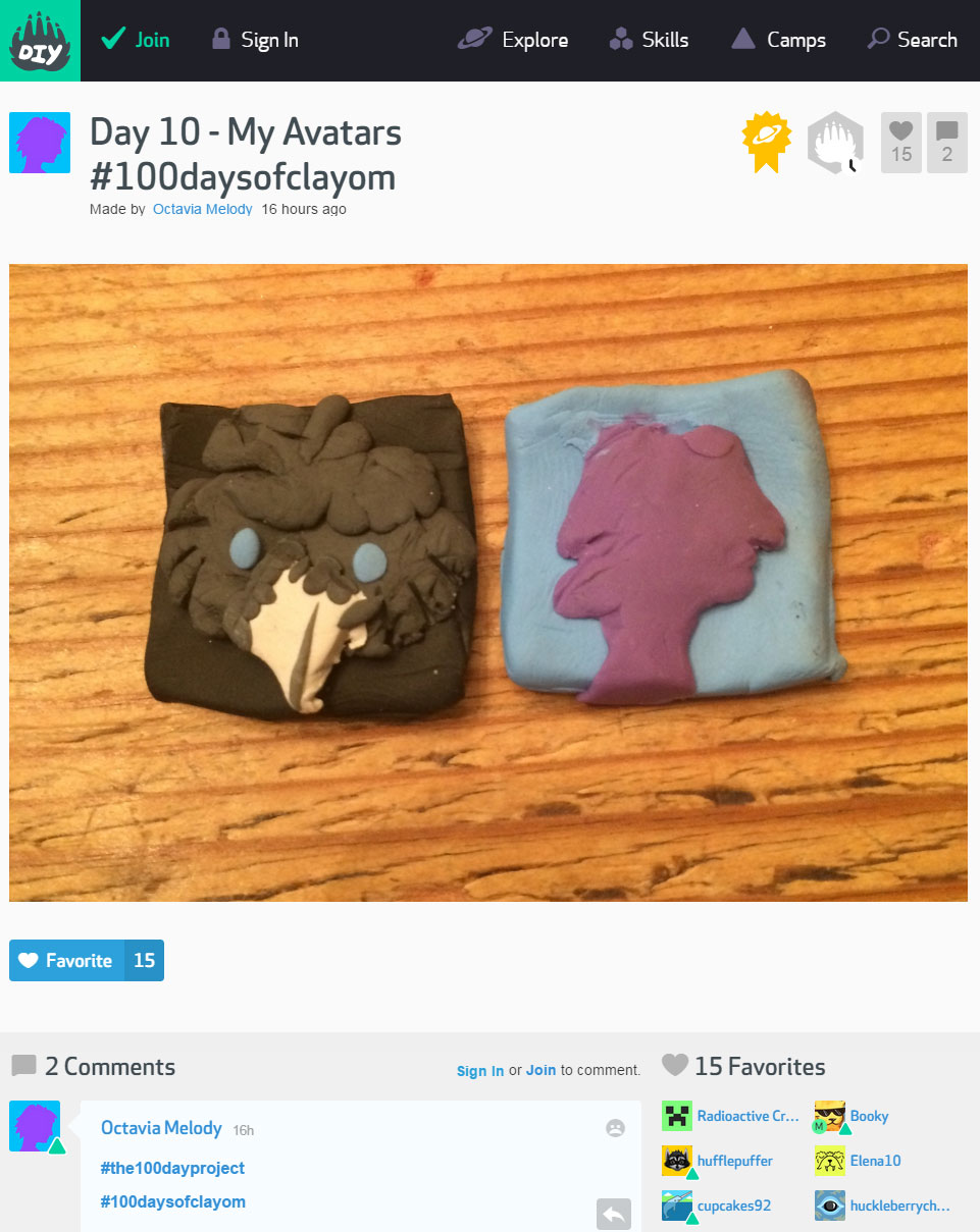
The powers of observation make for the best social learning tools. (Source: DIY.org)
According to a study, up to 30% of kids want to share their experience with other kids. Doesn’t matter if they are in the same room or not, but kids like to show off and collaborate on things. Children learn by using things together and observing others.
Ordering kids around is so yesterday.
Don’t tell them how to do it. Convince them to find the answers themselves. (Source: Wonderwill.ca)
Bombarding children with reams and reams of text and information should be an absolute no-no. Instead, the whole user experience should adopt an exploratory approach, where kids can discover things and understand how everything works by doing things themselves. After all, they do say that experience is the greatest teacher.
Conclusion
Human nature is a tricky minefield. As we grow older, generally speaking, our views get jaded and cynicism starts to seep in. We like to see everything in monochromatic black and white than in ‘splenderific’ colors. We start to lose sight of what evokes curiosity in us. In such an environment, designing websites and experiences custom-tailored for kids keeps this dystopian and cynical future from ever coming to pass. It keeps things fresh and interesting. And last but not the least, it makes the world a cheery place to live in.


