Google is chockful of advice on creating a hotel logo design. Some of that advice is good, but the rest you can ignore comfortably. It’s article after article, and post after post, all repeating the same thing: how to get the essentials right. Essentials include colors, fonts, and shapes.
In this article, we will go deeper. Why some shades over others, why certain styles over others, and why a versatile logo is a must in the hotel industry.
Diving straight in…
What’s so special about a hotel logo design — if anything at all?
Striving to create a strong hotel logo design is undeniably crucial. More than many other industry sectors, the hospitality industry relies on repeat consumers. You want people to keep coming back to you, spread the good word about you, and leave feeling fully revitalized and pampered after every stay with you.
While all of that comes with great service, visual identity plays a significant role in brand perception and loyalty. It activates the reflective level of design and can swing the bat based on how well-made the design is. A badly designed logo will not invite the right people to your hospitality establishment. Being unable to attract your target market essentially means that you’re leaving money on the table for your competitors. And boy, that’s a lot of money in the hotel industry, where the competition remains cutthroat at all times.
So how do you turn the tables in your favor?
You go to an AI-powered logo design maker to ask questions or approach a graphic designer, and get yourself an outstanding hotel logo for the business.
How to design a hotel logo with meaningful results
Hotel or hospitality logo designs follow some thematic patterns for the most effective branding. These patterns become easy to spot once you know what you are looking for. But to derive the most meaningful results, you have to pick up your spyglass, put on the detective hat, and go on the search for elusive whys.
In this section, we answer some of those whys, so you can create logo design magic on your next hotel branding project.
1. Explore versatile logo forms fit for digital and print assets
Logo application for the hospitality industry is quite vast. From countless print surfaces — paper to textile — to all the typical digital uses, a hotel logo design presents its brand on numerous avenues.
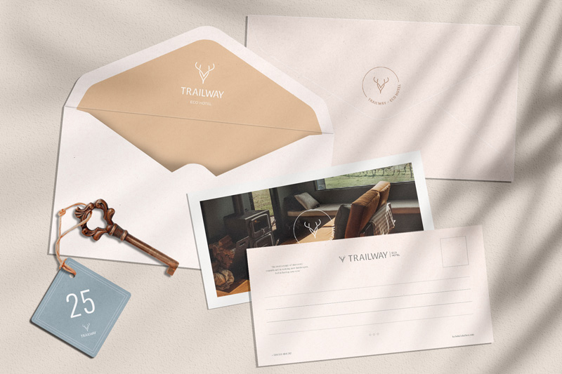
Image Source: behance.net
Versatility is the only way you can ensure the sanctity of your hotel logo and name no matter where it goes: on paper, marble, wood, steel, carved or painted, embossed or textured, favicon, or website banner.
A custom versatile logo fit for both digital and print follows some basic design guidelines:
- It prefers simple imagery that’s easy to transport from one surface to another.
- It uses a combination of raster and vector graphics so you always have a logo variation to fall back on.
- Fewer details ensure a tightly-held design identity that’s comfortably on brand.
Vector-based graphics perform a fundamental role in versatile logo forms. Typically present in the SVG format, they offer rich scaling of logos from tiny web favicons to full-page print magazine ads with no design distortions whatsoever.
2. Use rich and saturated hues that reveal comfort and indulgence
You need strong, rich hues for a hotel brand logo for two important reasons:
- Pastel or muted shades do not perform very well on print assets.
- Deep colors convey a sense of opulence, comfort, and restfulness that are perfect for hotel business logos.
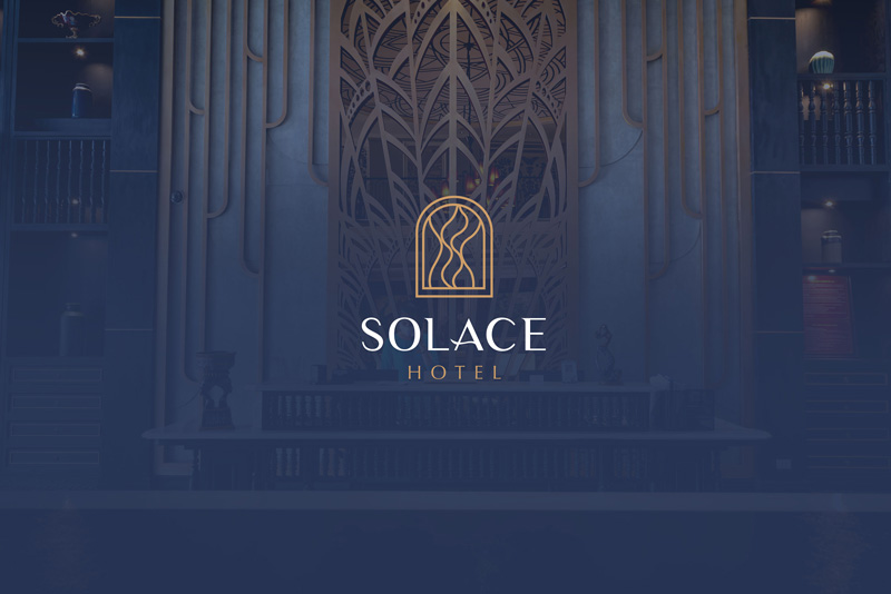
Image Source: behance.net
Design knowledge grounded in color psychology tells us that certain colors inherently present a more luxurious appeal than others. Purples, deep blues, indigos, and emerald greens, are popular color choices in the hotel industry. Gray hues in various shades and tones serve as the best secondary colors. Not only because they offer a good contrast to most rich shades, but also because they carry cool color properties, and promote a sense of serenity and comfort in hotel logo designs.
3. Conceptual and abstract imagery is better than bland descriptive logos
There was research in the Harvard Business Review a few years back about the powerful impact of descriptive logos on brand perception and business sales. Compared with abstract images, descriptive logos — that contain the visual elements that communicate a brand’s core products or services — are perceived as more authentic and consumers feel more willing to buy from such brands.
But do you really want your luxury hotel logo to contain a bland hotel icon? According to the same research, there are industries that do well without explicitly descriptive logos. Conceptual designs are much better when you are trying to attract a discerning clientele.
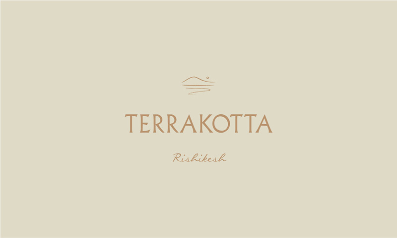
Image Source: behance.net
In the logo above, the imagery may not be overtly descriptive. But you can still make out the shapes of a wave or a mountain. That’s how conceptual designs are made. They bring the strength of descriptive elements and fuse them together with clever abstract imagery. The results are delightful industry logos that give you a hint of what the business is about but have deeper layers of meaning that you can explore and enjoy.
4. Explore monograms for luxury hotel ideas
Expanding a bit more on creating the best hotel logos with subtle imagery, I’d be remiss not to talk about monograms. Consisting of only business name initials, these concise designs offer the most elegant mix of recognition, grace, and exclusiveness. Since so much brand recognition is dependent upon design, hospitality business leaders recognize the power of monogram logos in conveying opulence without any flash.
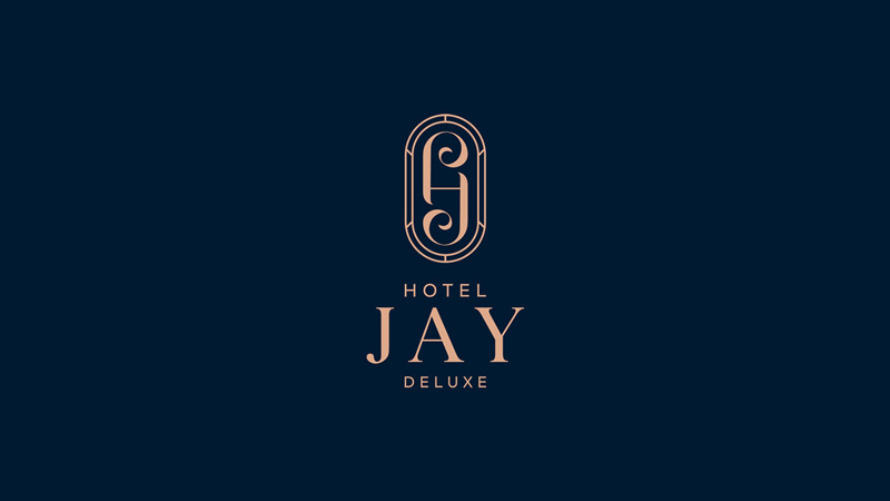
Image Source: behance.net
There are several different ways you can combine your brand initials to form the logo. But aim for a sophisticated logo design that conveys the old-world charm of lazy mornings and indulgent afternoons. A vintage logo design touch won’t be a bad thing to try. Compared with bare-minimum minimalism, vintage logos allow you to use details in a restrained way that elevates the end design.
5. Combination marks give you more room for experimentation
We all love a good wordmark logo but the fact remains that combination marks are more functional. For a wide-scope logo design, such as one belonging to the tourism or hospitality industry, a combination logo design is the most dependable way to go.
It will allow you to switch between the logotype and the logomark, depending on your brand needs, without needing multiple logo iterations to manage.
The hotel logo idea for a boutique hotel in California works on this principle.
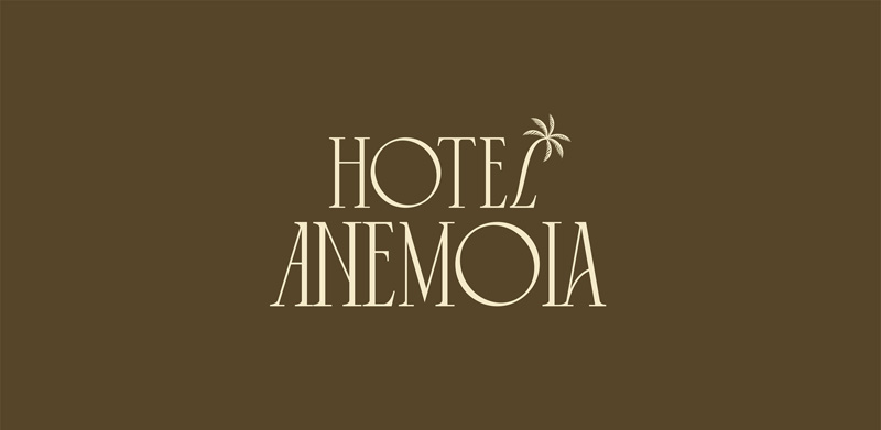
Image Source: behance.net
It’s basically a wordmark logo with just a hint of pictorial element in the form of a palm tree. As you’ll see next, it allows the hotel brand to present its identity with more flexibility and ease, never giving up the charming and enchanting vibe that the brand is striving to pull off.
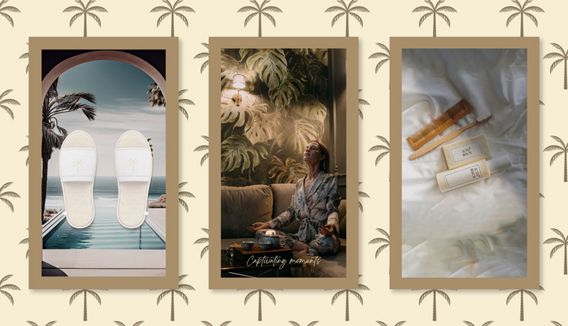
Image Source: behance.net
6. Keep your design choices centered on your brand message
While understated is the norm for luxe hotel identities or high-end hotel chain logos, a budget-friendly establishment will do well with a more welcoming identity. Curved shapes, bright colors, combination marks, and easygoing fonts are some of the hallmarks of such designs.
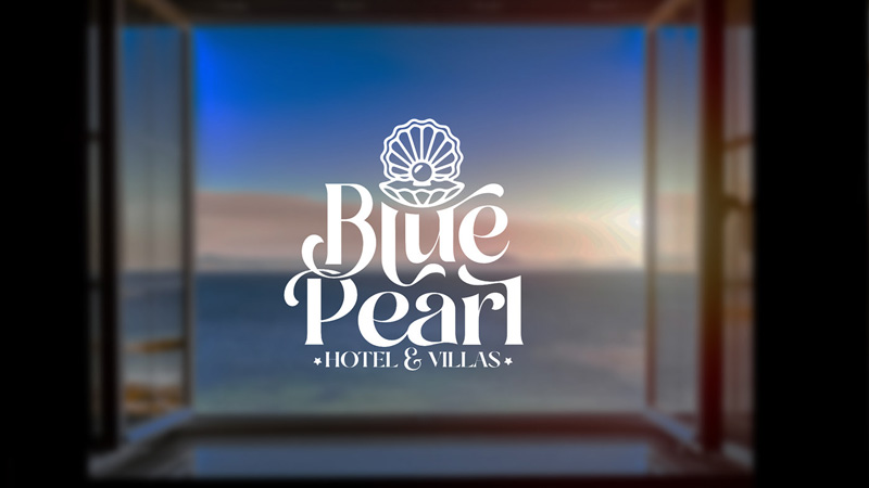
Image Source: behance.net
These details convey the element of approachability while still promoting comfort and convenience. In terms of attracting the target market, a family of four looking for their annual vacation may prefer the logo design of the Blue Pearl Hotel than say something like Hotel Anemoia. Both are good, but one looks like it belongs to a hotel where loud children won’t be welcomed. But the cushiony fonts of the Blue Pearl logo tell you that you can take it easy there and have some well-deserved downtime.
7. Minimal is the way to go with hotel management logos
Whichever final decision you make regarding these visual details, following the minimal design route for your hotel business logo, should be your number 1 priority. Remember that you are working with a logo that has to go on a lot of different surfaces and scenarios.
The fewer details you add, the easier it will be to manage a sprawling brand identity.
A Few of the Best Hotel Logo Designs on the Internet
To get your creative neurons buzzing again, here are a bunch of hotel logos to inspire and excite you.
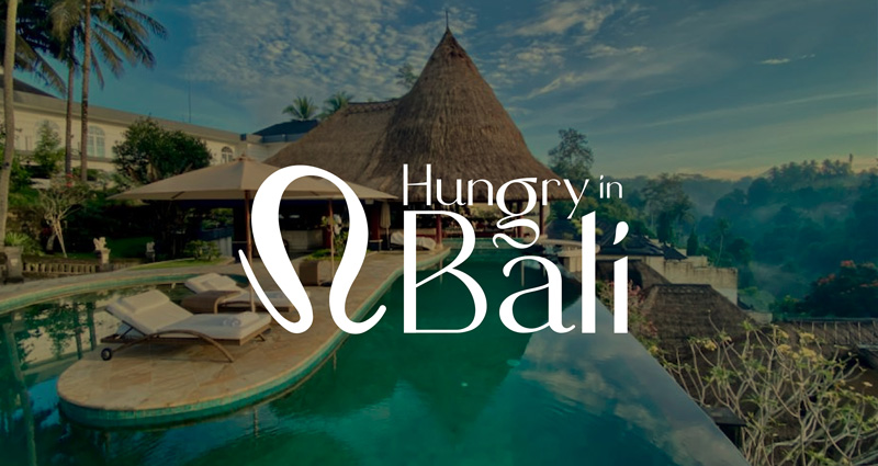
1. Hungry in Bali designed by Huzaifa Ahmed
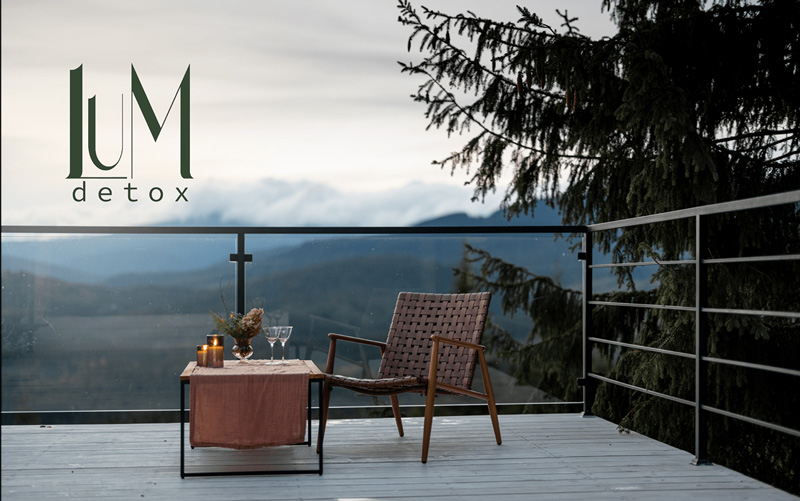
2. LUM, an eco-hotel logo designed by Oksana Sumerina
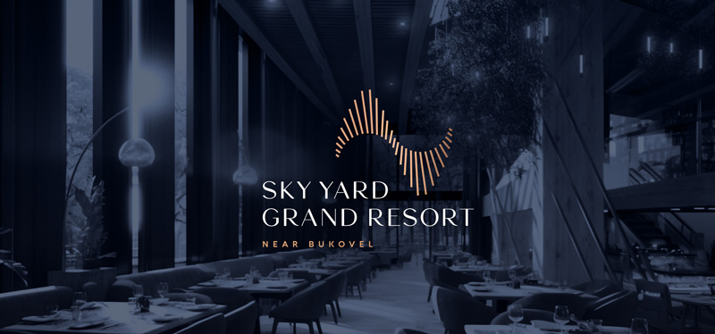
3. Sky Yard Grand Resort designed by Alyona Khomytska
4. Sanz Hotel designed by Yulin Design
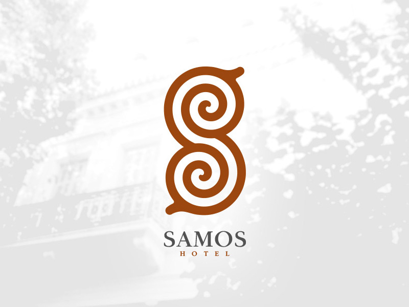
5. Samos Hotel logo designed by Stagaki
Design your own hotel logo!
Now that you’ve got the basics, the expert tips, and some handy inspiration, get to the drawing board and do your thing. If you thought creating a hotel logo design would be a breeze, you’ll soon realize how satisfyingly difficult it can be to nail down a design that wants to be equal parts depictive and creative.
You’re gonna have a blast! Good luck 🙂

