Transport businesses are trusted with the job of moving goods from one place to another. They may include shipping services, courier services, moving services or any other transport services such as travel services. No matter what the niche, all of the transport businesses have the power to go global –this is the given nature of their job. And with this in mind, it is important to design transport logos in a timeless and memorable manner.
When you are looking to design a good transport logo, it is important to understand certain things about design. For instance, the fact that good design is dependent upon strategic placement of every single element. To a layman’s eye, only certain elements and shapes may seem “deliberately constructed”, however, all designers know logos are designed to the tee. Every single line, white space, color, shape, and form are a conscious decision. This is imperative for good logo design and all of the design theory lays the basis for taking each chunk of design seriously. So today, we are going to talk about one such concept that will help you form memorable and timeless transport logos. This is the concept of Figure-Ground relationship in logo design. Let’s see what it’s all about!
What Is Figure Ground?
Before you learn to work effectively with the figure-ground relationship, it is important to train your eye to really see the space. Figure and Ground are two terms that will help you become more aware of the space in your Transport logos and help you break it down for effective management. The figure is known as the positive space in the design. It is the shape or a form. While ‘ground’ refers to the negative space or the background. It is the canvas on which the elements of the figure are placed upon. Usually, the elements in the figure are visually dominant; however, it is not always necessary. Sometimes a logo may also be ground dominant instead of being figure dominant.
Importance Of Figure-Ground Relationship
If you are wondering why the Figure-Ground relationship is important in transport logos, or any other logos for that matter, let us take you back to the Gestalt Principle. A very basic lesson learned from the Gestalt Principle is that design is perceived as a unified whole. When people view a logo or an image or anything else for that matter, they take in the individual elements and categorize it in groups and relationships. Figure-Ground Relationship is an extension of the same principle –basically what you are saying is that negative is just as important as positive because both spaces exist in relation to each other, and you are only able to view one because of the other.
Harnessing Figure-Ground Relationships For Good Design
While laymen are accustomed to ignoring the ground space, it is a designer’s job to give it as much due attention as possible. This is because the Figure-Ground Relationship works to complement each other. For example, if your transport logo has a symbol of a truck set against a deep blue background, the figure and ground work together to attract or detract your eye.
One can help to enhance the other or subdue the other. When designers achieve a good balance between Figure and Ground, they are able to build interesting icons, logos, and images with the help of playing with the contrast between image and ground. This can be used to add energy to logos. All of this brings harmony and beauty to the design!
The form of the object is not more important than the form of the space surrounding it. All things exist in interaction with other things. In music, are the separations between notes less important than the notes themselves? – Malcolm Grear.
The 3 Types Of Figure Ground Relationship
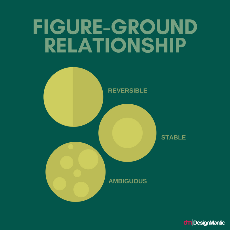
There are three main types of figure ground relationships which can help us yield interesting transport logos. Let us take a look at each one:
- Stable Figure Ground Relationship
- Reversible Figure Ground Relationship
- Ambiguous Figure Ground Relationship
1. Stable Figure Ground Relationship
A stable figure ground relationship is one in which a person can easily distinguish a figure and a ground. To achieve such a composition, designers need to make one aspect dominant over the other. For example, they may make the figure dominant over the ground or the ground dominant over the figure. This sets very clear boundaries, and the onlooker can easily identify the elements.
This is an example of a logo which has a stable figure ground relationship. You can easily see the figure dominates the ground here and both are clearly distinguishable. The truck, which is the figure, is set against a white background which is the ground.
Similarly, this logo has a very stable figure ground relationship even though two kinds of forms dominate the composition.
2. Reversible Figure Ground Relationship
A reversible figure ground relationship is one in which the figure and the ground attract equal attention. This can have very interesting results as it creates a sort of ambiguity. There is space for the figure to take over the ground and for the ground to take over the figure. This can form the basis of a very dynamic logo. Here is an example of a reversible figure ground relationship. The viewer’s eye is equally guided to see the “arrow” inside the typography.
Similarly, this is another example of reversible figure ground. The white stripes attract as much attention as the blue stripes.
Related: The Geometry Of Logo Design – Once Upon A Shape
3. Ambiguous Figure Ground Relationship
Ambiguous figure ground relationship makes it hard for viewers to separate figure from ground. The defining feature of this figure ground relationship is that the viewer cannot easily find a focal point. At times, there may not even be a focal point. Ambiguous figure ground is ideal for creating patterns in transport logos. Where there is no set focal point, there is still a sense of rhythm and balance in design. This is because even an ambiguous figure ground relationship is consciously designed keeping in mind the logo design principles. The designer carefully crafts the negative void as well as the positive space.
Here is a visual summary of the different types of Figure-Ground Relationship.
How To Create A Distinct Figure Ground Relationship For Logos
While you can use any of the three figure-ground relationships to create logos, the most common are the stable figure-ground relationship. Where you want to create a stark distinction between figure and ground, you can do it in a number of ways. Often, this will be the most helpful route for your logo because a stark figure ground relationship can help your viewers singularly focus on a single element –which would be your main message. So if you want to go down that route, here is what you can do:
- Use Contrasting Colors
- Making The Ground Non-Existent By Magnifying The Figure
- Blurred Background
1. Use Contrasting Colors
Creating a sharp contrast creates an instant and stark figure-ground distinction. If you use warm colors against a cool background or cool colors against a warm background, it will create a sharp contrast. Complementary colors also create a good visual contrast.
This is especially helpful if your transport logo is a word form. A high contrast between the background and the text makes it easy for users to read the text. The text jumps out and is visible from a distance, and can also serve as a mark of recognition.
Related: Choose Colors Wisely; Take Your SMB to the Next Level
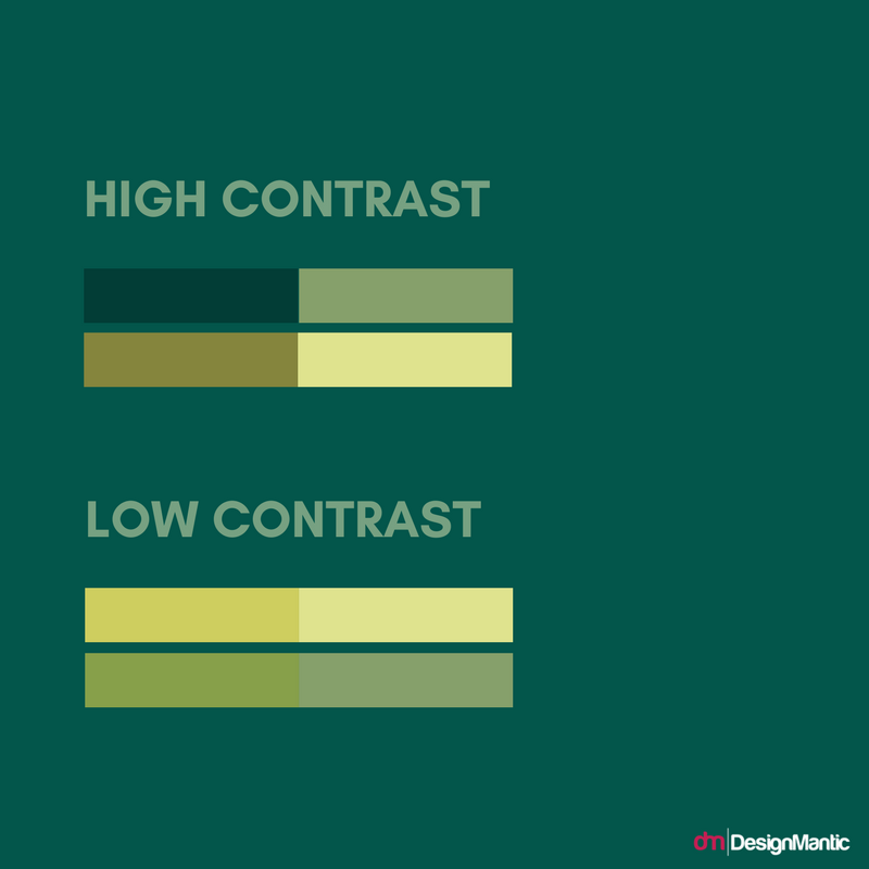
You may also use tints and shades to create a contrast. Tints and shades are basic values of the same color. The difference in gradation can create a high or low contrast. Here is an example of how shades and tints can be used for contrast:
Similarly, you can explore contrasts of Hue, Saturation, and Colors.
2. Making The Ground Non-Existent By Magnifying The Figure
Sometimes it may even work well for logos to magnify the figure elements so much that the ground becomes non-existent or insignificant.
For example, in this delivery logo, the figure is magnified to the extent that ground disappears. However, one may argue that the shapes on the background are the ground for the shapes on the top. In this way, a relationship flows within a relationship.
Here is another example. In this case, again, the figure is placed inside of an image that acts as a background.
3. Blurred Background
A blurred background is another way to make the figure ground relationship stark. While this is not used as much in logo design, it is a key technique in photography. A blurred background often acts well against a text. For example, here is a shape set against a blurred background:
Two More Concepts That Can Help You Enhance Figure-Ground Relationship
While the figure ground relationship teaches you to analyze, look at and design space, it is not the only design concept that can help with space. There are other relationships which are driven from the Gestalt Principles, which help us define space. Using these concepts with figure ground relationship will help you enhance the figure ground relationship.
- Proximity
- Closure
1. Proximity
Proximity is a very important design concept. It helps to tie together the design in a coherent manner and is especially needed in logo design. Proximity is very easy to understand. To put it simply, proximity means that related design elements should be put together and unrelated ones should be put at a distance. Because humans perceive closeness of elements as a “relationship”; it makes them take in the elements as a whole unit or a group.
For example, in this logo, the proximity of the curves help the viewers to realize the curves are a part of one unit, which is a road. If the curves were placed at a greater distance, it may not have been possible for the viewers to reach this conclusion. This is why proximity is a very important principle that should be used in conjunction with the figure-ground relationship.
2. Closure
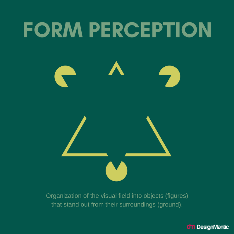
The second important principle which can be used in conjunction with the figure-ground relationship is the concept of closure. The closure means the gaps between individual elements which can help the viewers fill in the details and reach a conclusion.
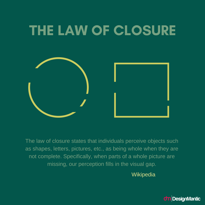
This is an example of closure:
See how the line segments are spaced apart and they enclose a space. This helps the viewers reach a visual conclusion, which is that this shape is a circle, square etc. Closure technique can be used to make your design look witty and creative. It works especially well with the figure-ground relationship because it cannot exist without exploiting the negative space.
Here is an example of a transport logo that uses a figure-ground relationship which is enhanced with the use of closure. You can see the two roads being formed out of a negative space, which is enclosed by the orange form. The orange form gives meaning to the white space and the white space gives meaning to the orange form. In this way, both complement each other and exist for each other.
Following these tips will help you form a great figure ground relationship which can be put to good use for the logo. This can add a touch of creativity and uniqueness to your transport logos and set you apart from your competitors. So what do you think? Are you suddenly seeing the negative spaces in all the logo design around you?!


