If your design process has been a bit slow lately – thanks to the pandemic and all that it has brought with it – you certainly aren’t alone. To kill your boredom and ours and to stimulate our respective creativities – here is a list of 20 beautiful engineering logos.
Engineering is an exciting profession. These professionals are not only experts in science and math but are wildly creative, too. Did you know, for example, that the slippery part of water slides was conceived by an engineer? Engineers are also responsible for inventing the Ferris wheel, the first snowboard, and the Morse code; among many other exciting things (the Egyptian pyramids, for example).
So, if you are designing a brand identity for an engineer or an engineering firm, consider your work cut out for you. These people are geniuses and deserve to be presented with the best that graphic design has to offer.
So, use these inspiring images below and help your design process move along.
1. The Iconic Merger
A key, a gear, a city skyline, and custom lettering. Though too much is happening here, the effect is still modern and sleek.
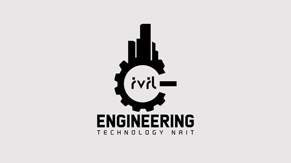
Image Source: Behance
2. Pointy & Precise
Take a cue from your brand name and create something that immediately gives away what your brand is all about.
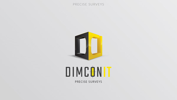
Image Source: Behance
3. Angles = Authority
Convey your leadership qualities by using sharp angles in your engineering logo designs. Triangle is a handy shape that conveys leadership, authority, and direction.
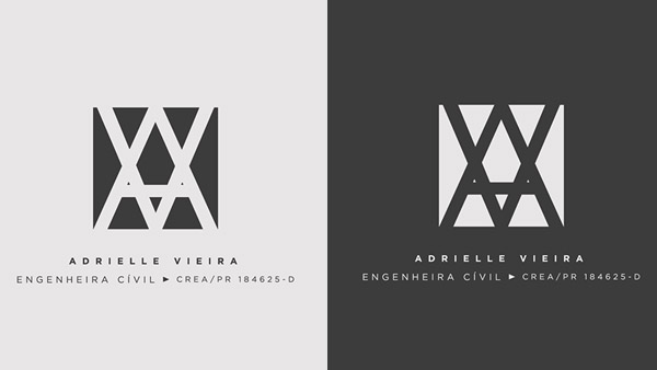
Image: Behance
4. Muted & Grey
Tell your audience how exclusive you are by using muted tones in your logo designs.
Image Source: Behance
5. Keep It Charming
Paradoxes in design keep things interesting. If you are using a futuristic font, pair it with a playful icon to make your brand look less like a robot.
Image Source: Behance
6. A Mascot Logo
Mascot logos make brands appear humanistic and approachable. A mascot for a STEM education logo can be a great rallying point for students.

Robot logo with intricate details
7. Green Energy
This green energy logo is unmistakable in its presentation of the brand offering. You immediately know it’s a logo for an energy-efficient brand.

Bulb logo with leaves inside
8. The Atomic Symbol
Using well-known industry symbols helps the target audience warm up to you and recognizes your brand easily.
Gear logo with a sphere around
9. Clean & Lined
Contrasting shapes in logo designs can help the audience understand the design better and make it look well-thought-out.
Iron rods logo with black circles
10. Stacked & Assembled
Use symmetry and repetition in your engineering logo to make the design look neat and proper.
Green logo with chip formation
11. The Shape Of The Logo
Geometric shapes are some of the most common shapes for this industry. Learn more about how the different logo shapes work for engineering logos.

Image Source: Dribbble
12. Elegant Engineering
A muted gold in your logo design can add a touch of elegance.

Image Source: Dribbble
13. Breaking The Mold
Fonts that break are instantly attractive. You can spot them from a mile away and they make the brand look distinguishable.
Image Source: Dribbble
14. Contrasting Font Pairings
Our brain remembers things that don’t go together. That’s why font pairings that contrast either in shape, size, or style help become the logo more recognizable.
Image Source: Dribbble
15. Strong Serifs
Double down on the stability and strength of your engineering business by using sturdy serifs that can handle a powerful image.
Image Source: Dribbble
16. Think Of The Layout
The side-by-side layout where the logo icon is on one side and the type on the next helps create an easy reading pattern. Our eyes move from left to right and hence we spot the image quite quickly.

Image Source: LogoPond
17. A Pop Of Color
It is the oldest trick in the book but still works like a charm. A pop of color in other wise dark logo makes that one part shine like a beacon.
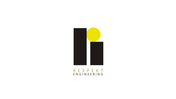
Image Source: LogoPond
18. A Clean And Confident Font
When you choose a sans serif font but still want it to have a commanding presence, reduce its height and increase the width.
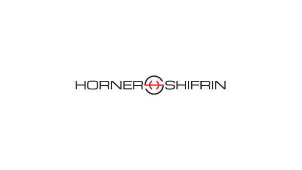
Image Source: LogoPond
19. Diverse & Authentic
Do not be afraid to show your roots through your logo design. The changing social climate has made it increasingly possible for brands to tell their authentic stories.
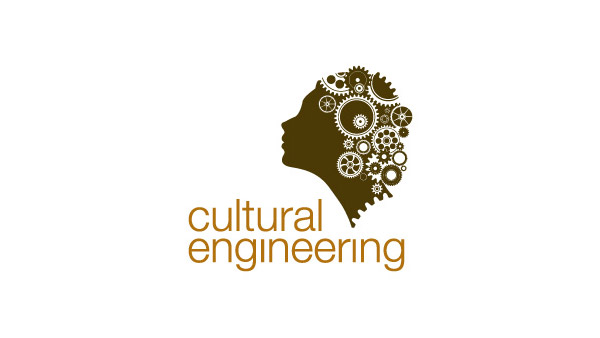
Image Source: LogoPond
20. Structure In Your Design
What better way to show that you are a structural design engineer than by using building drawings to structure your logo!
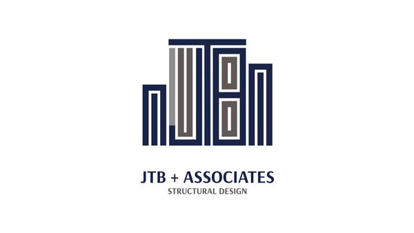
Image Source: LogoPond
So, What Do You Think?
We hope you are feeling inspired by the amazing work our designer colleagues have been doing. To see more brand identity designs for engineering firms, head over to our engineering logo gallery now.


