With international tourism growing every passing day and technology rapidly globalizing everything, the historic value of cultures and societies is also increasing. Museums are not just mere tourist spots anymore but they are a region’s cultural identity. It’s now even more important to engage our younger generation into these historic exhibits and to help them feel more connected to them.
And this is why museums around the Globe have recently gone through a major rebranding phase like many other firms and organizations! We have recently observed significant international art galleries and museums improvising the overall outlook of their logo palette.
In today’s blog we’ll go ahead and discuss the latest logo design trends for Museum and art galleries around the world. And the challenges involved into creating an imposing and contemporary museum logo design!
The Architectural Feel – SILHOUETTES
Modern museum logos are all about adapting to the modern perspective of art and creativity. Dynamic logos for museums and art galleries usually focus more around shapes and silhouettes in order to convey the message of art and craft.
And so we’ve seen organizations adapting to a more architectural look in logo design and feel when it came to rebranding their business. It seems that incorporating simplistic silhouettes of the organization itself is the perfect way to producing a dynamic and impressive logo!
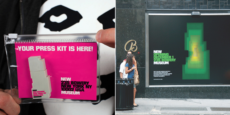
The New York City happens to house World’s numerous and most monumental museums. And one of its modern day museums, The New Museum has recently undergone a rebranding spell. The gallery inaugurated their new building in the Bowery back in 2012 and that’s when they also introduced their new brand identity to the world. The successful rebranding increased foot traffic by a 600%!
The building logo comprises of a thin outline of the building itself; a silhouette image. This way the offerings of the museum are subtly incorporated in the logo― showcasing that the art gallery is a container of art and timeless craft.
Wolff Olins and his team faced a major challenge with infusing the brand identity― a perspective of contemporary artwork reflected in the logo! The logo had to be calling people to indulge in informative and entertaining exhibits based on “New Art, New Ideas”. The logo’s type comprises of all-caps, house style while comprising Paul Rand’s mid-50s refined and eclectic color palettes on a black backdrop.
Fusing The Ancient And The Modern Feel – MOMENTOUS TYPEFACES
When we talk about museums we instantly picture ancient sculptures and medieval paintings in our mind’s eye. A great museum logo design could be achieved by fusing in certain creative typographic fonts to subtly play around with a lot of the other elements of the typeface. Museum and Art Gallery logos effectively convey more information if they are a typeface―not only does a typeface convey the name of the organization but it could be played around to create a distinct identity. We have noticed that a lot of museum and art galleries rebranding has focused much around the cryptic and modern fonts to produce dynamic typefaces.
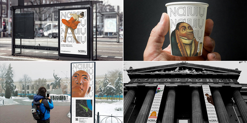
Also, museum logos should incorporate a subtle touch of the old and new.And that’s what NAMU has done!
NAMU is an acronym for the National Art Museum of Ukraine which was previously named and known as the Kiev City Museum of Antiques and Art since its establishment in 1899.The establishment has preserved Ukrainian history for centuries; having survived two World Wars and witnessing Ukraine’s Independence in 1991. The new name, the National Art Museum of Ukraine was adopted in the year 1994, and just last year the Museum underwent a major rebranding phase! The branding design was planned and managed in collaboration with Dmitry Rastvortsev.
Unlike the old, mouthful typeface, the new logo comprises of English and Latin Alphabets to meet the challenges of introducing the Ukrainian heritage to the World. The old letter logo could not be replicated on other print medium and merchandise. So the challenge was to create a modern day logo that did not only represent the national identity of NAMU but also was accessible and could be easily utilized
elsewhere. The renewed typeface reflects the Cyrillic alphabets in a distinguished way with English language to promote historic Ukrainian paintings, sculptures, and prints that date back to the twelfth century.
Playing With Positive And Negative – SPACES!
Designing a logo requires much thought and strategy. It wouldn’t be an overstatement to say that there’s more to it than what meets the eye! A museum logo design should not just read off a boring acronym, but it should evoke a certain message or ‘feel’ about the museum in its visitors’ minds. Positive-negative space plays a vital role into evoking such subtle messages, and this classic designing trick could be mixed with typographic fonts to create a logo that represents culture.
Such is the case with the Museo Morelense de Arte Contemporáneo Juan Soriano’s logo. The museum (MMAC) was inaugurated in 2018 as a contemporary art gallery in a peaceful, vacation town of Cuernavaca near the Mexico City. The museum is named after Juan Soriano, a famous Mexican artist, and the art gallery exhibits over 1,200 pieces of his work. And will be housing more of contemporary art contributed by local and international artists in the near future.
The challenge for the Mexico City-based branding studio, the Sociedad Anónima was to not only produce a negative space logo that could be used over in multiple medium but also reflect the modern ideology of the art gallery. The sans-serif typographic font was tweaked to create display characters that were inspired by the architectural features of the museum’s building designed by a local building firm, the JSa Arquitectura. The cuts and hollow spaces are infused in the typeface by making great use of positive-negative spaces to give off the concrete blocks and windows’ allusion. The design delicately conveys the iconography of signaling, dynamic color and communicative grid styles.
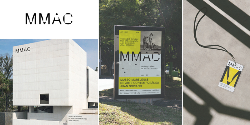
Image Source: MMAC by Sociedad Anonima
The logo could be easily deciphered with context to the building since the strange letter shapes indicate large concrete walls and square cuts that reflect other spaces. The dynamic typeface instantly stimulates a contemporary art museum ‘look and feel’ to the visitors and could be easily used in print as well.
Geometric Shapes With Bright Color Palettes – Monograms
Alluring typefaces are quite a sensation, but a simple sans-serif typeface with an edgy bright colored monogram is no short of being exciting! A great museum logo design could be achieved by strategically incorporating bright and sophisticated color palettes. A brand ideology could be effectively conveyed using geometric shapes which could be colored dynamically to play around with negative space.
Craft Contemporary (previously known as the Craft and Folk Art Museum) is an art museum located in Los Angeles that educates and captivates individuals to unlock their artistic potential. The museum was established in 1975 to exhibit the work of underprivileged craftsmen and artists while promoting contemporary art made from local craft processes. It also features workshops for the public that are conducted by professional artists.
Siegel+Gale redesigned the art gallery’s new logo which comprises of a simple sans-serif typeface with an edgy monogram. The challenge was to create a logo that did not only represent the institution’s rebranding development but also help channel the brand ideology to create a deepening relationship with contemporary art and creativity!
That’s why a simple yet meaningful typeface was created to emphasize the word “craft” in the logo; to give out an open invitation to the public to engage in a community and not just any museum; a community that promotes versatility and is constantly evolving! Therefore a soft color palette was considered for the sans-serif typeface and the word ‘museum’ was omitted deliberately. Also, a monogram was created to channel a set of principles and to use the stylish symbol in print or on other merchandise later. Geometric shapes were used that included outward facing triangles to represent a diverse community that believes in the distribution of contemporary art and culture. A bold, forward-looking triangle within the negative space was incorporated into the arts and crafts logo to represent progression and the zeal for pushing past boundaries.
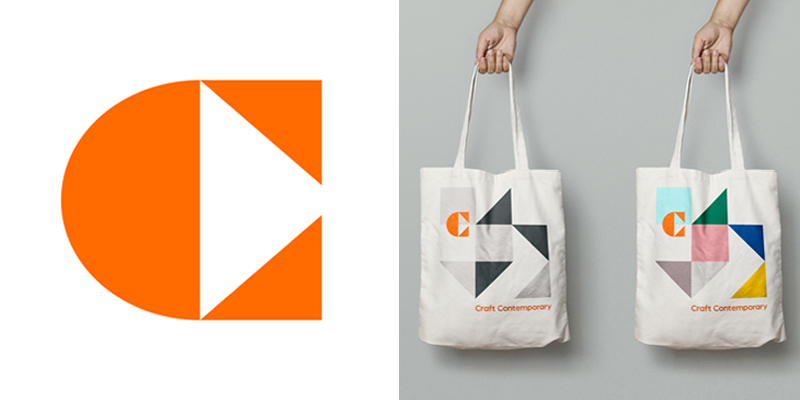
Image Source: Craft Contemporary by Siegel+Gale
Summary
Crafting a museum logo requires equal amount of logic and thinking as any commercial and industrial artists logo in the market. It is best to keep the design as flexible as possible so that it may accurately represent the ideology of an art or museum gallery. Designers must consider and keep accessibility aspects in mind while designing the logo since museums are rapidly adapting to the evolving technology.
Try Our Free Logo Maker Tool:
Art Painting and Drawing Lessons Logo Design
Paint Suppliers Logo Maker
Paintshop Logo Generator
Logo Maker For Painters and Decorators
Create Artistic Logo Designs
Professional Logo Templates For Calligraphers
Logo For Canvas Products
Brand Identity For Architectural Consultants

