Parallax scrolling has effectively taken over the world of web design. From large brands such as Hitachi and McDonald’s India to smaller personal portfolio sites, everyone is doing parallax. And why not? It’s exciting, arouses curiosity, and is an exceptional storytelling tool. Not to forget that it’s also absolutely stylish and deceptively smooth.
However, before we write it off as a surface tool that is all show and no depth, here is our moment of reflection. Parallax scrolling not only drives sales but also improves SEO and customer experience. So, if you are wondering should you ‘go parallax’ or stay put, look at these 7 stunning effects that only parallax – and no other technique – can give to your ecommerce website. Decide then.
But first, let’s get the basics right.
What Is Parallax Scrolling?
The term parallax refers to a change in the viewer’s point of view that distorts or modifies the placement of an object. Photographers know it well. The image that appears in their camera’s viewfinder and the one that comes out in the final photograph are never the same, because of parallax error.
Parallax also has applications in astronomy as well as the field that we are discussing today: website design.
In web design, parallax has come to represent all websites that are single-page platforms. However, in reality, a website that uses the parallax scrolling effect is employing a uniquely distinct technique. This technique uses the scrolling movement to make the foreground of the page move faster than the background. This distortion in speed creates a 3D effect and adds depth to the visuals. It can be used to amplify visual hierarchy, highlight CTA buttons, and create an overall effect of smooth transitions on the website.
Depending on the number of layers used, the speed of the movement, and the visuals themselves, the parallax scrolling effects can range from minimum to my-god-that’s-stunning.
Below, we are sharing 7 of these impressive effects that’ll convince you in the favor of all things parallax.
7 Unparallel Effects Of Parallax Scrolling
1. Font Heavy Effects
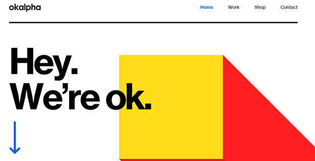
Since all parallax sites are single-page sites, some people feel concerned that the technique may not be all that suitable for content-heavy sites.
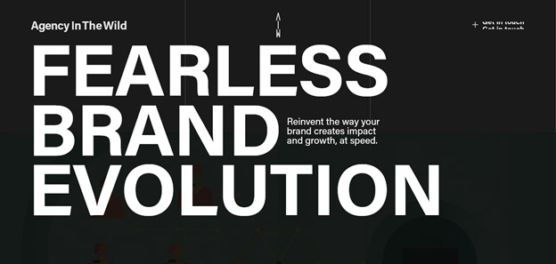
Business websites such as Tenddo and OK Alpha knock these worries out of the park. Both these sites use bold and eclectic typography to add depth and movement to the design. While Tenddo remains on the subtler side of things, OK Alpha amps up the design with striking colors as well as varying font sizes.
It enhances the storytelling of the brand and also creates a more interactive and engaging experience.
2. Zoom-In Parallax
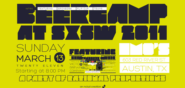
If you are in the business of creating unforgettable impressions and experiences, pair parallax scrolling with a zoom-in effect. The end result is bold, exciting, and spectacular.
Follow the example of BeerCamp to pull off this feat. The strategy is clever. You are forced to remain rooted at the focal point and your attention doesn’t deviate from that center of the page where all the action is taking place. As you scroll down, more and more information emerges and gets larger and bolder. The neon background and a cacophony of fonts take care of the rest.
3. Split-Page Parallax
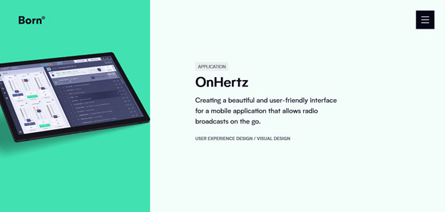
Another effect that takes parallax to the next level is splitting the page into two. It achieves two purposes. First, the parallax is introduced. Second, the split page makes the information compartmentalized and easier to consume.
Born Digital is a design agency that achieves this effect with aplomb. The speed of the parallax has been kept at a slower pace to ensure that the content is given maximum attention.
4. Minimalism + Parallax
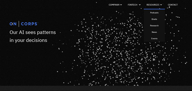
If you are thinking parallax is all about grand showcases, you are not wrong. While the technique encourages the extraordinary display of creativity, it also creates beautifully minimalistic websites that are still a great experience to be part of.
OnCorps, an AI service provider company, stays squarely on brand with a minimalist flair to its parallax website. The random dots on the first fold disperse and create beautiful shapes of varying graphs, with simple animation. With each scroll, you are introduced to newer shapes and graphs that perfectly encapsulate what the company does: creating actionable insights from random pockets of data using the power of artificial intelligence.
5. Parallax With Animation
Now, this is an effect that brings a great amount of digital goodness into the mix. We have parallax scrolling, animation, grid system, and static all merged into one. The site is a pretty long scroll with the website divided into many sections. If you pay attention, you’ll notice that each section has design effects that are different from the rest of the website while still containing many common themes – parallax being one of them.
If you are not afraid of going OTT, this is the effect for you.
6. Immersive Parallax
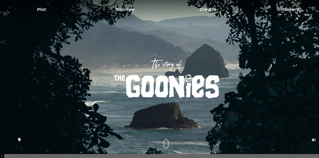
Talk about immersive scrolling! The Goonies website is a parallax delight with storytelling embedded into every corner of it.
This website is an homage to the beloved 80s movie and uses uncomplicated parallax effects. Varying speeds of the foreground and background layers plus the stunning visuals take you on a tour of the movie. As you start scrolling, the website opens up, and you feel a sense of stepping into the digital realm and going exploring the rocky coastline depicted in the movie.
7. Sudden Shifts
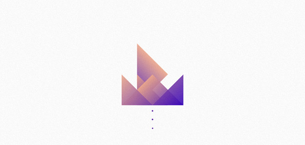
While parallax is an effect that’s synonymous with smooth transitions and butter-like scrolling, things can be spiced up by adding sudden movements, edgy shapes, and jolting motions. It not only makes for great visual viewing but excites the viewer to keep scrolling for more.
Alex Dram’s portfolio website is a great example that accomplishes this effect. The first fold consists of multiple triangles which open up to reveal a bit of introduction of the designer. As you scroll ahead, the triangles merge into each other with startling speed and are consumed by a beautifully animated moon. The whole thing is minimal and artsy, with a healthy dose of outer space imagery.
Is There More?
You bet. Parallax scrolling is a fertile and generous technique. It welcomes and takes in several different forms of digital art and enables you to create exciting immersive web experiences. With storytelling one of its strongest suits, we at DesignMantic are excited to present this collection of effects achieved by parallax scrolling. Employ them in your design and create stunning webspace. As you work with this modern technique, do not forget about page load speeds. Make sure you are running on a strong bandwidth that supports your parallax website.


