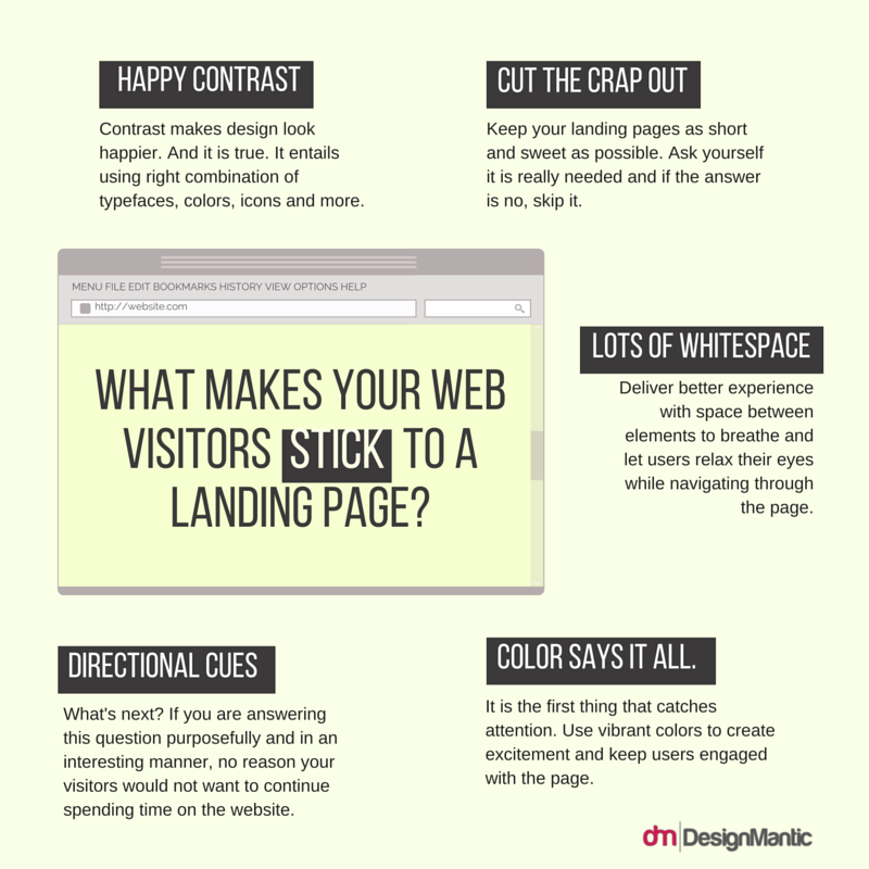
Creating a landing page is very crucial. A landing page is your brand’s first impression. Designing a well-organized and good to look landing page can actually uplift the chances of improved and increased conversions. With the help of a pre-defined and intelligently designed landing page the goal conversion becomes a lot easier.
For an amazing and conversion-oriented landing page, you need to work on proper, clearer and neat layout with bold heading and sub-headings. Nick Carson (Editor of Computer Arts) shares
“The first task is to find a clear USP (unique selling point) for the product or service in question, and then use the landing page design to focus everything on one primary call to action (CTA)…
- Clear, succinct headers and sub-headers
- and punchy, easily scanned bullet points are the order of the day”.
This clearly highlights the importance of great landing pages and components involved in them.
It is integral to only mention the relevant information on the landing page. The more irrelevant information present on the landing page, the higher will be the chances of lesser conversions. Kendra Gaines (a freelance designer and Jnr. Art Director at McCann) also shares the same regarding landing pages as
- “Remember to keep the most important information above the fold and never include a lot of fluff”.
At the end, as Oli Gardner (Con-Founder at Unbounce) states
- “Use conversion design rules to make your CTA stand out (whitespace, color, contrast, directional cues)”
Try to focus big-time on conversion designs for achieving a better conversion goal. You can pull off a perfect website design strategy and plan by carefully designing the landing page.

