“Invest in professional logo designs.”
“Hire the experts for the job.”
“Let skilled logo designers create your logo or risk failure.”
These are just some of the warnings you’ll come across the minute you announce your plans to walk down the path of creating your own logo. This is no surprise considering how designers can make between $100 and $5,000 (or even more) per project. However, hiring the best designer doesn’t necessarily mean that you’ll get your money’s worth.
You can easily end up wasting thousands of dollars on hiring a professional, tracking down their progress, and ensuring that they meet your deadlines.
This is why entrepreneurs are opting to create their own logos through logo makers. Despite promising their users cost-effectiveness, unlimited revisions, and creative freedom, these tools can backfire on them if they don’t know what costly mistakes to avoid. In fact, you can end up losing a generous amount of money since you may need to rebrand from scratch.
So, to save your money and ensure the results you want, here are ten common mistakes you can make while using a logo maker. And just to be clear, the following illustrated examples haven’t been created using a logo maker, but they’ll give you an idea of how even the experts failed to avoid these mistakes and suffered the consequences.
Related: 10 Reasons Logo Maker Takes over a Logo Designer
1. Creating A Logo Similar To Your Competitors
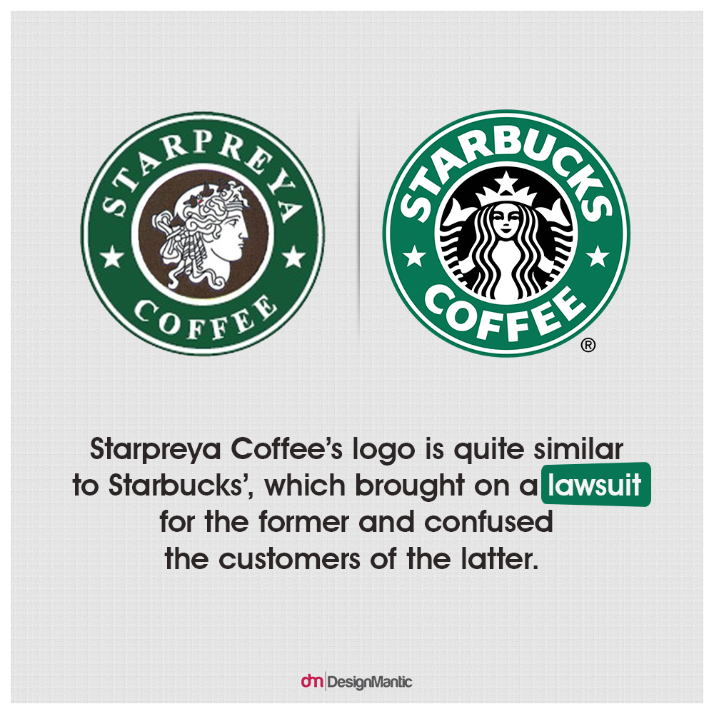
One of the critical design mistakes you can make while using a logo maker is creating a logo that’s similar to your competitors’. This is especially true if they used the same logo maker you’re using at the moment. Therefore, you need to make yourself stand out by choosing unique colors, shapes, icons and fonts. The bigger the difference between your business’ logo and that of your competition, the easier it’ll be for your customers to identify your business and products. Besides, your customers will appreciate the extra effort you put in making your brand unique and flock towards what they perceive to be the Next Big Thing.
2. Making Poor Color Choices
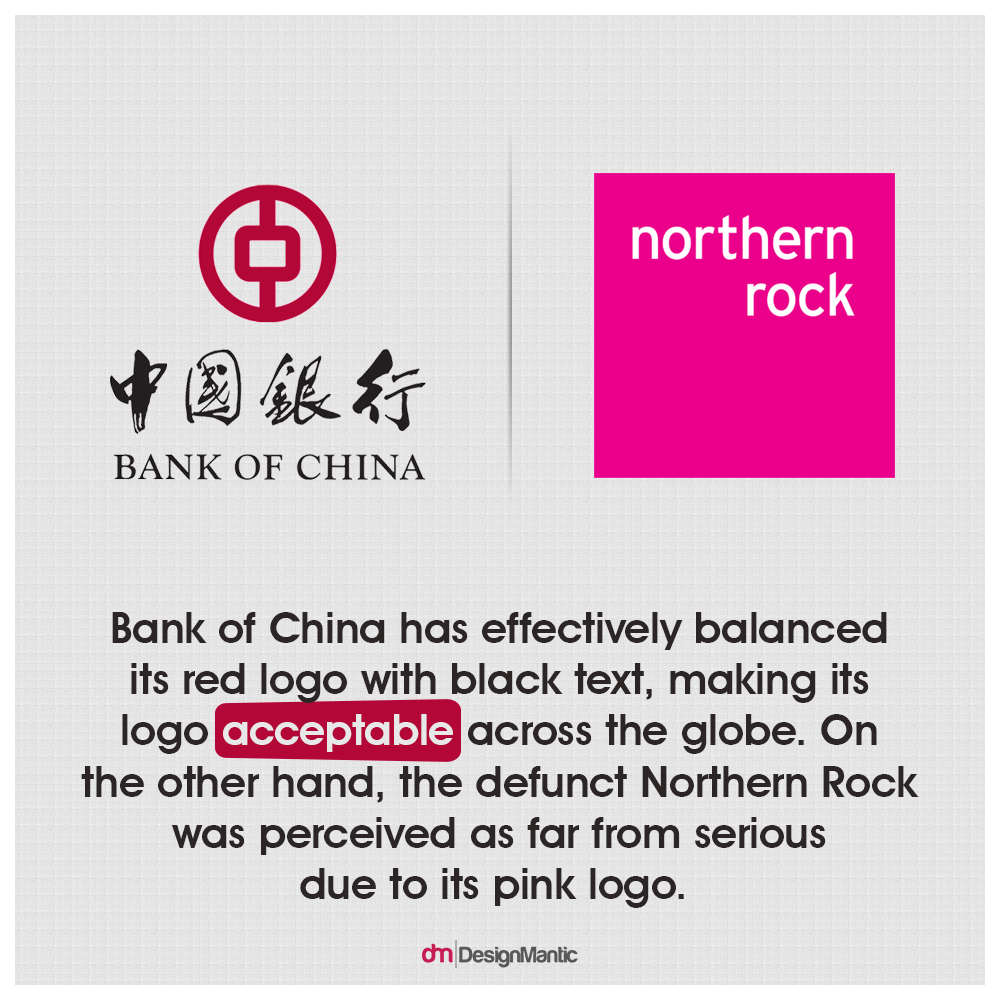
Carefully decide on the colors you’ll use for your logo. Sounds easy, doesn’t it? However, you need to strike a balance that ensures that the colors reflect your brand (e.g. using green to suggest health and prosperity) without alienating your target audience. For instance, Asian banks may prefer using red in their logos because the color represents good fortune and wealth, but they tend to mix it with other colors since their international clients perceive red to be rather ominous. So, take the time to first study which colors are most effective for your brand and to attract your target audience before firing up the logo maker.
3. Picking Just Any Font
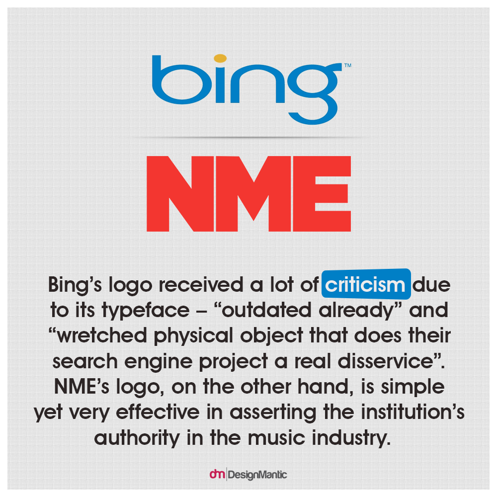
Just like colors, fonts are equally tricky to select while using a logo maker. With so many choices available, your personal preferences may step in. However, you need to think like a designer in order to select the best font for your logo. The following five steps can actually help you pull this off.
- Make sure that the font you select matches the message or purpose of your logo. Pick one of your brand’s qualities or characteristics and match it with a font that represents it best.
- Select a font that’s legible regardless of size. Don’t make the mistake of MegaFlicks, which ended up offending hundreds of people and drove customers to think twice before entering the store simply because it chose the wrong font.
- Take your clients’ ages and demographics into consideration to ensure that your font choice resonates with them.
- Read more about body typefaces and display typefaces to select the best one for your logo. If these aren’t as effective, consider ‘workhorse’ typefaces as these are the most flexible around.
- Test how easy-to-read your font regardless of size and finalize the font.
4. Trying to Communicate Too Much Through Your Logo
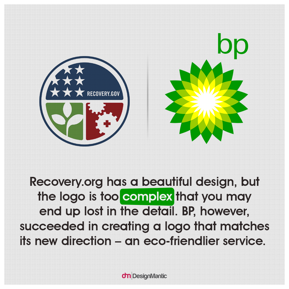
Your business may have too many values that it wants your clients to know. However, you shouldn’t go overboard trying to communicate all of these through your logo design. And it’s easy to go overboard since logo makers allow you to include design elements such as shapes, animals, clipart, and symbols. By including too many messages in your logo, you can easily confuse your customers and increase printing (or t-shirt embroidery) costs. So, focus on a single image that’s easy to remember and upload it to the logo maker.
5. Incorporating the Latest Trends
There are hundreds of guides on the latest logo design trends. However, how you and professionals use them differs. The latter tend to dig these out to avoid them. You see, trends come and go; your aim is to create a timeless logo that you won’t need to replace any time soon. So, while checking out the templates in a logo maker, look for something unique or customize it to create a unique brand identity.
Related: Logo Maker vs Logo Designer
6. Creating an Abstract Logo
In an attempt to avoid creating a bland or ordinary logo, you may end up with a very abstract logo. This can confuse your audience and misrepresent your brand. Your target audience should be able to identify what your brand is about from your logo, so focus on selecting a simple, relevant logo and don’t customize it to be abstract.
7. Creating A Monogram Rather Than A Logo
If your logo maker provides monogram serices, you may decide to opt to create one using your business’ initials. However, you’ll actually be settling for much less despite this possibly being a smart solution. Moreover, a monogram won’t help you effectively build credibility or convey your brand’s message. Besides, it may be too early for you to shorten your business name into acronyms. KFC, FedEx, and IBM took their time before flaunting their initials in their logo. Therefore, focus on designing an original and creative logo that reflects your goals.
8. Forgoing Proofreading Your Logo
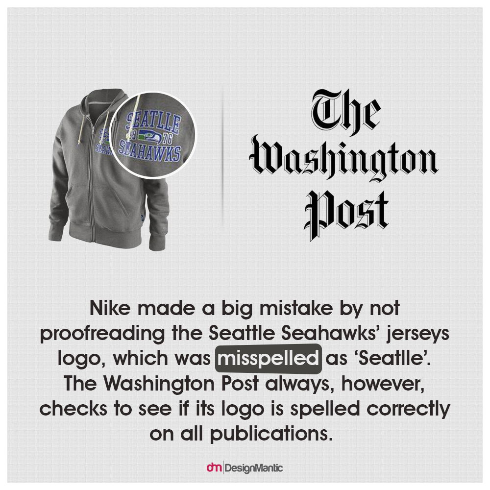
You may laugh at the fact that you need to proofread your logo. However, this is a very important step unless you want to be known forever by your misspelled name or become a ‘logo fail’ example which others point at. This mistake will be especially costly if you’re rebranding yourself as it may show your customers that you don’t care much about your business or them for that matter. So, before finalizing your logo on the maker, run the text you add through a spellchecker or have a fresh set of eyes go over the design thoroughly before finalizing it.
9. Including Special Characters
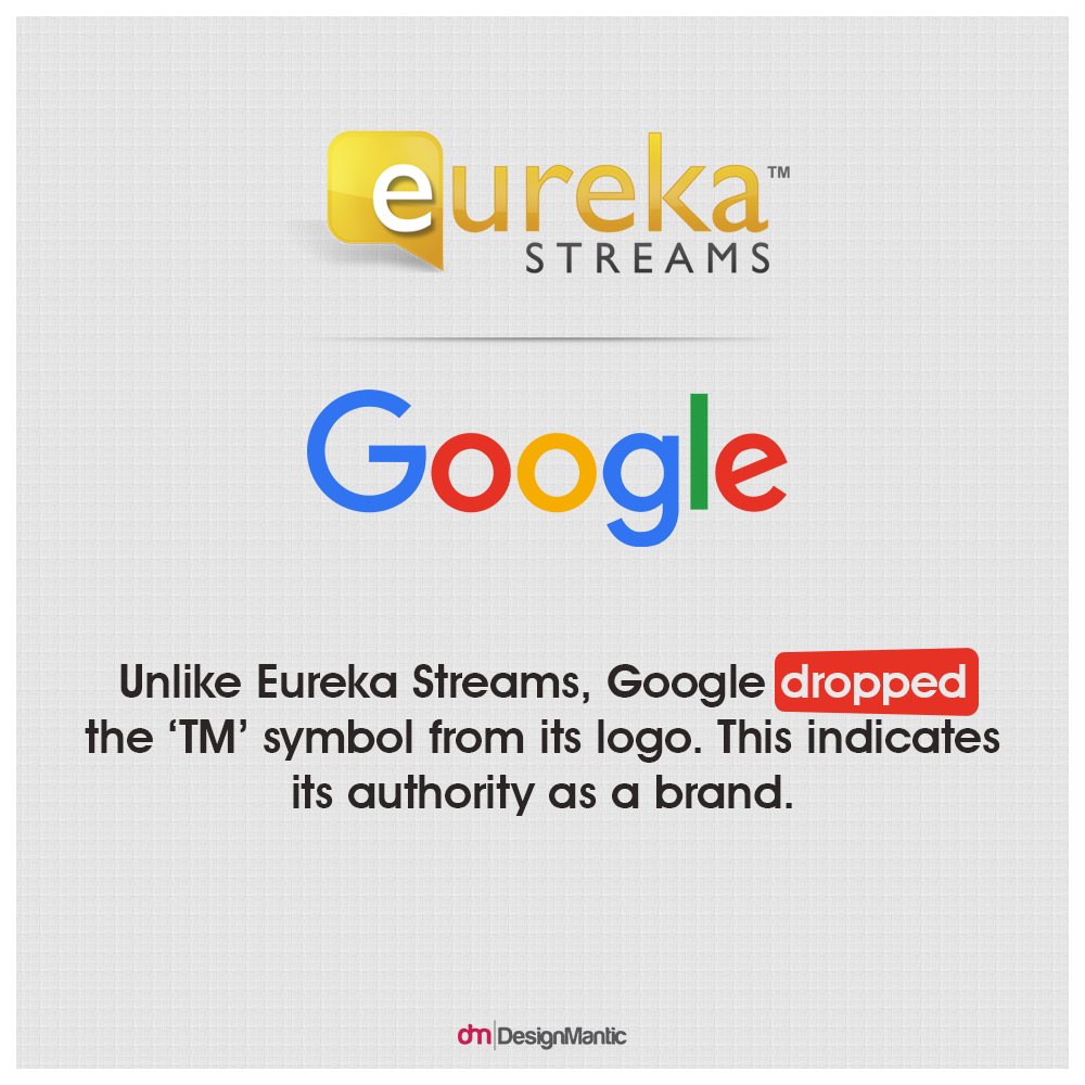
One of the ways consumers detect an amateur logo is by checking to see if it has characters, symbols, and elements such as Co., LLC, and Inc. While you may think that this is necessary to ensure that no one steals your logo, you need to remember that these additions go against the concept of a simple logo. They also tend to distract people from the core elements of your logo. So, be daring and avoid adding these special additions to your logo design.
10. Missing the Whole Point of the Design
This may be the biggest mistake you can make while designing your logo through a logo maker. If your knowledge of design is minimal, chances are that you tend to confuse design with decoration. The experts, however, know it to be about responding to problems. Therefore, you need to establish what you want your design to tell others about you and keep decoration to a minimum.
Avoid these 10 mistakes and the logo you create with your choice of logo maker will definitely be a hit with your customers. Just remember to do more research beforehand, which is easy since you’re here and just a click away from more logo maker resources that can help you get your logo right.
Good luck!





Thanks for sharing this wonderful blog and the mistakes you have provided are really good.