The global world has created a competitive environment for every industry and within this scenario there are terms like brand identity and brand image that have taken root and created new found glory for the logo.
Corporate branding involves various stakeholders and a diverse target audience which perpetuates the concept of the need for a strong brand that will generate long term customer loyalty and increased profitability (Plummer, 1985). The graphic identity, usually starting with the logo design, then becomes the basis of most marketing campaigns, so that even before the audience becomes a client or customer of the corporation, the logo presence creates an awareness of the brand.
A memorable logo design is then not only about the color, typography or white space, it is about the positioning of the logo within the goals of the corporation within the market.
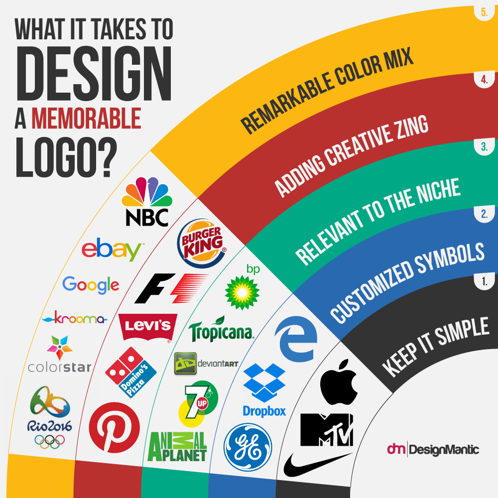
• Want A Logo That Is Different And Unique? Keep It Minimal.
So what should be the core elements of a logo in terms of a brand identity?
“After you have done the research you have to make sure your logo is what the client requested, has a strong visual appeal, it is unique, minimal, memorable, adaptable and scalable” Bogdan Sandu writes in a blog for Design Your Way.
The visual perceptions of people vary according to their unique cultural experiences and a complex logo can at times distort the message. Milton Glaser once said: “The logo is the gateway to the brand” (Wheeler, 2009, p. 35).
The various corporations around the world generally have a similar business concept. The industry continuously changes but the message and the service remains the same.
Related – Learn how to create an innovative logo design with a logo maker
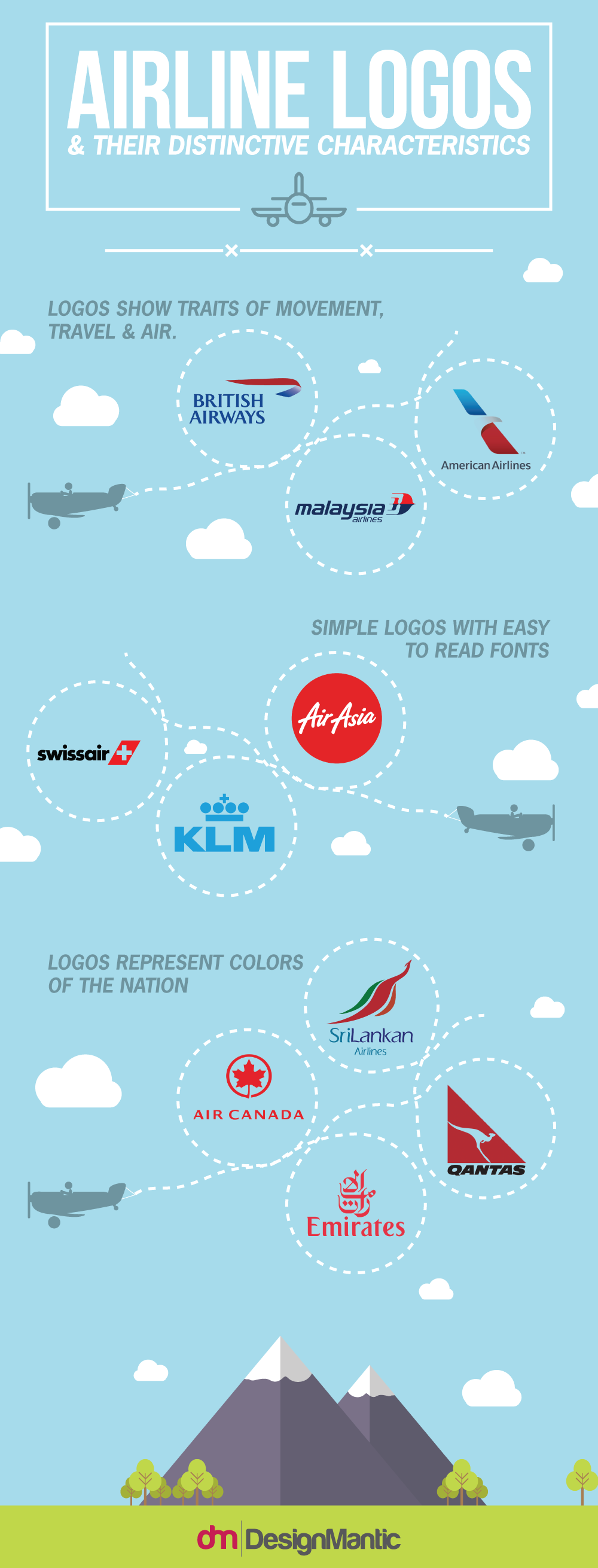
Memorable Logo Designing: Hints From Airline Industry! Consider the airline world. The various airlines representing the nations all focus on transport and service to the people. In terms of branding, there are minor differences in the corporate strategies but the end goal remains the same which is why many of the logo elements then are similar.
A study of the various logos for the airline corporations at first glance suggests:
- The logo elements include aspects of air, movement and travel. Think British Airways, American Airlines and Malaysia Airlines.
- The colors are usually representative of the nation the airline represents. Consider the logos for Air Canada, Sri Lankan Air, Qantas, and Emirates.
- The logotype is clear and font is simple so it is visible from far distances. Swiss Air, Air Asia and KLM.
However, each in its own right has become distinctive and well known as logo is followed by a tagline and the unique services they may offer. “The more clear, and simple the core essence, the more clear and simple the communication, the more quickly the prospective customer will understand what is intended” (Perry et al., 2003, p. 49). To create a memorable logo then there has to be an emotive connection between the brand, value, and the perception of the audience.
• Pictorial Or Lettermark?
In their book, Perry and Winsom (2003) state that “…a strong brand is actually an emblem and global symbol, capable of increasing credibility and attracting instant attention in a new country, category, or industry. It’s a powerful way to stand out by being relevant to target audiences and different from the competition.”
When designing the logo for a company the elements to keep in mind come from the corporate business plan. The brand positioning, the brand identity and the target audience all have to be kept in mind. The elements of the logo come from the signs that are chosen whether, an icon, index, or symbol. The pictorial representation becomes the relationship between the company and its business value.
It is imperative to understand the geometry of logo designs. Most logos are pictorial or graphic representations that are divided into picture marks (Apple Logo) and letter marks (Dell logo). The picture marks contain images that are representative of the corporate goal and/or culture while the letter marks are not only letters but maybe icons of the pictorial elements.
• Pictorial: Figurative Vs. Non-Figurative Marks!
Pictorial or Graphic logos contain marks or elements of figurative or non-figurative messages.
Figurative Marks
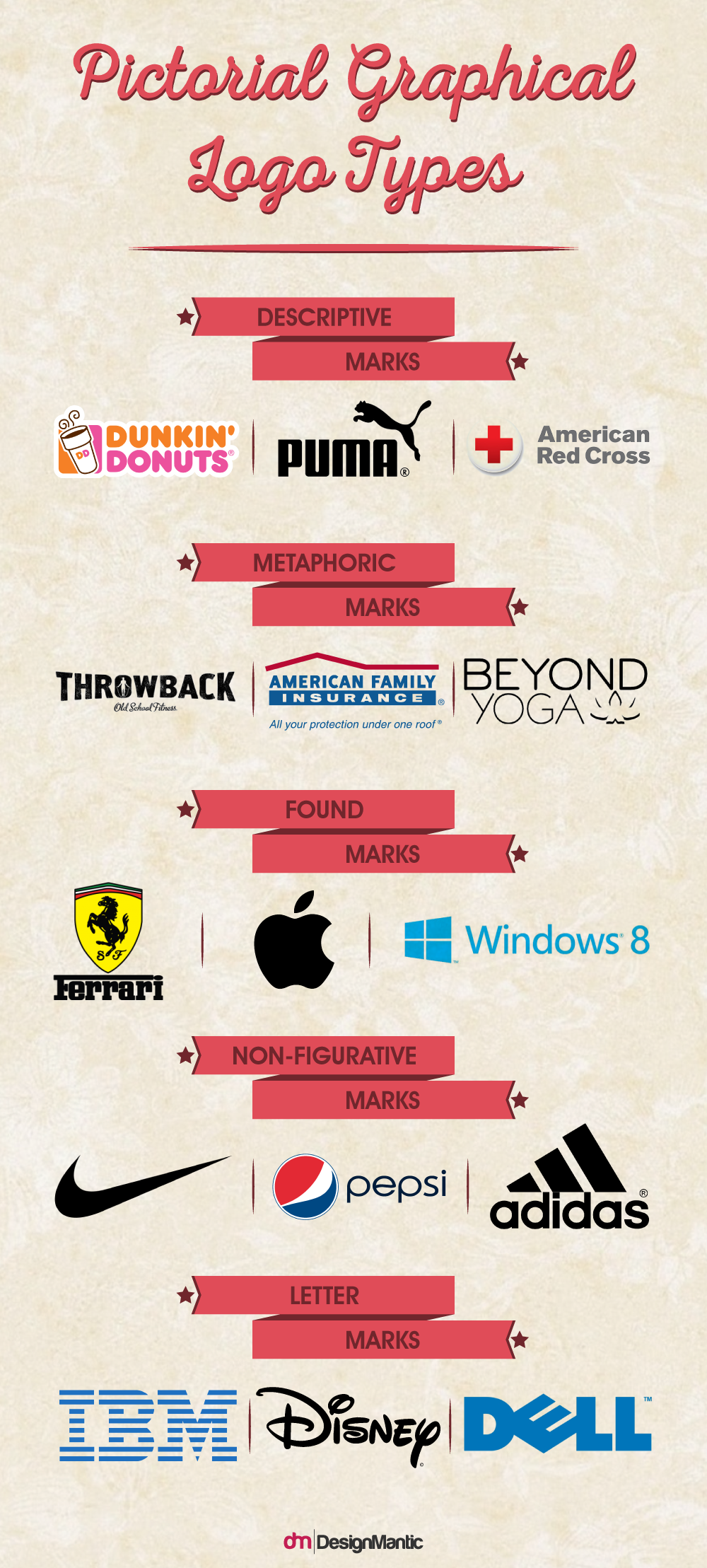
The figurative marks allude to elements of a logo that are recognizable within a specific industry. These can then be:
- Descriptive marks: Consider Dunkin Donuts’ whose logo has a coffee cup in it. The Puma Logo that has the shadow of the puma and the American Red Cross logo which has a ‘red cross’ as the pictorial logo graphic. These are usually adopted by franchise based or global corporations to overcome cultural barriers.
- Metaphoric marks: These allude to concepts associated with the industry. Some yoga institutes use the lotus flower to show calmness, Insurance industry logos make use of umbrellas to represent sheltering and gym logo’s may use the silhouettes of lean people to show healthy bodies. These are usually adopted for local businesses as different visual representations may have different meanings around the world.
- Found marks: The found marks are the most abstract of figurative logos and can at times fall into the category of non-figurative marks. They make use of connections and symbols that are abstract and may not have anything to do with the company itself. In fact, these marks allude to connections by creating stories. Consider the Apple logo. It has nothing to do with the corporate business. Yet, the original logo designed in 1976 showed Newton sitting under the apple tree with an apple hanging over his head. This context suggests knowledge and growth. The MTS (Mobile Tele Systems) logo is similar. It is an egg enclosed in a red rectangle. There is no connection to the mobile corporation unless it alludes to the beginning of a new idea. These are adapted by global corporations with large budgets that have the marketing team to create consistent and constant connections to create a brand identity.
Non-Figurative Marks
These are abstract marks that refer directly to the corporation but have nothing to do with the business. Chase Manhattan, Nike, BP, Pepsi and the Olympics logo are such abstract logos. As they are so abstract, the relationship between the company and the industry needs to be stronger and the corporation needs to work harder to create the connection. “[T]he public must learn the mark, requiring the public to be educated by repeated and frequent displays” (Skaggs, 1994, p. 81). These are adopted by multi-national corporations and usually the entertainment industry where simple is better.
• Letter Marks
Some logo companies use their full name or abbreviation as their visual representation. The letter mark also called the logotype logotype may be an acronym using distinctive font that is designed in a unique manner. As Wheeler (2009) said, “…there should also be a distinction of color and shape of the font from others in the same market “(p.54; Interbrand, 2006, p. 75). Dell, IBM, CBS, Fox News, Disney, and AT&T are all examples of this type of logo. “The true art of branding is distillation: the art of extracting the concentrated essence of something complex, so that its complexity can always be extracted back out of the distillate, but it remains portable and easily memorable” (Anholt 2003, p.141).
• Elements Of A Memorable Logo:
In order to design a lasting logo which can spontaneously impress the target market there are a few elements which should be present in the logo. Following are the main elements of a logo and can be used as the tips to make unique logos:
Designers and experts in the industry (with slight variations) agree to the following list of functional criteria (Wheeler, 2009, p. 30):
- Bold, memorable, and appropriate
- Immediately recognizable
- Provides a consistent image of the company
- Clearly communicates the company’s persona
- Legally protectable
- Has enduring value
- Works well across media and scale
- Works both in black and white and in color
• Wonders Of Logo Template:
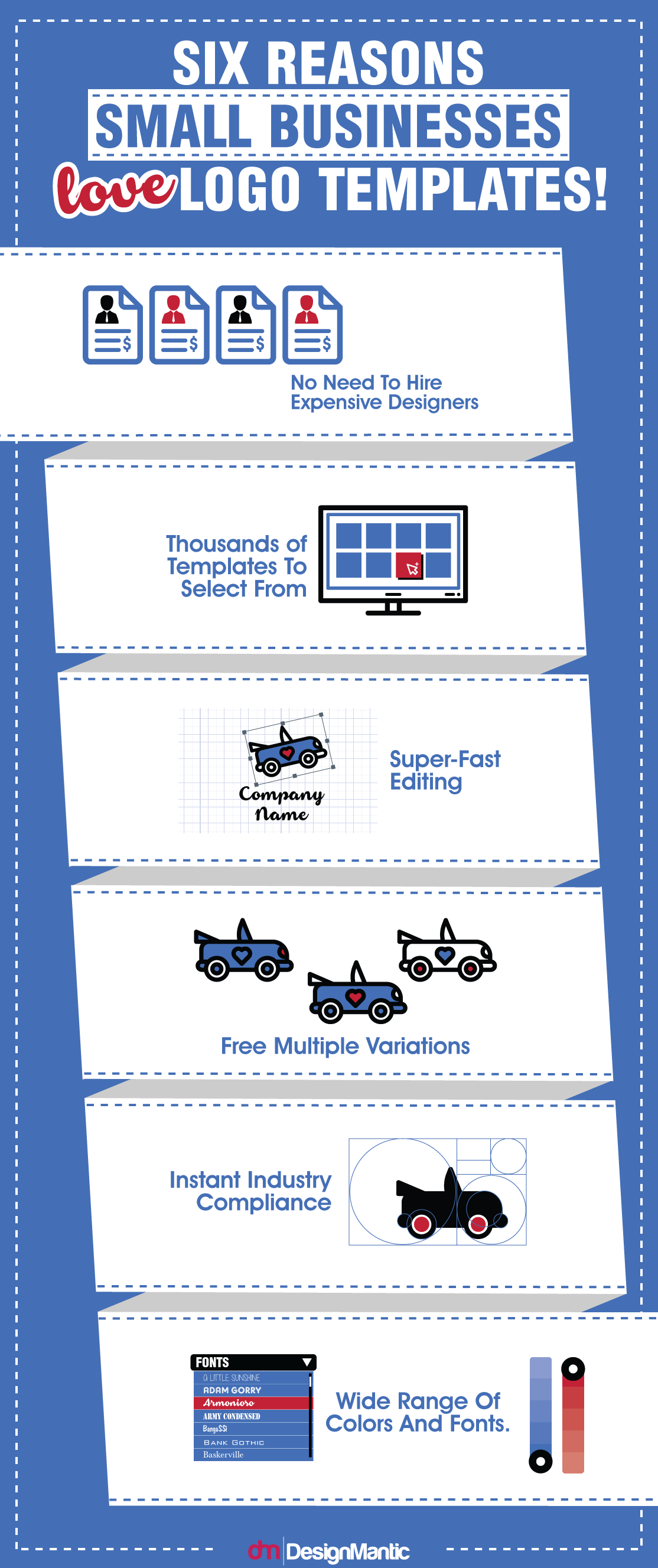
Rather than hiring a professional logo designer, who charges hefty amount and takes too much time in meetings, discussions and designing the logos for the business, it is a lot better to use logo templates. These logo templates are highly useful for those who are tight on budget and who want to get their logos finalized immediately.
One can do wonders with the online logo templates. Following are some of the prominent features and advantages of using templates.
• Add Symbols From The Library: In templates for designing logos, there are multiple symbols available in the libraries. All one needs to do is to select the relevant and interesting symbols. Once the symbols are selected, it is as simple as adding them to the design field and start editing them. It is not at all difficult. In fact, it makes it easier for the designer to create a logo.
• Play with The Text and Typography: Typefaces are important for logos. Fonts have great impact on people and this is why they are selected very carefully by the designers. Logo templates have great collection of typefaces and typography. Susan Meyer writes in “Branding: Creating an Identity on the Web” that “A good example is the particular cursive font of the Coca-Cola logo. It is simple but recognized instantly around the world”. By adding interesting and attractive fonts, logos tend to become more appealing and eye catchy. If you have a good understanding of the do’s and don’ts of wordmark logos then they can be easily designed through logo templates.
• Use Multiple Colors To Suit: Colors are the distinguishing elements of a memorable logo. From the huge library of the template, colors can be selected for the logos. This way, designers can easily use preferred color for the logos which they intend to design. Selecting right color for a logo is very crucial and important.
• Add and Edit Images: It is as simple as working on a Microsoft Word file because images and pictures can be added and then edited with great ease and comfort. In “Brand Identity Essentials: 100 Principles for Designing Logos and Building Brands”, Kevin Budelmann, Yang Kim and Curt Wozniak describe “Images add immediacy, power and clarity to communications, from stained-glass church windows to Michael Jordan billboards. Consider what images mean for a brand identity”. Designers find it a lot relaxing and convenient to play with the images and crop them to create a totally new logo for the brands.
• Preview Options: Logo templates provide designers with the preview options. This helps in getting feedback and second opinion from other designers, business personnel and individuals from different walks. This can help logo designers to decide beforehand whether to stick with the same logo or start designing another one.
• Download In Different Formats: Once the logo design is finalized and liked by majority of the people then these designs can also be downloaded in different formats like .png, .jpg etc. The root file can also be saved along with multiple image formats.
• The Bottom-Line:
It is significant to consider the elements of the logo before designing or creating it. Logo templates can help in designing a great logo provided the concept and thought behind the logo are crystal clear and expressive. Susan Meyer write in “Branding: Creating an Identity on the Web” that “After choosing which type of logo would work best for businesses, the owners should make rough sketches of how they would like it to look. It’s important for the logo to reflect their brand’s image”.
References
Sandu, B. Design Your Way.
Anholt, S. (2003). Brand New Justice: The upside of global branding. Oxford, UK: Butterworth-Heinemann.
Interbrand. (2006). The Brand Glossary. New York: Palgrave Macmillan
Plummer, J. T. (1985). How personality makes a difference. Journal of Advertising Research, 24(6), 27-31.
Perry, A., & Winsom, D. (2003). Before the Brand. Creating the Unique DNA of an Enduring Brand Identity. New York, NY: McGraw-Hill.
Skaggs, S. (1994). Logos. The development of visual symbols. Menlo Park, CA: Crisp Publications, Inc.
Wheeler, A. (2009). Designing Brand Identity (3rd ed.). Hoboken, New Jersey: John Wiley & Sons, Inc.



Great post, thanks for sharing.
The title of this post is a bit of an oxymoron if you ask me. How does something unique come from a template? All of the logos in your infographics are definitely not from templates. They are memorable because they were professionally design. They take the time they do to ensure they provide the right solution.