The field of logo design is rife with theories that define rules to help achieve a good logo. However, as any designer will tell you, these rules are meant to be broken. At the end of the day if your logo serves the purpose of identity and recognition, it is a classy logo, and it does not matter if it ignored every design rule out there. However, in spite of this varied and abundant nature of logo design, there are still some guidelines that you can follow, which can help you be more anchored towards producing a good result. So if you’ve been looking to redesign your dental clinic logo or design it from scratch, here are some logo design principles that can help you on the way.
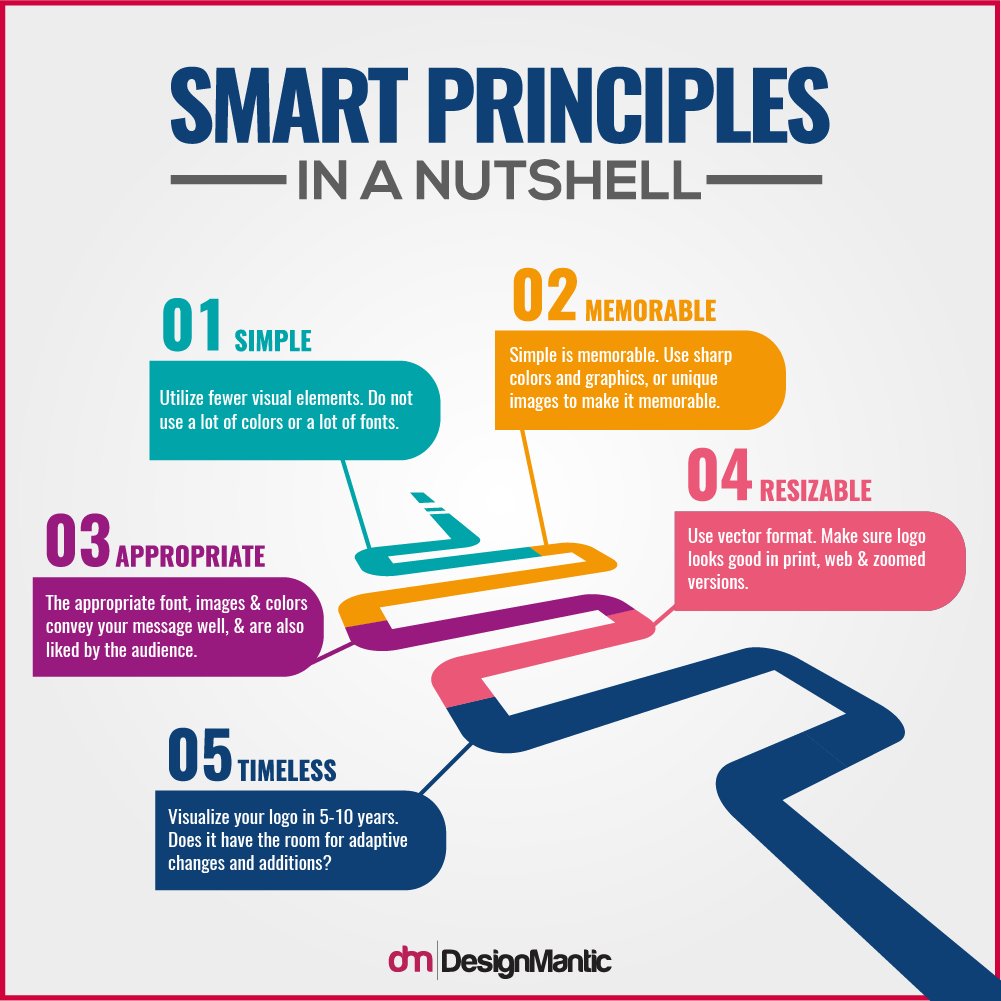
These logo design principles, known as SMART principles, can serve as a great yardstick to not only measure and formulate your design process, but to also measure the end results. SMART stands for Simple, Memorable, Appropriate, Resizable, and Timeless.
Great designers have found that the closer they stick to the SMART principles, the better are their results. So without further ado, let’s get to the point and dissect these principles to see how you can incorporate them in your dental clinic logo design.
How To Use Smart Principles In Your Dental Logos
1. Simple
The first logo design principle is simplicity. Your dental logo needs to stand the test of time. It needs to serve your dental clinic for the coming years. It should be a marker of identity and recognition. Plus, it must imprint your “brand” identity in the people’s minds. And guess how this happens best? Through simplicity! As the famous design acronym goes: K.I.S.S (Keep it Simple, Stupid!)
If you’re wondering how simplicity can help your dental logo, the reasons are many. First of all, a simple logo has the ability to serve as a recognition symbol. Every day, people are bombarded with thousands of images. In all this marketing haze, how you are going to stand out is through simplicity and not an overload of elements. Human brain has a tendency to take in the most basic information in an overwhelming environment. This means that in the visual bombardment, your dentists logo is likely to stand out if it just sticks to the basic elements. Instead of having very intricate logos, stick to logos that utilize fewer elements, colors, and fonts.
The Benefits Of Simplicity In Logo Design
According to research, when you are whizzing past at 100kmph, the human brain processes the simplest of the images. This means that if your logo for clinic is plastered all over a billboard or even your dental clinic board, people are more likely to see it if it is simple.
Simple logos are versatile; there are fewer elements in the dentist logo design, so it is easy to scale the logos and even develop and change them over the years. On the other hand, an overdone logo is in danger of losing its identity and impact upon scaling or further development.
Simple logos also convey your design intent in the best possible way. This is because your logo has a refined identity, which is so distilled that even the viewer gets it instantly. Simple medical logos have a clarity, which transfers to your audience.
How To Maintain Simplicity In Your Dental Logo
Here are some examples that help you see how to maintain simplicity in your dental clinic’s logo.
Straw Family Dental
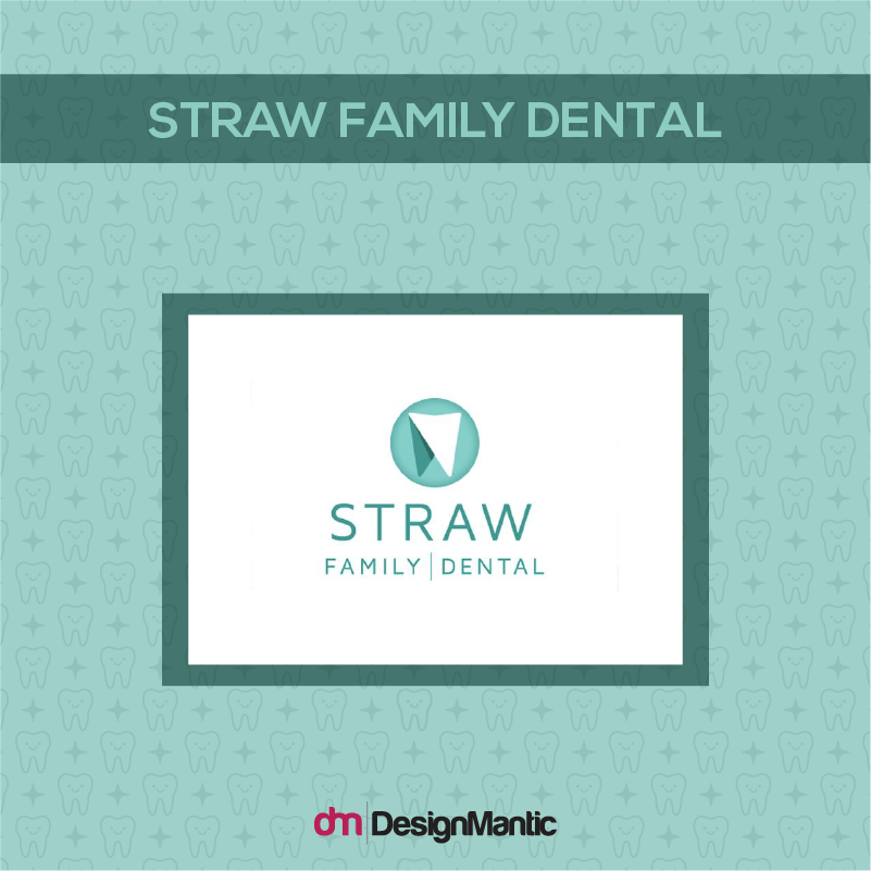
Image: Dribbble/Tony Upton
In this logo Straw Dental uses a simple, geometric image of a tooth set in a circular crest. There are no elaborate details. The tooth logo limits itself to two colors to maintain simplicity. And the sans serif font promotes further simplicity.
Dental Care Dumbarton
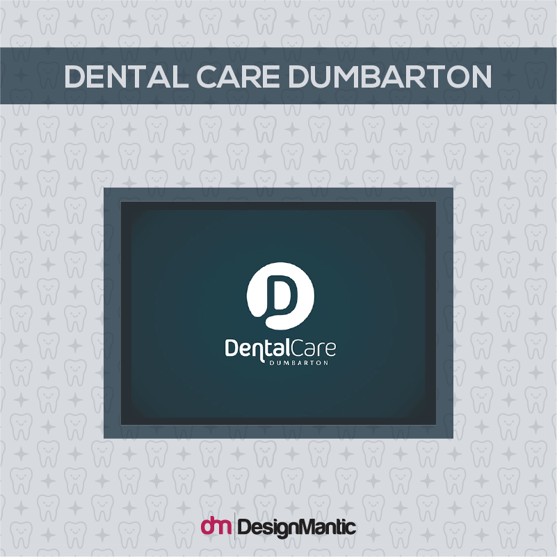
Image: Behance/Graeme Stoddart
Similarly the Dental Care Dumbarton Clinic makes use of negative space to create simplicity in the logo. The logo is limited to two colors: black and white. The logo utilizes three types of fonts, while the lack of additional design elements help give it an overall simplistic look.
Autumn Family Dental
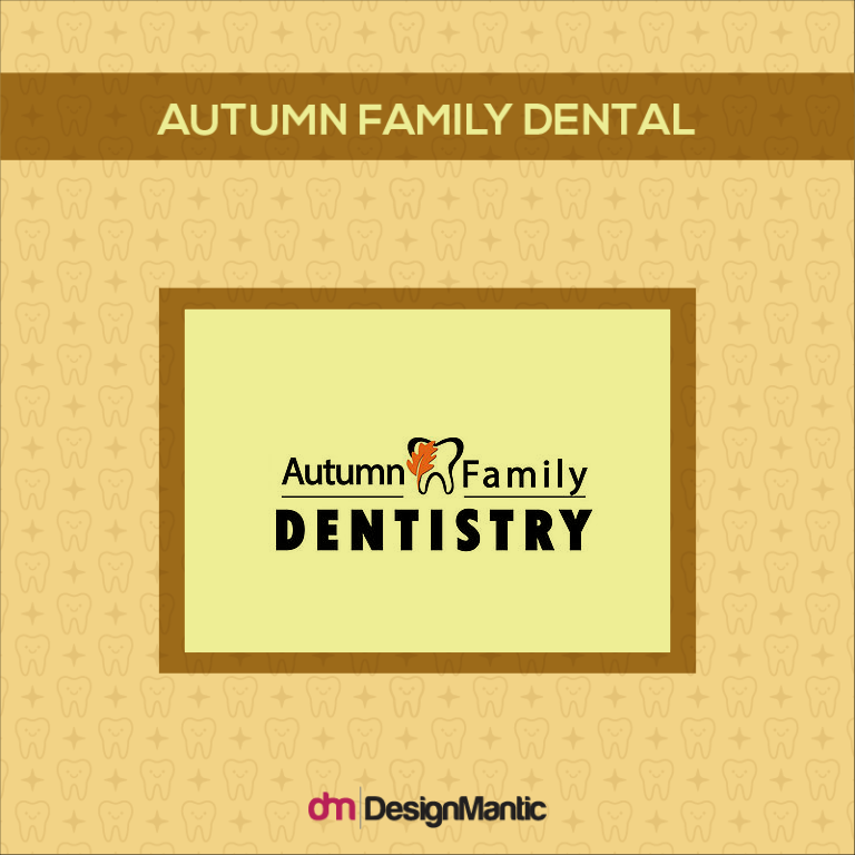
Image: Autumn Family Dentistry
In contrast to the aforementioned logos, the following dental clinic has a fall themed logo which executes design in all the wrong ways. There are too many elements superimposed within the image of the tooth; there is an overabundance of color and the font seems too elaborate for a logo.
In a nutshell, if you want to keep your logo simple, restrict your font styles, colors, and symbols. Distill the overall logo and make it precise as possible.
2. Memorable
The second thing you need to keep in mind while designing your dental logo is to try to make it memorable. A logo’s recognition power is directly tied to its memorable quality. The more memorable your logo is, the more it has the power to serve as a brand icon. Funny enough, how memorable your logo will be depends on its simplicity!
This means if you want to make your dental logo memorable, you should aim at making it simple. This is because you have just a few seconds to make an impression with your logo. The impact and effect of your logo should unfold instantaneously, and this is primarily achieved by simplicity.
How You Can Make Your Dental Logo Memorable:
Other ways of making your dental logo memorable includes using sharp, memorable colors and unique graphics. For example, many dental logos use the image of a tooth. However, you can choose to be different and use some unique graphics to make a long-lasting, memorable impression.
Rejuvenation Dentistry Clinic
For example, this dental clinic logo uses the image of a butterfly, instead of the typical tooth. It looks fresh, and makes it mark instantly! Butterflies are associated with the act of rebirth and rejuvenation. They are also associated with care and beauty. Your audience can instantly translate these messages into the quality and nature of your services.
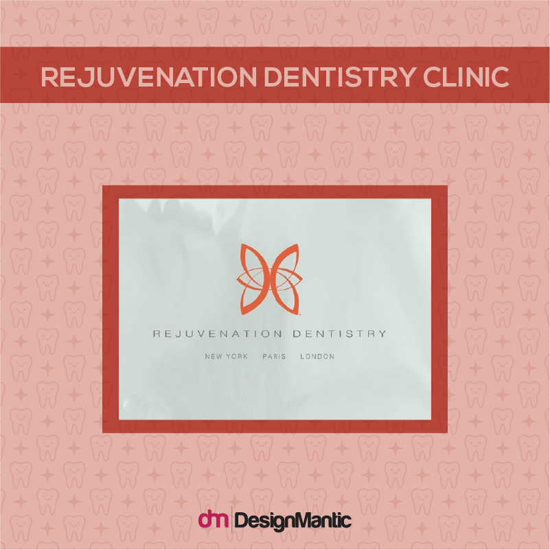
Image: Rejuvenation Dentistry Clinic
It is also a very simple logo. The butterfly is made up of a simple repetition and rotation of one element, the colors used in the logo are specified and so are the fonts.
Ladd Dental
Similarly, Ladd Dental’s logo uses unique graphics and a catchy color scheme to make their logo memorable and attractive. The green color soothes the eye and make a powerful impression, while the blue color brings the associated tranquility, trust, and healing
The image of the L in the shape of a grin is also very memorable. Because we instantly associate smiles with dental services, this makes the logo unforgettable. Together, this makes up a design that is impressionable –you can easily distinguish this in the crowd and remember it later on!
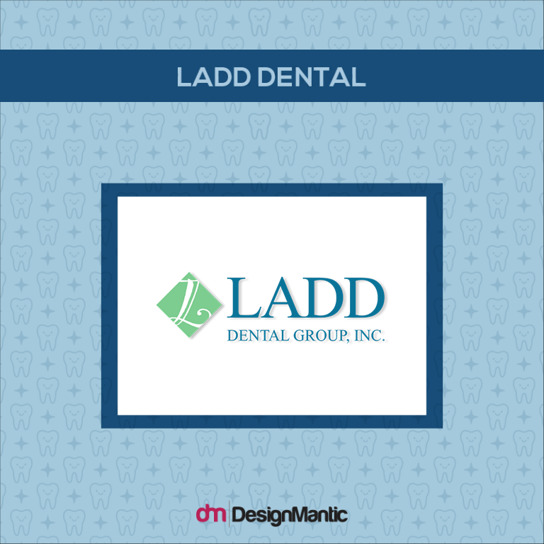
Image: Ladd Dental
Here are two more examples of memorable dental clinic logos that use unique graphics:
Molinari Dentistry Clinic Logo
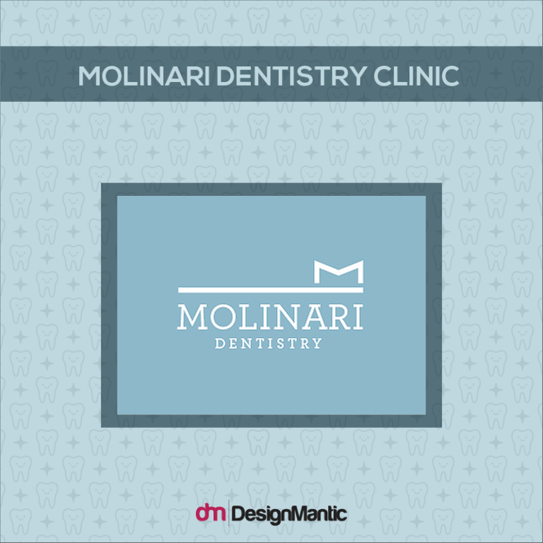
Image: JaceMolinaridmd
The logo makes use of a shape of a toothbrush executed in a minimalist style and that is what sets it apart.
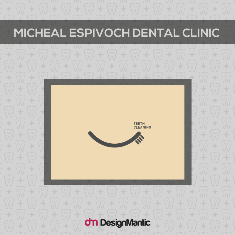
Logo For Michael Espivoch Dental Clinic
In this logo, the dental clinic focuses on a specific type of dental service that they provide. The tooth brush is used as a visual pun; as a teeth cleaning tool and as a smile!
3. Appropriateness
The third guiding principle for your logo design is its appropriateness. This means that your logo needs to be appropriate for your dental clinic and the kind of services it provides. Moreover, it also needs to be appropriate for your audience. So for example, if your dental clinic caters specifically to children, your dental laboratory logo needs to reflect that and should be appropriate for children. If your dental clinic caters to adults, it should reflect sobriety and if it caters to mixed age groups, people should also be able to see that.
How To Make Your Dental Logo Appropriate
Appropriateness can be achieved by understanding the messages you want to convey to your audience. So for example, you want to convey a message of healing, care, security, trust and expertise with your dental logo. This means your colors and images need to reflect these qualities. You also want to convey a sense of comfort and friendliness, because your audience is coming to you in situations of distress; where there is something wrong with their dental parts.
You convey all of this with the use of:
- Appropriate colors
- Appropriate symbols
- Appropriate fonts
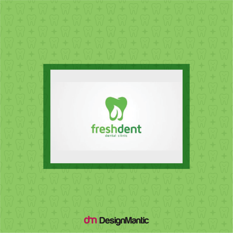
For example, the fresh dent clinic uses an image of a tooth with an image of a leaf that refers to natural care, healing, rejuvenation, and growth. The color green is also appropriate for these messages as it refers to freshness, and the font is friendly and modern.
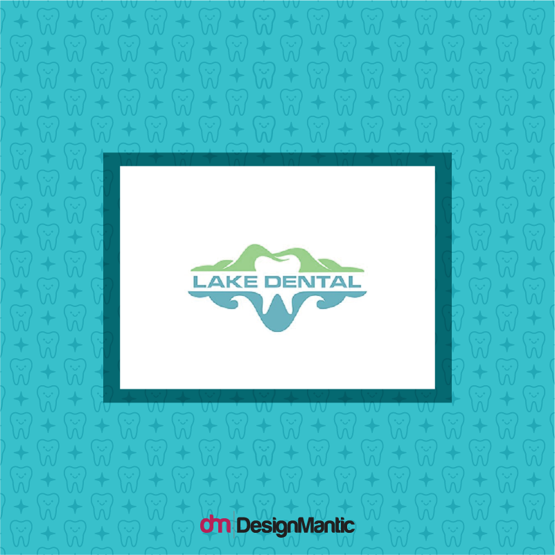
Similarly, the lake dental clinic logo is appropriate because it refers to its location, Lake Valley, referring to dental services and care at the same time. The colors used are appropriate for health services as well.
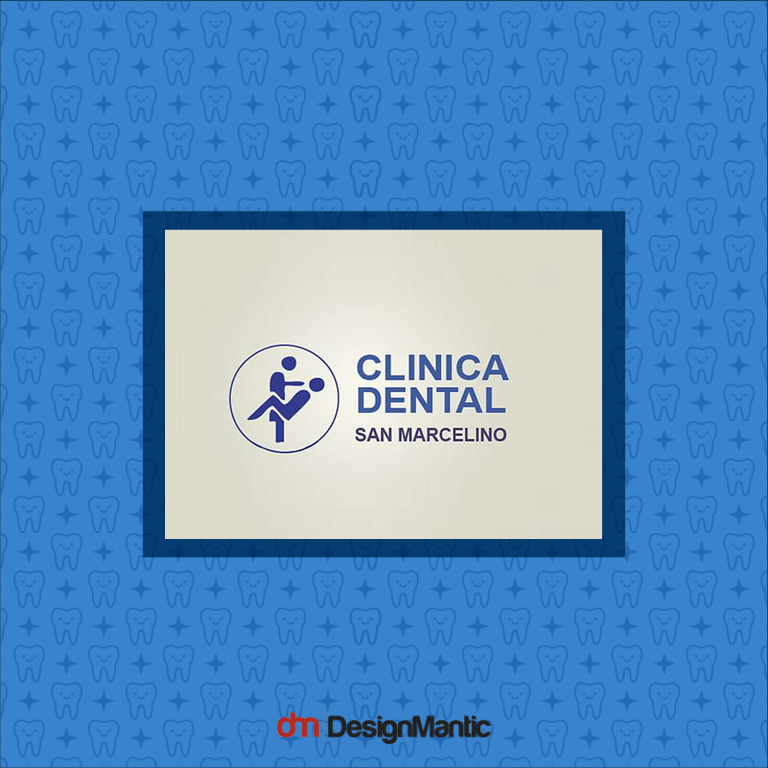
On the other hand, the blue logo below makes use of inappropriate imagery. While it refers to dental services, it uses an image that is uncomfortable to look at. The logo arrangement is strict and rigid and gives an uncongenial feel. It gives a feeling of repulsion at first look.
Is your logo driving your patients away? Here are 13 Logo Design Mistakes To Dodge At All Costs
4. Resizable
Your dental logo is going to be used in lots of places. It will be used on your prescription pads, on business cards, on sign boards, on your promotional stationary and items and a lot more. This means your logo needs to be versatile. It needs to be resizable and it should look good in all scales. Whether you blow it to be 10 meters, or a few centimeters, the logo should look just as compelling, clear, and beautiful.
To make your dental logo resizable, you need to design your logo in a vector format. And by the way, that is not all to it. A resizable logo also needs to work equally well in black and white as well as in color. It should not have any elements that are so intricate that they lose meaning when scaled down, or that look odd when blown up.
Here are some examples of good resizable dental logos that maintain their impact at any scale:
All of these logos use clear lines and curves that are still visually legible at a small scale. There are no elaborate details that come in the way of resizing and the logo will look equally good on a board, envelope, or any other item.
5. Timeless
Your logo should always aim to be timeless. While it is interesting to follow design trends and fads, you don’t want to be in a place where the trend runs out and your healthcare logo design is no longer relevant. To avoid this predicament, always approach logo design from the core values you believe in. This will give your design the energy to mold through the years, as your dental clinic grows, and it will also keep your design relevant.
To achieve this, ask yourself, how will this design look in 5 years? 10 years? 15 years? Even if you plan to use a specific design trend, analyze that trend in light of logo timelessness.
The Mat McGee brush logo, for example, has a timeless quality. It is a 2D image and that gives it timelessness. It also utilizes classic sans serf font that has a timeless quality. And of course, its simplicity complements the whole design.
Instead, if the designer had used 3D images and custom typography, the design might have not seemed relevant in a few years. The key to timelessness it to think in terms of classics and you have a great design on your hands!
Conclusion
Every designer will have his or her take on the design theories present in the field. And while it is completely okay to go against the rules, it still pays to analyze your dental logo design under these principles and see if they comply. Because these principles help you achieve the end result in a more precise and accurate way.
Try Our DIY Logo Maker Tool:
Create Cosmetic Dentistry Logo
Logo Ideas For Dental Technicians
Dentures Logo Maker
Teeth Whitening Logos
Teeth Logo Generator


