Presentation is key to food business success. Even more so when you create a culinary logo design.
Culinary logos are to food logos what Michelin-star restaurants are to your local food trucks.
Both provide great food, but one is more concerned with the chef’s expertise and the dining experience than the other.
Sophistication, charm, exclusivity, and artful cooking are the words you look for to describe culinary branding.
This post delves into culinary branding with much detail. We share what it is, how you can achieve it successfully, and how others have done it by giving you over 50 culinary logo ideas to help you do it right.
Are culinary logos different from food logos?
Culinary logos are the luxurious, more sophisticated counterparts of the more general and genial food logo designs.
Food logos represent a broader category of businesses where customers seek convenience and access. Think of quick-service food brands like Wendy’s and Domino’s. The Coca-Cola logo, Baskin Robins logo, and Kellogg logos are also food logo designs.
But culinary logos are different.
With culinary branding, the focus is more on the craft of food making than access and convenience. Think of artisan food logos vs. food logos. The audience seeks experience, knowledge, and artistry to reflect through these logos. Culinary logo designs can be used to emphasize the quality of ingredients, the journey of taste, and the enjoyment of food as an art form.
How to design Pinterest-worthy culinary logos
Pay attention to luxury branding to get your culinary logo right. Figure out a design that aligns with your brand values of food artistry and gourmet experiences.
In other words, tasteful visual language and a brandless branding approach are the foundation upon which niche-favorite culinary brands are built.
To achieve that, consider these three fundamentals:
• Widen the white space
Culinary logos exist in clean and wide-open design spaces. These large canvases celebrate the hero elements of the logo — whether lone icons or custom wordmarks — and ensure the elements don’t have to vie for attention.
Culinary branding primarily focuses on communicating a promise instead of a product. So while there will be tons of gourmet logo designs or delicious bakery icons with elaborate fonts or custom details, the focus will continue to be on the vibe they send out, not a popular product on their menu. (Unlike a burger on the Burger King logo).
• Choose natural colors
Since we don’t use many colors in custom culinary logos, the few colors we use must be leveraged intelligently. A great practical application of that is using natural colors in culinary branding.
Natural colors are great vessels to convey premium quality ingredients, homemade gourmet cooking, and an experiential dining event.
The entire spectrum of green, beige, yellow, brown, and red plays a central role in culinary brand messaging and uplifts the idea of cooking as an art form rather than a necessary chore.
• Embrace bespoke fonts
Simple fonts look good on a culinary logo, but if you want a design that does justice to the made-to-order nature of the culinary lifestyle, you have to go for something exclusive and niche.
That’s where bespoke fonts or custom fonts come in.
Even when you aren’t creating a wordmark logo where the font will be the number one detail, you must find creative ways to turn a simple font into a stylish, uniquely-you, logo element.
A tailor-made font style or font combination can make a design instantly pop! — ensuring it captures the discerning eyes and refined tastes of the select few.
50+ Culinary Logo Design Ideas and Templates
Create delectable food brands that keep your patrons coming back for more! Here are 50+ culinary logo ideas to make that happen.
1. Gourmet Grove
A bespoke culinary logo by DesignMantic
Looking for a simple way to make your local culinary logo look more elegant? Include a gloved hand icon to elevate the appeal.
2. Culinary Alchemy

Knife and fork icons in a culinary logo by DesignMantic
Beautiful alignment plays a key role in conveying a cohesive and clean brand identity which is a must when crafting a culinary brand identity.
3. Epicurean Craft
Chef icon in food art logo design by DesignMantic
Chefs are the backbone of any eatery but in a culinary setting, they are the most central figure to your brand identity concepts. So give them the spotlight they deserve!
4. Flavorsmiths
A jaunty chef symbol for a culinary logo design by DesignMantic
Inject personality and character in your culinary logo to create a more accessible design that feels welcoming too.
5. Savory Artisan
Chef hat icon creating a food artisan logo by DesignMantic
Simple yet effective use of white space can help you turn gaps into creative shapes. See the clever way our designer has used line art to create a chef hat out of nothing.
6. Culinary Artisan & Co.

Chef logo design in pastel green by DesignMantic
Colors are going to be your strongest allies in culinary branding where the use of icons is quite minimal. So use them to create a range of logos from gentle cafe designs to bespoke bakery branding in loud and confident hues.
7. Flavor Foundry
Chef hat symbol creating a fun artisan logo by DesignMantic
Infuse your brand messaging with curved shapes and slanted lines to create a sense of fun and mischief that go hand-in-hand with homemade cooking and authentic recipes.
8. Artisan’s Pantry

A culinary logo design in beige green and warm orange by DesignMantic
Orange is a warm color that must be leveraged as a primary color in food branding. It brings a lot of warmth to the whole process of food preparation and design.
9. Elysian Eats

A chef logo design in glasses by DesignMantic
Here’s another shade of orange to work with. This is a little tinted and offers a brighter, more open warm orange to work into your designs.
10. The Taste Workshop

Culinary logo design conveys craftsmanship in this design by DesignMantic
Little details like steam wafting from your family-owned restaurant logo can be a beautiful idea. Use it to invite people to your eatery and show them what a good time they’ll have.
11. Gastronome’s Guild
A culinary brand identity featuring a chef logo prominently in this design by DesignMantic
Put a slant on your chef cap and make a simple gastronomy logo look instantly more charming and delightful!
12. Gourmet Atelier

A culinary logo featuring knives by DesignMantic
Serif fonts can play an important role in promoting your gourmet logo design as a work of art. The neat serifs put a traditional and handcrafted spin on a simple font.
13. Epicure’s Essence
The burger icon makes this culinary burger logo design look more accessible. Created by DesignMantic.
Even though sans-serif fonts are typical fixtures of fast-food logos, you can customize them creatively to make a simple burger logo design look more artistic and crafty.
14. Bespoke Bites
A happy chef icon displaying his kitchen wares by DesignMantic
Can you add a lot of elements to your restaurant logo design if you aim to promote a culinary brand identity? You can if you want to make the design appear more approachable and friendly.
15. The Gourmet Artisan

A gourmet logo design by DesignMantic
Badges, seals, and shields are your best design elements to mark a culinary brand. They exude elegance, tradition, and experience — hallmarks of a culinary cooking heritage.
16. Gastronomy Gallery

Multiple cooking symbols adorn this logo by DesignMantic
Organic colors such as green and red should feature prominently in food logo designs. These colors are found in nature and help food logos seem more appetizing and appealing.
17. The Flavor Artisan
Food artisan logo design by DesignMantic
For those who like to play it safe with colors, brown and gold is a classic combination that can’t go wrong. Ooze sophistication and class with this beautiful color pairing!
18. Culinary Couture

Culinary couture logo design by DesignMantic
Balance is a fundamental logo design element. Look for symmetrical and harmonious balances in a culinary logo so as to communicate ease and cohesion.
19. Artisanal Flavors
Turtle icon in a cafe logo design by DesignMantic
Do you think a turtle icon has no place in restaurant branding? Think again. It’s a cute little icon, not too on the nose, and conveys your seaside restaurant logo design with a lot of personality and flair.
20. Heritage Harvest

Minimal culinary logo design by DesignMantic
Minimal design is one of the most fundamental aspects of modern logo design best practices. Using limited elements and giving each its clean and defined shape helps you demonstrate a professional and neat visual identity.
21. Euphoric Eats

A blue logo design for culinary food branding by DesignMantic
Color theory teaches us how monochrome designs can be the most effective color choices to communicate a clean, sparse, and minimal design identity.
22. The Food Smith
Food emblem logo by DesignMantic
Want to make your food truck logo look more professional and corporate? Add a seal design, especially if you are into retro food branding and vintage visuals.
23. Crafted Cravings

Pink logo design for food branding by DesignMantic
Pair a vivacious magenta color with a delicate handwritten font to make your artisan food logo look even more chic and lovely. If you are a fan of all things magenta, here’s a great collection piece we did on graphic design adorned with magenta.
24. JP Gastronomy

A sleek logo design for culinary restaurant branding by DesignMantic
Nothing wears sophistication like black does! It’s a color of elegance and finesse in color psychology guides. Marketing too loves black for the sheer class it brings to every visual design piece.
25. Kaizen
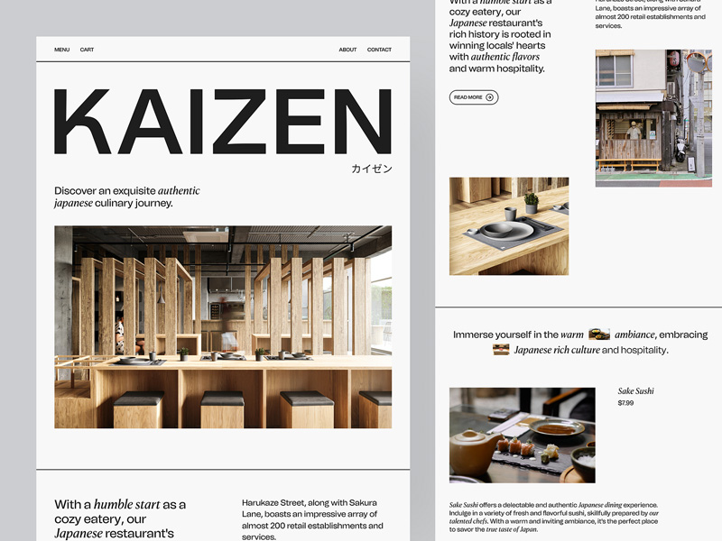
Kaizen logo design by Fahad® for Keitoto/Dribbble
Wordmarks or logotypes are the best friends of culinary logos. Their bespoke fonts complement the restrained and refined vibe of the culinary brand and put a lot of craftsmanship at the center of visual identity.
26. Miso Ramen
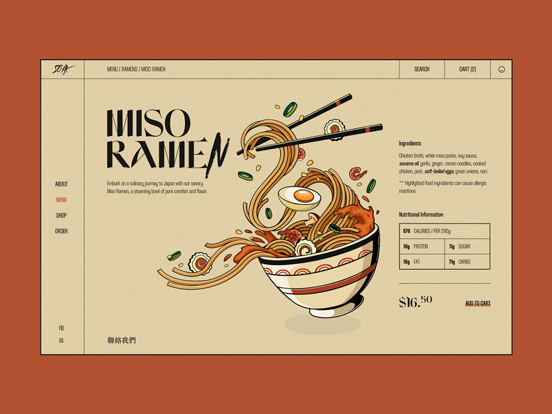
Miso Ramen logo by BN Digital/Dribbble
Here to create an Asian restaurant logo? Don’t forget to check out our handy inspiration guide with 50+ noodle logo design images!
27. La Nonna Siciliana
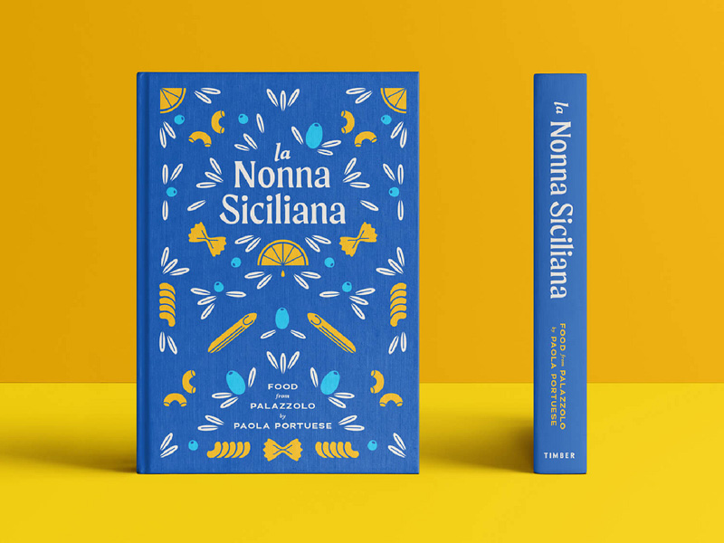
La Nonna Siciliana book cover design by Tessa Portuese/Dribbble
Don’t limit your culinary branding to bistro logo designs or deli logo designs. A cover design for an artisan cookbook can also be a source of inspiration for original ideas.
28. Coozina

Coozina bakery logo by graph_uvarov/Dribbble
Embrace the distinction that cheery colors bring to your culinary logo design. Go for striking visuals and tempered but bright colors to create a confident and strong culinary identity.
29. George Lopez Tacos
George Lopez Tacos logo by Nick Stewart/Dribbble
Red and white create one of the most longstanding color combinations in logo design. Pair them with a custom handwritten font for the maximum appeal of a family-owned restaurant logo.
30. Beach Bar Tavern
Beach Bar Tavern logo by Gregory Grigoriou/Dribbble
If you are using patterns and textures to make a custom culinary logo, experiment with warm and cool color combinations to tie the whole vintage visual together.
31. L’etoile Patisserie
L’etoile Patisserie logo by Shyam B/Dribbble
Does your culinary restaurant offer specialty cooking in an elegant environment with hushed tones and opulent furnishings? Think of color pairs in cool tones, dainty shapes, and sleek minimal fonts.
32. Foodoso
Foodoso logo design by Omnium/Dribbble
Descriptive logos use shapes and icons to communicate your core product or service at a glance. Details like spoons and knives may sound commonplace in a food logo but an intelligent designer can make them look more urban and artistic than you think.
33. Brunch Bar
Brunch Bar restaurant logo by Masud – Logo Designer/Dribbble
Cafe logo designs and bakery logo designs often stick with sans serif fonts as they want the primary visual feel to be accessibility and invitation.
34. Jasscook
Jasscook chef logo designed by Melissae/Dribbble
While mascot logo designs may not be the first thing you think of in culinary branding, the very idea of using them makes them distinguished just by the virtue of being out of the norm.
35. À la Carte Consulting

A la Carte Consulting logo designed by Remus Hincu/Dribbble
Play on the strength of your brand name when you have got something as tongue-in-cheek as À la Carte for a full-service food and beverage consulting firm.
36. Andé
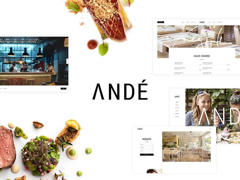
Ande logo design by Qode Interactive/Dribbble
An all-caps logo provides the most fitting balance to a modern and minimal font.
37. The Golden Fish
The Golden Fish seaside restaurant logo design by Ardian | Logo Designer/Dribbble
Love retro logo designs? Behold this textured fish icon making a simple restaurant logo look beautifully cultural and artistic.
38. Piccolo’s
Piccolo’s Pickles logo design by Damian Orellana/Dribbble
Culinary branding isn’t restricted to local eatery logos or homemade food logos. You can also opt for a culinary visual appeal for a specialty food logo where your core offer is a family recipe or unique taste.
39. Freshbox
Freshbox Farms logo by Nrepen Roy/Dribbble
The many details in this farm-to-table logo are handled artfully, nothing looks too much or even out of space.
40. Bamboo Bistro
Bamboo Bistro logo by Davito Andy and Achmad Zaini for Vektora Studio/Behance
Speak in handwritten fonts when you have something culinary to say!
41. Crisp Bakery
Crisp Bakehouse bakery logo by Dilyana Kuneva/Behance
Juxtapose a comfortable font design with curved shapes and circular angles with a name that’s as crispy as it gets.
42. Rasayana Mysore Kitchen
Rasayna Mysore Kitchen logo by Shivani Satish/Behance
Enrich your culinary logo with icons and elements that highlight the handcrafted appeal. Hand icons, leaves symbols, and mortal and pestle images play their role in uplifting this ayurvedic culinary logo.
43. Rustic Cup
Rustic Cup coffee shop logo by Dikshita Kumawat/Behance
A beautiful font design for an artisan coffee shop logo.
44. Buckley Culinary Center

Buckley Culinary Center logo design by Chihurumnanya Nwanevu/Dribbble
Create a catering food logo design with culinary visuals at the center of your branding.
45. Pemu
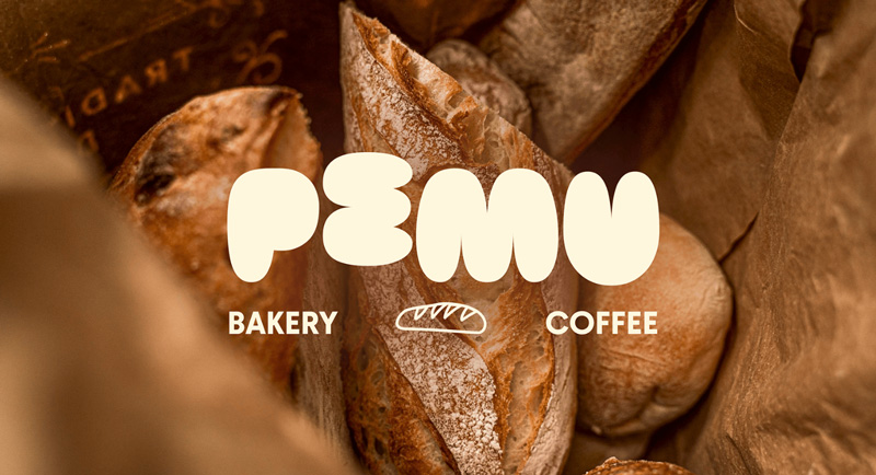
Pemu bakery logo design by Виктория Подолян/Behance
A puffy font logo design gives this bakery logo the perfect swell and steam!
46. Win-Win
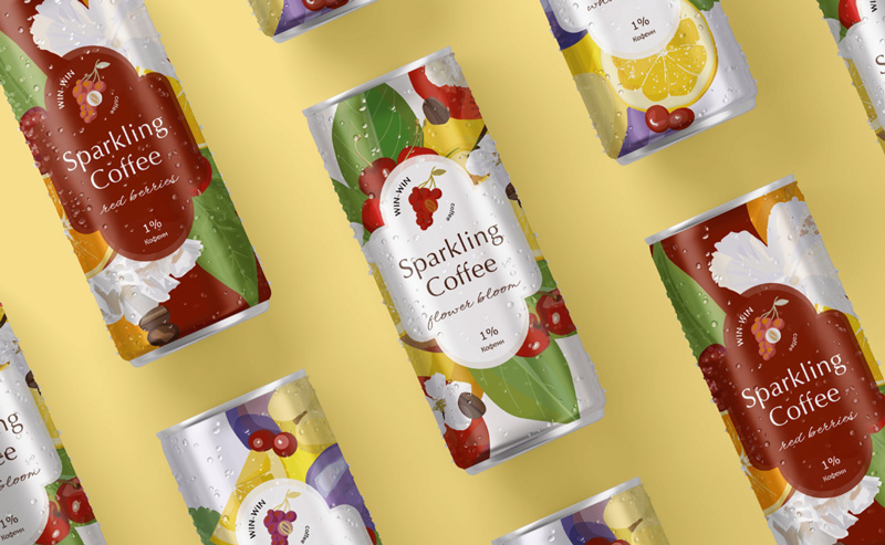
Win-win Coffee logo design and packaging by Kate Kuznetsova/Behance
Who said coffee couldn’t be sparkling? This culinary beverage logo design puts caffeine front and center of its visual identity.
47. Virsa
Virsa Indian culinary logo design by Abu Talha/Behance
‘Virsa’ translates to heritage and the turban icon on the top makes the logo chic and traditional.
48. Cups
Cups coffee shop logo design by Juli Summers/Behance
Handwritten fonts and doodles can give your culinary logo a more authentic feel.
49. The Hungry Hut
The Hungry Hut restaurant logo design by Abu Talha/Behance
Bright colors create a welcoming effect in an otherwise simple restaurant logo.
50. Angry Chef
Angry Chef logo by Terrence B. Haack/Dribbble
Seek characteristics and mascots to design your culinary logo. Mascots humanize the brand and allow us to visualize the brand character in a clearer, more real way.
51. Dhaba City
Dhaba City restaurant mascot logo design by kamruls design/Dribbble
Here’s another mascot logo for your culinary brand. The bubble-like effects in the font complement the overall approachability of the design.
52. Marry Me

Marry Me burger joint logo design by Anastasiia Talanova/Behance
Vintage logos and culinary brands go hand-in-hand. Both offer a homemade, authentic, and raw appeal, filled with nostalgia and craftsmanship.
Design a food logo with our culinary logo maker
Ready to create your culinary logo design?
Use our AI logo maker to help you come up with unique ideas and bespoke designs. Explore thousands of unique food logo templates that you can customize and make your own. Whether you are creating something as simple as a food truck logo or as unique as an artisan food logo, we have the designs and customizations to help you get your ideas just right.
Try our logo maker and get your responsive logo designs ready in minutes!

