There’s a lot of talk about AI everywhere. People are wondering what it can do, what it can accomplish, and what it can create. Is it a friend or a foe? Is it going to take all our jobs? Throw over governments? Start creating logo designs?
What is it after?!
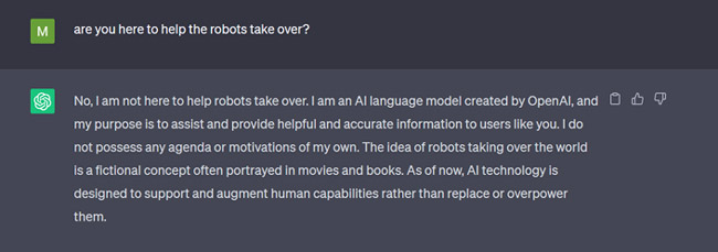
Not me asking the critical questions from AI
The truth is that AI is an incredibly supportive tool. Whether you are a writer, a developer, or work in any other profession, AI tools like ChatGPT are purpose-driven to augment your work, improve your focus, and take on the majority of the mundane tasks so you can commit to more creative pursuits.
As a graphic design company, we’ve worked hand-in-hand with AI for over a decade. Our AI logo maker tool has helped us create stunning design pieces, launch businesses, enrich our decisions, and build hundreds of unique brands over the years for our clients.
But there are secrets to maximizing what AI logo makers can do for you. This article will discuss those industry secrets and provide helpful insights for perfecting our logo design game using AI.
10 Tips to Create a Perfect Logo
All good logo designs follow a set of basic guidelines for maximum readability, memorability, and recall. Think of them as Logo Design Commandments to create a new logo.
You take care of these rules, and the basics can be perfected.
But a powerful logo that carries your brand’s character with all its might and flawlessly communicates it to the world requires more than just the basics.
For that added oomph and panache that sets a logo design apart from the rest, you need help, and the tips we are sharing next will make all the difference.
Let’s go.
1. Use symbolic icons.
Pictures may be worth a thousand words, but they are mostly literal and leave nothing to the imagination. With premade logo templates, if you are not adding some air of mystery, your design may fall flat, and the logo might end up looking too generic.
To avoid this common pitfall, prioritize symbolic icons over literal graphics. For a beauty logo, for example, a dragonfly icon may look better and be more appealing than the actual face of a woman.
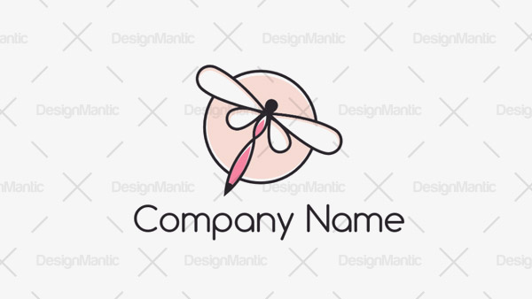
Image Source: DesignMantic.com
It can also free up your salon branding to hint at salon services that aren’t limited to skin care. A dragonfly beauty logo can be used for nail art branding, spa and massage logos, and haircare services too.
Using abstract logos enables you to add more meaning to your design.
2. Choose a proportionate size.
Size matters in logo design. So, pay attention to proportions when you are searching for logo templates. As a rule, your icon should either be larger or equal to the size of your text. If you are going to minimize your icon’s size, you may doom the entire brand message.
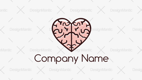
Image Source: DesignMantic.com
Either skip the icon altogether if you want the text to take center stage, or give it the hero status it deserves for maximum brand penetration.
Because people remember icons better than words. Reducing your icon may make it appear insignificant and thus not worth remembering.
3. Don’t add too many details.
KISS — Keep it Simple, Stupid! — is an essential graphic design principle. It emphasizes the need to be concise and straightforward. The most meaningful things are said in the simplest words. So, if you can say it with an icon, don’t add two. If two colors make sense, there is no need for the third.
Image Source: DesignMantic.com
Embrace the power of clarity with as few details as possible.
4. Create a simple color palette.
As we learn to find brilliance in keeping things uncomplicated, it’s important to mention colors. Colors are heavily-loaded design elements. Brands employ colors to convey emotions, inspire behaviors, and form associations.
Image Source: DesignMantic.com
A simple color palette can be dazzling without working too hard. Effortlessly strong, it speaks of a confident brand that you can trust and put your money into.
Not only do too many colors look dated, but they may also detract from the message, creating a singularly confused logo.
5. Explore your letterforms.
Brand names on logo designs can be all-caps, all-small, or in sentence case.
Make the decision based on the type of font you’ve chosen, the size and color of it, and the design theme you are going for.
A sleek font in all caps looks refined and poised.
Image Source: DesignMantic.com
The same font in all-small may look weak, but not for the tagline. An all-small, thin font tagline is always perfect for luxury fashion logos and looks timeless.
The sentence-case is the most common choice to go with, and it’s not necessarily a bad option. But it can quickly become bland. Mix it up by using a dramatic font for the tagline and keeping the drama going.
6. Establish visual balance.
Visual balance refers to the distribution of elements in your logo. If you divide the logo in half, do the elements remain in the center or shift to one side of the logo? The former establishes symmetry, while the latter is asymmetrical. Both establish balance, but of different kinds.
Symmetrical balance is stable, formal, and orderly. Asymmetrical balance is dynamic and engaging. Since the human brain naturally craves order and symmetry, we like logos with two equally distributed halves. They are perfect for industries where stability and trustworthiness are paramount. Law, finance, medicine, and such.
Image Source: DesignMantic.com
But if you are creating a logo where you have to show movements, such as a sports logo or a gym logo, an imbalanced or asymmetrical logo will be more suitable. Media, music, entertainment, and communication are perfect avenues for such designs.
7. Give it some breathing room.
Before I say anything, take a look at how finicky Netflix is about the white space around its iconic logo:
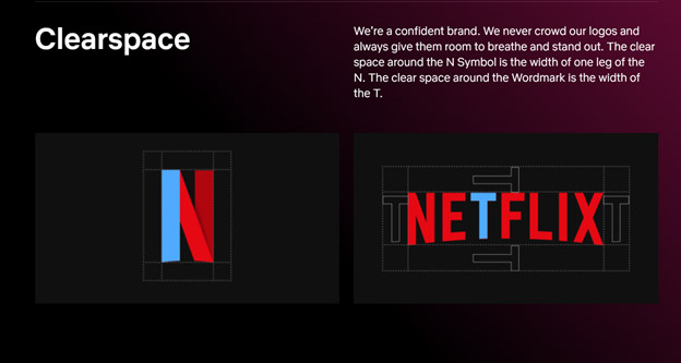
Image Source: brand.netflix.com
It starts with, “We are a confident brand”.
It implies that if you have to force your logo to take over people’s entire screens, you aren’t the most secure brand in the world.
It proceeds by saying “We never crowd our logos and give them room to breathe and stand out”.
And that is all you need to know about using white space as a vast stage for your brand logo to shine on.
8. Create a scalable design.
As your logo design gets resized from the professional website design to the App Store, you want to ensure that it retains its original shape and quality.
Vector graphics offer that scalability.
Image Source: DesignMantic.com
Since most AI logo makers work with premade logo vectors, customizing them and personalizing them to your brand goals does not affect their quality. You can resize them, add more details to them, and take them from one medium to the next, and their integrity won’t be damaged.
The other option, raster graphics, is a huge red flag. Your design will explode into pixels, even with the slightest manipulation. So, when you are choosing an AI logo maker, go where they offer you vector templates.
9. Do not forget the contrast.
You will find that most premade logos come with sufficient contrast to not require any changes. But in instances when you customize the logo and any changes affect the quality or amount of contrast, you have to strike the balance again.
Image Source: DesignMantic.com
Contrast is not only paramount because it improves engagement, but you also need it to fulfill accessible design guidelines.
People with disabilities who cannot perceive a poorly contrasted logo make up a significant portion of the online audience. Nearly 15%. That’s millions of users you could have potentially converted but lost due to bad design decisions.
10. Timeless > Trendy
Do not fall prey to the allure of a snazzy design. However strong its appeal may be at the moment, the trend, by its very nature, is fated to pass into dust. Ten years down the line, you’ll have trouble explaining to your audience what all those shifting shadows mean in your logo design.
Image Source: DesignMantic.com
So, don’t put an expiration date on the relevance of your logo and create something timeless. A minimal design with a limited color palette and a simple shape. Nothing too complicated, just refreshingly simple.
Conclusion
AI logo maker tools are a godsend, especially if you are looking for quick results for half the effort and price — and zero reductions in quality.
But to use them effectively, you first have to know how to use them intelligently. Our article today is a step in that direction.
Learn these tips and become better at using your AI logo maker. Instead of just relying on the first few logo samples it gives you, use these tips to demand more from your AI. Know what you can achieve if you just do a bit of tweaking here and a bit of tweaking there.
Shun mediocrity and join AI to create exceptional work.


![[INFOGRAPHIC] The 10 Commandments Of Logo Design – 2022 Edition [INFOGRAPHIC] The 10 Commandments Of Logo Design – 2022 Edition](https://www.designmantic.com/blog/wp-content/uploads/2022/01/10-Commandments-of-Logo-Design-2022-Edition.png)
