Monogram logos are the most symbolic logos of all. They’re basically just letters, artistically combined together that create an emblem. Take the logos of Louis Vuitton, Gucci, and Chanel, for example. But monogram logos aren’t limited to the fashion industry. They are a favorite of everyone who wants to portray a vibe of class, sophistication, global appeal, and recognition.
Monogram letters are classy and date back to the Ancient Greeks, who reportedly started the trend by adding city monograms to the back of their coins. From the Ancient Greeks of 350 B.C to this recent American in 2019, monograms have traveled a long way and proved themselves timeless.
If you’re also enamored by monograms, find below the top tips you can use to create a stunning one for your business logo.
1. Decide Where Will You Use It The Most
The primary use of your logo will decide whether it should be a monogram and what kind of monogram should you go for. A one-letter monogram is perhaps the best fit for a website favicon, whereas two- or three-letter monograms can work well on most other digital media.
HBO, for example. The service uses their three-letter monogram logo in all digital and print media and uses their last initial O as their favicon.
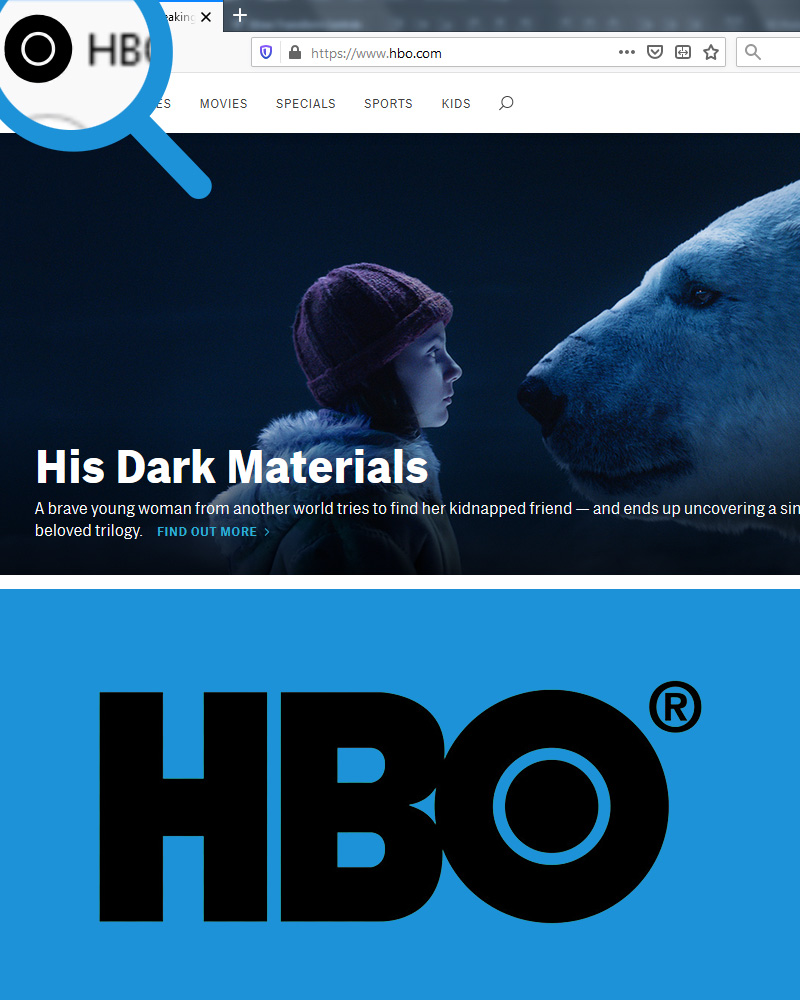
Image Source: HBO
2. Choose A Distinct Typeface
Look for a typeface that can stand the frugality and scarcity inherent in a monogram design. We suggest a cleaner Serif or a Sans Serif for your monogram logos. Or you can go for a custom font, especially if you’re looking for something unique and distinct.
We don’t suggest Script, however. Why? There’s too much going on in Script. Even when it’s single letters. Then you combine two or three of them, and the design is no longer the clean and sophisticated logo you were going for. So stick to the Serifs (or sans) or go for a customized monogram font.
Monogram Logo with Diamond Shape
3. Pick A Defining Feature
A defining feature in your monogram logo is that bit of extra detail that makes your logo memorable. Much like this LSO logo for London Symphony Orchestra. The design firm The Partners, along with the Symphony’s in-house design team, created this logo. The monogram logo consists of the Symphony’s acronym in the shape of a conductor who’s holding a baton, about to start a concert.
The logo is in Script typeface, by the way, but because of its custom typography, looks elegant and not sloppy.
Or look at the more commonly seen LG logo.
The monogrammed letters are arranged in a way that takes the shape of a human face, to show the determination of the company to create connections with its customers. The letter L gives the shape of a nose and the circle of G outlines the face. The dot near the top of L symbolizes the eye.
4. Be Frugal About Colors
Be frugal in your color choice. The more colors you add, the more confusing the design will be. Keep the color choice to two, max three. Most people opt for black and white in their monogram logos, if you recall the logos of Chanel, Louis Vuitton, and other luxury fashion houses. Even H&M, not a luxury brand but definitely on the minimal end of logo design.
However, don’t think you’ll only make a statement with the mysterious black. If you recall the LSO logo above, you can appreciate how creative use of color can enhance the appeal of a monogram logo. Primary colors can amp up the overall look of a monogram in the most effective way possible. They’re statement-making, highly memorable, and leave an impact.
5. Decide The Layout:
There are 7 popular ways you can arrange the layout of your monogram logos: horizontal, vertical, interlocked, stacked, on a seal, mirrored, and others. Let’s look at each.
Horizontal
It’s the most common way to orient the logo: letters displayed next to each other. Think of the logos of BBC, HBO or NBC (or any of the hundreds laid out in a similar pattern).
Vertical
In complete contrast to the horizontal monograms, vertical monograms are the rarest and that’s why the strongest to leave an impression. Volkswagen is a great example, as well as Yves Saint Laurent.
Interlocked
Interlocked letters are also seen most often on monogram logos. By interlocking the letters, unique shapes are created, details added, and brand recognition emphasized. Coco Chanel’s and Gucci’s logo are the most prime examples.
Stacked
You can also choose to stack the letters of your monogram on top of each other to create a geometric shape, give the monogram the shape of an ornate seal, or to add more depth to a simple monogram. Stacked letters are also a prominent trend in monogram logos.
On A Seal
To make sure that your classic monogram logo is being appreciated as the standard of quality, place it on a seal. Monograms added to seals have a certain regal appeal that is timeless. Take a look at the recently redesigned shield of the Warner Bros. logo. The classic monogram looks enduring even with the modern bright blue.
Mirrored
Mirrored or flipped monograms are another popular trend in monogram logos. They are mostly used with single-letter monograms and emphasize the brand name by adding doubles of it. It’s a really creative way to make sure your customers don’t forget your initial.
Feeling Ready?
With these handy tips at your disposal now, do you feel ready to try your hand at creating monograms? See, the trick is simple. Just think of the inherent message your brand contains and see how you can incorporate that into a succinct visual design.
No, scratch that. I’m only joking. Perfecting monogram logos isn’t that easy. But nothing good ever is. It’s just a start. Try till you get it. Am I right?

