As a creative individual who lives and dies by the works he creates, the odds of him becoming a recognized design professional are favored by how he curates his work. Whether you’re an artist, an art director, or a graphic designer, your work is the biggest or rather, your only asset. The thing that summarizes the quality of your work is your portfolio. It’s a collection of your creative ideas shaped into wonderful pieces and is a haven for anyone looking for a potential hire.
But what should a portfolio contain?
Your portfolio needs to reflect your skills, expertise, and experience and must be a manifestation of your overall creativity. Considering the portfolio equivalent to the traditional cover letter or resume is simply an underestimation of the idiosyncratic style of a portfolio. That’s why hiring managers are more likely to pay attention to the digital portfolios than the rudimentary resumes. Touché.
However, a strong designer portfolio is a great way as well as the gateway to get hired instantly when the hiring rink keeps closing up, all thanks to the market shifting to the digital resume and portfolio websites. So, how do you surpass every other Tom, Dick, and Harry’s portfolio? Well, my friend, it’s your flaring creativity, spot-on profile logo and the sound curation of your content that attracts em’ all.
Whether you’re a recent graduate, a freelance graphic designer or a senior art director, you need to breathe life into your portfolio and organize it like God’s organized the universe. And there are several ways you can do it, depending on the intrinsic nature of your work and profession.
Create, And Then Curate
How you create your designer portfolio and the way you curate it speaks about your work and professional life. To create and curate a portfolio isn’t a child’s play, but rather a massive task, which needs determination and careful consideration. Creation begins when you collect your work pieces, assign a professional identity design and breathe life into them. Next comes curation, which requires an orderly arrangement of your work. Together, creation and curation present a bewildering array of your chefs-d’oeuvre. Everything on the layout should be in sync and must be able to give the viewer some hedonistic delight.
So, in order to reach your potential clients and stun them with your creativeness, here are the golden rules to provide you an idea of how an ideal portfolio should be created and curated.
In For The Kill And Out For Any Fill
Most people, no matter how smart they are, sometimes commit the most common mistake.
Just consider a potential client chancing upon your portfolio, expecting to see something worth viewing or an eye-catchy business promotion logo and later being disappointed with what they’ve just confronted: every single idea/project (even the decade old ones) on display that are suffocating and tight-packing the whole space.
Hello, designer!? People aren’t here to view your history channel; they’re supposed to see the work which you’ve specially created out of a kaleidoscope of skills and expertise.
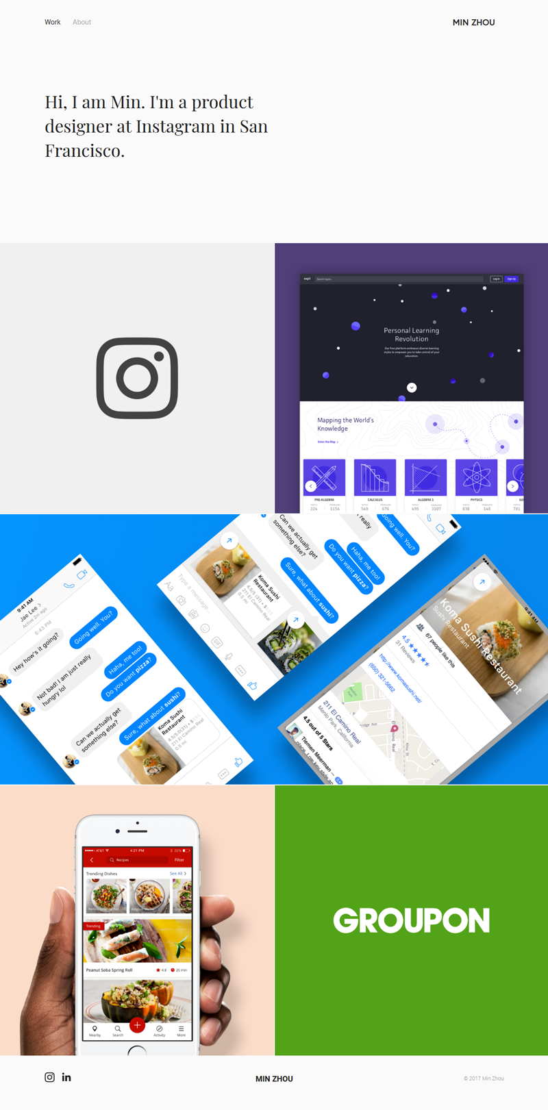
Above is the screenshot from Min Zhou, a product designer, who knows how to nail the ‘all kill and no fill’ idea. Grab your best pieces (the ones which you’re proud of) and put them on display so that your target clients could admire your simple-yet-magnificent portfolio and your intelligence, of course.
Go in for the kill, or don’t feature that filling thing at all!
Adapt The ‘Start With Da Vinci And End With Michelangelo’ Approach
So, you want to kill the competition, eh?
The first thing you’d want to do is start with the perfect work you have, like the ‘Vitruvian man’ by da Vinci, and end with something far from the usual, like ‘the Creation of Adam’ by Michelangelo.
In simpler terms, you need to begin with something that attracts instant attention and finish off with something that hits the roof of the sky and make your audience crave for more.
As a matter of fact, it’s easy to see such portfolio in the traditional print, but you can still apply the same approach to an iPad folio or a PDF document.
Related: 30 Most Inspirational Illustration Designers On Behance!
Make Them Crave For More And More Of It
As you’ve learned, being a designer your audience expects you to keep running their passion for your work. Don’t make it awkward, especially when you’re invited to join a formal meeting or an interview and you sit there dumbfounded.
Instead, tell your stories, elaborate the challenges you’ve met, discuss your vision, acknowledge your contribution,flaunt your graphic and exceptional logo designs for businesses and communicate your creative thought process and ideas from within the portfolio.
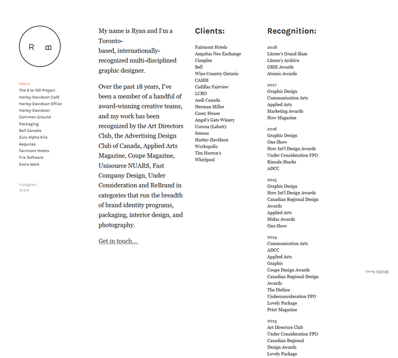
Image: Norightthing.Format/Ryan Booth
With a different yet unique all-text homepage, Ryan Booth tells you about himself, his work experiences, clients and awards that have brought him to fame.
The more information you deliver about your ideas, challenges, and end goals, the better it is for you to keep widening the path of the audience coming your way.
Let’s not forget to avoid exaggeration in certain areas of your design portfolio. You might want to sustain your approach in keeping the content interactive rather than boring a client with a zillion samples of the same piece.
An Online Portfolio Will Do Just Good
In the world we’re living today, you can’t escape the idea of not having an online portfolio. No matter what professional title you hold, it’s just unacceptable!
Oh no, you don’t have to learn to code or anything like that. You can simply create an online portfolio with numerous benefits from different sites, such as Squarespace, Portfoliobox, Crevado, Adobe Portfolio, and so many more! Plus, for your convenience, you can also access off-the-wall and aesthetically crafted WordPress themes or use business networking logo templates to add extra oomph to the profile.
Marci Nipper’s online illustration seems like a good place to start if you’re serious about getting started.
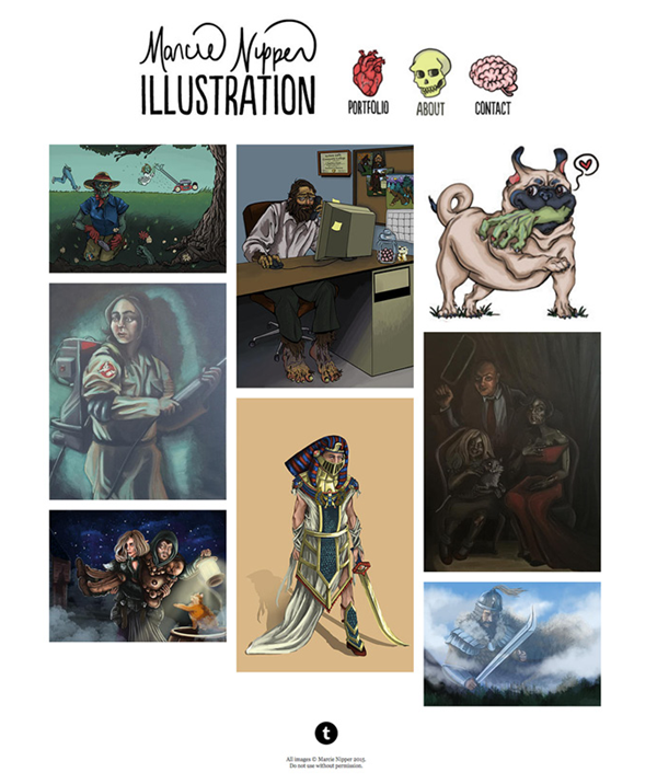
Image: Marcienipper/Marci Nipper
Choosing The Format That Suits You
Should you go digital or just go with the ritualistic paper tradition?
The decision isn’t as hard as the pop quiz you didn’t study for in the third grade. However, the common belief declares the iPad winning over the paper when it comes to providing an interactive portfolio during an interview.
Although there’s no restriction on whatever format you choose, it’s better to go as per your work’s demand.
For digital art or projects, using an iPad can be a convenient option, but if you’re designing a leather bookcase, the tactility of the piece might feel good when produced in flesh.
Just make sure you’re using the format that corresponds to your line of work.
Stay Quiet And Let Your Work Speak
Presentation and pacing are the key aspects when designers are creating and curating a portfolio. As stated before, don’t overdo your portfolio – whether it’s online or a printed form of it.
Organize your work in such a way that your audience is capable of distinguishing the start, the middle, and the end. Whatever the themes and aesthetics you choose for your portfolio is your share alone, but in this case, just remember that less is more.
Hush now! Let your work express itself and be the drawing card for the evening. Fancy or not, make your work pieces accessible and viewable in larger formats.
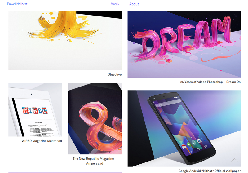
Speaking of work talking, Visual Artist and designer Powel Nolbert showcases glimpses of his projects, work in progress, inspiration, and gives insight into the line of his work.
Moreover, every aspect of your portfolio should have a harmonizing impact on one another and should be in sync.
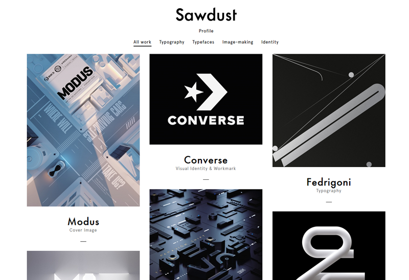
For instance, SAWDUST is a UK-based design studio that has delivered out-of-the-world and cutting-edge portfolios that aren’t just trendy but also are easy to navigate.
Keep in mind that your portfolio should be straightforward, to the point, easy to use, and engaging rather than a redundant, distracting, and design-laden portfolio.
Adapt To And Organize It For The Job You Need
Treat your portfolio as a creature that needs to be regularly fed and that adapts to every contemporary situation (think Frankenstein, but a handsome-looking one!).
In case you’re looking out for someone to hire you, all you need is to keep updating your portfolio for the job you opt to land on and embed your portfolio link into the cover letter template that you send to the potential employer.
Fashion Illustrator Haley Koehn shows off her fashion-focused work that involves a creative display of intermingling stills and gifs.
Also, please, don’t be so basic by sharing every piece of work in your portfolio for every job you apply.
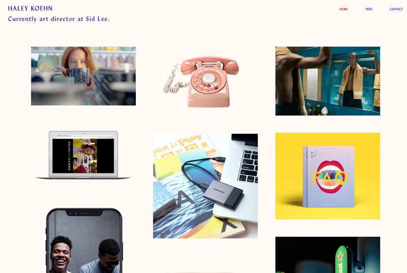
Image: Haleykoehn.Format/Haley Koehn
View your work from the client’s perspective and think about it while imaging yourself in their shoes.
If you’re still perplexed, there’s a plenty of folio curation sites in the sea of the internet, such as
Showcasing The Work You Own
Whenever you’re curating your portfolio, don’t forget to be confident and share the work you’ve flexed your muscles for.
You simply can’t imagine the power of that self-initiated project you decided to put on your folio. The hirers and managers are watching out for people who share their own accomplishments, are confident, and comfortable in their own skin.
This kind of strategy brings out the part that mirrors your passion and is a fruit unique to your individual self. Showcasing your self-initiated projects will help you get noticed by the employers who want to know where your work can be used.
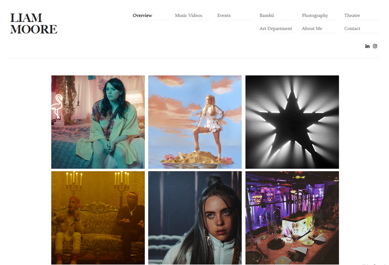
Image: Liammooredesign/Liam Moore
Being a design artist, Liam Moore keeps the light, acceleration, motion, and accentuation intact and has found a great way to flourish his creativity in his art logo and projects.
Show your work, get your own voice, share back stories about your project, tell them what inspired you, show how you did it, and yes, keep every aspect in equilibrium.
Create, Curate, And Get Hired
Your Designer portfolio is the way you would like to present yourself to the world and obviously, land a dream job. Following the golden rules of portfolio creation, employing an appropriate graphic designer logo and curation properly can help you achieve the desired results.
Ensure that the portfolio you created is your first impression but not necessarily the last one. It should include the best ever pieces you’ve created, about which you can talk in meetings with your head in cloud nine, and explain the enthusiasm and passion that drove you to the verge of bringing a dream to life.
So, are you ready to embark on your journey? Tell them what you’ve got and spread the word!
Try Our Online Logo Maker Tool:
Artist Logo Maker
Art Painting and Drawing Lessons Logo
Logo Generator for Artwork
Design Logo Ideas
Logos For Furniture Designers
Make Logo For Graphic Designers
Interior Designers Logo Creator
DIY Jewellery Design Logos
Kitchen Designers Logo Generator
Commercial Graphic Designers Logo




Amazing write-up, Evan.
I’d also recommend Pixpa for building a portfolio website. I’ve been with them for a couple of years, and find their platform to be much more intuitive than most other platforms that I’ve tried. I’m yet to explore its e-commerce features, but would definitely recommend it to others based on my current experience.