The world has finally opened up, and we have the latest science of immunology to thank for that. In December of last year, the world finally received its first Covid-19 vaccine and all of us felt a shared sense of relief and excitement. We could finally get out of our houses, meet our loved ones, and truly appreciate what we’d been missing since late 2019: human connection.
As a design agency, we decided to look at the top 5 pharmaceutical companies that have made all of this possible. Leading the pack, of course, is Pfizer, not only due to its commitment to science but for the sheer business acumen that critical shifts in brand visions need to be communicated through refreshed brand identities.
While Pfizer may be the only company in this list with a new logo design, every single one of them sports a logo that perfectly encapsulates the core promise made by their company.
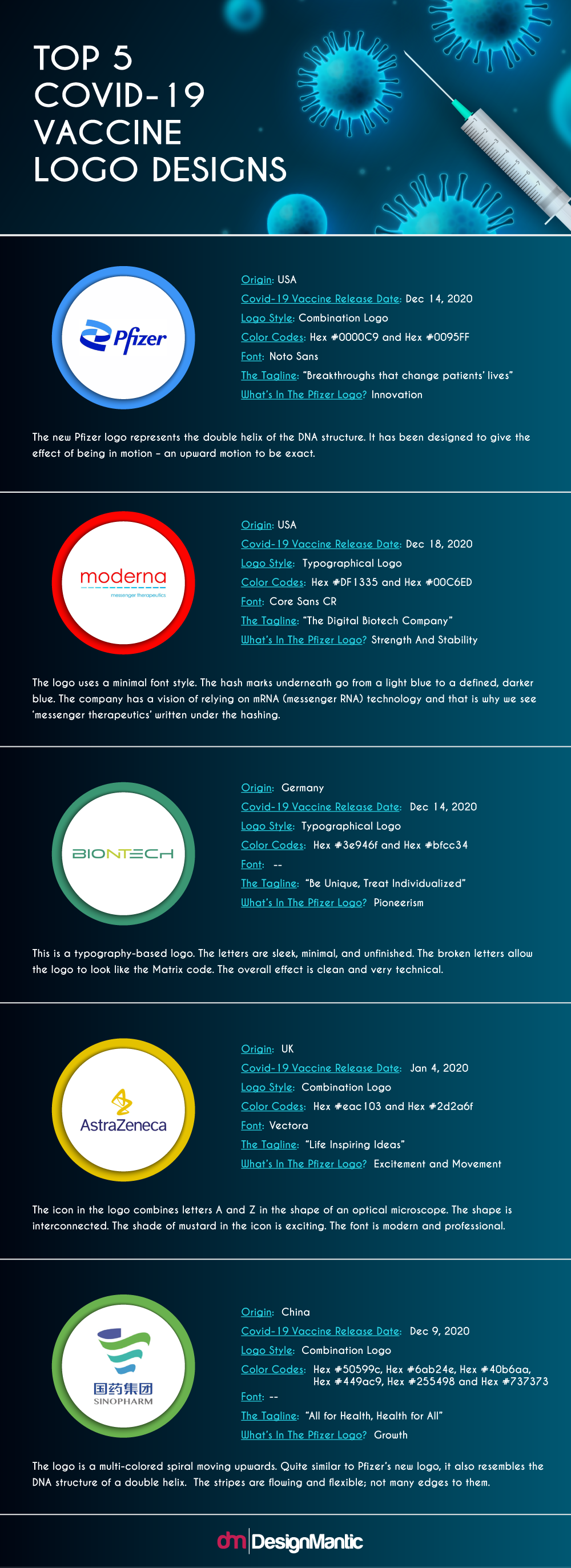
So, enough chatting. Let’s look at all the logos.
1. Pfizer
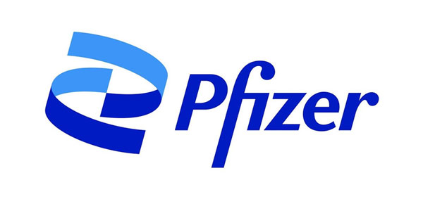
Image Source: PM Live
Origin: USA
Covid-19 Vaccine Release Date: Dec 14, 2020
Logo Style: Combination Logo
Color Codes: Hex #0000C9 and Hex #0095FF
Font: Noto Sans
The Tagline: “Breakthroughs that change patients’ lives”
What’s In The Pfizer Logo? Innovation
The new Pfizer logo represents the double helix of the DNA structure. It has been designed to give the effect of being in motion – an upward motion to be exact. The colors used are blue and cyan – the usual colors for the pharma industry. The titled company name remains in the same style in this new logo.
What Does The Logo Say?
This logo signifies the company’s shift from commerce to science. The original pill logo has been opened up to reveal the science at its core: the helix of the DNA. The ribbons in the icon are purposeful and confident. The shades of blue and cyan are confident and commanding. The overall look, especially if you recall the previous medical company logo, is refreshing, cleaner, and clearer.
2. Moderna
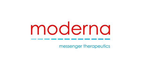
Image Source: Drug Discovery and Development
Origin: USA
Covid-19 Vaccine Release Date: Dec 18, 2020
Logo Style: Typographical Logo
Color Codes: Hex #DF1335 and Hex #00C6ED
Font: Core Sans CR
The Tagline: “The Digital Biotech Company”
What’s In The Moderna Logo? Strength And Stability
The logo uses a minimal font style. The hash marks underneath go from a light blue to a defined, darker blue. The company has a vision of relying on mRNA (messenger RNA) technology and that is why we see ‘messenger therapeutics’ written under the hashing.
What Does The Logo Say?
The light blue of hashing that slowly becomes a darker blue signifies ‘process’. The process of drug development or a patient’s progress towards health – could be both. The hashing itself represents the communication of mRNA. The red shade is a traditional color of health and emergency but the calming blue prevents the pharmaceutical logo from becoming too much and instills a sense of stability and control.
3. BioNTech

Image Source: Asia News
Origin: Germany
Covid-19 Vaccine Release Date: Dec 14, 2020
Logo Style: Typographical Logo
Color Codes: Hex #3e946f and Hex #bfcc34
Font:
The Tagline: “Be Unique, Treat Individualized”
What’s in the BioNTech logo? Pioneerism
This is a typography-based logo. The letters are sleek, minimal, and unfinished. The broken letters allow the logo to look like the Matrix code. The overall effect is clean and very technical.
What Does The Logo Say?
As a biotech firm, the company has achieved perfection with this logo. The colors are pharmaceutical but the font, the lettering style, and the weight of the font strokes – all of that is technology. It’s important to note that BioNTech is not the only biotech firm on this list, yet they are the only ones with a tech-oriented logo design which says a lot about the company’s vision and seriousness.
4. AstraZeneca
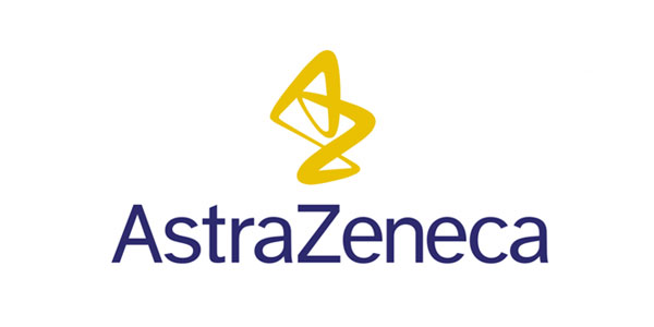
Image Source: Zero Cancer
Origin: UK
Covid-19 Vaccine Release Date: Jan 4, 2020
Logo Style: Combination Logo
Color Codes: Hex #eac103 and Hex #2d2a6f
Font: Vectora
The Tagline: “Life Inspiring Ideas”
What’s in the AstraZeneca logo? Excitement and Movement
The icon in the logo combines letters A and Z in the shape of an optical microscope. The shape is interconnected. The shade of mustard in the icon is exciting. The font is modern and professional.
What Does The Logo Say?
Compared to other logos in the list, the icon here is a bit haphazard and the letters look as if they are in a tango. This logo has a personality that shines through the varying stroke weights in the icon which are all about movement. The font is lightweight yet purposeful, and the whole effect is of a company that is warmly patient-centric.
5. Sinopharm
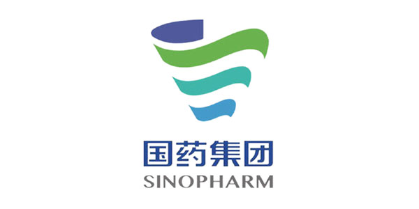
Image Source: Drug Discovery and Development
Origin: China
Covid-19 Vaccine Release Date: Dec 9, 2020
Logo Style: Combination Logo
Color Codes: Hex #50599c, Hex #6ab24e, Hex #40b6aa, Hex #449ac9, Hex #255498 and Hex #737373
Font:
The Tagline: “All for Health, Health for All”
What’s in the Sinopharm logo? Growth
The logo is a multi-colored spiral moving upwards. Quite similar to Pfizer’s new logo, it also resembles the DNA structure of a double helix. The stripes are flowing and flexible; not many edges to them. The colors are conventional pharmaceutical colors: green and blue in varying shades.
What Does The Logo Say?
The spiral is a constant movement and the direction of the movement is up. This signifies evolution and growth. The edges of the stripes that make up the spiral are more rounded and less pointy, emphasizing the company’s promise of inclusivity and warmth. The colors are dimmer and not eye-catching. While the rest of the logo is fine, the colors look like they could use some help. Perhaps using a brighter shade palette would fix it?
Conclusion
Creating medical logos is a process that’s built on tradition. There are colors and icon choices that audiences readily associate with medical logos. As a designer, you can choose to be more adventurous and dramatic but instead of crossing the lines, perhaps pushing the boundaries will be more favored by clients. Case in point: BioNTech.
As you start working on your next logo design project for the pharmaceutical industry, remember to use the repertoire of shades in green and blue, use simpler fonts, and medically-relevant icons.


