Religion and symbolism go way back. Ever before there was any organized religion followed by mankind, the caveman drew suns, stars, and moons as representative of higher deities. Continuing with this ancient custom, all the major religions of the world have always relied heavily on symbolism for identification, representation, and unification.
In recent decades, these religious symbols have gone through an evolution. Now, you’ll find these symbols giving birth to much cleaner, more sophisticated, and more inclusive religious logo designs.
Ahead we have arranged for you a compilation of 25 religious logo symbols that showcase this evolution. So, take a look, feel inspired, and save them for your idea board.
1. Clean Lines And Simple Layout
Less is always more. Make the most impression to your church congregation by using a clean and edgy cross logo design.
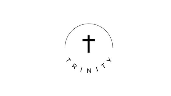
Image Source: Dribbble
2. Line Art Jesus
Straight lines and a sophisticated color palette give you a stylish Jesus logo.
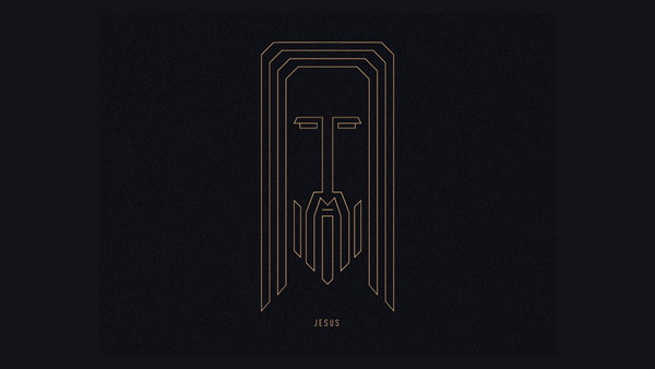
Image Source: Dribbble
3. A Clever Logo
This is a logo for a bible reading app. The orange stroke of letter J is in the shape of a bookmark while the olive semi circle looks like a smiley face.

Image Source: Dribbble
4. An Inclusive Logo
Religion has become more inclusive and diverse in recent years. Express that by using colors and icons that have a broad meaning.
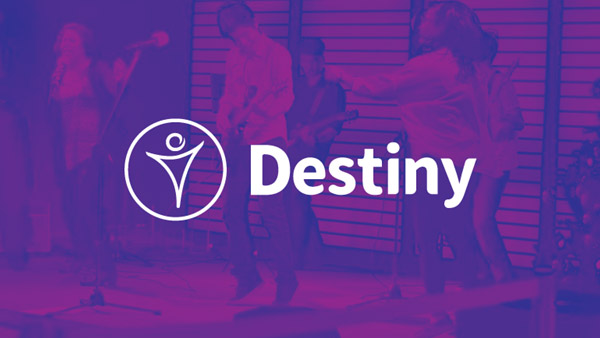
Image Source: Dribbble
Related: What Does A Modern Church Logo Design Consist Of?
5. Soft Colors For A Soft Image
Colors can play an important role to send nonverbal and icon-independent information to your audience.
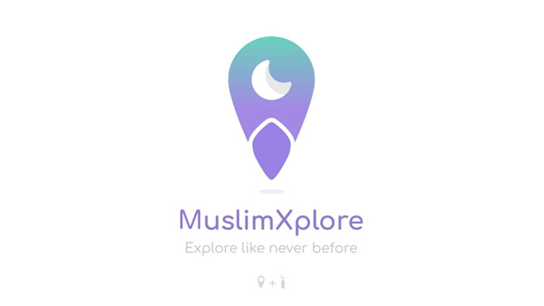
Image Source: Dribbble
6. Use Your Language
While using a universal language makes sense in a logo design, it’s okay to use another language for a more intimate and community-centered feel.
Image Source: Dribbble
7. Gradient In Colors
Gradients allow your logo to have more than one meaning. For a multi-layered design and for a multi-purpose organization, color gradients are the answer.
Image Source: Behance
8. Strong Imagery
Some religious icons represent powerful deities or concepts. Emphasize the strength of such imagery by using powerful elements in your design.
Image Source: Dribbble
9. Interconnectedness
All religions are about unity and connectedness. This logo plays up on it by creating a cross with interlinked chains.
Cross logo depicting religious unity
10. A Multilayered Design
This icon of Hindu god Ganesh – the elephant God – uses the trunk of an elephant as well as its large ears but the overall layout makes it look like a delicate butterfly. Great imagery.
Hindu god Ganesh logo in gold
11. Arabic Window
This unique style of window is popular in Arabic architecture. Therefore, it serves as a useful presentation of an Islamic religious iconography.
Flower vase outside a window logo
12. Spot Of Red
If all else in your logo design is grey and neutral, a splash of red will help it stand out.
Splash of red logo for hinduism
13. Rangoli Logo Design
Rangoli is traditional symbol of Hindu festivals. Using it in your Hindu logo design for a temple or for a community center can work wonderfully.
Hindu Logo with rangoli graphics
14. Cool Shades
Mosque logo inside the circle
Add serenity to your religious logo icon by using cool colors, such as a soothing blue, green, or a combination of similar hues.
15. Bold Backgrounds
Logo design with a bold background creates a strong and confident impression. You can keep the logo looking clean by utilizing narrow lines and fewer elements.

Image Source: Behance
16. Gold And Black
Metallic gold has a regal shine that gels well with religious icon impressions. It may not be a suitable color choice for a religion-based charity, but can work well for a church logo design.
Image Source: Behance
17. A Central Icon
Your religious logo design can contain a defining icon that becomes a foundation for your larger brand design strategy.
Image Source: Behance
18. A Modern Presentation
This logo for an Islamic radio service is modern, chin, and captivating. The use of colors is enticingly non-traditional and the font choices play well with the rest of the design.
Image Source: Behance
19. Beautiful Typography
Type is an important part of logo design. Choose clean, modern, and flat typefaces for your religious logos to avoid them looking churned and cramped.
Image Source: Behance
Related: Symbolism In Religious Logos: Masculine vs. Feminine Elements in Design!
20. Design For Your Audience
Keep your audience in mind when conceptualizing your logo. For younger audience, use modern shapes with striking colors but avoid the shine.
Image Source: Behance
21. Captivating Iconography
Think of unique ways you can present classic icons. This striking image of a cross is a beautiful example.

Image Source: LogoPond
22. Iconize Your Brand Name
This logo turns the brand name into icon. Using multicolored tiles that grow smaller in size the farther they are in the layout represent a ‘path’ interestingly.
Image Source: LogoPond
23. Islamic Calligraphy
Calligraphy is an important part of Islamic culture and aesthetics. Using a piece of calligraphy on your logo is as representative of a culture as it can get.
Image Source: LogoPond
24. A Multipurpose Symbol
Buddha is an iconic symbol of spirituality. But it has many applications. It is used for meditation logos, peace logos, charity logos, and much more.

Image Source: LogoPond
25. As Good As The Brand Name
A good religious logo enhances the community image it represents as well as the brand name it contains.
Image Source: LogoPond
A Parting Thought
As logo designs keep evolving, make sure your understanding and conceptualization of religious logo or spiritual logo imagery must not remain stagnant. Experiment with colors, shapes, fonts, and icons to present commonly known symbols in a new light.


