Looking for what’s best out there when it comes to construction industry logos is interesting. The design evolution in trends, technologies, and tastes has elevated the standards. Forget about slanted roofs and hammer icons; the construction logo designs have matured and finessed over the years. Shape psychology has taken center stage, designers choose colors more strategically, and use of unique fonts complements construction logo designs.
In this article, we share with your 25 of the most aesthetically pleasing logo designs created for various sub-industries of construction. We have divided these images as per those categories so you can not only enjoy looking but can also learn and detect patterns.
So, let’s start.
– Construction & Building
Look for geometric shapes when designing a logo brand. These geometric shapes can be organic or more technical. These shapes instantly propel your design into the relevant industry and make your brand recollection easier for your audience.
Apart from shapes such as squares and circles, you can also use line art to add some depth to your design. Line art construction logos are a favorite of designers who want a minimal approach but want to avoid being mainstream. The same goes for clip art construction logos. They help you get a rustic and vintage look added to your design without cluttering the canvas.
Construction logos are useful for construction companies, builders, and contractors. Architects and designers also use variations of these designs to form their brand identities.
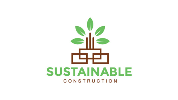
Image Source: LogoPond
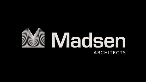
Image Source: Dribbble
Purple logo with geometric equipment
Image Source: Behance
Image Source: Dribbble
– Handyman
While logos for construction companies can be anything from modern to classic, you will mostly see handyman logos in more illustrated or hand-drawn designs. These logos are also more rustic in texture and use obvious icon choices. Various constructions tools are pictured routinely on handyman logos.
In color palettes, the dominating colors for handyman logo designs would be yellow, red, orange, and similar. The affinity with yellow/orange for handyman logos is because yellow is the color of construction worker hats. Looking at a yellow handyman logo is not only instantly recognizable but also tricks the brain into thinking that the concerned business knows its craft and is reliable.
Handyman logo with yellow dress
Saw logo with yellow construction cap
Image Source: LogoPond
Image Source: Behance
Image Source: Dribbble
– Repairs & Renovation
Repairs and renovation is a sub-industry of construction that uses the most sophisticated and minimalistic brand identity designs. Since renovation can be of multiple kinds, most businesses opt for typographical logos. Still, there is no shortage of repair logo icons in the market.
Home silhouettes with various construction tools are a popular renovation logo fixture. 3D logos and line art logos are also routinely used in repair and renovation logo marks. From images to colors, and from styles to fonts, design elements are kept minimal and contemporary. It helps people visualize how their spaces would look once this renovation company has done its job.
Geometric Pattern logo in yellow and blue
Image Source: LogoPond

Image Source: Behance
Image Source: Dribbble
Image Source: Dribbble
– Roofing & Flooring
Roofing and flooring is another thriving sub-industry of the construction market. As a very niche industry, it poses some design challenges for creators. With limited icon choices, graphic designers need to find creative ways to portray the brand identity of roofing or flooring company.
Related: Shaping A Winning Construction Logo; Leveraging The Art Of Shape Psychology
While you can use a lot of tiles and flooring variations in your logo, it’s better to be more subtle so people can differentiate you from the crowd. Think of unique wordmarks, line art, or using your brand initials in certain geometric forms that give the illusion of roof tile or floorboard. You can also let go of icons and symbols and rely on a unique brand name that spells what you do, such as Roofle, in this collection.
Brown square shaped floor logo
Image Source: Behance
Image Source: Behance
Image Source: Behance
Image Source: Dribbble
– Construction Tools & Hardware
Hardware store logos fall under the retail side of the construction industry. To design these logos, you have to pay attention to branding elements that work in the retail sector. In addition to images, these include a more careful choice in colors as well as fonts. You have to pick a font that not only shows relevance to the industry but is legible from a distance, is scalable, and can be read in different lights. The same rules apply for colors. Pick bright shades that look good not only on merchandise but packaging and promotional material too.
For images, rely on subtle, minimalistic cues, so you are not cluttering the signboard or the billboard. You can display a neatly arranged array of hardware tools on your logo or go contemporary with a single tool announcing your connection to the construction industry. Unique brand name or stylized wordmark logos can also give your construction store logo an added advantage.
Image Source: Behance
Tools in construction logo design
Image Source: LogoPond
Image Source: Behance
Image Source: Dribbble
Conclusion:
The construction industry is vast, and there are different kinds of logo styles that suit its different sub-industries. We hope that this quick recap has helped you get an idea of these differences, and you’ll use these cues to guide your future construction logo design projects.
Check Out Our Free Logo Maker Tool:
Quick Wrench Logo Design Ideas
Create A Free Logo Using Buildings
DIY Construction Logo With Machines


