The advancement in technology has largely affected the course of digital graphic design. With new gadget technology, the emerging types and principles of user interface design and connectivity options, the digital graphic design has grown to possess an all-inclusive nature. One of the ways this change has manifested is in the form of flat design. And the flat design has also inevitably seeped into logo design trends.
When we talk about logo styles for computer companies, flat design is something that is hard to ignore. It has a presence, and it has all the right elements that makes designers embrace it so readily for logo design. Thus people have increasingly come to associate flat design with the gadget technology, and when this happens, it is only natural that people associate the same set of graphics with the computer company logos. If logos are representative of what their companies do, then flat design logos can really make a point for your business.
What Is A Flat Design?
Flat design style suddenly became popular for web designing in 2012. A flat design is the graphic design style that is devoid of any 3D effects or glossy effects and rebuffs anything that gives a realistic look. Instead, it relies on making things clean, crisp and clear. In that sense, flat design can be understood as an offshoot of minimalist design. Over the years it has also been embraced by logo designers. Logo designers are charmed by the clarity and beauty of the flat design. The minimalistic effect helps put forth clear branding messages in a much easier way.
Flat Design Logos Vs Skeuomorphic Logos
Flat design is the opposite of Skeuomorphism or realism. Realism is the design style where elements and shapes have the minute details that give an illusion of reality, while Skeuomorphism is the design style that acts as a metaphor and mimics a real-life precedent. Both of these styles have been in use by computer company logos. However, the current trend features more flat designs.
Related: 20 Fantastic Flat Icons And Their Meaning In Logo Design
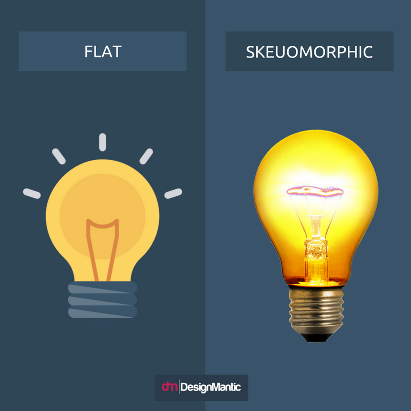
Here is an example of the difference between a flat design and a skeuomorphic design.
Skeuomorphic logos often have elements that give a raised look. When viewers look at such logos they feel the logo has a more rounded, three-dimensional quality. It feels that the logo can be pressed down, like a button! Sometimes skeuomorphic logos will utilize a sunken look. Where the viewer will feel as if something can be filled up inside the logo. Designers use shadows, highlights, bevels and edges to provide such a look.
A flat design logo will be the opposite of this. It will have no extra details, no ornamental features, no shadows or very little shadows, and almost no use of gloss.
Benefits Of Flat Design Logo For Your Computer Company
Now that you understand what flat design is, let us look at some reasons why designers are opting for flat design instead of skeuomorphic design.
- Flat Logos Offer A Clean Look
- Flat Design Can Work Well With Different Branding Elements
- Flat Makes A Bold Statement With Colors
- Flat Design Fit Well To Smaller Screens
- Flat Logo Is Responsive
- Flat Shows You Are Modern And Up To Date
- Flat Design Catches The Eye
- Flat Logos Look Good In Colors And Monochrome
- Flat Design Can Easily Be Updated
- Flat Is Cheaper
1. Flat Design Logos Offer A Clean Look
Not only is such a logo easy on the eyes, it is also more impressionable. The human mind tends to remember simpler designs better than complex designs. This is why one of the principles of logo design is the simplicity of your logo. The simpler your logo, the stronger and clearer your message. Flat logos are devoid of any extra features and give your design a very clean look. At most, you will see one or two solid colors, an impressionable flat shape, and a long shadow. Other than that there will be no ornamental additions or anything that is added just for beauty. This means your computer company logo will have lots of white, breathable space.
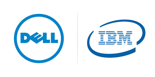
Here are two logos that do not look messy. When such a logo is used on the website or on other marketing material, it appears uncluttered and does not make your overall layout look bulky.
2. Flat Design Logos Can Work Well With Different Branding Elements
Your computer company logo is going to be used in a vast context. Sometimes it will appear on billboards, sometimes on stationary and sometimes on flyers and brochures. When designing a logo, it is important to envision how it would look across all the branding mediums. Will it look good on a letterhead where there is so much text already? Will it stand out when printed on the side of a pen?
The flat design enables your logo to be versatile. Because it has so much breathable white space and an uncluttered look, it can easily fit in with other branding elements. It can work well with an icon, or on the corner of a letterhead or even anywhere else. Flat design is able to achieve this objective by not being overwhelming and in-your-face.
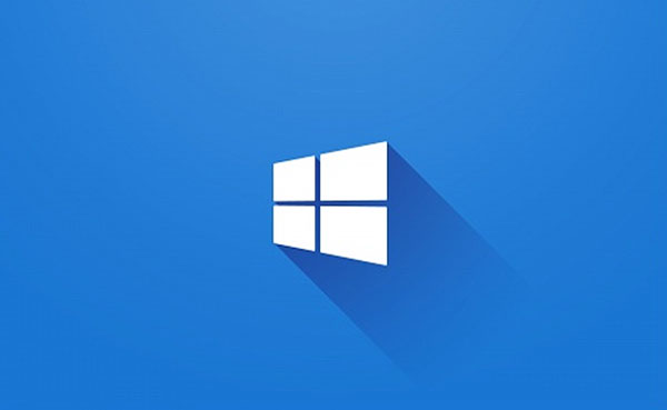
For example, consider the Microsoft logo. Because of its flat nature, it can sit in harmony anywhere and everywhere across different media.
3. Flat Design Logos Make A Bold Statement With Colors
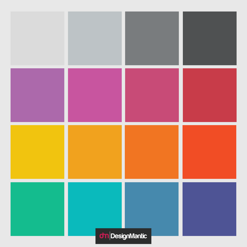
Because flat designs do away with additional design elements, they essentially rely on colors to make an impression. This means your flat design logo will have to utilize bold colors and work with unusual shades. While this may seem like a challenge to most designers, it can actually be a blessing in disguise. Thinking that what color should your logo design be and nailing some bold, solid, flat colors for your logo would mean you have singled out some amazing shades for your branding. When your branding color scheme is powerful, viewers are automatically forced to take notice. Here is an example of a flat color palette that can be used in your computer company logo.
Notice how the pastel shades and lighter colors are missing from this palette. This is because rendering a flat design in pastel colors or lighter shades will make it unrecognizable. People won’t be able to spot it at all. Without the use of shadows and glossy effects, designers have to rely on color alone to make a statement.
4. Flat Design Logos Fit Well To Smaller Screens
Flat design logos have the ability to appear perfect even on smaller screens, while a skeuomorphic or a realistic logo, on the other hand, will have blurred details and an unclear overall outlook. This is why user-centric design is king when it comes to user experience. When you go for a flat logo for your computer company, you can be sure the logo will appear just the same on a small screen as it would on a bigger screen. With the advent of social media, e-commerce has taken a huge rise. Whether you have a computer company or any other business, most of your customers are going to be online. This means they will be viewing your products, your promotional campaigns, and your logos from behind mobile device screens. To make sure such customers feel included, it is important to address the on-screen utility of a logo as well.
For example, this logo will appear just the same on a small screen as it would on a big screen.
Related: Logo Translations For Small Screen By H.I.T. Students
5. Flat Design Logo Is Responsive
Carrying forward the idea of your computer logo being very relevant across different devices, we also come across another benefit of the flat design logo; it will work across a range of devices. This means a flat design logo is very, very scalable. And if you remember, scalability is one of the principles of good logo design.
A flat design logo has responsiveness. It has fewer colors per pixel, which means it can work well across different kinds of mobile displays –it will always appear the same. Similarly, a flat design logo can scale sizes as well. Whether it is shown on a tablet, a mobile device or a laptop, you will experience a uniformity in the output.
6. Flat Design Logos Show You Are Modern And Up To Date
The first computer company to embrace and purport flat design was Microsoft. Since then, almost every computer company has caught up with the trend –even Apple, which stuck to its skeuomorphic styles for a long time. While following logo design trends mindlessly is never recommended, following this trend (if it works for your goals) can have special benefits. One of the benefits is that you put across a very hip and up-to-date image of your company.
Flat design is all the rage and everyone knows it. It appears clean, fresh and new –very different from the skeuomorphic and realist styles. So when you go for a flat design logo, you are claiming modernity in front of your customers. Which is a great message to give! When you appear modern and up-to- date, your customers trust your products will be the same.
ScienceLogic is a leader in Hybrid IT Infrastructure Management. See how clean and modern their wordmark logo appears. It not just conveys the message that ScienceLogic is modern, fresh and up to date, but it also says how it is determined to excel in what it does.
7. Flat Design Logos Catches The Eye
One of the purposes of the logo is to provide your computer company with a recognition. Typically, in real life, your company only has 90 seconds to make an impression with their logo. The human attention span, when whizzing past a billboard, or when looking at an advertisement, is 90 seconds at most. When you talk about such a minuscule duration, it is important to make a bold impression immediately to get results.
Related: 25 Videos Explaining The 5 Most Vital Elements Of Logo Design!
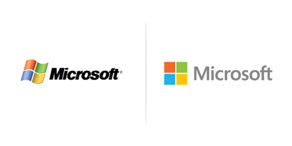
A flat design logo is able to do this perfectly. The minimal details are easier for the brain to process. This means, while your brain would overlook an intricate and complex logo, it is more likely to focus and remember a simpler one. Here is an example of the Microsoft logo. While both logos have the same colors, the subtraction of extra details such as shadows and serif font makes the flat design look catchier.
8. Flat Design Logos Look Good In Colors And Monochrome
The absence of extra details in flat design logo means these logos are strictly minimalistic and utilitarian. There is no element that is added to the beauty, everything serves a purpose. When you simplify the logo to such an extent, it develops a rather versatile quality. Because what remains in your design is only the bare minimum –the essential. This is why flat design logos can look good in black and white, as well as in color. While this is a quality all logos need to have, irrespective of the design style, it is easier to achieve this end with the flat design style.
9. Flat Design Can Easily Be Updated
Over the years your computer company will include new products and services. It may expand and it may choose to broaden its horizons. At such times, it becomes essential to give your computer company logos some updating touches. While this can be a challenge with skeuomorphic designs, it is easy to do so with a flat design. This is because retouching the logo means you need to retain the recognizability of the logo while giving it a makeover.
In designs that have too much detail, it is difficult to see which element contributes to the overall recognizability and which does not. Whereas with a flat design, all you have are the basics. Everything or most of the things need to stay. This makes the updating task easier for you.
10. Flat Design Is Cheaper
And finally, a flat design logo is cheaper. This is because it involves less work on the designer’s end. When there is less sweat to sweat, you can get the work done for a cheaper rate. If you are a new computer company that is just starting out, budgeting will be an issue for you. In such a case going for flat design, branding can be very helpful. You will meet the objective at a lesser rate.
So now, when nearly everything is said related to flat logo design and its benefits, let us know what you think about it. Will you try it for your computer company logo?


