Colors are important visual cues when it comes to brand logos of any industry. They become even more important for a service-oriented and high-stakes industry such as transportation. Using the right color – and the right shade of that color – you can communicate a wealth of information about your transport logo to your audience.
Color psychology tells us that every color contains some inherent qualities that can be used to amplify a brand’s unique message and character. For example, the green color can announce that your transport brand is eco-friendly. Blue and brown colors can be used to communicate about dependability, care, and reliable service.
When you are choosing colors, pay close attention to their various shades and hues. Getting the right shade is important. For example, the blue of IBM speaks of dependability and established trust. But a lighter shade of blue – sky blue, for instance – won’t create the same sense of calmness and assurance.
Below, we will talk about the 7 most popular colors of transport logo designs. Each of these colors communicates something different, carries a different mood, and contains different psychology. Let’s discuss and figure out which color matches with your brand personality the most.
1. Orange: Speedy, High-Energy, Efficient
Orange is one of the most prominent colors of transportation industries. As a warm color and the color of the sun, it is associated with feelings of pace, speed, energy, and efficiency. These are the traits that transportation brands aim to communicate through their logo designs.
When you use an orange transport logo or even use it as a secondary color in your transport logo design, you make your logo identifiable in a crowd. As an attention-grabbing color, it attracts the eye, and its cheery mood helps the audience react favorably to it.
Related: Drive Your Brand To Success With These 20 Cool Transport Logo Ideas
Beware though, use orange with care. Think of FedEx’s orange. It is a darker, more muted orange with no glare or shine. Even if you want to use a lighter shade, balance it out with other subtler visual cues in the logo unless you want to go all out and announce your presence with a bang.
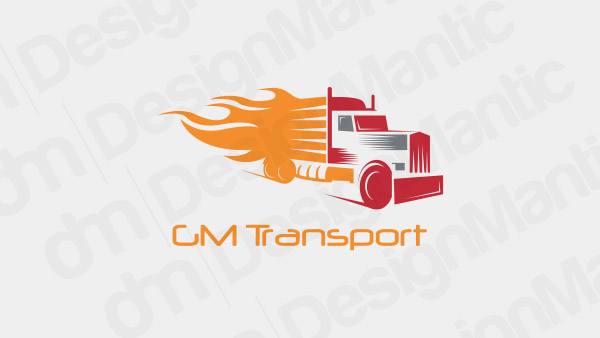
Truck logo with orange flame
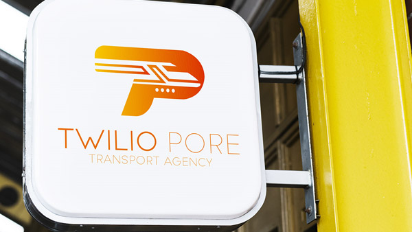
Image Source: Behance
Image Source: Dribbble
2. Green: Natural, Related To Earth, Organic
No other color says ‘nature’ as loudly and simply as green. As the most dominant color in nature, green is associated with feelings of abundance, serenity, and fertility. A green transport logo communicates to the public that you are dealing with a brand that is dependable, established, and has some relevance to nature, too.
It can be a perfect color for transport brand logos where there is a mention of ‘green’, ‘organic’ or ‘natural’ (or variations of it) in the brand name. If your transport brand is fuel-efficient, sustainable, or invests in carbon-neutral initiatives, going with green in your transport business logo is a perfect choice.
Minimal car logo in green
Image Source: Behance
Image Source: Dribbble
3. Brown: Strong, Dependable, Grounded
Similar to green, brown is also a color related to Earth. However, unlike green that is a happy, calming, and soothing color, brown is subdued. Businesses that want to appear as strong, established, and dependable often go with brown in their logo designs. Transport is one such business.
UPS (United Parcel Service) is a famous logistics logo (part of the transportation industry). It uses brown and gold as its main brand colors. The company prides itself on being strong and dependable, and no wonder it chose brown as its main color because the choice claims confidence: ‘We don’t need bright oranges to get your attention; our dependable service will do that for us’.
Brown in a transport logo can be a clever choice if you are willing to put in the work to back up your claims of dependability and reliability. But like any other color, be careful with brown too. Too much of it and the logo may seem too boring or dated.
Vintage logo design for transport

Image Source: Behance

Image Source: Dribbble
4. Red: Passionate, Powerful, Energetic
Red in a transport logo image proclaims passion, power, and energy. It is the warmest color in the color wheel and ignites feelings of intensity and fearlessness. We won’t mistake anyone wearing red as being shy. Color Psychology tells us that we interpret red as being a sign of confidence and dare.
So, if you want your audience to look at your trucking logo and think of your brand as a forward-thinking, confident, and powerful company, go with red in your logo. You can use complementary or analogous colors to balance the brighter and glossier shades of red.
Red logo design with flower
Image Source: Behance

Image Source: Dribbble
5. Yellow: Optimism, Confidence, Courage
Yellow is a warm color and like other warm colors in the spectrum, it enjoys a place of significance in transport industry logos. It is a hopeful, cheery color that portrays feelings of confidence, courage, and optimism.
Most trucking companies, logistics brands, and transportation businesses use yellow in their logos as it is culturally associated with transport details: the yellow traffic light, yellow traffic cones, yellow stop signs, yellow stripes on roads, and such.
The last one, the road stripes, is a powerful concept when it comes to transportation logo elements. The yellow school bus is another famous symbol of transportation logos. Coupled with black, yellow emerges as a strong contender of being the most well-recognized color combination in the transport and logistics industry.
Yellow bus icon in a circle
Image Source: Behance
Image Source: Dribbble
6. Blue: Calm, Reliable, Trustworthy
There is hardly any color in the spectrum that is as tranquil and calming as blue. It is perhaps these qualities that make it a universal favorite color across genders and cultures. In all of its shades, blue appears as cool and calming color. However, in the transportation industry, the shade of blue that pronounces reliability, trustworthiness, and dependability is the deeper, darker shade of ocean blue.
In the transportation and automotive industry, few of the most famous examples of blue in logo designs are Ford, Boeing, and GM. Melton Truck is a famous trucking company based in Oklahoma and rocks a solid blue logo as its official brand design.
Gears logo in a screen on wheels
Image Source: Behance

Image Source: Dribbble
7. Black: Sophisticated, Elegant, Luxurious
If you are thinking of sophistication and elegance, think of incorporating black in your transportation logo image. Though it is a neutral color, it is popularly associated with feelings of being classy, powerful, and stylish.
Transport wordmark logos in black especially look extremely chic. You can pair it with white and pull off a classic black and white transport logo icon that will look good anywhere. This combination will immediately put your audience in the mind to expect high-quality services from you.
A black transport logo is also a practical choice. It looks good on most surfaces and with most textures. You can also use variations of your black logo whenever the occasion demands it.
Airplane logo with a runway
Image Source: Behance
Image Source: Dribbble
To Sum Up…
Colors are clever design elements that contain important psychological and emotional properties. Marketers and designers have been using these properties to complement, enhance, and amplify their brand messages and to give unique voices to their businesses.
Related: An Exploration Of The Figure-Ground Relationship In Transport Logos
We hope this article has helped you understand colors in the context of transport logo designs. With the use of information provided in this article, you can consider yourself equipped and well on your way to understanding colors a bit better, and can apply this knowledge in your designs with confidence.
Free Logo Templates For Automobile
Create Logo Designs For Cab Services
Generate Automotive Logo Designs

