We have been sitting quiet for some time, observing the unprecedented rise of animated logos, and believe us, we are not complaining. As humans, moving things never cease to fascinate us, for instance, waves lashing against the rocks, blazing and licking tongue of fires, flickering screens, a swirling kaleidoscope of colors, and so on. It was about time that logo design jumped on the bandwagon and started creating similar magic that would leave viewers in awe. Logos that disintegrate, transform themselves, bounce, dance, and spin are remembered for a long time and are aesthetically pleasant to look at!
One of the Logo Design Trends SMBs and Startups Should Look out for in 2017 is that of moving-parts logos. Animated logo is a distinctive and unique way of promoting your business online. It makes your brand stand out in the sea of static, monotonous industry logos, and outshines a simple logo with its fluid movement. The way your website maintains its professional looks is never overlooked by the customers. Since customers are already bombarded with myriad options when it comes to finding what they are looking for, websites with animated logos can help convince visitors to stay in a site for a long period of time and buy.
5 Ways Animated Logos Work Wonders for Your Brand
1. Increase Brand Awareness
The main goal of a logo is to create brand awareness. An animated logo helps to strengthen ties with your brand by creating a more memorable image in the minds of your customers. Since most logos employ static images, customers need several interactions to foster a permanent connection with your brand. However, clever animation makes your brand come to life through color, sound, and motion. An animated logo enhances brand awareness by instantly creating an impression in the minds of the customers.
2. Create Animated Logo GIFs
Animated logo GIFs combine a series of still images of kinetic logos to form a continuous video loop. They are sometimes transformed into internet memes and are especially prevalent amongst social networks. When used effectively, they are highly engaging and often go viral, which contributes to their memorability. Easy and quick to both create and consume, animated logo GIFs are a potent weapon in your content marketing strategy. For a seamless creation process, consider utilizing an AI GIF Generator.
3. Evoke Emotions
The use of animated logos works wonders in inducing emotions in your audience. While text can be persuasive on its own, graphic design and visual imagery is generally more effective. Animated logos allow you to narrate your brand story since they have the potential to elicit specific reactions.
4. Boost Your SEO
A great way to boost your SEO is to embed an animated logo into your website. Statistics reveal that videos boost the amount of time people spend on a web page, hence enhancing the visibility of your website within search engine rankings. A keyword ranking tool can help track how well your optimized content is performing. Animated logos elevate your Google search ranking as well, since Google’s algorithm takes visibility as a viable factor.
5. Its Unique
An animated logo has the ability to contribute to the overall story behind your brand, thus connecting with your ideal target audience on a deep emotional level. The use of graphics in an animated logo instantly helps to convey the vibe of your brand. This serves to grab the attention of the audience for a longer time period. Considering the barrage of content and information users are flooded with on a daily basis, retaining the short attention span of your target audience is a tough nut to crack. However, an animated logo keeps you miles ahead of your competition.
Morphing Shapes To Create Animated Logos
We live in an emoji world. This is because processing and sending simple images and icons as a way of communication is second nature to us. As we are more on the go, we are inadvertently transitioning towards a glyph based system of language. It’s much easier to express information with a few images than copious bodies of text. Therefore, it’s only fitting for designers to want to incorporate shapes, simple images, and iconography in their work to convey their message efficiently. Morphing between icons is the best way to transition information quickly and smoothly; multiple facades of the same logo!
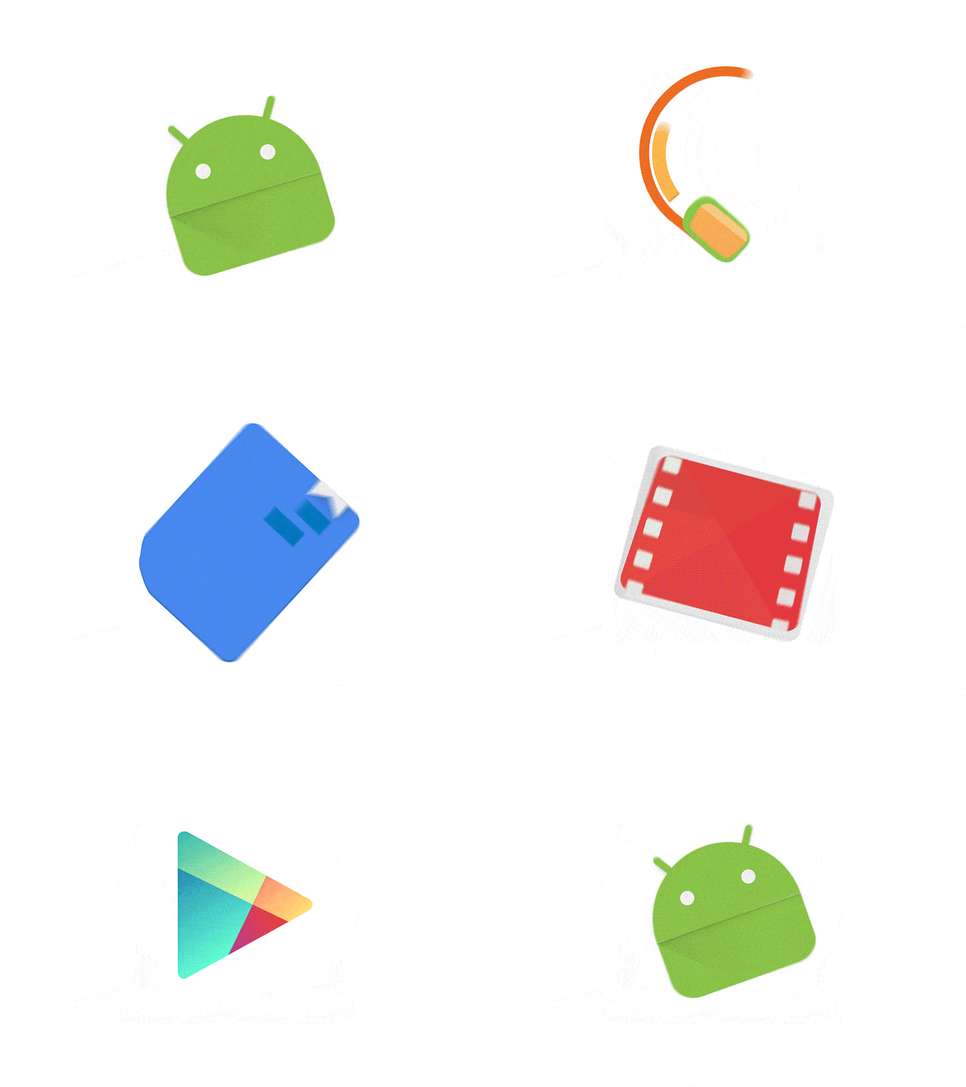
GIF: Veed.me
Consider this Google Play logo animation as a sample. In the few seconds that the animation runs, the animator morphs between a film strip, a document, headphones, a game controller, and the Android robot icon, succinctly illustrating every offering of Google Play, with no lengthy animation or copious explanatory text to get through.
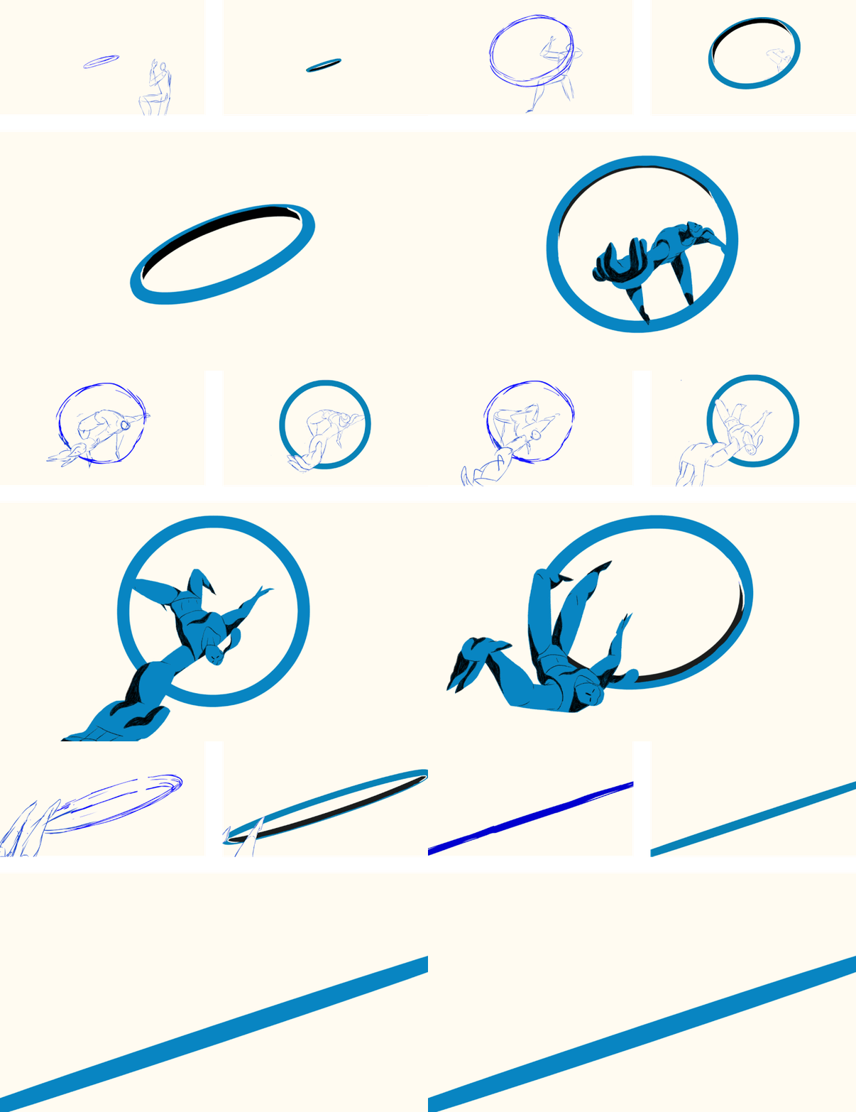
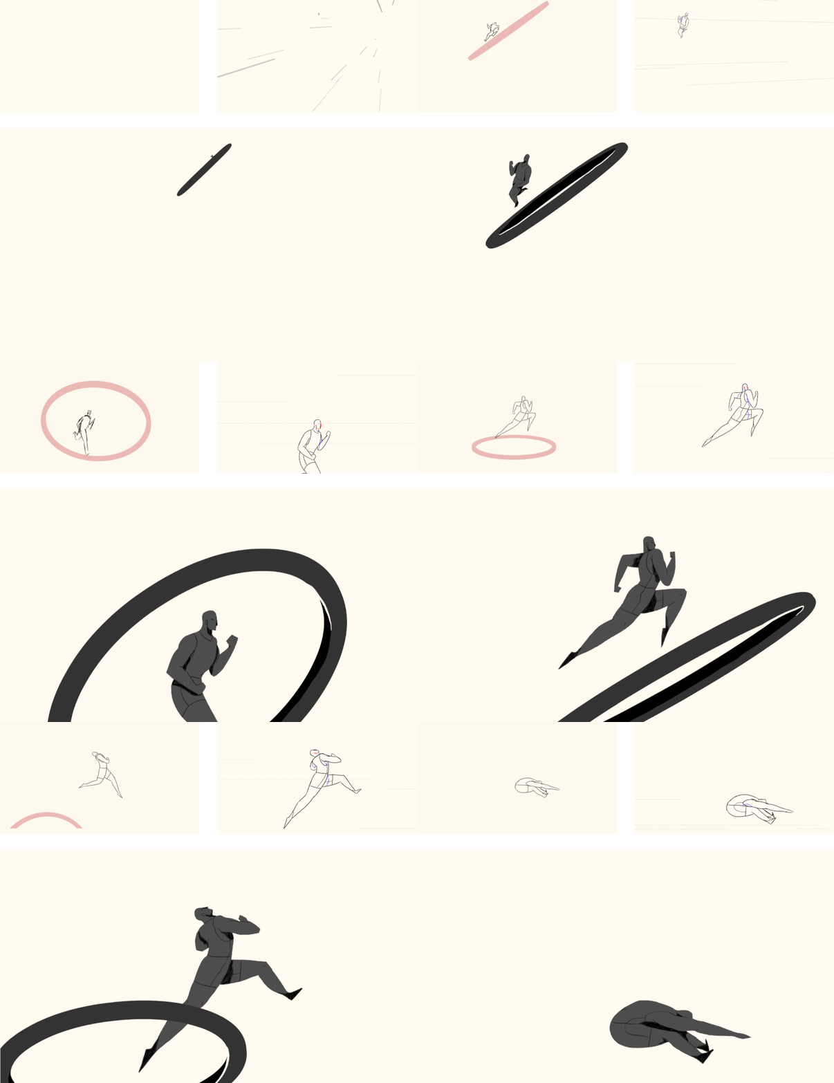
GIFs: Behance/OLYMPIA
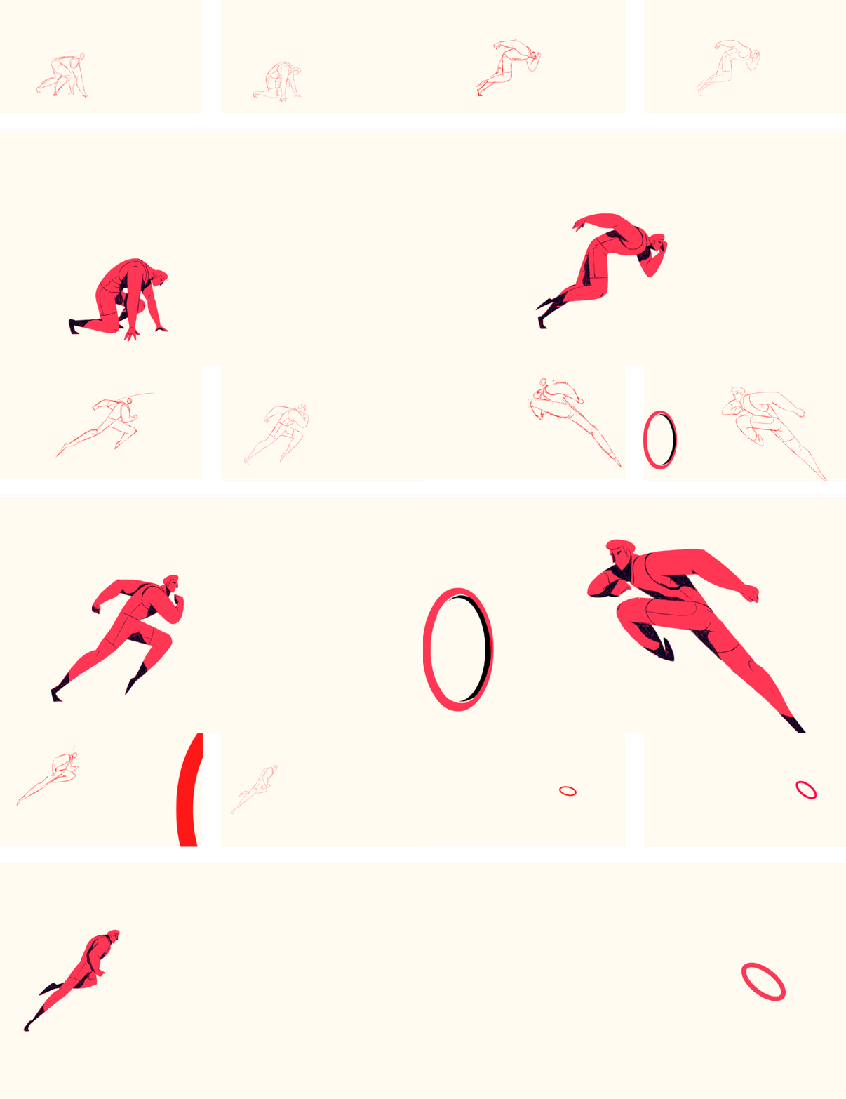
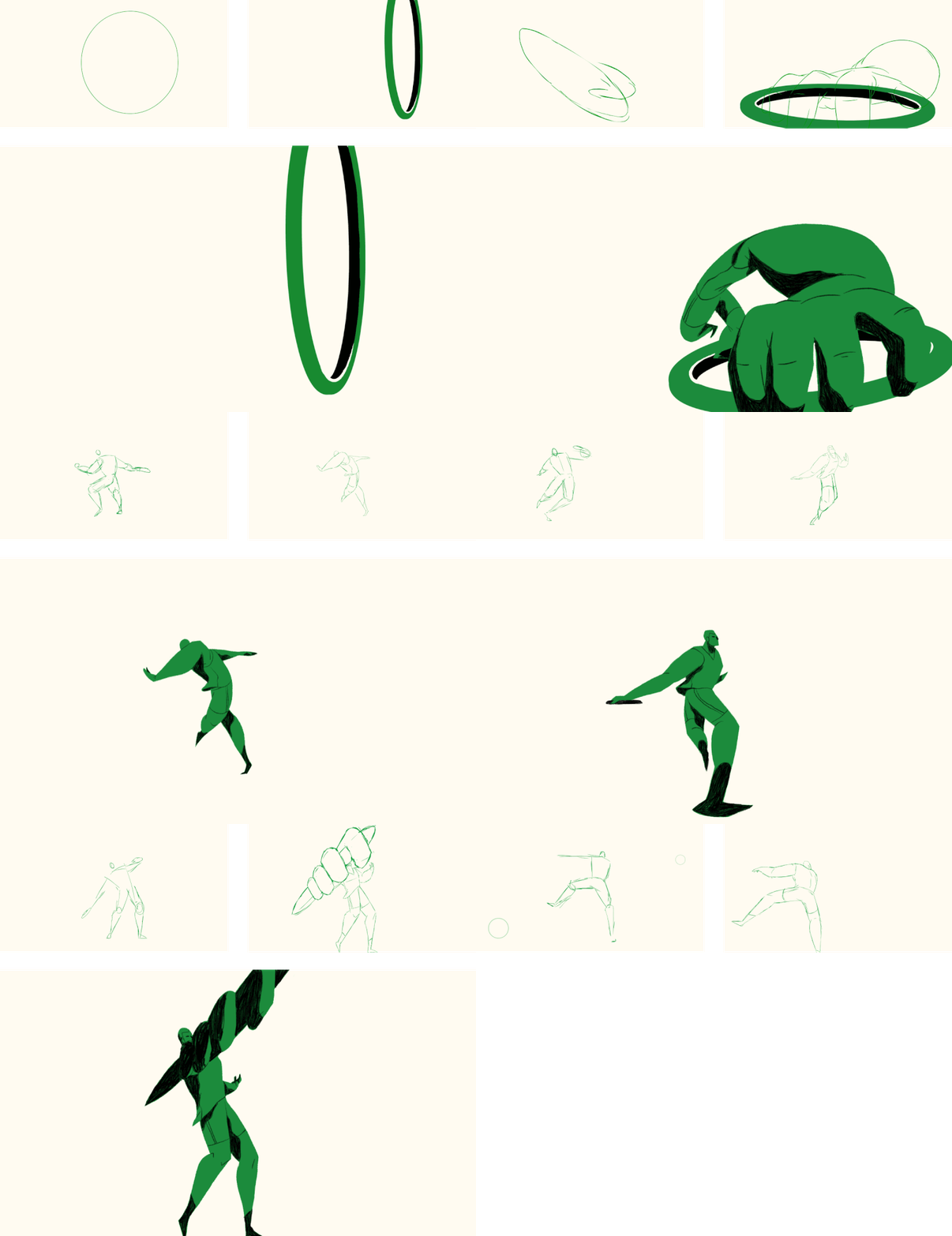
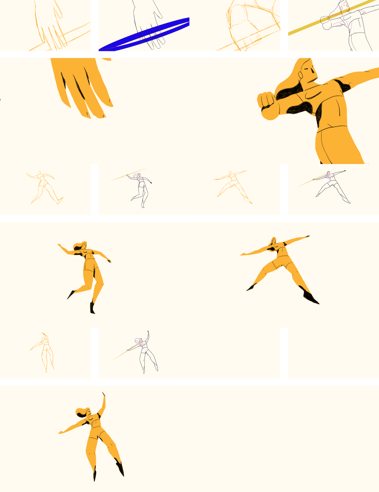
Similarly, three creative designers, Conor Whelan, Rafael Mayani, and Henrique Barone, animated the Olympic Logo by transforming the logo into animated athletes. Each subsequent ring of the Olympic logo is converted into an athlete competing in one of the ancient Olympic sports. The red ring competes in Hurdles, the green in Discus, the yellow in Javelin, the blue in high jump, and the black in long jump. The athletes leverage the rings that they were created from, such as vaulting over them, throwing them, or leaping through them. All the hand-drawn images were turned into a sequence of animated GIFs. The designers also uploaded the process GIFs to narrate the stories of how the images started out as mere sketches before they were worked into the completed animation.
Infusing Hand-Drawn Logos With An Animated Flair
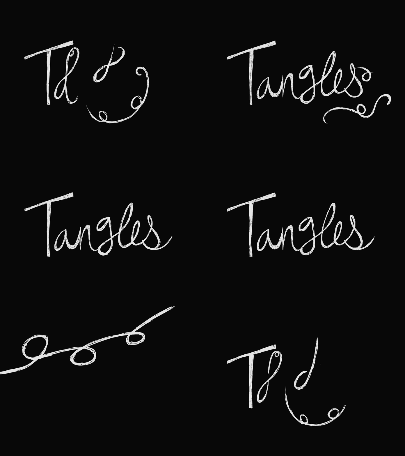
Be it real or skeuomorphic, hand-drawn logos have been around forever. They portray the human and warm side of a business and resonate better with the customers. Which is why it hardly came as a surprise when designers took that style to the next level through animation. The logos of Craft and Tangled employ animation to visually articulate the process of “painting” or “drawing” the logo. Animating the logos further exaggerate their hand-drawn appearances by letting the audience see the artistic process behind the masterpiece; from blotchy marks to slick and smooth brush strokes to swirling pencil design!
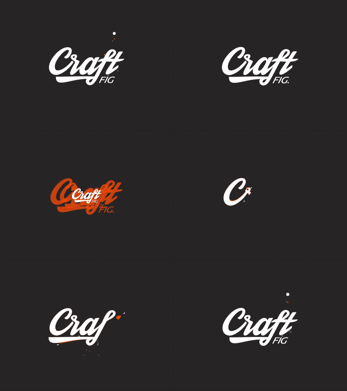
GIF: Dribbble/buatoom
Similarly Moving brands gave a new and animated identity to Ireland’s state owned telephone company, Eir. The brand story they created, aimed at driving the brand and the business, in addition to galvanizing its people, is vital to Ireland and essential to life. ‘Business rises on Eir’, expresses uplifting optimism when used in B2B communications. To further reinforce their message, the animated hand-drawn logo seems to be rising from the ground up as the logo forms right before our eyes.

GIF: MovingBrands/Eircom
Animated Logos Explaining The Design Process
Consider the animated logo design of the fashion brand Geky’s key, used by the design firm Concreate studio to show the concept behind the logo to their client. By depicting how each element fits together and morphs into the complete design, the company gains the ability to build their brand around their logo. This is an ingenious way of using the animated logo as an internal document, and not something for the end users of the brand. Once the clients comprehend the efforts and thought that went into the logo design, this process would help designers boost approval rates and alleviate confusions.
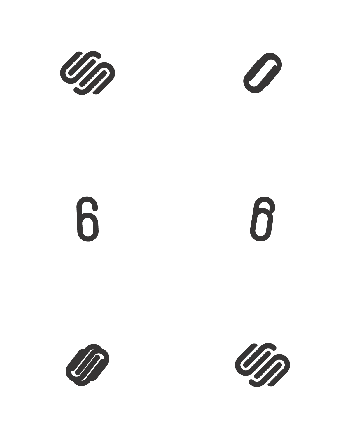
Similarly, the logo animation of Square2 shows how the intricate logo was formed from the number 6. Definitely helps puts a meaning to the logo that we are never going to forget.
Re-Arranging Logos
Another trend that we have recently started seeing in animated logos is that of animated rearranging, where some or all of the logo elements move around in loops into different compositions.
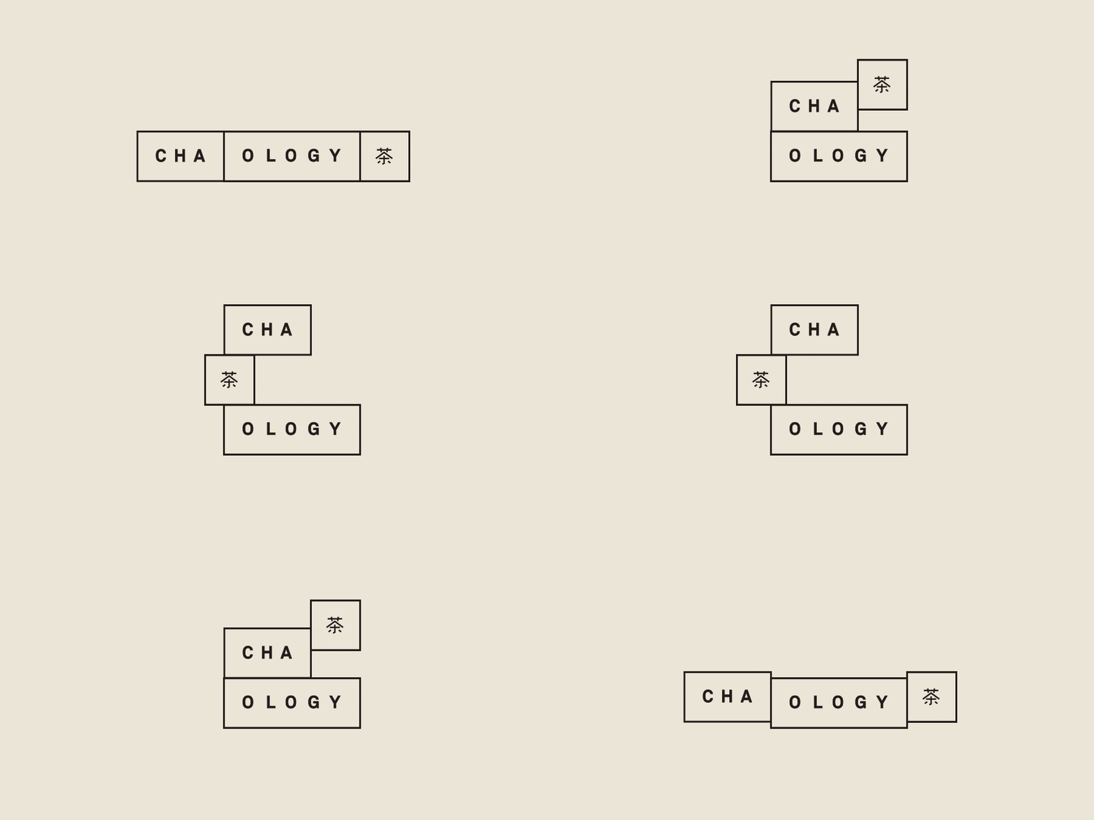
GIF: Behnace/Cha.ology
Chaology puts forward an animated logo, built of modules, where all modules move around and rearrange themselves in a central location on the grid. Similarly the logo for Sim Smith plays with the notion of a picture frame containing rearranging content. Seems like a perfect logo idea for an art gallery.
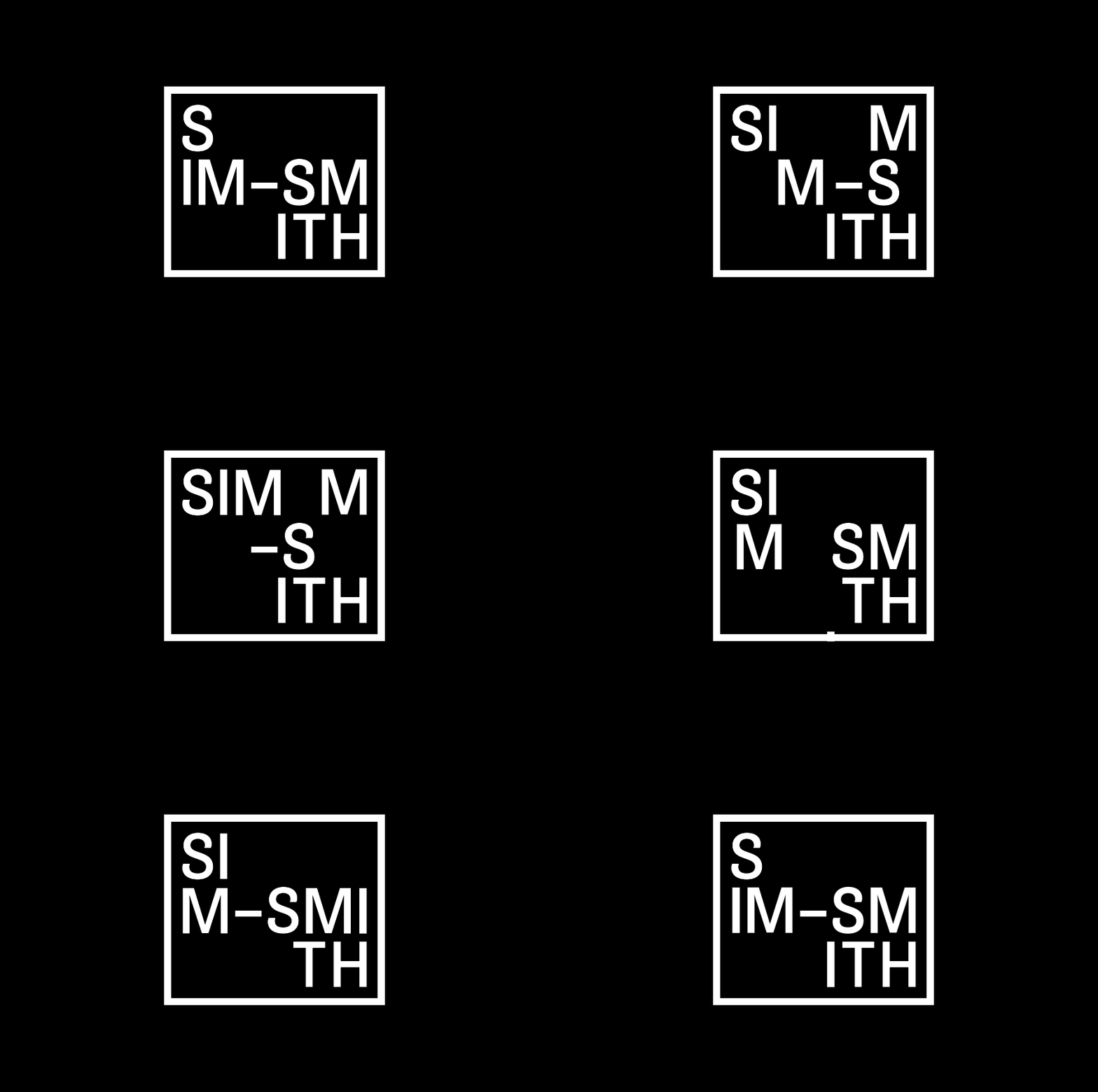
GIF: Spin/Sim Smith
Meanwhile, the Design of Torget rearranges the letters “D” and “T” to represent different products they sell, and the logo of the smart List uses a rotating composition that eventually changes junctions and shapes itself into the logo.
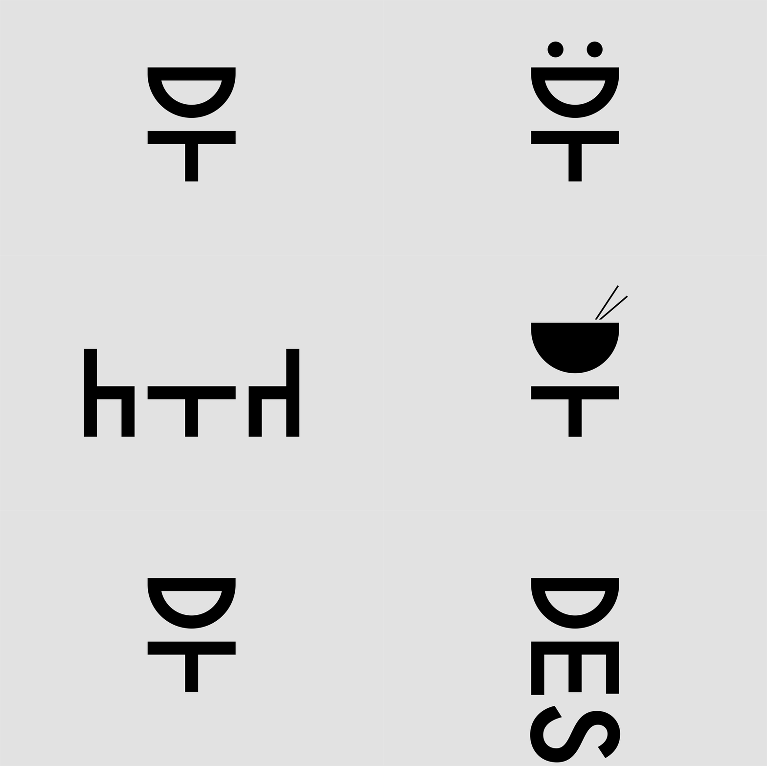
GIF: Kurppa Hosk/Design Torget
Animated Logos That Expand Right Before Your Eyes
One of the biggest challenges of dynamic branding is figuring out how to fit a logo design within any scale or dimension! Animation is a potent tool that can facilitate that process without losing the context of the design. For instance, the logo of Kevin Yang expands to reveal the full logo at larger dimensions, while shrinks into the logomark at smaller dimensions. Talk about the epitome of responsiveness!
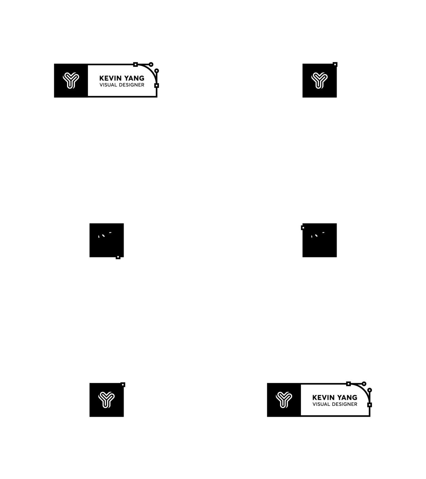
GIF: Dribbble/Kevin Yang
In another example, the logo design of Ideo Architekci is built over a yellow grid based area that can contract or expand to fill the available space. It’s one of the most viable solutions, especially given that architecture works with similar floor plans and grid systems.
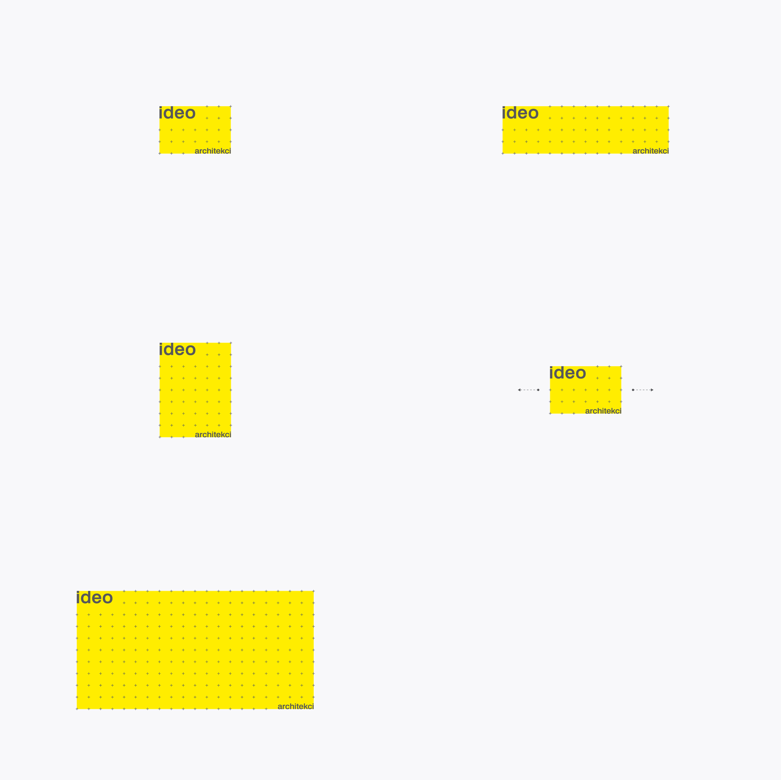
GIF: For Brands/IDEO
Another concept that can be achieved with an expanding logo is depicted by the logo of furniture designer Simon Pengelly. The logo expands right before the eyes by adding layers or lines to represent myriad layering of plywood. Not only does this help the logo fit into different spaces throughout the company’s branding, it also speaks to the material in his products.

Animation: Spin/Simon Pengelly
Key Takeaway For Brands In 2017
Customers are forever on the lookout for fresh and innovative content that helps them better connect with the brand. Animated logos not only satisfy the need for a visual identity for a brand, they also provide their audience with an interactive medium to comprehend the message the brand is striving to communicate across. Animated logos are the secret ingredient to success for brands wishing to come across as fresh, pioneering, and out of the box.
Can you think of more creative ways brands can animate their logos? Do let us know in the comments below.



Logo animations at their best! Thanks for sharing!
The above logo animations are amazing. Recently I have also published an article on animated logos. Thanks for sharing!