How do you summarize an entire year of logo designing in a single, short, end-of-the-year post?
The task is interesting – you get to revisit all the greatest trends, projects, and techniques that dominated the past 12 months – but also greatly frustrating.
How do you distill all that creativity and dazzle into a couple thousand words?
There are a few ways it has been done before:
do you summarize an entire year of logo designing in a single, short, end-of-the-year post?
- Write about graphic design trends …
- Talk about the best graphic designers of the year …
- Explore what 2022 could bring for the global graphic design market.
But we wanted something different. Definitely not another trends post, for sure.
So we settled on three key areas to focus on:
These three areas cover graphic design quite comprehensively, from theory and learning to programs and projects.
So let’s see what everything has been about.
Logo Revamps – New Logos, New Brands
There was something about 2021 that made all the brands quite excited to try new identities.
Pfizer unveiled its new logo along with a brand shift earlier in January 2021; so did General Motors. Then Kia followed suit, and Facebook (the company) concluded the trend by restyling itself as Meta – the social technology company – in late October.
What do all these rebrands signify, and are there any lessons to be learned here?
1. Pfizer Drops the Pill
When should a company rebrand its logo?
Most experts agree that a logo change must signify something. An elemental shift; a core change in brand ideology.
Early in January this year, Pfizer unveiled its brand new spiral logo. The company marketed the move as ‘unlocking the pill form’ – which is clever and apt. The implication is that when you pry open the pill – Pfizer’s old logo – the core was always scientific innovation.
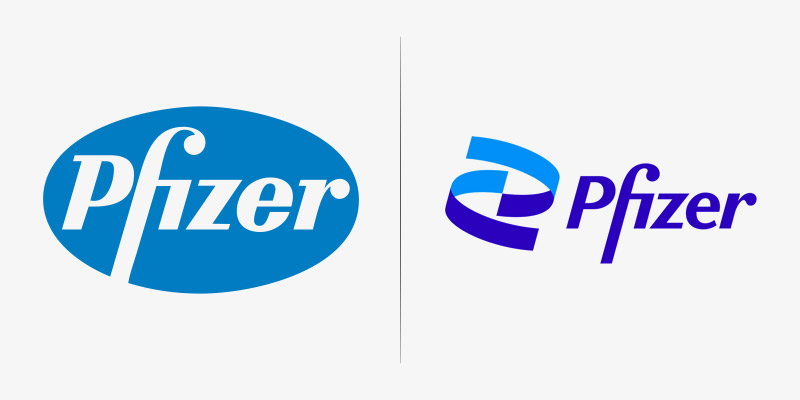
Image Source: Wikimedia
As this logo rebrand came right after Pfizer launched its Covid-19 vaccine (in partnership with BioNTech), you can appreciate that this was not your run of the mill logo change.
This was much huge. It signaled and represented the shift of Pfizer from a consumer-centric pharmaceutical brand to a science-driven biotechnology company that champions innovation and human well-being.
The new Pfizer logo is a two-toned blue helix that’s endlessly spiraling upwards. It represents the DNA structure as well as the company’s mission to combine scientific innovation with curing and preventing diseases.
The Rebranding Lesson Here:
If there is a fundamental shift happening in your brand ideology, operation, and alignment, symbolize it with a logo change. The redesign shouldn’t have to be a creative marvel, but it must identify the core change that’s taking place at the company.
2. Facebook Becomes Meta
While (in hindsight) we all saw the Pfizer rebrand coming, nobody expected Meta to materialize from Facebook. It caught the whole world by surprise.
When Mark Zuckerberg revealed the new company brand, he said it was because the name Facebook just cut it anymore. According to him, ‘Facebook’ doesn’t cover the expansiveness of everything the company was doing or planning to do in the future.
More specifically, he was referring to the metaverse. Zuckerberg’s dream project of digital experiences where all of us will be able to connect with each other virtually via VR headsets. But since this project is way ahead into the future, it is a bit difficult to understand what this current name and logo change mean.
However, tackling the logo revamp itself, it’s not too shabby. Considering their past efforts, we know Facebook could have done much worse. In fact, we tried to help them by suggesting some unique colors for the logo.
But Facebook stuck to its signature blue. Ah well. At the least the new logo is somewhat interesting.
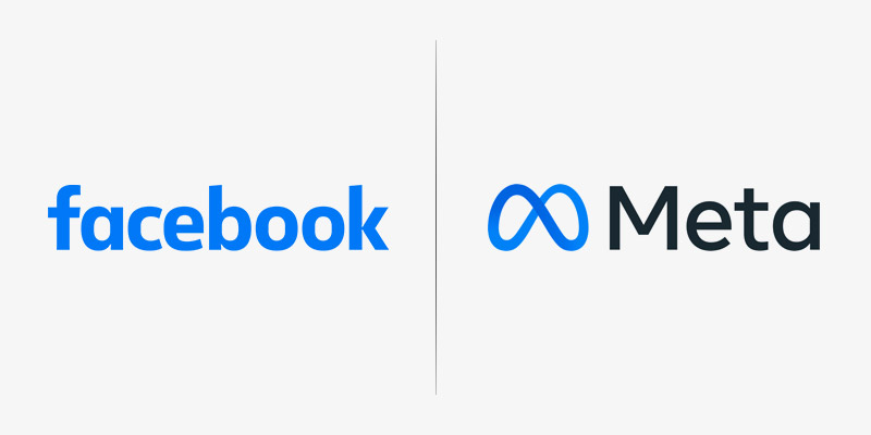
Image Source: Wikimedia
It’s an infinity loop and signals constant motion. On one hand, it shows flexibility, movement, and evolution – change that’s constant. On the other, it’s simple, to-the-point, and captures what the brand was trying to say.
The only problem is, the change that it’s referring to may not happen for many years to come. So, right now, the brand redesign seems a bit empty. It’s nice and pretty but when you scratch the surface, there isn’t much to see.
Unless it’s a diversion, and the true purpose has always been to distract us from the tons of negative press Facebook was getting due to the leaked internal documents that accuse the company of preferring profits over safety?
Guess, we’ll never know.
The Rebranding Lesson Here:
If your company policies are problematic, logo rebrands will not save your reputation.
3. Kia’s Confusing but Very Cool Logo
I love Kia’s new logo. It’s the latest in Kia’s rebranding journey to move from fuel-powered cars to electric vehicles. So far, the rebrand has been an absolute success.
The new logo confidently expresses this internal shift of the company. The design is steely, exciting, and undeniably edgy.
And I know, if you have followed this rebrand closely, you must have also noticed that the new Kia logo has a fair bit of crinkles.
First, many people find it confusing. Depending on your vantage point, the logo sometimes reads KM, KN, NIN, or something else. Basically, anything other than Kia. Others have come and pointed out how the new logo is somewhat crooked, too.
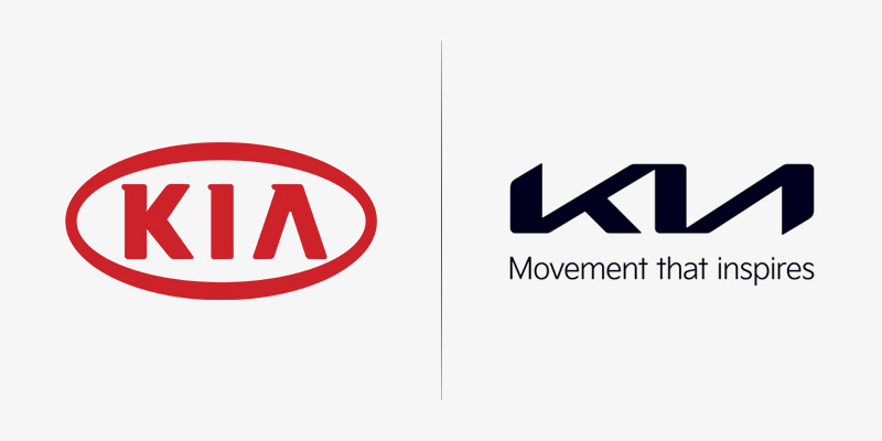
Image Source: Motor1
Here’s my take.
Yes, there is a bit of visual ambiguity, and ideally it shouldn’t be there. But it isn’t anything that a bit of time and familiarity cannot cure. The more we’ll look at it on beautiful cars around, the more ‘normal’ it’ll start to seem.
About crookedness? Again, ideally it should have been handled. However negligible the alignment, it should not be a part of a major brand identity. That said, there is tons of good things happening in the logo that we feel comfortable ignoring these few minor flaws.
The logo is solid. It’s angular and you can see the movement the company has alluded to in its tagline, “Movement that Inspires’. It’s a single, unbroken line that creates all these angles as it forms the word Kia. The lettering is thick, which again talks of power and strength.
In a world of automotive logos that are getting increasingly sleeker, this confident display of powerful branding is a highly reassuring.
The Rebranding Lesson Here:
Always, always, always double-check and proofread. Otherwise, no matter how genius the logo is, the flaws will attract all the attention.
Related: Top 10 Rebranding Costs of Famous Logos
4. GM’s Too Well-Hidden Plug
We all like a meaningful rebrand. And a legacy automotive company shifting to an all-electric future is an exciting reason to rebrand the whole thing.
But there’s only so much you can ask a logo to do.
General Motor’s new logo – a tiny design icon – is going full throttle in its commitment to reflect the company’s internal shift. From shape to colors, font, accents, and even white space, the new GM logo pulls out all stops to try and achieve its goal.
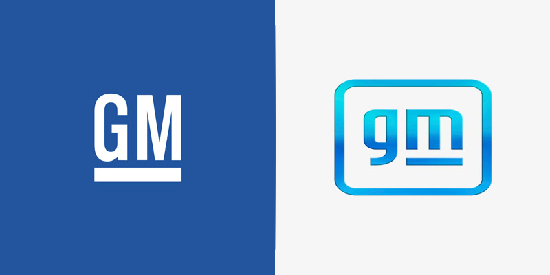
Image Source: Independent
There’s no doubt that the new GM logo is much sleeker, vibrant, and lighter. Definitely more modern and open than its old design.
The blue gradient around the borders is designed to reflect zero-emissions skies. It’s shiny and clean. The lower-case letters are meant to make the brand look young and fresh. The familiar underline of the old GM logo is there only under the letter ‘m’. The purpose of this effect is make the negative space within the ‘m’ resemble an electric plug.
Has the logo done what it set out to do?
The colors and fonts certainly make the brand look more modern but I really can’t see the plug, unless I make an effort. But should I? Make the effort, I mean?
The thing is, a good logo design does not ask the audience to squint, tilt, or move that way to spot a hidden detail. It should be there without being too obvious. Much like the arrow between the E and X of FedEx logo. Once you see it, you can’t believe you never saw it before.
GM’s new logo fails on that count. On the rest, it scores highly. So, overall, a win for GM.
The Rebranding Lesson Here:
Don’t hide the Easter eggs too well. You want them to be found, so leave enough clues around.
5. Burger King’s Retro Rebrand
To conclude our discussion on logo revamps on a high note, let’s talk about Burger King.
A major rebrand of 2021, it was a resounding success. To express its vision for the future, the fast food company went back to its roots. From colors to type, icons, photography, sketches, illustration, copy, and even the overall vibe – everything points to a time when things were simpler, dinner parties were loud, and friends were many.
It’s basically a call to Millennials to renew their childhood connection to Burger King. And by the looks of it, the call has been received with much enthusiasm and cheer. From industry veterans to general public, everyone likes the new logo and compared to other fast food brands and their bland and flat logos, Burger King’s new visuals are rich and zesty.
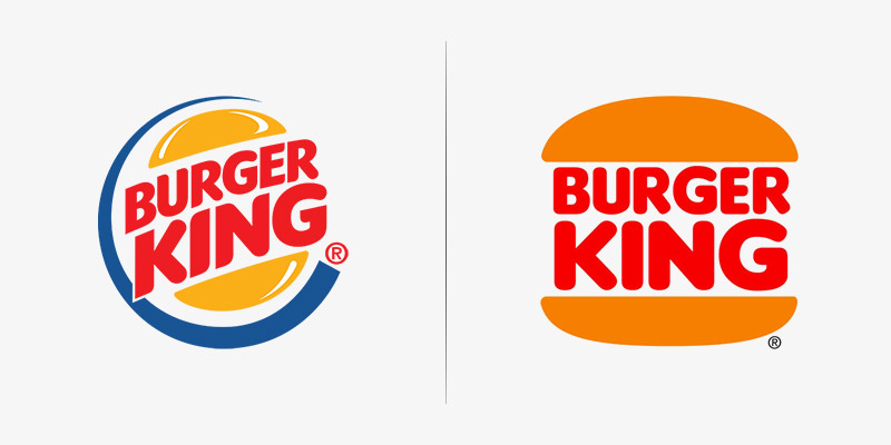
Image Source: Pinterest
The typeface used is called Flame, and was created specifically for Burger King’s rebrand. The font is gooey, thick, and squishy. Colors are natural and organic. There’s burnt orange and red, colors that make you think of ketchup and mustard. Green for the vegetables, and brown and white wrapping the whole thing up nicely, conforming to the latest color trends according to the CTN News.
The rebrand is not limited to just the logo only. It was extended to website design, restaurant décor, staff uniforms, marketing assets, and even the paper that goes on to your tray as you order your Burger King meal. This comprehensive and expressive display of the rebrand has given Burger King the much-needed freshening up it needed to stand its ground.
The Rebranding Lesson Here:
Revisiting your original brand identities is important as it lets you stay authentic when you try to find inspiration for the future.
Design Tools – Work Smarter, Get Better At Design
What are some of the top graphic design tools and programs that have made the most impact on designers this year?
In this list, you’ll find mostly classic names that have not only stood the test of time with continuous changes and upgrades, but have perfected their original features, which keeps the new competitors at bay.
Related: Coronavirus Pandemic: Productivity Tips and Tools For Graphic Designers
Don’t worry, though. I’m not going to make the list predictable by including Adobe programs or graphic design software. We all know they work and they are the industry standard. Here, we are talking about some lesser-known but equally strong programs and logo design tools that you can use alongside your favorite Adobe software to boost your skill-stack.
1. Procreate – Sketching Tool For iPad
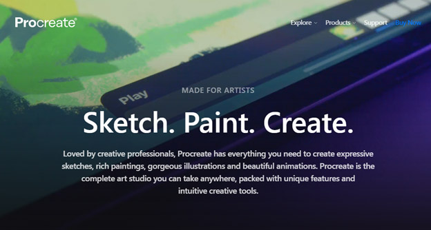
This is a creative tool that you can use on the go. With hundreds of unique and customizable brushes and other features, you can use Procreate to design illustrations, sketches, drawings, animations, and a whole lot other drama. The only drawback: creates raster graphics, so your scaling would be limited.
Price: $9.99
2. Affinity Designer – It’s Adobe Illustrator On Bargain
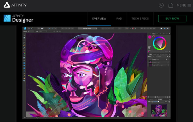
If you are out looking for a vector graphics editor but cannot afford the hefty price tag of Adobe Illustrator, Affinity Designer has got you covered. It has got almost all the same features as the Illustrator plus it’s somewhat easier to use, too. It’s great for beginners, as well expert designers and offers regular updates, add-ons, and unique offers that keep the software recent and fresh.
Price: $54.99 (Windows and Mac) – $9.99 (iPad)
3. Stencil – Your Drag-And-Drop Graphics Program
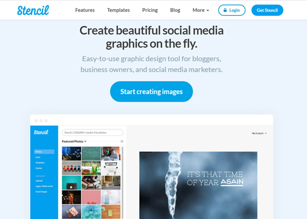
Sometimes we are looking for some quick and easy fixes to marketing and design problems. When you want some easy-to-use, online graphic design solutions, Stencil is where you go. It helps you create images for social media, marketing assets, digital ads, blog headers, and much more. Interface is pretty straightforward with enough personality and features to keep you hooked.
Price: $9/month. Free plan available with limited features.
4. Sketch – For Your Web, App, and UI Collaboration
If you’re looking for real-time collaboration on your design work, this is one of the best free survey tools on the market. Sketch is a vector graphics tool and helps you create powerful icons, interfaces, and app designs with Mac OS functionality.
Price: $9/month
5. Inkscape
It’s an open-source design tool that’s powered with the passion and commitment of its creators and community. You can download and use Inkscape to create logos, animations, web design, drawings, and illustrations. It’s a vector graphics tool with a bit of learning curve, for sure. But it comes with enough free and rich learning resources that make this software compensate a worthy candidate for this list.
Price: Free
More tools to help you improve your productivity:
- Fotor – an online photo editing tool
- FileStage.io – File sharing for review and approval
- Pixelmator – Professional image editing and handcrafted brushes
- Webflow – A quick and easy way to build websites
- Coolors – A color scheme generator for graphic designers
- Colorcinch – Turn photos into paintings and drawings with a single click.
Learning Resources – Learn, Grow, and Design
Professional graphic design work is much more than just having raw talent. You need guidance and education of the trade to really figure out what it is that you are doing. The more you understand and know about your craft, the better your ideas and execution would be for your clients and their work.
Related: 50+ Startup Resources To Start Making Money After Covid-19 Pandemic
These resources help you give a leg up in your graphic design journey. Starting from the most fundamental, these resources take you on a quest to understand the most specific facets of professional graphic designing.
1. Hack Design: Online Source to Learn Graphic Design Philosophy and Fundamentals
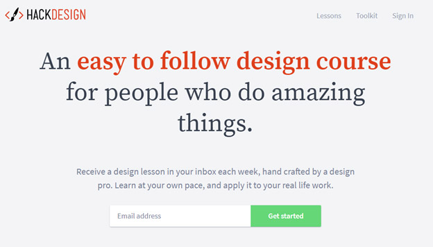
It is a community of passionate designers who curate lessons on different areas of graphic design to make it more accessible and understanding. These curators use blogs, books, videos, games and tutorials to make learning more fun, comprehensive, and interactive. Once you sign in, you are free to choose your teachers to start getting weekly lessons from them delivered right to your inbox.
2. Udemy – For Self-Paced Graphic Design Education
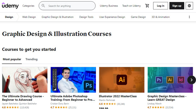
If you are looking for a learning environment where you have more control on what you learn and when, Udemy can be a helpful starting point. Here you can subscribe to existing lesson plans and lectures, and figure out your own path to learn graphic design. There are thousands of courses to choose from, with instructors of varying backgrounds, teaching styles, specializations, and achievements. The review system helps you choose your instructors and courses that are more suited to your individual style and needs.
Other places to look for online courses:
3. How To: An All-Inclusive Design Manual
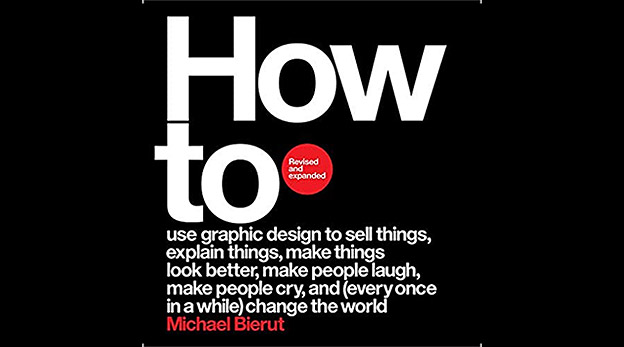
Using real stories from his rich and diverse career as a graphic designer, Michael Beirut teaches about using design to make things happen. The book provides insights into the creative process that goes into creating campaigns and designs for brands and businesses as varied as financial companies, global art, and political campaigns, etc.
4. Ebaq Design: A Blog for Branding
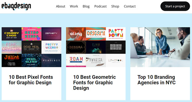
Branding is almost a core area of graphic design. In my opinion, almost all graphic design is created to promote a brand: perhaps a company, person, or even an idea. But branding is at the center of it. The Ebaq Design blog helps new and experienced graphic designers alike with tons of expert articles, case studies, op-ed pieces, and trending articles.
5. YouTube Channel: The Futur
This is the only design channel you need to follow on YouTube. It is filled with great quality content on design mindset, motivation, sales and marketing, negotiations, pricing and such. It helps designers get the latest, most recent knowledge and updates on how the industry is trending and what you need to keep abreast of the advancement. One of its videos ‘Stop Charging Hourly’ is a great tutorial on how you should base your pricing on your project’s value rather than how long it takes you to finish it.
Interesting YouTube channels to follow:
Conclusion
2021 has been one of the most active years when it comes to brands using graphic design to its fullest potential. We have had some significant rebrands and thanks to the latest tools and learning resources, our knowledge of design is richer than it was a year ago.
Can you think of a design endeavor that has made the most impact on you since last January? Sound off into the comments below.

