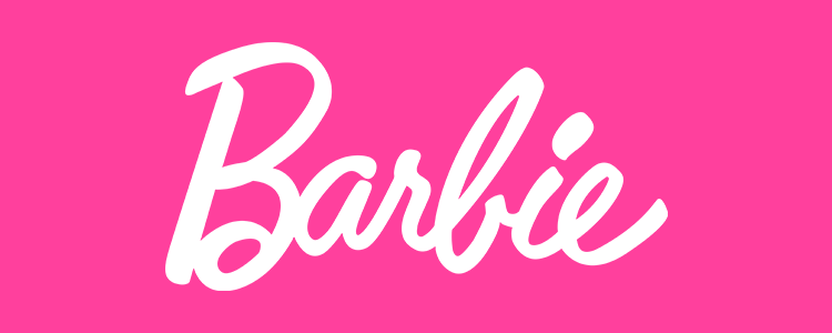
Barbie is arguably the world’s most popular doll. She emerged on the scene in 1959 and became an instant cultural icon. While the Barbie brand has faced consumer attitude shifts over the decades, Barbie has remained stubbornly iconic. She’s fierce, feminine, and unapologetic. As a symbol of fun, fashion, and aspiration, the Babrie logo has similarly been a cultural symbol.
Its evolution represents the evolution of society’s perceptions and treatment of women. Through the lens of its redesigns, you can see the meanings of ‘women empowerment’ change from one generation to the next.
Stick around as this article gives you an inside look at the Barbie logo evolution and transformation. We’ll discuss its design fundamentals, and the core of the Barbie brand identity, and answer your most burning Barbie FAQs!
Barbie Brand Identity: Modern, Feminine, and German?
As much as Barbie is an American icon, its origins are rooted in the German comic industry. When Ruth Handler — the creator of Barbie dolls — was looking for a breakthrough toy for her newly launched company Mattel, she found inspiration during a family trip to Europe.
The trip cemented an original idea Handler had already presented to her partners Elliot Handler (her husband) and Harold Matson. The idea was to create an adult female doll for the modern American woman — a woman with choices, conviction, and freedom.
While her partners initially had doubts about the idea, all the doubts were cleared during that trip. When visiting Germany, the Handlers came across the Lilli doll. A cartoon-inspired doll that represented a woman with a devil-may-care sexual attitude and a provocative personality.
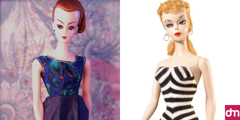
German Lilli doll vs. American Barbie doll
Though the Lilli doll was more of a gag gift for men in Germany, she did convince Mattel founders that an adult female doll for women was a marketable idea.
They instantly started working on it. The first Barbie doll was created and sold in 1959 and an iconic brand identity was formed.
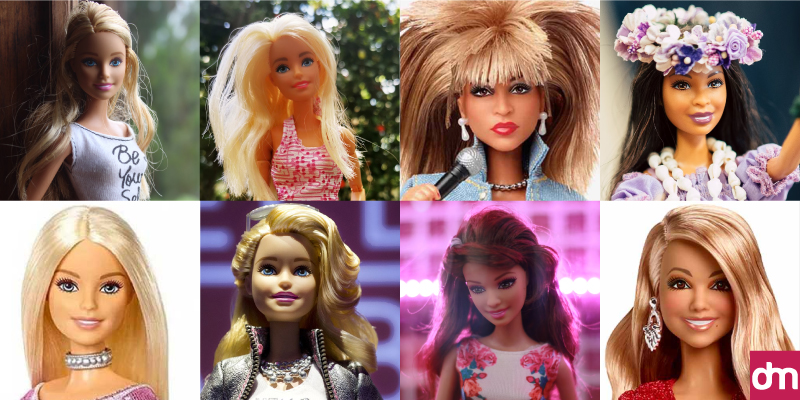
Iconic barbie dolls over the years
Fun Facts about Barbie:
- Barbie’s full name is Barbara Millicent Roberts — after Ruth Handler’s daughter.
- Jack Ryan, a missile systems engineer in the U.S. military, designed the Barbie doll.
- Though she’s marketed as a children’s toy, Barbie was inspired by the Lilli doll, a German doll of sexual origins.
- Barbie has over 200 inspirational careers, including a news anchor, a Pizza Hut cashier, a US Air Force pilot, and a US presidential candidate.
- Barbie was marketed as a toy for young women, hoping to inspire them the same way firefighter action figures inspire young men but the strategy didn’t work. They quickly moved their target market to children and teenage girls and Barbie became an instant bestseller.
- In 1993, Mattel created and released the Earring Magic Ken, a version of Ken that was supposed to look cooler than the original. The new Ken doll had a mesh top, necklace, purple vest, and earrings. Gay men bought it in droves, making it the top-selling Ken doll ever. The doll was discontinued after six months.
Barbie Logo Evolution: How a Legend Transformed!
Ruth Handler, the brains behind the Barbie doll creation, designed the famous Barbie logo wordmark. Take a look at how the logo has evolved.
• 1959: Vintage Barbie logo
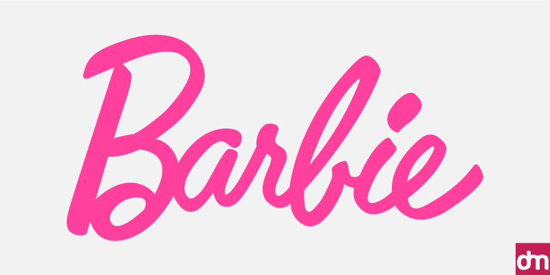
1959 vintage barbie doll logo
The original Barbie logo was a cheerful pink logotype in a display script font. The font was a custom typeface, giving the design a personal, handwritten feel. The pink logo color palette was bright yet sophisticated, on-brand with Barbie who was glamorous but elegant.
• 1975: 3D Barbie logo with pink shadows
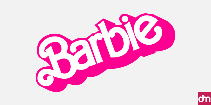
1975 3D barbie logo
The 1975 redesign of the Barbie logo was a major branding shift. The wordmark had changed directions. It was slanted upwards and sitting diagonally in the box. It was also in 3D now, with deep pink shadows! But the pink was no longer soft and sophisticated. It was hot, edgier, and attention-grabbing. Together, the design elements signaled an evolving brand that was becoming more fashion-oriented and expanding to include more careers for its titular doll.
• 1991: Simple and fresh!
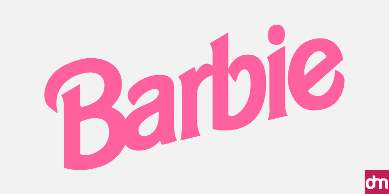
1991 simplified barbie logo
In 1991, Barbie simplified its wordmark. The classic Barbie logo shunned childish fonts and adopted a sleeker script typeface to convey a progressive brand. The color palette cooled down too. It sported a softer pink now, conveying an overall fresher brand identity.
• 1999: Confident Barbie with a cursive logo
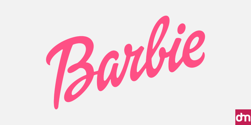
1999 cursive barbie logo
Perhaps feeling like they have departed too much from the core of the Barbie brand, designers came up with a refresh. The new Barbie logo design again adopted a darker pink palette and a narrower logotype.
Barbie was growing and it showed through her color choices. The cursive logotype also hinted at the brand adopting a more confident and bolder visual identity.
• 2004: A short-lived confusion
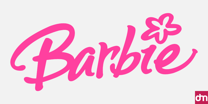
2004 handwritten Barbie logo
The Barbie signature logo went through another shift, though not as successful. For some reason, they introduced a flower to dot the smallcase I. The effect made the million-dollar enterprise resemble a preteen child’s scrapbook rather than a serious business. The redesign only lasted a year, the shortest duration for a Barbie logo design.
• 2005: Small improvements making a big impact!
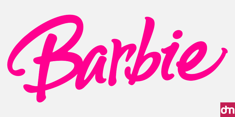
2005 new and refreshing barbie logo
Of all the Barbie logo variations, this one had the most minute amount of changes. The flower detail was removed and the color palette was made a tone darker. The richer shade of pink instantly lifted the Barbie brand identity and communicated a streamlined yet fun and cheerful logo design.
• 2009-Present

2009 trademark barbie logo
In 2009, the Barbie logo found its way back home. The brand returned to its roots with the Barbie trademark logo, only in a clearer pink color. The original wordmark is a shade closer to red. The current pink, however, has become a cultural phenomenon. It has birthed trends and inspired fashion designers. It is so popular and specific that Pantone has assigned it its unique title, calling it the Barbie Pink.
The Barbie Logo Design Elements
How do you create a logotype that is as fabulously fashionable as the Barbie logo design? Let’s find out.
– Barbie Logotype
The Barbie logo is primarily a minimalist wordmark. Though a female head silhouette appeared on it as a brand icon, it never became part of Barbie’s primary visual identity. That prestige remains with its iconic wordmark.
And that comes with a lot of benefits.
With shapes and icons, brand identities can sometimes feel restrictive. Symbols, regardless of the wealth of their meanings, often have limits to that wealth. There are only so many ways a high ponytail can be interpreted.
So adopting a wordmark as its primary logo design has allowed Barbie’s brand identity to remain fluid, flexible, and always up for a challenge.
– Barbie Pink Color
Barbie Pink is not a color; it’s a state of mind, a style statement, and a women empowerment symbol. Always associated with a fiercely feminine energy, the hot pink of the Barbie brand is chic, confident, and courageous.
Design-wise, it’s very close to the vibrant magenta color and conveys the color psychology of delight, passion, and warmth.
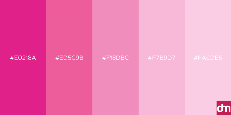
Though shifting societal standards and feminist movements have often thrown Barbie Pink in hot waters, like its eponymous doll, the color remains undefeatable. Thanks to the recent release of the Barbie movie, Barbie Pink has enjoyed a fresh new wave of love from celebrities, fashion designers, the general public, and style influencers.
• Barbie Logo Variations
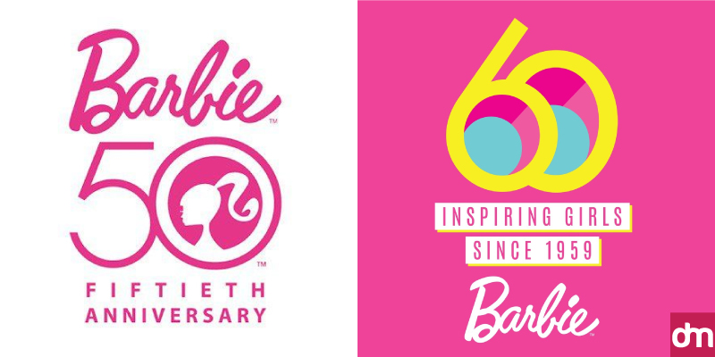
The Barbie logo has not varied a great deal in its design roots. It always appears in the form of a script-based logo in a unique shade of pink. However, some variations have been released to accommodate print design requirements, commemorate special occasions, and expand the brand identity.
These include Barbie logo wordmarks in all-black color to suit print design needs, two special occasion logo designs that were released on the brand’s 50th and 60th anniversaries (in 2009 and 2019 respectively), and a female head silhouette that sometimes accompanies the primary logo or appears on its own to show a different side of the brand.
Barbie Movie and #Barbiecore
Mattel has always worked to present the Barbie doll as an icon of female liberation. She has always been a ‘single career girl’ — just as Ruth Handler had insisted — and was never tied to society’s demands. Even when there were demands for the Barbie doll to have babies or for her to marry Ken, Mattle never gave in. Instead, the company released the babysitter Barbie and outright refused the marriage proposal.
Despite all that, Barbie has always faced criticism for her unrealistic figure and narrow cultural representation. Though there were efforts to make Barbie more inclusive — more body types, more textured hair, and more careers — the once-beloved doll struggled with acceptance.
Until the 2023 Barbie movie.
The movie changed things for the Barbie brand. For one, it renewed interest in the Barbie dolls. And for another, it gave people insight into the Barbie experience. Margot Robbie made Barbie feel more human than ever before, and the criticism she faced and the expectations she had to fulfill were brought onto the big screen in the most poignant display.
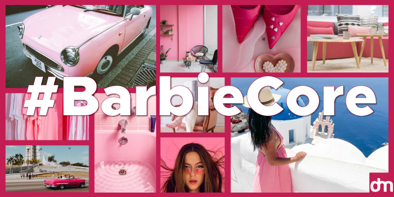
The hype around the movie set in motion the #Barbiecore. A trend that engulfed the entire Hollywood and fashion industry. It took its aesthetics from the Barbie world and made pink popular again. Makeup looks were created in various shades of pink, runway collections were designed, and even the architecture was inspired by the high-energy pink galore.
For a time, we all lived in the Barbie world and it wasn’t all that bad.
Barbie Logo FAQs
• What is the original Barbie logo?
The original Barbie logo is a pink wordmark in a handwritten style font. The logo was designed by Ruth Handler, co-founder of Mattel and original designer of the Barbie doll.
• Why is Barbie’s logo pink?
Pink is culturally associated in the West with femininity and female sexuality. As a teenage fashion model, Barbie sported a vibrant pink palette to show off her youth, adventurous spirit, and fashion-forward style.
Pink, a highly contrasting color with most palettes, is a natural attention-grabber. It seeks to command your notice and delights in being noteworthy. Barbie’s pink logo was paramount in making the doll a symbol of female empowerment. It allowed Barbie to have goals and aspirations while never giving up on her femininity.
• What is Barbie’s font style?
The Barbie logo font is a customized script font which is very likely handwritten. It is a unique typeface and conveys the font psychology of being girly, fun, and confident. It portrays a modernized brand identity that takes pride in its feminine roots.
• What are Barbie’s signature colors?
The Barbie logo’s signature color is called Barbie Pink. It’s Pantone 219 C — a vigorously vibrant color that communicates an unafraid spirit, one that’s always there to take up a challenge, and has a curious, imaginative mind.
• What is Barbie’s motto?
The Barbie brand has had several slogans over the years, but its most recent one seems to be ‘You Can Be Anything’. The slogan refers to feeling empowered in your potential. Whatever you want to be, find a way to be that. Learn, grow, acquire skills, and be the great anything you want to be.
Want to have a go at the Barbie logo?
Create your version of the Barbie logo design with our AI logo maker. Find your favorite templates and use our intelligent editing tool to modify the design. Adjust color, add icons, and apply font styles. Create a fashionable Barbie logo as unique as your imagination. Our logo design tool is easy to use and free to try. Give it a go!

