The automobile industry is as vast and fast-paced as it’s competitive. Everything from car manufacturing to auto shops, tire works, car rentals, and so much more falls under its umbrella. Designing an automobile logo design that can cut through this noise can be a challenging task for a new designer.
But not if we can help things around.
Consider this post your guiding star as you navigate the murky waters of initial design challenges in your career. We have collect20 of the most note-worthy auto logo designs here from around the world that will help your creative juices going. From vintage designs to modern minimalism, you’ll find everything here.
So let’s dive in and see what our top 20 favorite car logo designs are.
1. Metallic Car Logos
Auto industry is huge on metallic logos, especially car manufacturers. Think of Mazda, Chevrolet, and Mercedez, all of them use metallic logo designs for their brands. To stand apart from your competition, you can add a bit of metallic shine on your minimal car logo and immediately step up your logo game.
Image Source: Behance
Related: 10 Most Iconic Automobile Logos!/
2. A Cool Color Palette
To offset the bulky, heavy work that goes on in car washes, auto workshops, auto detailing stations, etc. use a cool color palette. Even if you are using a warm color, use its lighter, softer, and more muted tones to provide a more soothing design.
Image Source: Behance
3. Use High-Energy, Passionate Colors When Needed
Warm colors like orange, red, and yellow are great to show speed, energy, and vigor in your car logo designs. Therefore, choose colors wisely for your logo design.
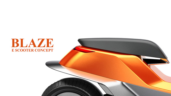
Image Source: Behance
4. Wordmark Automobile Logos
Not a lot of automobile companies for it, and that’s the very reason why it may work. Consider using a wordmark logo to create an impact. It works especially well if your brand name is shorter and easy on the tongue.
Image Source: Behance
5. Creative Display Of Logo Shapes
True, you have a limited supply of icon shapes to work with when it comes to automobile logos. But use it as a reason to challenge yourself and add shapes into your design in creative and subtle ways.
Image Source: Behance
6. Rely On Classic Imagery
Images like wings, skulls, and gears have long been in use in auto logo designs. You can also use these images in a cleaner, more sophisticated way to create an impact.
Skull logo in the middle of a circle
7. A Green Auto Logo For A Sustainable Auto Brand
The simplest and most effective way to show the sustainable side of your brand is to introduce elements of nature, especially the color green, in your logo designs.
Car gear making a sun and leaf logo
8. Nostalgia Always Works
For some reason, a city tour bus logo in vintage design and colors looks much more interesting and exciting than a modern, flat design. Perhaps it plays on our nostalgia and makes us think we’re going to discover hidden but trendy spots in the city that not many people know about.
School bus standing on the road logo
9. Vintage Car Logos
When choosing a vintage design for your car logo, first make sure it works for the brand. In this case, for an automobile museum, a place for auto artifacts, a vintage car logo is a perfect choice.
Image Source: LogoPond
10. Automobile Logo With Wings
Car or bike logos with wings work especially well. They signify high-speed, make us think of daring adventures, and look on-brand.
Automobile logo with wings
11. Car Rental Logo
If you run a car rental service, a city skyline in the backdrop can be a great idea. You can also choose to showcase a car silhouette in the logo or go minimal with a pictorial mark or a wordmark.
Car logo in negative space
12. Car Logo Using A Shield Design
A shield or emblem adds a classic touch to a simple car logo design. It is great for a brand that wants to showcase its unique character and personality through its logo design.
Image Source: Dribbble
13. Friendly And Casual Car Company Logo
No one said a car logo needs to look serious and (boringly) professional all the time. For an auto brand that wants to send a cool and casual vibe, an understated logo with a bright spot of color can seal the deal.

Image Source: Dribbble
Related: Logo Designing Now Made Super Easy With DesignMantic Logo Maker
14. Illustrative Car Logos
Illustrative car logos used to be big in the past. Since not many companies realize how well they can still work if designed with care, we don’t see many illustrative automobile logos. You can break this mold by choosing a detailed illustrative logo for your automobile business.
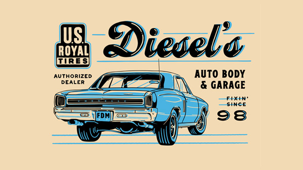
Image Source: Dribbble
15. Dynamic Car Logo Icons
Car company logos need to showcase movement or direction through their icons. A stationery logo just doesn’t cut it when it comes to automobile brand identities. So through your icon curves, shifts, and layout, try to show movement and dynamic when designing an automobile logo.
Image Source: Dribbble
16. Scooter Logo
A scooter logo can work perfectly for a delivery service, for a repair shop, for a scooter manufacturing business, and can also work as a great personal branding icon.
Image Source: Dribbble
17. More Than A Single Icon
An auto workshop performs multiple tasks in its care for automobiles. You can choose to showcase a few of them by displaying some well-placed icons.

Image Source: LogoPond
18. Creative Use Of Imagery
A sure-fire way you can stand above the rest in your industry is to think of creative ways you can work with you’ve got. Using a simple band-aid icon for a used car dealership logo is a genius idea.
Image Source: LogoPond
19. Black + Orange = Fierce
There are some color combinations that never miss the mark no matter the context. Black and orange is one such combo. Together, they spell fierceness, daring, and adventure. Perfect color combination for an auto repair shop with expert mechanics and specialized services (such as restoring old Harley-Davidsons).
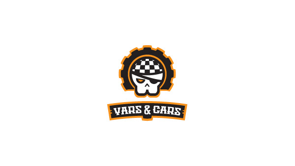
Image Source: LogoPond
20. Road Strips For An Automobile Business Logo
Another great automobile logo icon is black/white or black/yellow road strips. People immediately recognize them and they offer easy recall for your brand.

Image Source: LogoPond
The Sum Up
So, what do you think of these awesome designs? Shout off into the comments to tell us which your favorite is, and share your designs too. In the next post, we will be discussing various logo styles that you can use for your automobile brands and why they work.
Check Out Our Customized Logo Maker Tools:
Use Wheels Icon To Design Logo
Generate Supercar Logo Designs


