Alignment in graphic design isn’t a new principle; it’s the foundation upon which your design stands and appears attractive to the viewers. In simple terms, alignment refers to the arrangement of different design elements on various positions. Alignment declutters the design and frees it from becoming a disorderly chaos. Believe me; no one likes a design with scattered text and misaligned graphics. It’s the worst design sin anyone can commit!
Defining Alignment In Design
Think about shapes for a moment. If you misalign any one of the lines in a triangle, it won’t be called a triangle. The whole idea of alignment revolves around the proximity of different design elements. The closer the elements are aligned, the clearer the whole picture will be. Even in the real world, we explicitly exercise the art of alignment such as in symmetrical logo design, web design or other forms of design.

Imagine two scenarios. In the first one, you’re standing in an organized coffee shop and peacefully waiting for your turn. In the second one, you’re panicking about where to stand when you can’t even see where the line started. Which one would you prefer? Probably the first one, right? That’s because each figure in our picture is acting synchronous to the other, all thanks to the alignment. The latter one is what you would see when there’s no arrangement and no order.
All of these examples apply similarly to the graphic design domain. Every element is lost and can’t find its perfect spot if there’s no alignment. Without each other, they just fall apart. Thus, alignment is the crucial aspect each of your design should be based on.
Why Is Alignment So Important In Design?
Ask any designer why alignment is important and he’ll lay out each fact why it isn’t. But let’s save those questions for later. Right now, let’s discuss the importance of alignment in design. Since it’s that simple, it helps the graphic designers organize different components in their design. Alignment provides a robust structure, thus creating geometric balance in logo. If the alignment is done right in any design project, the result comes out clear, professional, and crisp. Plus, it won’t look like something just tied by a loose rope. The second important thing is your audience. People coming across your design might find it easier to skim the page in one go. Their eyes draw naturally to the picture-perfect logical sequence in your work and the interest keeps developing.
Types Of Alignment
Alignment is all about providing the sequence to your work and its elements in congruence with an imaginary margin or line. There are two basic types of alignment, which depends on their use of the margin differently. These are:
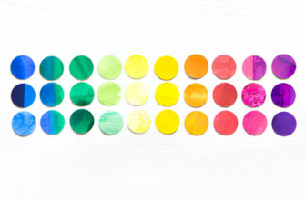
1. Edge Alignment– As the name suggests, the edge alignment refers to the placement of content on either edge of the page or the canvas. Whether the elements are placed on the right, left, top, or the bottom of the page, everything is kept on the edge. If the edge alignment organizes elements on the left or right, it’s called horizontal alignment, but if the elements are arranged on top or bottom edge, it is known as vertical alignment. When we’re placing the text, it means that all the lines will be adjusted to the left edge. If you’re placing right-handed text, then it will be aligned to the right edge of the page.

2. Center Alignment– this is the second type of alignment which places the content on the central imaginary line. Take an example of center aligned text. Each text might have a different width, but each is placed just at the center of the page. The same rule applies to the text and other elements in commercial graphic designers logo design as well. The funny thing is, if the central imaginary line is running from top to bottom, what we get is horizontal alignment. Similarly, if the central line runs along the horizontal plane from one side to another, our content gets vertically aligned. It might seem a bit of topsy-turvy, but it works well!

Horizontal Alignment And The Text
What did you first think of when we mentioned the horizontal alignment? For a fragment of time, you must’ve thought about the text in general, which is correct, but there are other elements to consider as well. Anyhow, the text always looks good when it’s placed horizontally and that is why the horizontal alignment comes into play whenever we’re dealing with text based logos.
Now that we’re coming round the placement of text in design or photos, let’s discuss the 4 common types of alignments – center, justified, flush left, and flush right.
1. Center Alignment

As the name indicates, the design or text is anchored right on top of the center margin, which makes it a good case for headers. Placing the text in the center gives your text the symmetrical look and makes it look more organized. But there’s one problem. It might tire your readers and dwindle their interest in your design. Also, centralizing your text will make reading even harder for your audience, which you really don’t want. It’s better to use small text instead of large paragraphs.
2. Justified Alignment

Justified alignment provides a neat and clean look to your text. Not only does it give the right shape but also creates equal margins on both sides. It’s ideal for crafting professional documents that are organization-oriented, with multiple text columns. You can confront one problem here though. Unwanted gaps might appear in between the words in your text, which might make it look unattractive and dull.
3. Flush Left Or Left Alignment

This is the most common and widely used type of horizontal alignment. It places the text on the left edge with a tight left-hand margin and a soft edge on the right. It gives a sense of comfort and natural feel to your audience, but you can still find ways to use it creatively. If you’re using large paragraphs, the orientation and the unequal edge distribution allows us to move fluently with the flow. If your paragraphs are left aligned, make sure your header is too.
4. Flush Right Or Right Alignment

Much less popular than its counterparts, flush right is used to deliver a unique sense to the elements used in the logo design for businesses. The text in this alignment type is placed hard on the right-hand margin, with the left side being soft and uneven.
Just like the center-aligned text, placement of large text should be avoided in this orientation as well. Using large chunks of paragraphs with this alignment challenges the readers, who are used to the flush left in English. The shorter the lines, the easier they are to read as they’ll gain more weight and importance. The use of this alignment type can be used in interesting ways, but the overuse might frustrate the audience.
One more thing; flush right is also used for languages that are oriented from right to left. It increases the readability to give convenience to the readers.
Want to Make the Textual Elements Work for You? Check Out 14 Touchstones To Get The Text Right!
Aligning The Elements: What To Consider
Designers have the habit to experiment with various alignment types. That is why they are less likely to stick to one alignment during the course of their design process. If we take an in-depth look, designs are usually made on grids, which support the design and maintain its consistency. Plus, when the design is completed, the grid is visible to none other than the designer.
If your design structure is strong, you must align the elements carefully to give a neater and crisper look your idea logo. Here is what you need to consider regarding various design elements and their alignment. In a similar vein, ensuring the alignment of your business goals with the right expertise is crucial, especially when considering software development outsourcing services.
• Text
Text in each alignment style is self-explanatory, only when it’s used carefully. But you must think once at least to see how each alignment fits your design and how well do they go along. For instance, you can use headers and short text for center alignment, which might be a bit confusing for the readers. You also need to consider if your approach is multicultural or culture-specific. You can use a universal language for the former, but for the latter, you can use either flush left or flush right.
• Images
Placing the images can be rather difficult than placing the text. It isn’t as easier because the alignment refers to the size of each image. You can place smaller images such as website logo within your content without even disrupting the content itself. Larger images, on the other hand, are known for interrupting the reading flow, and hence, are more difficult to place inside the content.
What you can do is place the images outside your content, i.e. in between paragraphs and before/after the content. You can also assign slots from images in the gird as well by employing advanced clipping techniques. On a relative note, you can easily employ the first option and make it work with the image aligned centrally in between text paragraphs. For high-quality, diverse images that can elevate your content’s visual appeal, many content creators turn to stock photo services like Depositphotos, which offers a wide range of options suitable for various placement strategies.
• Background Images
The alignment of background images is one of the trickiest parts as it is relevant to your design and the subject as well as the background image size. The alignment of these images can be pretty rigid in terms of their designation and orientation. Make sure that the background images you choose comply with the overall design and also the alignment or else your design would be a total disaster. You must be able to question the parts of your design with respect to their alignment. Think about how you can polish your design and make it work well.
Mastering The Art Of Alignment In Graphic Design
Alignment is the organization and organization is an art, regardless of the subject matter. Placing your content, online logo design and other elements is a way to not only bind them together, but also is a way to make the overall design more visually appealing.
In this post, we covered alignment, its types, and its behavior with different elements. As a designer, you must know the basic principle of alignment like the palm of your hand. Create and position the text along with different media and keep experimenting. That’s how you’re going to learn, isn’t it?
Try Our Online Logo Maker Tool:
Create Logo Design For Online Magazines
Logo Design with Order
Organization Logo Maker
Pattern Makers Logo
Puzzle Logo Design Generator
Quick Logo Ideas
Sphere Logo Creator
Logo Designs Worldwide
Ying Yang Logo