Branding spaces on digital platforms are getting smaller. There isn’t a lot of space on a smartwatch for example to display a brand’s full-scale logo. With combination marks thus becoming obsolete in digital spaces, brandmark logos are rushing to the rescue!
These neat little graphics are optimized to be full of meaning. With descriptive shapes, conceptual imagery, and clever use of colors, brandmark logos help brands stay connected with their audiences in ever-changing digital environments.
Learn what makes brandmark logos so successful and how to get the most value out of these fabulous graphics.
What is a brandmark logo?
A brandmark — also known as – a logo mark — is a type of logo design conveyed exclusively through imagery. Without any brand name in the logo, only icons or symbols represent a company, maximizing the brand’s confident appeal.
Remember that a brandmark is different than a brandmark logo. The former refers to symbols or icons in combination style logos but the latter signifies logo designs that only consist of visual imagery.
Brandmarks are usually born of a transition. Combination marks (text + icon) gain enough recognition in the market that the brand feels comfortable removing its name from the logo. But exceptional examples do exist where brands are launched with their icon-only logos. A beloved example is the WWF Panda. While some versions do include the brand name in the logo, those are exceptions and not the rule.
For the most part, the WWF Panda reigns alone on the canvas (and on our hearts!) and extolls the effectiveness of brandmark logos.
Brandmark vs. wordmark vs. logo design
How can you know that a logomark or a brandmark is the right one for you if you don’t know what distinguishes it from the rest?
Take a look at the key differences between a brandmark, a wordmark, and a full-version logo.
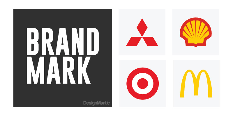
Brandmark: It’s the icon, symbol, or pictorial graphic in the logo. While a brandmark can be a variation of the brand’s main logo, the brandmark logo is a full-body graphic and exists without the brand name.
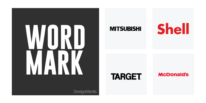
Wordmark: Also known as logotypes, wordmarks are brand names stylized in a specific typeface. Similar to brandmark logos, a wordmark logo is a whole logo design while the wordmark can just be the brand name in a logo design.
Logo design: Logo designs — in this context — refer to combination logos (icon and text). But when split into categories, they can be exclusive brandmarks (i.e., Apple logo) or exclusive wordmarks (DesignMantic logo).
Types of brandmark logos
Brandmark logo designs come in all forms and styles. You can judge the right one for your brand depending on which one serves your goals the best.
We classify brandmark logos into four categories explained below.
– Descriptive brandmark logos
A descriptive brandmark logo is a pictorial or symbolic icon reflecting the nature of the product or the service. They are the most meaningful logo designs and offer an immediate understanding of the company’s core offer.
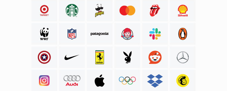
The bun symbols in the Burger King icon, the open box icon in the Dropbox logo, and Instagram’s camera icon are examples of descriptive brandmarks.
– Abstract brandmark
An abstract brandmark logo is a conceptual shape and mark. Open to interpretation, these designs may invite more engagement and help the brand portray a more nuanced identity.
Think of them as more mysterious peers of pictorial graphics. While these images may contain specific shapes and forms, those shapes may not necessarily reflect the core product or service of the brand.
The Apple logo for example doesn’t reflect a grocer’s shop. The Pepsi logo doesn’t sell traveling services. And the Nike swoosh isn’t a logo for a productivity tool.
– Emblem brandmark
An emblem brandmark is a logo mark enclosed in a shield or badge. Emblems (aka ‘coat of arms’) are traditional symbols of history and legacy. If you’ve got a legacy brand to promote or wish to showcase your brand’s expertise in the field, a brandmark is the most natural choice to establish authority.
Starbucks uses an emblem-based brandmark to do exactly that. Their siren-inside-a-shield logo demonstrates their mastery of coffee and cafe culture. Ferrari’s prancing horse logo and Captain America’s shield exemplify how wide-ranging emblem brandmarks can be.
– Mascot brandmarks
Brandmarks, where the mascots are the logos themselves, are called mascot brandmarks. They are a mouthful to say but they are highly efficient at humanizing the brands than traditional mascots. Why? Unlike typical settings where mascots are secondary parts of a broad brand identity, mascot brandmarks are the whole logo design themselves.
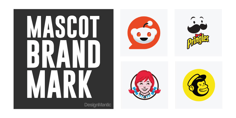
The Pringles logo and the Reddit logo are popular mascot brandmarks. While both brands do have supportive wordmarks for special uses, their mascot brandmarks are their primary logo versions and are marketed as such.
When to choose a brandmark logo
Different kinds of logo designs serve different purposes. To get the most benefits out of your brandmark logo, you must use it appropriately and strategically.
- When your brand has become really famous. You can afford to ditch your brand name from the logo when the brand has gained widespread recognition, much like Apple did.
- When you’re pressed for space. Brandmarks are ideal fits for smaller branding spaces like website favicons or app containers. On a tiny screen of a digital watch where your full-version logo may look crazy, a slick wordmark will keep things clean.
- When you’ve got a tricky brand name. Mastercard dropped its name from the logo because they realized they’ve got a pretty long name. Plus they had enough brand capital to survive on the brandmark alone which they are doing with aplomb.
- When you have an extensive marketing budget. Brandmark logos have insane branding power because images are a universal language. But it will take everything you’ve got to get people to associate a picture with a brand without the brand name. Especially if you are a new business! So if your marketing budget can stomach it, create a brandmark from the start and build on its power.
Best examples of the brandmark logo
Want to streamline your brand identity and get rid of the fluff? Take inspiration from these fearless brands and their beautiful brandmarks!
The brandmark of the champions.
Take a bite and innovate!
Rock, Roll, and Risque!

The sexiest bunny rabbit on the list.

Fall in love with saving animals.

Is it the rising sun or a golden crown?

Always on the mark.
We are the competition.

Get out and look good!

The rings to rule them all!

The magical shield of Chris Evans.

It’s the bird logo that every reader knows.

The pioneer of gradients in logo.
Making pared-down branding look chic.

Sports. Championship. Unity.
The star of innovation and luxury.
How to create an effective brandmark
And what design rules govern the perfection of brandmark logos? Let’s see.
– Choose simple and unique shapes
There’s a reason our brains love images. They are easy to understand and even easier to remember. Don’t make things complicated for the brain by creating overly complicated or conceptual graphics.
Nike is a world-famous icon for a reason. It’s simple to understand and riveting in its versatile appeal. No matter who you show it all around the world, they’ll be able to understand the icon as something that represents doing things or accomplishing stuff.
By keeping the shape simple and unique, you give your brand universal charm.
– Select relevant imagery
Your audiences do not have a lot of time to sit around and ponder over the meaning of your brand logo! That’s not what the logo is for. Its main job is to assist people in recognizing your brand and relevant imagery can help you do that effectively.
But relevant imagery does not mean literal imagery. Choose visuals that represent your brand’s core product or personality without being too obvious.

Take the Penguin Books logo as a ready example. It’s a bird logo design on a publishing company’s brand. It shouldn’t work but it does. Why? Because the imagery may not be related, it’s relevant.
Instead of a printing press, it shows a beloved bird that people associate with love, beauty, uniqueness, and adaptability. Perfect synonyms for a brand working to make high-quality printing books more accessible to the masses.
– Ensure adaptability to changing backgrounds
There are a few ways you can make your brandmark logo look perfect across different backgrounds. One of them is to make sure the shape or symbol holds with or without colors. Design the logo in black and white to confirm the fidelity of the shape. If it can convey meaning without relying on colors, you’ve got a strong icon for the logo.
Another way to ensure adaptability is to create multiple versions of the primary logo.
Such as:
- A brandmark in greyscale
- A brandmark in gradient colors
- A brandmark with only the outline of the shape
- A brandmark that splits the shape in two further reducing the icon to fit smaller spaces
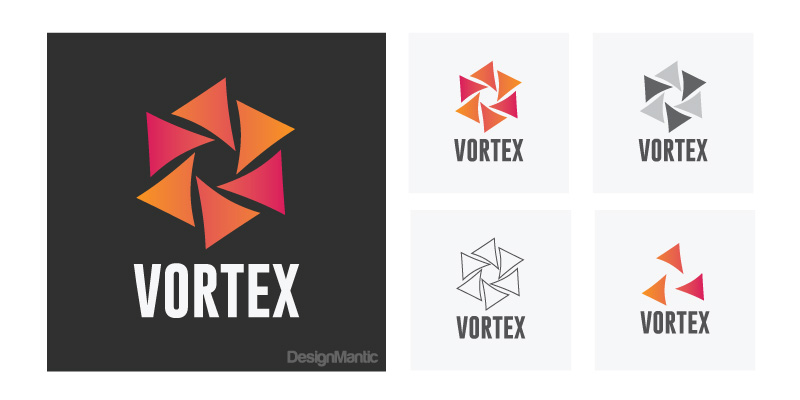
These variations will ensure that you always have a version to fall back on when your preferred one doesn’t work in a given environment.
-
Choose a striking color theme
The colors you choose are going to be super important in brandmark logos. They can make a simple shop pop and a somewhat complex shape to feel more amicable. Depending on the kind of color palette you’ve chosen.

Go with a bold and confident color theme if you are working with a flat and simple shape. We love what Firefox has done with its brand logo. An assuming circle has become that much more powerful with those magnificent orange and purple themes.

Not being edgy enough with colors will give you something very similar to the X logo design which Reddit agrees “looks like a new startup that hasn’t bothered to hire a designer”.
– It must be fit for print
Count printing needs in the mix when you design your brandmark logo. In addition to digital spaces, your brandmark will also need to go on print surfaces like brand merchandise, product packaging, business cards, and more.

A print-ready logo will ensure your marketing can carry on without interruptions. It will take care of the scalability of the logo so whether you display the logo on the App Store or blow it up on a gigantic billboard, the logo looks chic and true.
Create a brandmark logo with DesignMantic
In 2024, it’s all about keeping it pared down. From the Johnson and Johnson logo redesign to the Lamborghini logo makeover, brands are looking for ways to shed unnecessary design weight and create leaner brand identities.
Brandmarks have seen a massive boom and renewed love from marketers in all this drama. If you are interested in experimenting with a brandmark logo and are unsure where to start, why not try our free logo maker and see if you like what it can do?
All our logo templates are 100% customizable and give you plenty of icons, symbols, and shapes to explore. Give it a try today.

