Abstract logo designs are more than just shapes and patterns. They are the perfect styles of designs as they allow the business and designers to represent multiple aspects of the brand in a single image. They are also great for those who want to avoid literal imagery and want to go for something more interesting and creative.
Abstract logo designs mostly rely on shapes to represent their meanings. However, they are often paired with typography to spell out the brand name. This approach works really well in the long run for the business’ success as the abstract shape can gain longevity as the brand’s signature logo mark.
Before you decide to represent your brand with an abstract logo shape, here are a few designs to help you get acquainted with them. Explore these 20 unique designs created by professionals and determine which shapes, patterns, and ideas seem the closest to your brand.
1. Sound Waves For A Music Company
Some industries are more suited to abstract design than others. For example, the entertainment industry. With an unbroken line and a few strokes in opposing directions, you can create a very subtle and highly on-point mark for a music company.
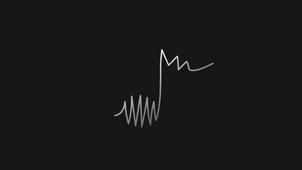
Image Source: Behance
2. Abstract Wordmark
Brands often use abstract wordmarks to characterize their brand names. In time, these abstract wordmarks can come to symbolize the whole brand itself, without any help from typography.
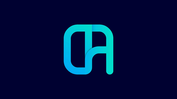
Image Source: Behance
Related: Do’s and Don’ts of Wordmark Logos: A Guide for Businesses
3. Inspired By The Master
Picasso was the master artist behind the abstract movement. Look at the image below that has been inspired by Picasso’s artistic style.
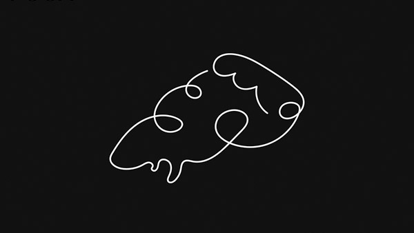
Image Source: Behance
4. Illustrative Abstract Icons
Abstract icons do not always have to undecipherable or complicated shapes. Illustrative abstract logos help create shapes from negative spaces, through elaborate drawings, and simple marks.

Image Source: Behance
5. Repeated Patterns
A lot of times, your abstract logo can repeat a single pattern multiple times to create a homogenous shape.
Image Source: Behance
6. Introducing Symmetry
Symmetry is an important concept of logo design work. Abstract logos usually rely on the uniformity that a symmetrical pattern provides to represent key traits of the brands, such as reliability, trustworthiness, and strength.
Circles in a pattern logo
7. Abstract Image With Intricate Patterns
Feel free to include something detailed and complicated to spice things up in your simple abstract shape.
B logo design with abstract artwork
8. Solid Abstract Shape
Abstract logos with solid shapes are perhaps the most popular forms of abstract branding designs there are. They are quite simple in execution and understanding and thus send very clear brand messages.
Clever logo idea for scary games
9. Brush Strokes
Use some simple brush strokes to transform a simple abstract logo image to something more clever. Keep the color choice and color style minimum so as not to overwhelm the design.
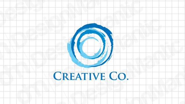
Brush logo ideas with minimum colors
10. Geometric Shapes
Geometric shapes and abstract designs go hand in hand. As solid and stable shapes, they add weight to the abstract logo without crowding the design.
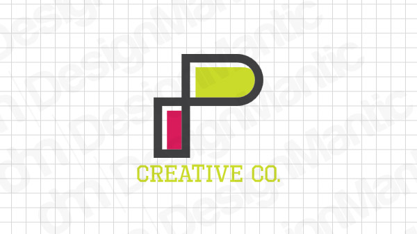
P logo with geometric shapes
11. Use Your Brand Initial
You can create an interesting abstract logo image by using your brand initial and turning it into a solid shape that you can repeat. The white space can also help bring out the design.
Image Source: Dribbble
12. Abstract Letter Marks
Abstract letter marks work as standalone logo shapes. They are quite popular in the technology market as well as the gaming industry.
Image Source: Dribbble
13. 3D Abstract Logo
Use 3D shapes to design your abstract logo. The approach adds another layer of meaning and dimension to the whole design.
Image Source: Dribbble
14. Merging Two Shapes
This abstract logo design below merges the letter ‘M’ and the play button icon to devise a clever form. To achieve such a result, think of organic ways instead of forcing the design.
Image Source: Dribbble
15. Dynamic Abstract Logos
Abstract shapes do not rely on any rules or structure. Therefore, they are the perfect way to represent feeling and movement in the design.
Image Source: Dribbble
16. Intricate Patterns
Abstract logo marks with intricate patterns are some of the most soothing and calming logo designs there are. You’ll usually see them on spa logos, community logos, health and wellness logos, and such.
Image Source: Logopond
17. Saying It With Color
The tech industry is highly creative, imaginative, and inspiring. Abstract logos that are designed for tech brands often use bright, beautiful shades to enhance the appeal of their brand logos.
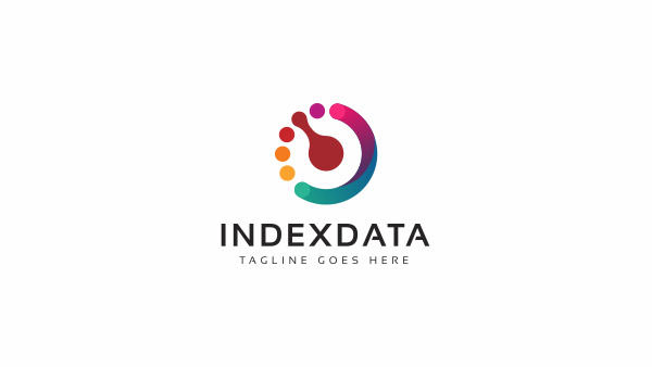
Image Source: Logopond
18. A Tiled Image
While most of the time an abstract logo isn’t looking to be literal, but sometimes unembellished and simple representation of the brand can be achieved with your routine 2D tiles.
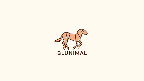
Image Source: Logopond
19. Encourage The Feels
Abstract imagery is about representing feelings, so let your imagination run wild as you think of unique ways you can capture a brand’s integral trait through a visibly emotion-inciting image.
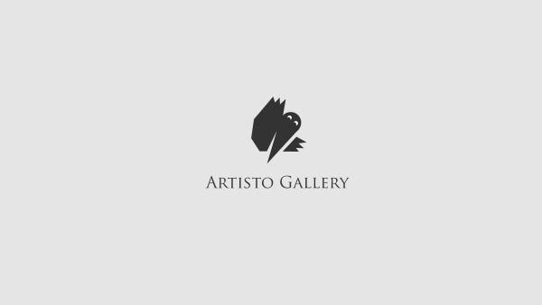
Image Source: Logopond
20. Flip The Shape
As shown in this image, one part of the abstract logo shape has been flipped to not only become the other half of the letter N but also to represent the curve of the river.
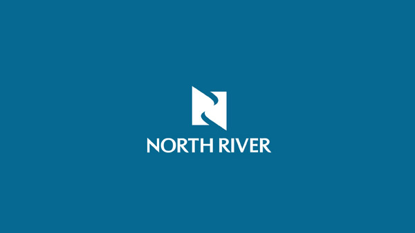
Image Source: Logopond
Feeling Inspired Yet?
Hopefully, our unique collection has given you an overview of what the world of abstract logo design is all about. As you get ready to create abstract images for your client, make sure you are keeping the brand idea in mind. While abstract logos may not have many rules but there is one rule in branding that you must always follow: if it isn’t working for the brand, it isn’t worth the effort.
Check Out Our Tailored Logo Maker:
Use of colors in abstract logos

