What strikes your mind when you think ‘abstract’?
The term ‘abstract’ isn’t coined just for paintings; it’s around us in the form of famous artistic logos that have been symbolizing their creativity and vividness of unique thoughts in the most simplistic yet ingenious style.
You can use a text logo or the one that uses a kaleidoscope of colors, but designing an abstract logo gives you an opportunity to exhibit your business in a unique way.
As abstract logos usually represent geometric forms or simplistic versions of organic forms, one can’t immediately connect the abstract form and the company persona. Some can be easy to interpret, while some can be a good brain teaser.
However, an abstract logo establishes a new identity for a business that (if done right) parallels the goals and ideas of the business. These logos are used by wide-ranging businesses to deliver their tone and mood, apart from the business personality.
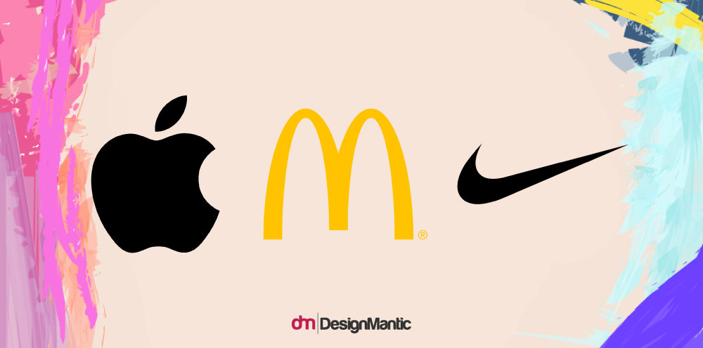
Perhaps you’re in the middle of an abstract-thought crisis, when inspiration from Apple, McDonald’s, and Nike hits you and in an instant, you get the idea for your next adventure logo design. Notice what they all have in common. Figuratively, all have nothing in common except the concept of uniqueness.
This gives you an idea; why don’t you design your own abstract logo to stand out from the crowd? It’s new, it’s modern, and it never grows old!
You can create a logo idea, define your objective, and fine-tune your ideas to fit the abstract thought bubbling in your mind. But there are a few things to keep in mind when designing an abstract logo or using free logo services.
Prepare your notebooks and get ready for some do’s and don’ts guide for abstract logo design.
The Do’s Of Designing An Abstract Logo
1. Simple Yet Unique
Abstract logos are known for the different concepts and ideas they deliver. One of the attributes of a good abstract logo is the simplicity of style, mood, and tone.
You can make a logo that represents your unexpected out-of-the-box ideas and gives your audience some food for thought with a dose of simplicity.
Even if you are making a colorful abstract logo, make it simple and present the image clear and crisp, so that your audience gets a clue or gets intrigued and curious about what the brand’s mystery.
2. A Logo Worth Remembering
Abstract logos have that thing about them that makes them special and captivating. It should represent a multitude of ideas that should converge to the core of your brand.
For example, according to Rob Janoff, the designer of the original Apple logo,
Rob incorporated a rainbow-striped apple to indicate Apple’s futuristic ability to show images in color. A deep message with a sense of modernity has made Apple’s rainbow image memorable ever since.
3. Do Your Research
Since your brand image represents your business ideas or at least some bits of it, you should consider going for a logo design that responds to the aspects of your business and delivers the notion of connectedness to the audience.
Make sure you do your research to design an authority logo that is a reflection of your own thoughts and is intended to be perceived clearly by your audience.
4. Adapt A Versatile Design
Although abstract logo designs don’t ask for much, it’s necessary to cover its overall features. Ensure that your design is adaptable across various media platforms and has a voice that communicates across various themes.
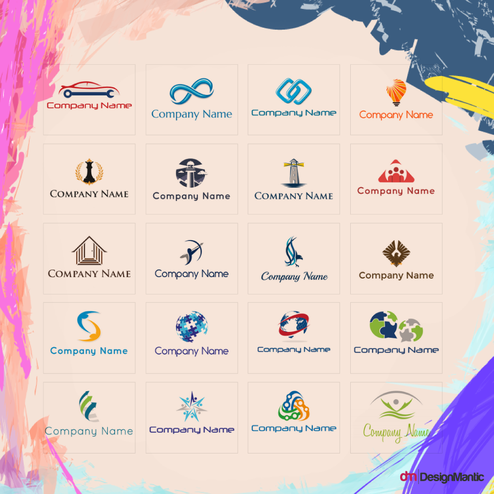
If you want an elegant DIY logo design that suits your style, feel free to check out these refined abstract logos from DesignMantic:
5. Coloring The Logo Abstract
Once you’ve come up with a final design, the fun yet challenging part comes next. The colors you choose when using a logo maker should encapsulate your ideas and messages you want your audience to perceive.
Just sit and think for a while; Are my colors as strong as the visuals of my abstract design? As a matter of fact, colors are responsible for increasing brand identification up to 80%.
Moreover, research has clearly shown that about 90% people are influenced by the brand logo color only. Choose wisely and think about the companies who have pulled it off with their color psychology in their abstract logos (Nike’s Swoosh is a good example!).
The Don’ts Of Designing An Abstract Logo
1. Design Suffocation
An abstract logo should be a design that indicates boldness of thought and company profile, that’s why you shouldn’t be overdetailing it.
Adding in too much detail would definitely kill the purpose and overshadow its creativity.
2. Copycatting Famous Brands
An abstract logo should be a proof of your originality and individuality, so it shouldn’t look like any other company’s logo. The similarity in different logos create a notion of distrust among the audience and reflects your lack of skills to generate a logo for your own identity.
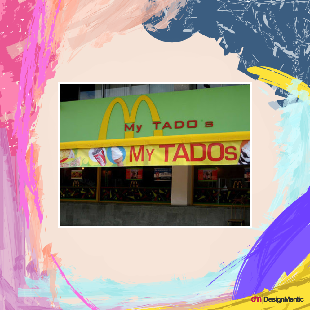
Image: Ask Designers
For instance, if you design an abstract logo that looks like the McDonald’s golden arches, then your audience will never be able to grasp the concept behind that logo and will probably confuse it for a copycat of fast food logo design.
3. Being Over-Simplistic
One of the most common don’ts of designing an abstract logo is making it seem too simple, too void, too devoid of life and energy.
Just stop right there!
You can get rid of redundant and arbitrary shapes and colors but that definitely doesn’t mean that you should crop out the entire thing and leave it looking like nothing less than a circle dangling on the screen.
4. Color Collision
Finalizing your design is one thing but another critical issue that surges is the choice of colors.
Related: What Color Should Your Logo Design Be
You must understand that using colors that don’t match will only damage your brand collaterally. Thus, it’s better to keep your mind present and choose colors that encompass all the areas of your company you’d like to display.
5. Giving Off The Uninspiring Vibe
How would you feel if your company is well-off but people find it repulsive because your abstract brand logo abhors and repels them?
It doesn’t seem nice and is never a good place to start. Design your fresh logo in such a way that it triggers different emotions in different people.
Many have been contemplating over Apple’s abstract logos, which have given rise to several theories and inspiring ideas.
Keep Calm And Design Abstract
Abstract logos come in all shapes and sizes and provoke multiple areas of the human psyche. Designing your brand logo isn’t that hard once you’re into it but you got to be prepared for how your ideas can turn out to be. It doesn’t necessarily have to represent your overall company approach.
Make a design that makes you proud and leaves your audience amused and excited. Just remember – Think big and create abstract!
Try Our Personalized Logo Maker:
Art and Craft Shops Logo
Make Art Painting and Drawing Lessons Logo
Draw Logo Designs With Shapes
Use Shadows in Logo Design
Fantasy Logo Maker
DIY Picture Logo Design
Oil Paint Logo GeneratorTraditional Art Logo Creator
Design Quick Logo Template


