Here’s a harsh truth; historically, the financial industry had been a homogenous market and this is what financial marketers had been contending with since marketing carved a niche in the banking industry. After all, almost every bank has the same offerings; loans, checking, savings, and a few trivial side products added for good measure. However, are all the banks essentially the same? If you just nodded your head in approval, your bank might be in the throes of a brand identity crisis! Take a moment and ask yourself the following questions:
- Who are we?
- How do we differentiate ourselves?
- What do we do differently?
When bared of all facades, all banks are technically the same, yet why is one favored over the other? In the past, rates have had precedency as the chief value of any financial proposition, while branding had no seat at all. However, the market of today has been impacted by an explosive change that has left the stick-in-the-mud marketers in conundrum.
Even a few years ago, no one would have believed the touch points customers have with banks. A contemporary realization has suddenly dawned upon the traditional banking sector; if you fail to build your bank logo right, or even worse, if your brand loses its relevance and meaning to your customers, there will be nowhere to hide. Times are ruthless and customers are unforgiving!
What financial marketers need to do to is to start denying the fact that all banks are essentially the same because it’s far from the truth. Banks can also differentiate themselves and impinge their brands upon the minds of the customers, albeit not at the product level necessarily. In all honesty, banks do offer services along the same lines, maybe with some inventive variations thrown in, but in the end they are all selling a debit card and a checking account. How gorgeously designed the debit card is, is a moot point.
Where banks CAN differentiate themselves is when it comes to the question of WHO the bank is. It is becoming indispensable for marketers to treat the banking brand as a breathing, living being, which is how people are going to connect with it. It’s not necessarily the cute puppy debit card or the checking account people like. It’s the connection that your brand fosters in the minds of the consumers and the loyalty it breeds.
Here are the 4 quintessential branding elements that marketers can leverage to aid in the process of identifying the brand of the bank and carving out a unique identity that sticks in the minds of the customers for years to come:
How To Design A Memorable Bank Logo?
An industry that thrives on other people’s money should exude commitment, trust, professionalism, and establish a level of confidence and expertise in their capabilities to manage money. It takes a lot of persuasion to convince people to entrust you their hard earned money. Since people are inherently suspicious of financial institutions, it makes it all the more imperative for banks to project a potent identity.
A viable banking logo is the surrogate voice of your brand and should ideally communicate with an audience and reflect the trusting personality and the business division of the bank. Tiniest details, such as the color of your logo, the typography used, images and icons incorporated, and the shape and size of your logo can be leveraged to articulate your bank message.
This is why banks need to garner a well-designed identity before they become e a faceless entity in the vast sea. In fact, logos are so vital for your banking brand that a bad logo can actually drive customers away and make them distrustful of you! However, since most bank logos incorporate similar elements such as colors and icons, finding an original bank logo that perfectly conveys your business message across to your audience and embodies the true essence of your bank is what sets your bank apart.
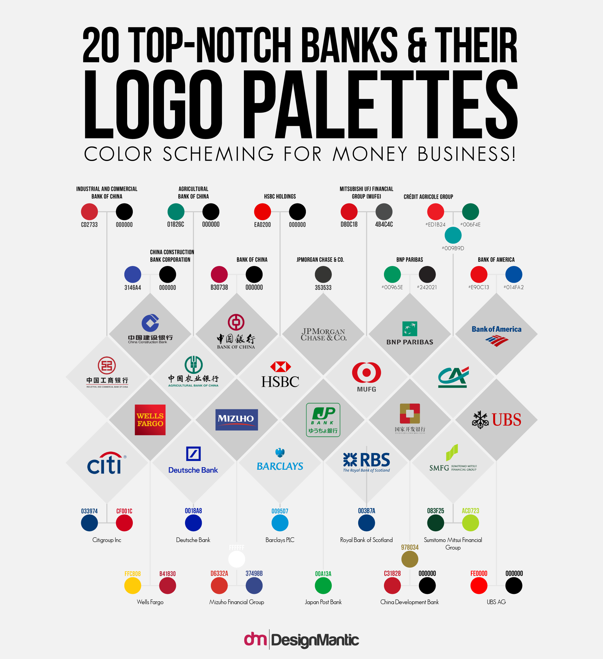
Popular Color Palettes For Bank Logos: Explore in detail here.
If you are wondering how banks communicate with their audience effectively through their logos, this is because baking and financial institutions advertise everywhere. You’ll stumble upon banking identities on retail branch signs on every bumper stickers, TV commercials, street corners, and the writing stationery the bank employs. By capitalizing on the prowess of logos as their primary marketing tools, banks glean the power to captivate potential customers and retain the old ones.
What’s In Popular Bank Logos?
Here are some powerful bank logos that deliver the true essence and meaning of banking sector:
- Trustworthiness
- Diversity
- Comfort and Belief
- Friendliness
- Patriotism
1. Citibank, Designed By Paula Scher
The logo offers a promise of security. By incorporating the red arc over the lowercase “t” in Citibank, the logo appears to be a powerful umbrella taking care of and sheltering its trustworthy patrons.
2. Suntrust, Designed By Siegel And Gale
The revamped logo of the Sun Trust bank is a beacon that reflects the diverse range, energy, and the warmth of the organization. The logo is donned up in warm hues to instill a feeling of internal warmth for the SunTrust brand and it’s tight-knit, local community.
3. Chase Manhattan Bank, Designed By Chermayeff And Geismar
While JPMorgan bank has merged with the Chase Manhattan Bank, The latter has still retained its original abstract symbol. The logo reinforced the element of trust by repeating the shape over and over again. The repetitive symbol is designed to nurture a sense of familiarity which makes patrons feel comfortable with entrusting their assets to the organization.
4. Bank Of New Zealand, Designed By DNA Design Auckland
The use of the blue color alone suffices to depict loyalty, trust, and confidence. The typeface Serrano, with its welcoming italicized font, has been specifically designed for the Bank. The logo appears trustworthy, friendly, and modern all at once; all the things you look for in a bank.
5. Bank Of America, Designed By Bob Wolf
The icon used for the Bank of America logo refers to the USA Flag, which is synonymous with patriotism. They say that the best things in life come in 3’s, and this is what you see here. The double-lined pattern repeats thrice to portray familiarity and reinforcement. In addition, we are accustomed to associate blue and red duo with trust, power, strength, and excitement.
Related: The Power Combo Of Red, Blue and White!
All these successful banks have employed ingenious branding designs that communicate crucial information about their strengths and values in a subconsciously effective and non-verbal way. Since the banking industry is a cutthroat arena, logo design may be a significant factor that can make or break an organization. By choosing the face of your bank wisely, you give yourself a clear advantage.
Design A Distinctive Business Card That Spreads The Word
If your banking logo is the face of the brand, a business card is the initial customary greetings one usher to a potential contact. Even in the digital age, a diligently designed business card is a road map to success and opportunity. It could help your bank make money or glean a great business partnership. Despite being a small tool in your bank’s marketing arsenal, business cards can have a significant bearing on your brand recognition and the success of your bank.
Here’s a familiar situation that most banking employees are acquainted with: You have got your networking pants on, and are aspiring to market your bank by making contacts. You stumble across someone who looks like a potential client, perhaps at an airport lounge, happy hour, industry conference, or a tradeshow. So you walk over, introduce yourself, and brief them on what you do, but most importantly, you need to find a way to hand off your contact information. In this regard, a business card makes you look professional and saves plenty of time in small talk, in addition to helping you nurture valuable business connections.
According to John Williams of Entrepreneur magazine, “Business cards, along with your manners and dress, form a client’s first impression of you.” Using business cards depicts the passion and pride you take in your banking services. In addition, business cards imprint your image in the minds of the clients when they get back to their office and find your card stacked in their pockets. Though they may not need your services today, but when they do, they are more likely to pull out your business card and give you a call than scour the web endlessly trying to remember your bank information. Make sure your employees keep a few in their laptop bags, money clip, wallets, or pockets, so the next time they encounter a prospect, they are all set to impress. These paper handshakes provide all the vital information that your contacts need to stay in touch with you.
What Makes A Great Banking Business Card Design?
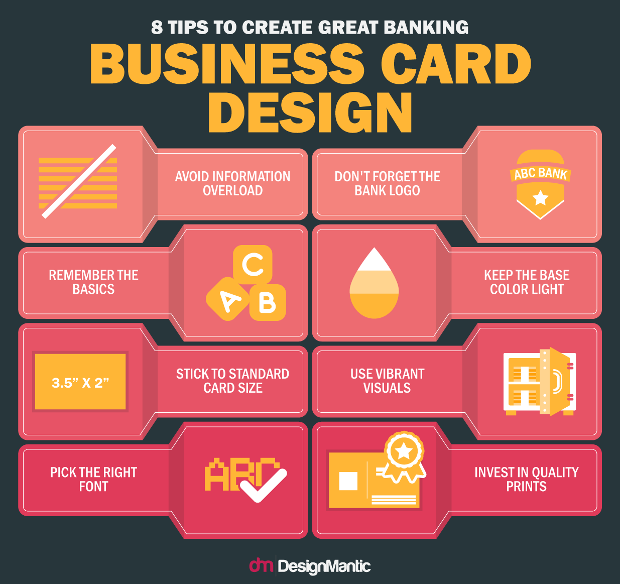
Here are few pointers to keep in mind when designing a business card for banks:
- Keep Clutter to a minimum and be deliberate about what information you want to include. The name of the employee, their job title, the name of the bank, along with the business phone number, Work Email address, location of the bank, and bank website are vital pieces of information that need to go on the business cards!
- Add your Bank Logo: Your banking logo is what people recognize you from. Be sure to add the banking logo in a way that is conspicuous.
- For a Solid Card Style, Stick to the Basics. While creativity can run rampant when designing a business card, traditional style demands that you print all the information on the front, while leaving the back blank. You can incorporate supplementary copy on the back if you want, such as the mission of your bank.
- Use a Lighter Base Color. Using a lighter color, or preferably white, as a base color allows your clients to write additional information or visible notes about you on the card.
- Stick to the standard size. If you don’t want your card to be tossed out because it doesn’t fit your client’s card holder, stick to the standard size of 2″ by 3.5″. Confusing shapes or bizarre designs don’t reflect the level of solidarity banks wish to exude.
- Add value to the card by Adding Photos. When employee business cards incorporate their photos, it makes clients far more able to remember them the next time they wish to conduct business with the bank.
- Choose the Right Font. Remember that your tone is just as important as the selection of words when wooing a client. Keep your font size legible and choose the font style prudently to reflect the overall ambience of your bank.
- Spend more on Quality: While it can be tempting to skimp on quality for affordability, the message you articulate with a shoddily designed and cheap business card isn’t likely going to seem memorable and reflect badly on the quality of your banking services.
Design A Viable Banking Letterhead To Herald Your Image
Every time a bank sends a letter to its customers or prospective clients, it’s akin to sending over an ambassador from your bank to woo them over. The letterhead appearing at the top of the page is the only official representation of your business in your absence. Since your bank letterhead may be the first encounter a client has with your bank, it’s indispensable to leave a great impression that lasts.
Even when you are sending a letter to a customer who has done business with you before, the look and feel of your stationery has a powerful, yet subtle, impact on their attitudes towards your bank. Meticulous letterhead designs can help stimulate a referral or retain a customer. Thus, as with banking business cards, letterheads make for an astoundingly noteworthy marketing investment. Make sure to garner an impressive and clean design that rubs customers favorably.
A letterhead is much more than a blurb you stumble across at the top of each corporate letter. It incorporates vital pieces of information, akin to a business card, that a customer might like to know to get in touch with you. An articulate design approach, imbued with the potent combination of the bank name, logo, and contact information helps establish the message your bank is aspiring to get across and allows for easy recognition and credibility by the recipient. Banks can easily convey and capture their personality in business cards and letterheads.
Something as seemingly unpretentious as a letterhead could give away much about your business at a glance. This is why a carefully designed letterhead communicates a sense of integrity and reliability to your customers and clients, lets them know that you are passionate about what you do and have invested care into the services you tout, and exudes an air of professionalism. On the contrary, an unkempt letterhead reflects bad banking practices and makes clients less eager to associate with your bank.
A smart and professional letterhead should be aligned with your overall marketing plan, as the design you project will appear on all your business communications. Keep all modes of communication, such as banking website, business cards, social media accounts, letterheads, and envelops consistent by using the company logo, similar contact information, the same color palette and typology, and other aesthetic elements.
What It Takes To Design A Stellar Banking Letterhead?
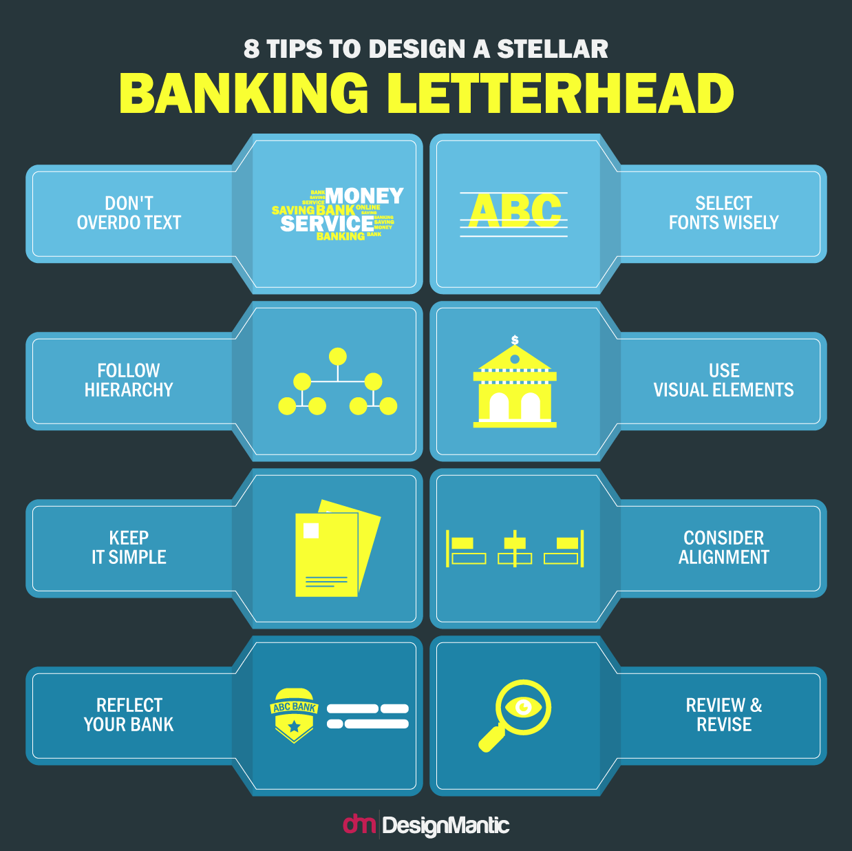
Designing a letterhead does not need to be complicated. Here are few simple tips to help you design stellar banking letterheads.
- Keep the Text Minimal: Determine the text that is absolutely quintessential for the layout. Bank name and logo should be incorporated in the letterhead at the left corner, along with other pertinent contact details, such as the contact number, Email address, and bank address printed at the right corner.
- Stick to Informational Hierarchy: Once you have decided on the text you want to include, order it by level of information, so that your final design renders the appropriate prominence to each piece of text as it deserves. Different font sizes can be used to make certain information more conspicuous than others.
- Keep it Simple. A letterhead is just a delivery mechanism and not the content itself. While the design of your bank letterhead should look and feel great, it should make way for the letter contents printed over it. It should highlight the content, not wrestle it for attention.
- Embody the Essence of your Bank. Your bank letterhead should perfectly represent your bank. This includes the bank logo, the color palette employed, and other aesthetic elements, which should be kept consistent with your overall corporate identity.
- Choose the Right Font: If you have used a particular typeface somewhere else in your corporate identity, the same typeface should be used within your letterhead design. Never use more than two fonts within your letterhead.
- Use patterns, lines, shapes, and colors. These design elements can be leveraged to accentuate the other elements of your letterhead. Footer or banner can be separated from the main body using lines, taglines and contact information can be tucked away in color filled shapes, and patterns can serve as a blending option for lines and shapes.
- Consider Alignment. Think about the medium you are printing for before you layout the elements. The shape and size of the stationery also has an impact on the alignment of your letterhead elements. For instance, when designing for a standard A4 portrait letterhead or letterhead for legal sheets, the elements will be aligned differently.
- Review Your Proof Copy many Times: Before your order your completed letterhead, print out a review copy and scrutinize it for any mistakes or design discrepancies. You can also garner a second opinion on the overall design from a third person.
Design Creative Social Media Covers For Banks
When your customers land on your bank’s social media accounts, social media covers act like the gracious smiling hosts who open the gates and usher them in! In a world where more than 40% people claim better response to visual information than plain text, Its prudent to optimize your bank’s social media channels with stunning visuals. Social media cover photos, siting right at the top of your bank’s profiles, are one of the most viable ways of capitalizing on visual content. Banking industry is perhaps construed as boring, dull, and uninventive, but your social media cover photos might say otherwise. These banner sized cover photos allow banks to reflect their established branding or express their online persona.
Your bank’s social media cover photos are great for conveying what your bank has to offer, highlighting a current campaign or a stellar marketing gimmick, and conveying brand values. To optimize your bank’s social media presence, you have to ensure that the images you are using as your social media covers are of top-notch quality, and fit the social network they are used for. Social media covers should not only draw in users but also be enticing enough to compel the customers to spread them across social networks.
How To Create Mesmerizing Social Media Covers For Your Bank?
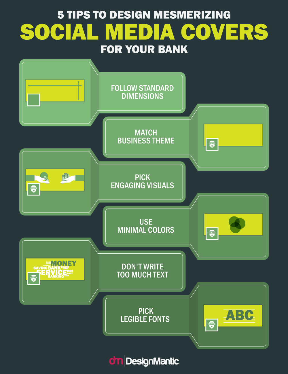
Need more engagement? Wonder how to create cover photos that inspire more interactions and page likes? Follow these tips:
- Pay Attention to Dimensions. After cover photos was introduced by Facebook, Google+ and Twitter followed suit. However, simply designing a beautiful cover photo doesn’t suffice; it has to be customized for size according to the social media channel in question, lest it stretches beyond the cover photo boundary or fails to meet it, resulting in poor aesthetics. Since each social media channel has a varying set of requirements, dimensions, positioning, and viewable area, your cover photos need to be optimized for each channel.
- The recommended size for a Facebook cover photo is 851 x 315 pixels, while the minimum dimensions you can employ are 339 x 150 pixels.
- The ideal dimensions for a Google+ cover photo are 1080 x 608 pixels, but it can be stretched up to 2120 x 1192 pixels. 480 x 270 pixels is the smallest size allowed.
- Twitter cover photos have a fixed recommended size of 1500 x 500 pixels.
- The hero image of LinkedIn has an acclaimed size of 1400 x 425 pixels.
- Use Colors that are Consistent with your bank. Your bank’s cover photos should seamlessly blend in with the rest of your branding in order to be effective. For instance, if your social media cover photo doesn’t match the colors of your logo, the page could fall at the risk of appearing disjointed. Similarly, while your display picture and cover photo do not need to be similar, they could use a complementary color palette.
- Change social Media covers Often. You should change your social media covers frequently to match or complement an upcoming banking event, the season, or any current promotions or campaigns.
- Focus on Fans. Social media is all about interacting with and fostering connections with the community on an interpersonal level. Focus on what your customers likes and what they expect to see from your bank. They key is to stay proactive and reflect your community’s mood in your social media covers.
- Use appropriate images for each platform. Do your due homework and find out what each platform means for your business and the type of audience you are likely to encounter, before choosing images for each.
- Facebook: The Facebook cover photo should directly reflect your bank and thus, you can use one of the product pictures that represent your bank. When the cover photo matches your customer’s interests, you can leverage the cover photos to make them take a specific action or feel a certain way when they land on your page.
- Twitter: Twitter is another social media channel where your customers have conversations about your bank. Since your Twitter cover photo is a great branding opportunity, use the header image to align your bank’s tagline, marketing message, and overall look and feel.
- LinkedIn: LinkedIn is a great place for banks to engage and connect with professionals and foster connections. As such, it is imperative to use a header that portrays the essence of your bank and is enticing enough for people to notice and form an image about your bank.
- Google+: Since the Google+ account is tied to the search engine itself, it is a great site to represent your bank. Every time a customer searches for your bank, Google pulls in your account information, including your social media cover. Make it count by using an image that reflects the values and believes of your bank.
One Platform To Unify Them All!
Defining the face of your bank is the first steps towards standing out from your competitors. A plethora of banks may offer the same services in the same niche, but how they brand themselves and make an impression set them apart. However, keeping abreast of the latest developments and trends in the logo design industry, keeping up with the essentials of designing a letterhead, wrecking your brains to come up with a business card design that woos your customers, and splurging a fortune on hiring graphic designers to design your social media covers can prove to be too bothersome, exasperating, and time consuming for financial institutions, and like most others, they give up and maintain a low profile.
On the Other hand, DesignMantic offers a complete branding package that allows banks to define their entire marketing strategy using viable tools available at affordable costs. Be it banking logo design, business cards, letterheads, business envelopes, and social media covers, DesignMantic software takes care of all. Since you are designing all your branding elements on the same platform, you can rest assured that consistency and integrity will receive a paramount position, which is what the banking sector stands for.

