The motto for 2016 is: “Everything old is new again.” With so many blasts from the past, it was only a matter of time before web design joined this trend and introduced the modern retro style. While this style is very popular in print projects, you’re bound to come across it in many websites, including the 25 examples featured in this round of #GivingTuesday.
But first, what’s modern retro?
Retro, in general, is a style that brings on a sense of nostalgia. It’s one of the most effective web designs when it comes to connecting sites with users. Even without brands or icons, retro has the power to make users say, “I remember this.” As a result of this user-centric design, they’re intrigued by the site and give its content and offerings a chance.
Modern retro takes generations X and Y in mind, flaunting design patterns that were popular from the 1970s to the 1990s. Also referred to as nerd culture, it’s easily identified by the following elements:
- Old-school computers and technologies
- Musical elements from that era such as tapes or boomboxes
- Abstract illustrations of people without faces
- Line art and squiggles that use bright colors
- Geometric shapes with thick strokes
- Pixel-based illustrations such as those from older video games
- Neon colors and neon-colored elements
- Custom typefaces such as bubble-style lettering and blocky slab serifs
- ‘Happy’ hues such as yellows, oranges and reds
Related: How to Pull off a Perfect Website Design Strategy and Plan
Intrigued? Here are 20 modern retro web designs that have gained the acclaim of both designers and website users for you to be inspired by.
1. The SmART of Seduction
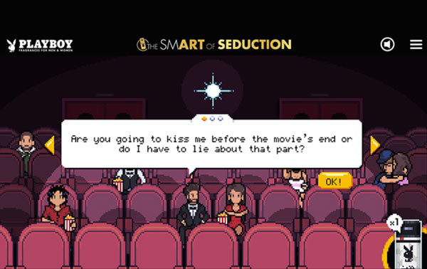
Image: Awwwards
Nominated for many prestigious web design awards including the 2016 CSS Design Awards, this one-page web design by MNSTR (@MNSTR_agence) flaunts a retro-style game with pixel art characters and humor that appeals to millennials.
2. An Artful Science
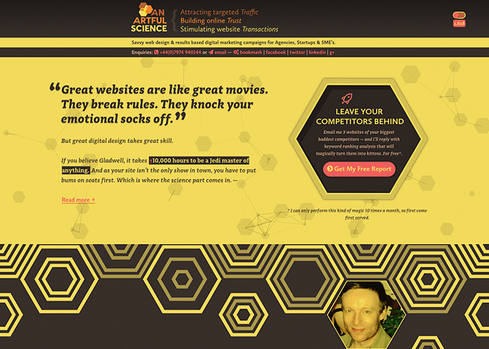
Designed by Stephen Shaw (@anartfulscience), An Artful Science is the web designer’s own site. Through this site, he offers his web design and digital marketing expertise. However, this modern retro site made headlines when it became an Awwwards nominee.
3. Boogie Lover Band
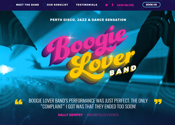
To reflect its dynamic style and dedication to disco and modern dance, Boogie Lover Band contacted Maeve Lander from Enigma Digital to create a modern retro style site. The band’s logo actually boogies to the movement of your pointer and the colors are vibrant enough to make you want to dance. (PS: listening to Daft Punk’s Harder, Better, Faster while playing with the logo can be VERY distracting).
4. The Dazzling D-man: Design Superhero
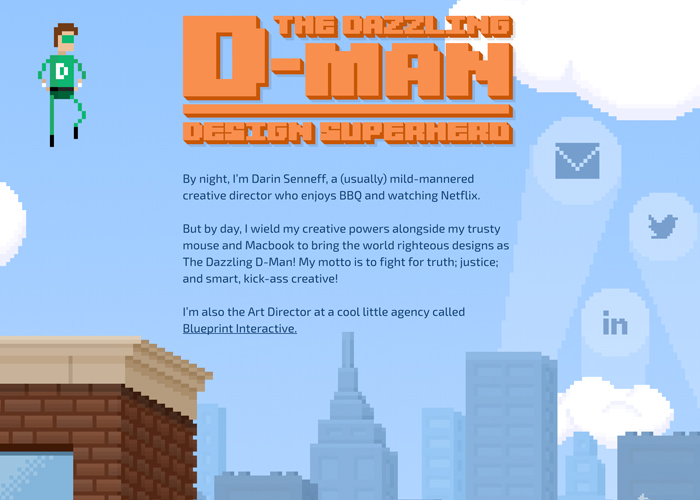
Another Awwwards nominee, The Dazzling D-man: Design Superhero was designed by Darin Senneff (@dsenneff). It’s a one-page website that’s really bound to bring a smile to your face. You’ll especially love the Reference section since you can interact with each character to see their testimonial.
5. Merry Kitschmas
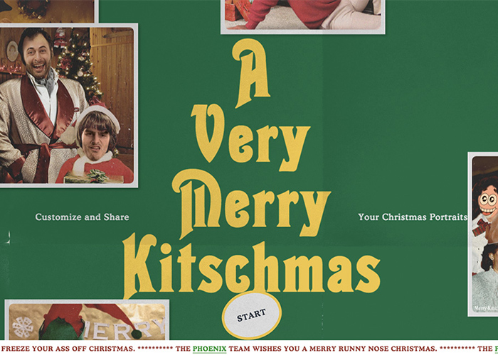
Image: Awwwards
Merry Kitschmas is an online tool that allows you to create the most awkward Christmas pictures. Designed by Phoenix The Creative Studio (@__ThePhoenix), the site flaunts an interactive one-page design that has a 70s feel. Even the images created by the site’s users and the fonts used reflect this modern retro design.
6. Limoncello Studio
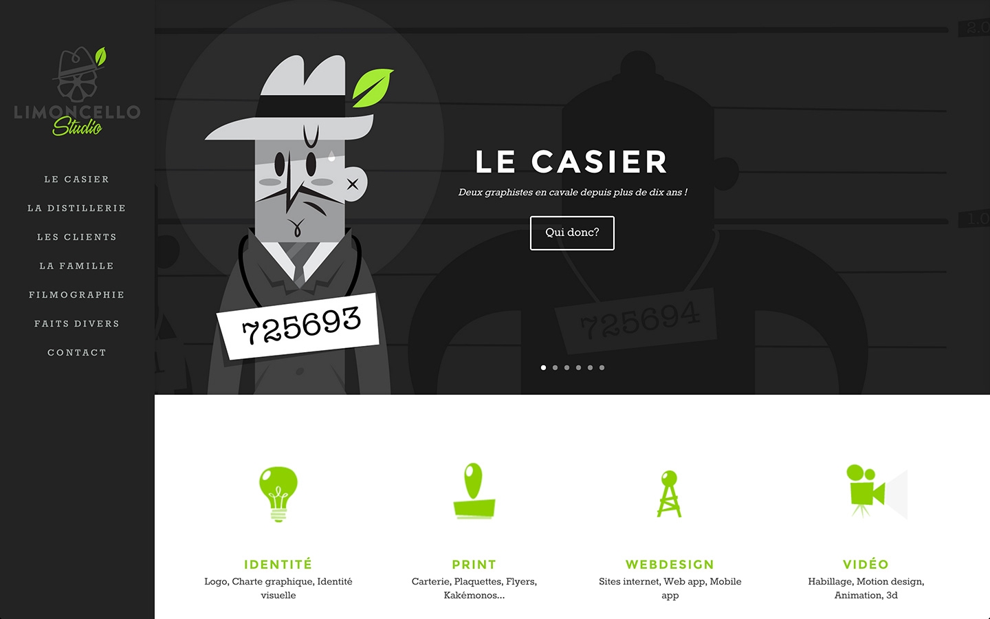
Limoncello Studio (@Lmncello) showed its graphic design expertise through its own website. Flaunting a pure retro theme depicted by 90s style animation, the French site is truly a site for sore eyes (pardon the pun). If you’re planning a modern retro web design, this is definitely a great source of inspiration.
7. Revelation Concept
Owned by Chris Perryman, Revelation Concept (@RevConcept) made the list due to its retro fonts and design elements. You’ll feel a very 90s vibe from this site despite the relatively older graphics. With engaging content to add, this is definitely an interesting site to check out.
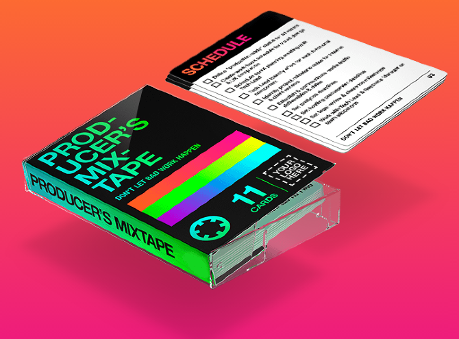
8. The Producer’s Mixtape
Nothing screams the 80s like neons. And that’s exactly what Crispin Porter + Bogusky (@cpbgroup) used for The Producer’s Mixtape, the company’s production checklist and custom 3D printable case. Just one look at this will make you miss your old cassette selection.
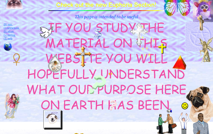
9. Cameron’s World
Step back into the 80s and 90s through Cameron’s World by Cameron Askin (@CameronAskin). Offering a collage of images from GeoCities pages, a service that lasted till 2009, the site is a gorgeous representation of everything modern retro. And Cameron is quite thorough as he even designed the scroll bar to remind users of Windows 98.
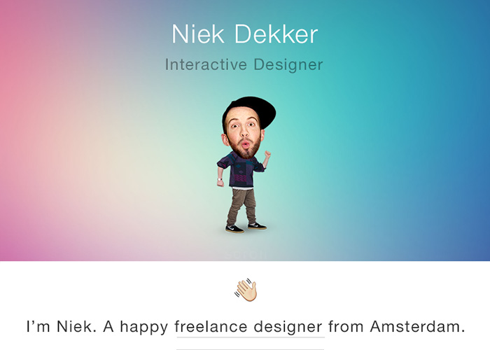
10. Niekdekker.sexy
Niek Dekker (@niekdekker) in an Amsterdam-based designer who has a good command over web designs and everything retro. In fact, press the Space bar on his site and your heart will skip a beat because you’ll relive one of the horrors you experienced while using the earlier versions of Windows.
11. Font Diner
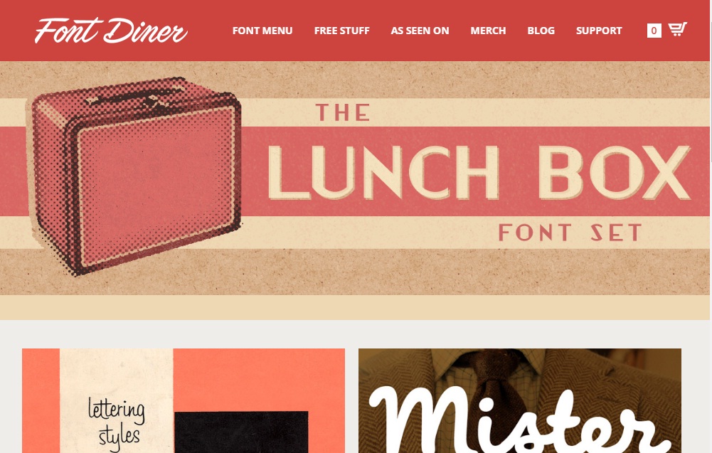
To complement its selection of retro fonts, Font Diner (@fontdiner) created a site that’ll easily appeal to the modern retro generations. Everything from the font to the hues and all the way to the design elements gel well to give the site a user-friendly look.
12. Team Fannypack
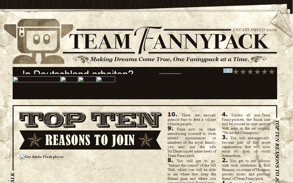
Blending both vintage and modern retro, the site of Team Fannypack is definitely a treat for generations X to Z as well as older ones. Denise Chandler (@deniselchandler) is the artiste behind this appealing web design and one of the main reasons the site was a success.
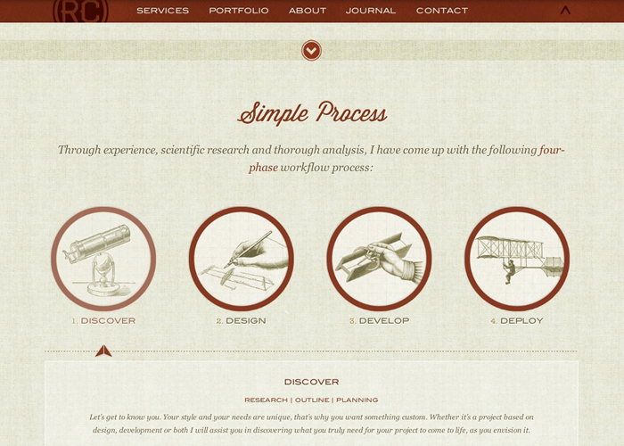
13. CSS Zen Garden
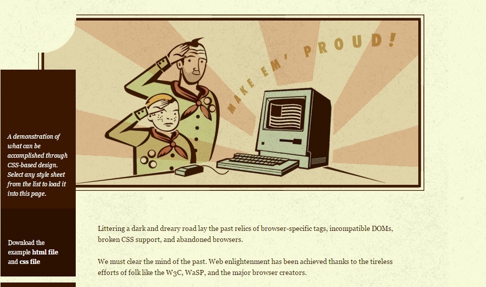
Designed by Dave Shea (@mezzoblue), CSS Zen Garden offers web designers a range of CSS resources. If you ever read Tintin growing up or even watched one of the movies, the banner will actually click with you. Even if you haven’t, the retro styled scouts will bring back fond memories (maybe not your own if you’re too young).
14. Tom of Finland
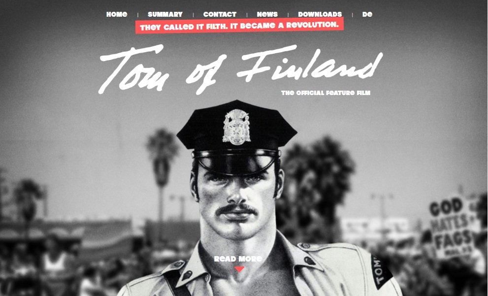
Dedicated to the feature film on the life of Tom of Finland, this website by Great Apes (@greatapesltd) flaunts a 70s look, which is the era in which the artist’s work gained the most praise. The font complements the imagery, further driving the modern retro theme home.
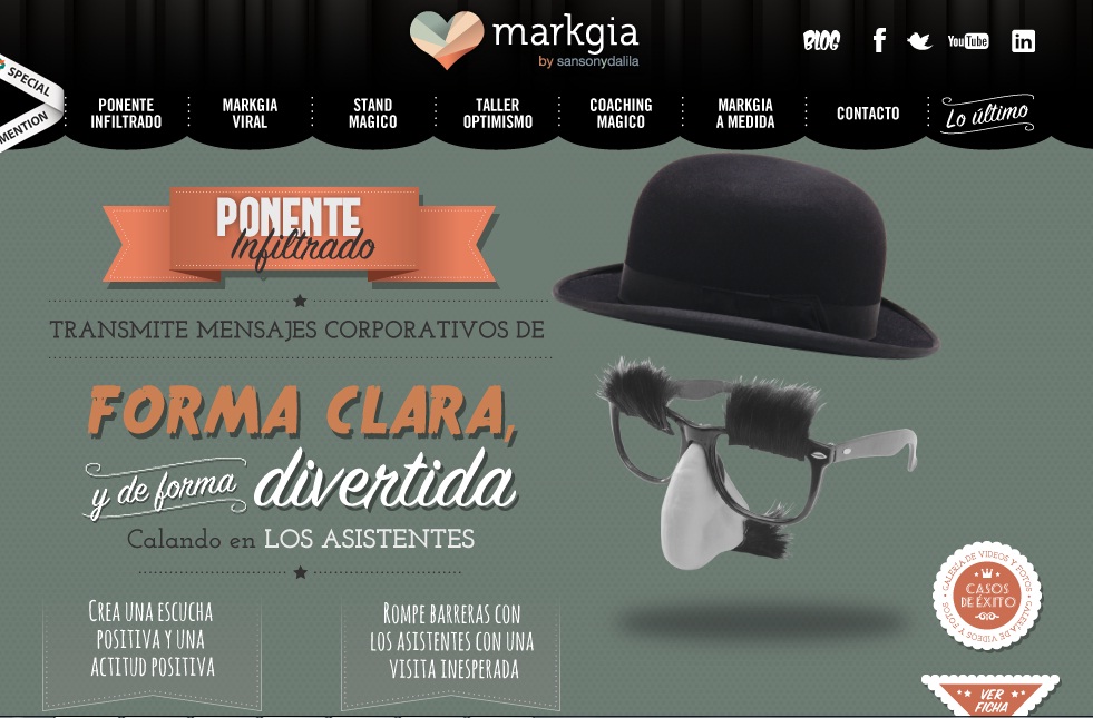
15. Markgia
Another site that combines both vintage and modern retro elements, Markgia was designed by Sanson y Dalila (@sansonydalila). The design earned an Awwwards honorable mention because of the creativity and effort invested in its creation.
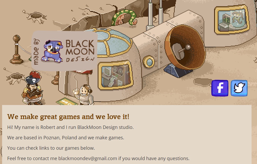
16. BlackMoon Design
Designed by the agency’s owner Robert Podgorski (@blackmoondev), the official website of BlackMoon Design uses the different 8-bit games and characters throughout. Despite the lack of content, the images and the site’s design itself testify to Robert’s expertise in game development.
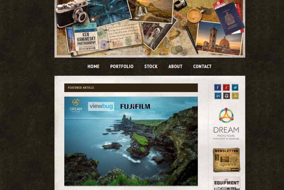
17. Ken Kaminesky Blog
Though the header designed by Nikola Lazarević (@colaja) is what makes this site a good example of modern retro, the overall simplicity contributes to the overall effect. These elements are in a sharp contrast between the posts themselves, but the site’s layout isn’t affected. In fact, you can say the design will keep readers on the page for long.
18. Tom, Dick & Harry Creative Co.
Nothing can flaunt your web design skills as effectively as your own official website. That’s why Tom, Dick and Harry Creative (@TDHcreative) designed their own website and added elements of modern retro design there.
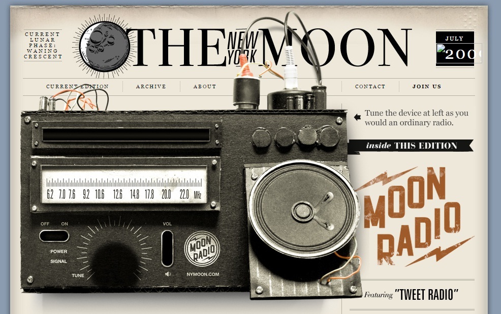
19. The New York Moon
The New York Moon is a “collection of experimental, reflective, and imaginative projects that unfold in any medium.” While its posts are intriguing, the first thing users will love is its design, which was co-designed by Tumblr’s creative director Zack Sultan (@ZackSultan).
20. Restaurant La Banquise
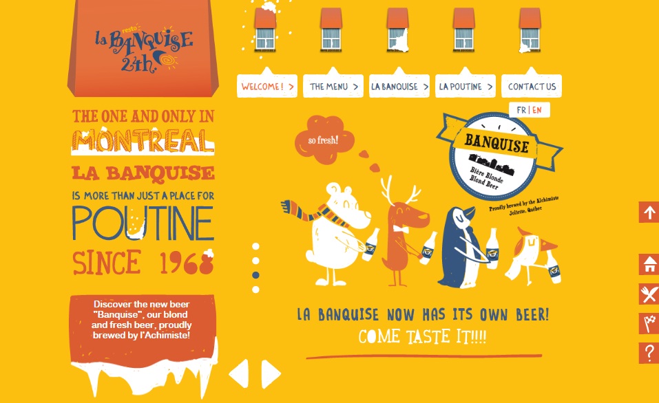
The last Awwwards nominee on this list, the site of Restaurant La Banquise is the combined effort of Alec Lacroix (@aleclacroix), Marie Bergeron (@marie_bergeron), and Gabrielle Bastien (@GabBastien). It reminds users of early 90s cartoons and graphics, which is why it’s one of the best examples of this design trend.
Related: 7 Biggest Challenges Of Web Design
So, which of these designs did you like the most? Do you have any suggestions you may want to add to this list? Get in touch and let’s swap ideas for the benefit of both web designers and website owners.


