This content has been reviewed and verified by Zaheer Dodhia, a logo and branding expert.
When it comes to branding, no one does it like Game of Thrones. Every house vying for the Iron Throne is a unique brand. The extremely wealthy Lannisters, for example, are renowned for being “the most pompous, ponderous [BLEEP] the gods ever suffered to walk the world” according to Renly Baratheon.
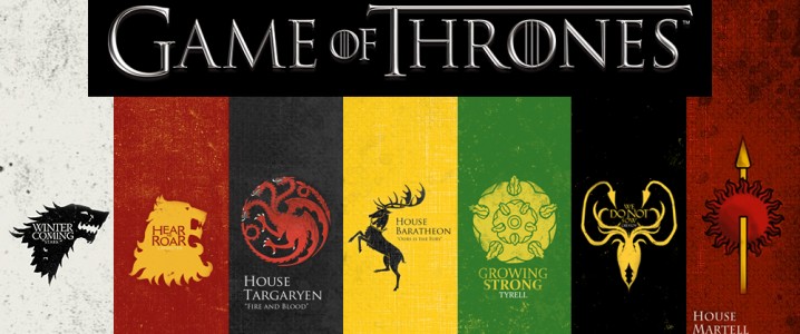
Further confirming GoT houses’ status as brands is each one’s sigils, i.e. signs or symbols that may have magical powers. A sigil is the source of strength for each character and the aspect that best describes their personality. Based on this definition, you can say that it’s the direct equivalent of the logo of a brand.
How To Create Your Logo With GoT Symbols?
With more than 6.5 million people watching the show and a few million more streaming it, you can bet that your target audience will identify with your brand better if you use elements of design from GoT house sigils. Here are the top seven you can choose from for your upcoming logo.
1. The Direwolf
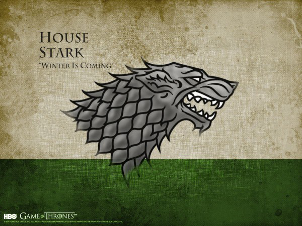
House Stark’s sigil is a gray direwolf against a white or green background. What makes the wolf symbol a great choice for this house is that the wolf is mainly found in colder climates. Moreover, it matches the house words, which are “Winter is Coming”. Wolves are also resourceful enough to withstand harsh weather and have a sense of loyalty to members of their packs even when they aren’t traveling together. Complementing the direwolf symbol is a white or green background, both of which represent good, innocence, and peace.
Why the Wolf is Perfect for Your Logo
Whether you want to use the wolf or direwolf symbol as a logo design, you need to remember that this symbol represents free will, unity, and toughness. As part of a logo or sigil, it can point out your brand’s leadership, adaptability, compassion, intelligence, and the ability to evolve. Because of these meanings, the wolf is used in the logos of the following industries:
- Consulting
- Sports Equipment
- Outdoor Activities and Equipment
- Educational Institutions
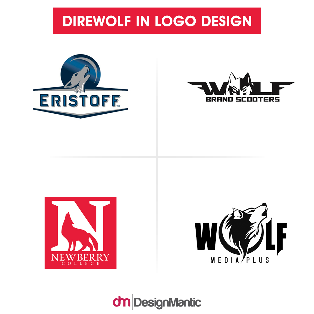
Check out the following brands using the wolf to represent them.
2. The Lion
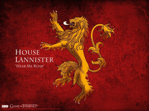
Befitting the Lords Paramount of the Westerlands and Wardens of the West, House Lannister’s sigil is a golden lion on a crimson background. In addition to strength, lions symbolize wisdom, power, royalty, dignity, courage, and ferocity. However, Lannister House’s lion carries the undertones of pride and thirst for power as well. Choosing gold as the color of the lion also signifies its importance and wealth. The red background further complements the lion while representing hatred, death, and anger.
Why Creating A Lion Logo is a Great Idea
As the lion’s mane makes it look like the sun, it’s been used to depict authority, justice, and safety from harm. It also represents courage, honor, leadership, passion, generosity, and control. When used in a logo, the lion tells your audience to have faith, stand tall, feel safe, and follow their leader. That’s why this strategy for logo design is a great choice for the logos of:
- Educational Institutions
- Sports Clubs and Equipment Providers
- Media Companies
- Financial and banking Institutions
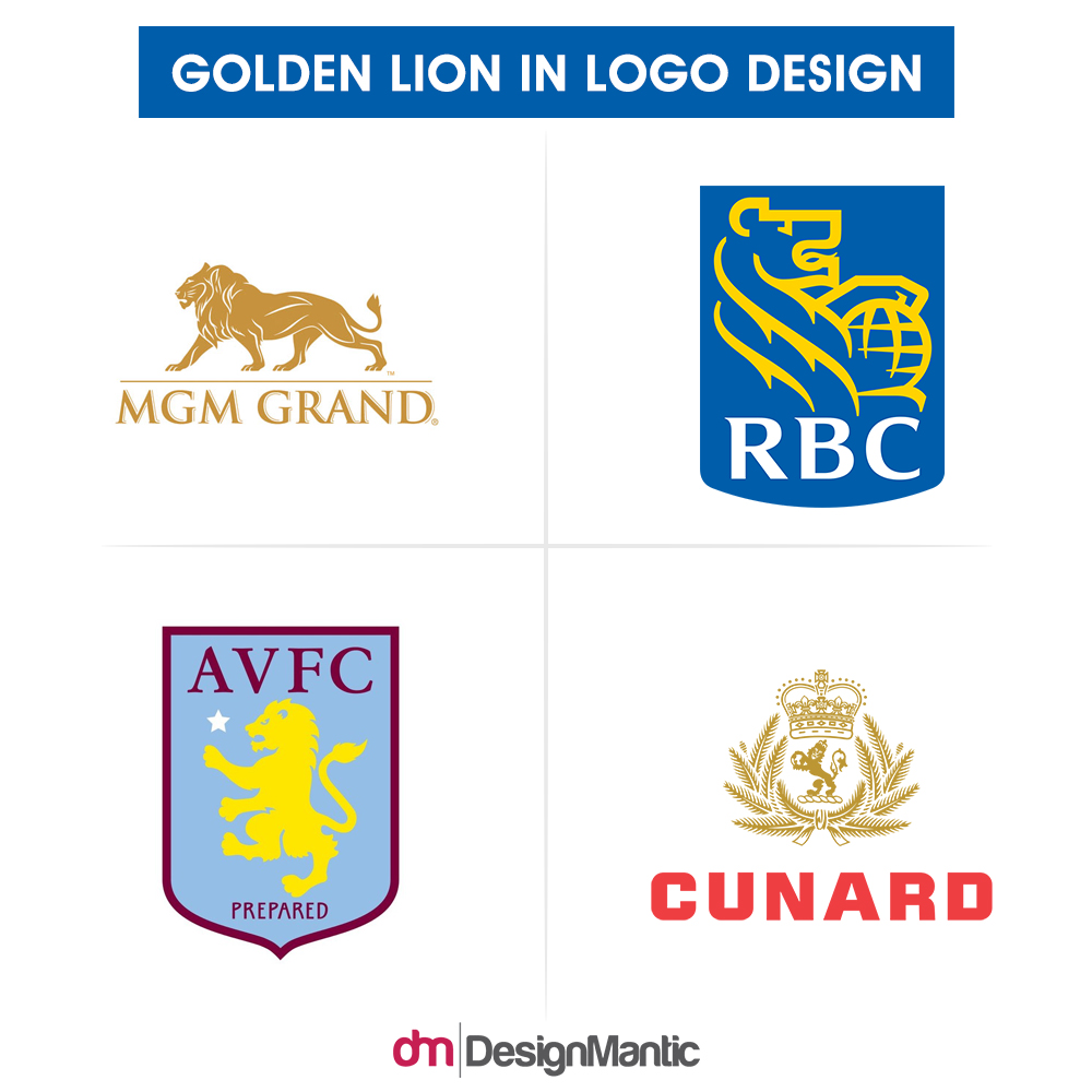
Because of the strong emotions which the lion symbol evokes, the following brands have added it to their logos .
3. The Dragon
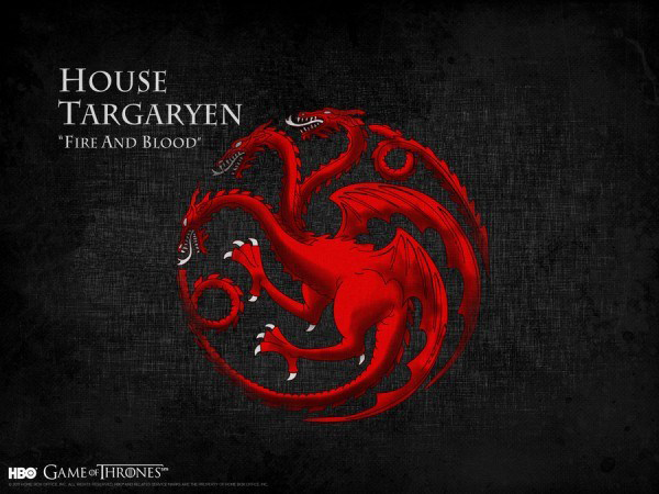
The few members of the House Targaryen flaunt a three-headed red dragon on a black background. In general, dragons symbolize power, luck, and wisdom. However, red ones take symbolism to another level, signifying victory, respect, protection, anger, and death. The black background of the Targaryen sigil complements the red dragon perfectly as the color is associated with power, death, mystery, fear, and evil.
Why the Dragon is a Hot Choice in Logo Design
House Targaryen have made the dragon seem hostile, especially by matching it with the “Fire and Blood” motto. However, using it in your logo is highly recommended as it signifies courage, fortitude, balance, loyalty, protection, and balance. And allows you to come up with a memorable logo. As it embodies mystery and strength, it’s the first choice of Asian establishments from all sectors. Even if your headquarters aren’t in Asia, you can create your own logo with a dragon icon if you belong to the following industries:
- Alcoholic and Energy Drinks
- Gaming Development
- Alternative Medicine (e.g. Acupuncture)
- Security and Surveillance
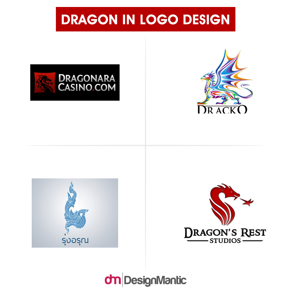
Here are some logos from brands that chose dragons to inspire you.
4. The Stag
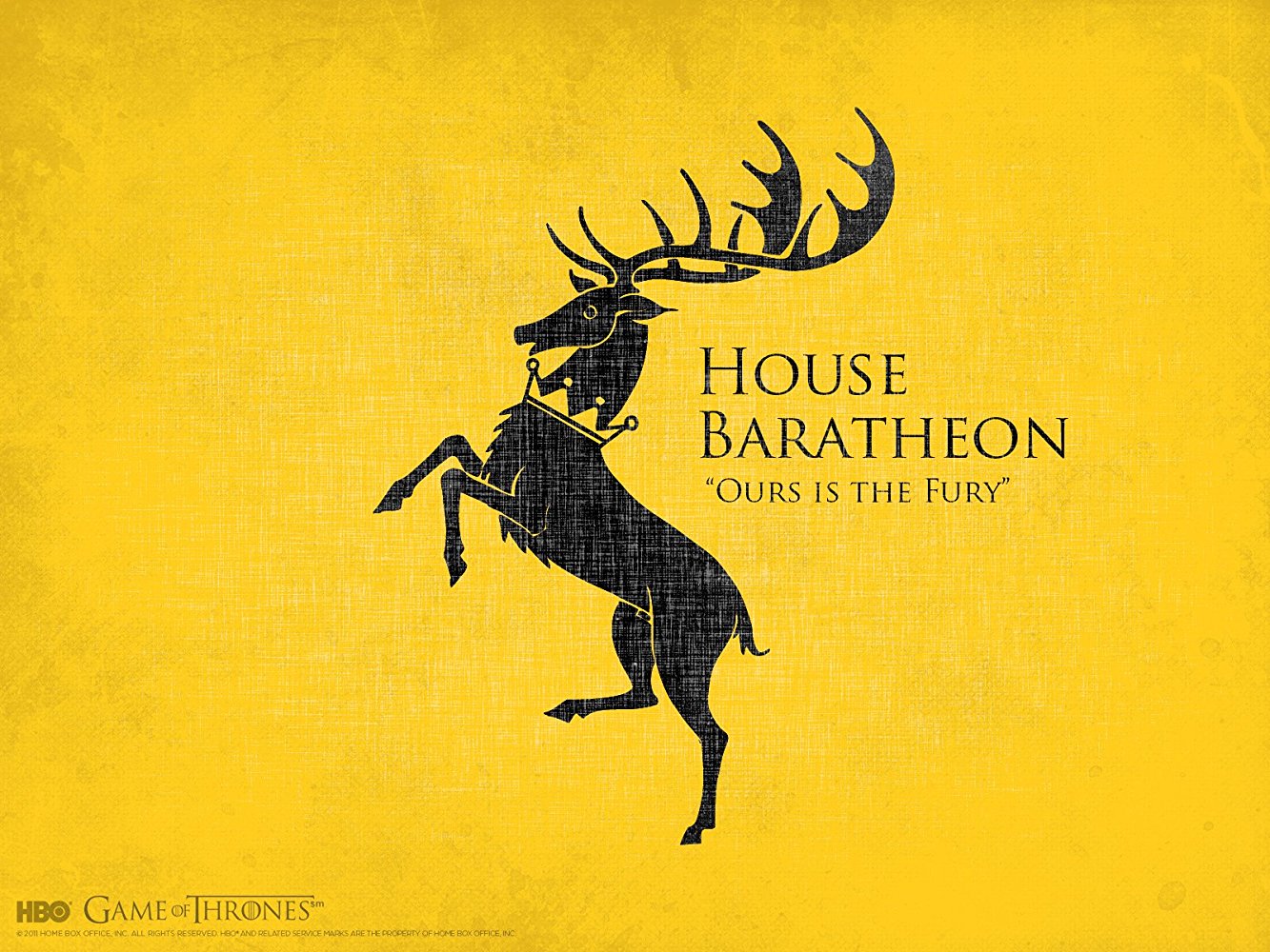
The sigil of the royal house, House Baratheon, is a black stag with a gold crown against a gold background. This sigil is quite versatile and multi-faceted just like Renly, Stannis and Robert Baratheon. It symbolizes wisdom, growth, and virility. As stags renew their antlers regularly, they’re a symbol of regeneration. This is especially true considering the branch-like appearance of their antlers. This animal is also a symbol of royal status and masculine values. The addition of the crown further confirms this as the headgear symbolizes authority, power, and royalty. Similarly, the crown’s color evokes feelings of prestige as it means wealth and high quality.
Why Have the Mighty Stag Grace Your Logo
The stag is truly one of the most versatile elements you can include in your logo. In addition to its meanings in GoT, it’s a symbol of grace, magic, and peace. It evokes the emotions of humility, creativity, benevolence, and safety. It also radiates responsive energy and revels in simplicity. Because of these contrasting meanings, you’ll need to put much thought into the design of the stag itself as well as the colors you use in your logo. However, you can’t go wrong by having it represent your brand if it’s in the following industries:
- Art and Entertainment
- Natural Supplements, Products, etc.
- Clothing and Fashion
- Yoga and Spirituality
A number of brands have successfully integrated the stag as part of their logos. Here are a few .
5. The Flower
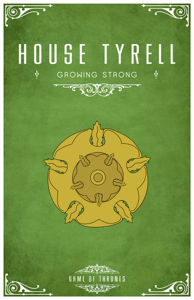
Image: DeviantArt/LiquidSoulDesign
House Tyrell’s sigil is a golden rose on a field of green. Now you probably know that flowers represent love and compassion, but only a very few realize that they signify secrets and confidentiality. That’s because they’re associated with Harpocrates, the god of silence and secrecy. Golden roses have their own meaning as well. They’re associated with perfection and higher importance. Considering that dull green symbolizes ambition and greed, it’s no wonder that GoT’s graphic designers chose this sigil for the Tyrells.
The Importance of Floral Logos for Top Brands
Some brands have beautifully added flowers to their logos, giving them both a whimsical look while establishing their reputation as compassionate companies. Adding this element also signifies a brand’s growth potential, willingness to make connections, and generosity when it gives to clients. Different types of flowers further provide their own meanings to your logo. For instance, roses symbolize devotion, sensuality, and beauty whereas lilies imply innocence, purity, and promise.
If you belong to the following industries, a floral logo may be right for you:
- Health and Beauty
- Baby and Wedding Photography
- Groceries
- Women’s Fashion
Wondering if a floral logo is right for your brand? Look at how these four brands pulled this off .
6.The Kraken
Season 5 unleashed the krakens (I’m so sorry, I was itching to write this), proving that the Greyjoys are actually quite powerful. The house’s sigil is a golden kraken against a black background. The kraken is a legendary creature that may have once been the ancestor of the octopus. It symbolizes mystery, defense, complexity, intelligence, unpredictability, and flexibility on the show. The black background matches these meanings, adding formality, mystery, and strength to the sigil.
Read The Branding Bible; Logo Design Explained to Unravel the Secret behind Successful Logos
Why Your Customers May Love Your Kraken Logo
Despite the relatively negative symbolic meanings above, brands consider using the kraken (or its descendent, the octopus) in their logos because it represents will, focus, diversity, creativity, and adaptability. It also tells your customers that you’re diverse, dedicated, and fluid. With these meanings in mind, brands from the following industries use the kraken or octopus in their logos:
- Web and Game Development
- Media and Entertainment
- Water Sports and Gear
- Sports Apparel and Equipment
The following are four brands that effectively flaunt krakens in their logos .
7. The Sun
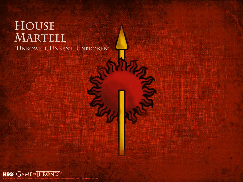
Season Four introduced Oberyn Martell, a.k.a. The Red Viper, as well as House Martell. Seasons Five and Six have continued his legacy, proving just how ruthless and vindictive the Martells can become. However, this shouldn’t come as a surprise considering the sigil of this house: a red sun pierced by a golden spear against an orange background. As symbols, the sun signifies life, strength, force, and self, whereas the spear symbolizes war and power. The yellow, and orange colors in this sigil gel well with the overall theme as they represent war, danger, strength, passion, determination, and intellect, while from romance to rage, red is the color of passion, as the Martells have proven time and again.
Why Adding the Sun Can Make Your Logo Shine
The sun is literally the largest power in the world, which is why it’s the ruler of all. It represents intellect, power, clarity, and self. As it has been used to represent ancient gods and even the main figures of modern religions, the sun is considered divine and the center of mankind’s existence. If you want to have the star of the solar system as part of your logo, here are the industries it best represents:
- Security and Surveillance
- Construction
- Organic Food and Natural Products
- Travel
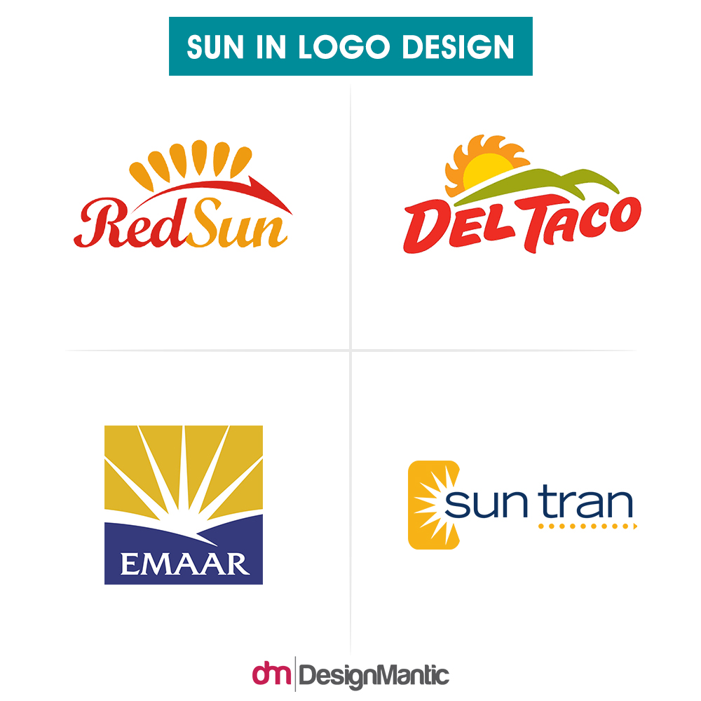
If you want the sun to be part of your logo, check out this unique design element in the following brands’ logos.
When You Play The Game Of Thrones… You’ll Be Inspired!
Though GoT is one of the most entertaining shows on HBO at the moment, you can’t deny how effectively it can inspire graphic designers to create great logo designs. Who knows? The seven elements above may help you become one of the legendary designers whose marks on pop culture won’t be forgotten for generations to come.

