Colors play most significant role in the UI and UX design. Websites are hugely based on the color syncing and utilization of proper colors. For those who really want to understand the dynamics of color usage on a website for better response rate, they should focus on exploring the philosophy of colors. That is why the color wheel is considered as the most authentic and inspiring way of selecting colors with close focus. In fact, it is significant to choose colors for businesses. Color wheels have great standing for wed designers.
Philosophy Of Colors In Web Designs
There are technically three main components of colors’ philosophy from a UI’s perspective. These components are described as under:
• Distinction:
There is an opposite color for almost every color, famous wheel of color elaborates that distinction and contrast. Opposite colors are, on designers’ will and choice, used in web designs and can be best put together to stand out as web designs. The smarter the contrast, the better they stand out as a whole.
• Harmonization:
Apart from severe contrast, beauty also lies in the harmony of colors, right? This is the reason why colors which complement each other look great together on a website. For instance, yellow color’s complement is blue. This describes the harmonization of different colors and web designs look great with a dash of harmonious colors.
• Vivacity:
Every color has its own effect on people, there’s no surprise in it. The color with darker shades like purple, green and blue are considered as soothing and comforting colors, on the contrary, brightly warm colors like yellow, red and orange are colors of vitality and energy. Different websites use these combinations (soothing colors along with warmer shades) to create their own uniqueness and distinction that appeal their visitors and users.
Coloring System In Web Design (Scheming)
Color system is the basics to every web design and it is significant to follow a set pattern for the entire web design. Colors considerably affect the users’ and visitors’ mindset which include their attitude and perception. It is of high importance to select and lock the final colors for the web design smartly. One thing to look out for is that websites can use different types of color formats. These include Pantone, RGB, and CMYK. Each format has its own pros and cons, and most importantly, color vividness is different in each format. In web design, RGB is the primary color format used. Pantone may not be directly applicable in web design, but understanding Pantone colors can still be useful for ensuring brand consistency across different media types. You can convert colors from one format to another easily with the help of various free resources that can convert RGB to Pantone or vice versa. Efficient use of such tools will ensure that your color schemes are accurate. In order to select colors for a better and even impressive color scheming, there are different ways like:
• Analogous:
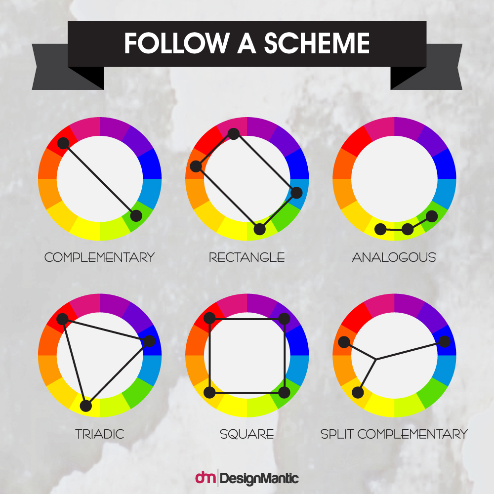
If you want to play with the most vibrant and vivacious color combinations then analogous is your style for the website design. Complementary colors are point of focus in this setting. The interesting and daring part is to select the color tones and combinations. At times this can backfire as well, so be very careful when going for this. Imagine a combination of yellow, orange and red and you’ll understand the point of discussion here.
This particular color scheme is among the most harmonious ones, designers use analogous color scheme to give an attractive impact to the visitors. Playing on a wider range of contrast is the key to come out with analogous color scheme. Selecting a dominant color like green, purple or red and then supporting it with another shade that is stronger like brown and blue with a hint of any shade from white or grey can actually make a great pleasing web design.
• Monochromatic
Monochromatic web designs are based on one shade or color, playing with their hues and tints. For instance, if we look from the other end of the color wheel, single base color or monochromatic web design will include a color pattern from purple to beige and to red. To make a good tint for monochromatic web design can be obtained by adding white to the main color. For a good tone and shade add grey and black respectively to the same color and see the difference.
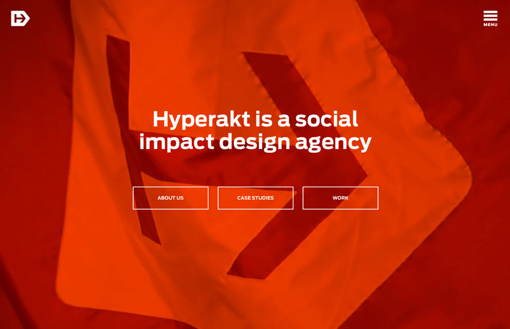
Image: Hyperakt
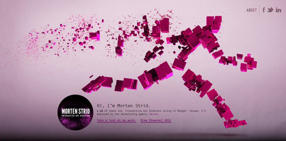
Image: Morten Strid
• Triad:
This is undeniably the most used style for web designs because of it being the safest bet. Selection of colors from a color wheel in such a manner that every color is 120 degree distant from another one. Usually it is based on the selection of 3 colors, with definitely 120 degree distance. Out of 3 colors, one is selected for the background, whereas the remaining 2 are set for navigation and content. Always try to utilize one color as dominating whereas the other two for the inflection. For instance, using a dark shade of yellow to hazel and then using modifying colors to go with that.
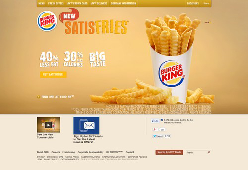
Image: BurgerKing
• Complementary
It’s very simple to come up with a complementary color scheme for a web design. How’s that? Well, select any color from a color wheel and select its opposite color in the wheel; like red is to green and blue is to yellow. Quite simple, isn’t it? Usually it is not easy to mess up at all, because of its distinctive and prominent selection. Designers may add white to red and green to give web designs awesome looks, without much of a hassle or visual distress.
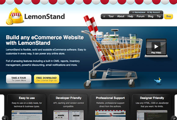
Image: LemonStand
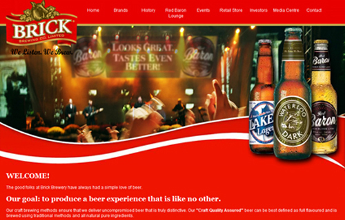
Image: Brick Beer
• Compound:
This one’s simple yet fiddly at the same time. Select any two colors which complement each other and other 2 which are distinctive in nature. Yes, 4 colors in total.
• Square:
This color scheme is all about selecting 4 colors which are equally distant in the color wheel. The art of using this particular color scheme is to keep only one color as dominant one. Web designers should closely focus on the cooler and warmer colors as well, when planning to go for square color scheme.

Image: Treehouse
• Rectangle
If you are looking for some sort of variation in web design then you can opt rectangle color scheme. This color scheme is based on 4 colors where 2 are complementary set of colors.

Image: SproutSocial
• Split Complementary
From a color wheel, select any color and then use it with two colors which are endwise to its matching color. This color scheme offers stark contrast with little rigidity.

Image: FinalTouch
Industry Wise Color Scheme
Web designers carefully use different color schemes for different industries like food and restaurants, beverages, banking and fashion etc. This is done on a legit purpose. That is because every color has certain association and impact on people i.e. target market. Following are some industry based examples:
• Color Scheming For Restaurants, Café And Coffee Houses:
Restaurants and cafes attract customers to visit and order scrumptious food to satisfy their hunger. Colors like brown is easily associated with steadiness and consistency. On the contrary, the same color is associated with coffee and chocolate. This is one of the reasons why cafes and coffee houses prefer to use their theme and color scheme based on brown color.
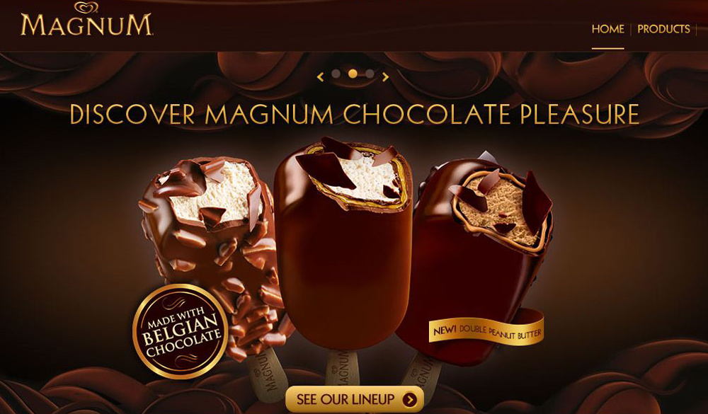
Image: Magnum
Black is the color of power and classiness. Restaurants prefer to use black color for fine dining and this is one of the reasons why black and its shades are found is websites which offer food services.
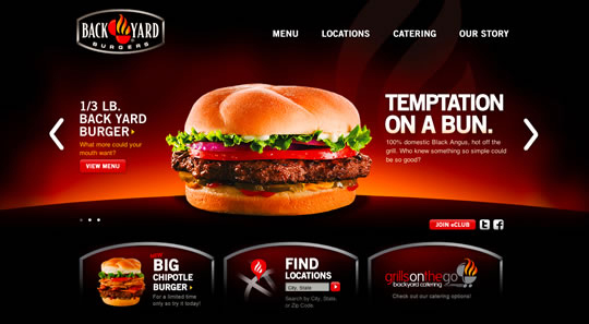
Image: Backyard Burgers
• Color Schemes For Spa For Women:
Color schemes used for websites for spa are usually based on fluorescent and bright color tones. These may include shades of pink, green and purple etc. Mostly web designs with brighter shades and vibrant strokes are used for spa and fashion industry.
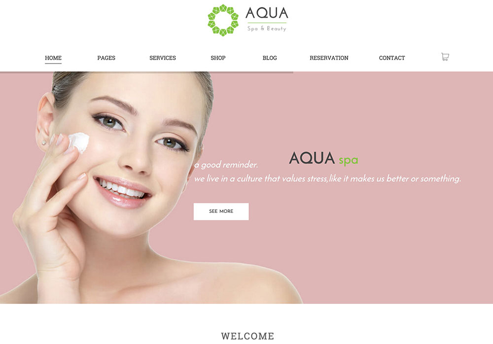
Image: Aqua
• Color Schemes For Beverages:
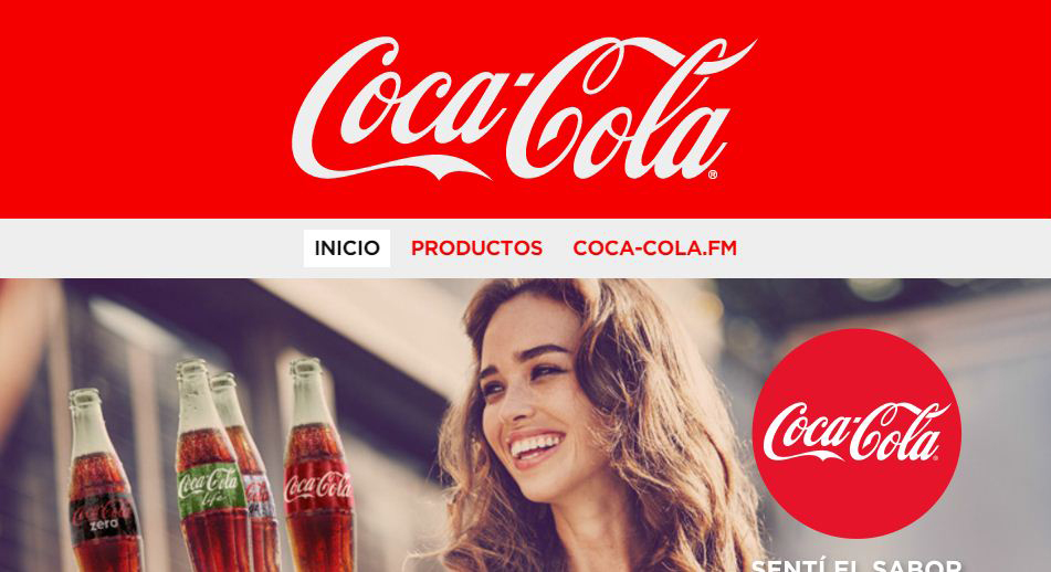
Red is the strongest color and represents desires and actually boils ones’ blood for tasting that desire. This is why most of the beverage companies prefer to use web design based on red color. Just mentioning two most popular brans from the world to showcase color red’s importance here:

Image: Budweiser
With these basics sorted and rightly understood by any UI or UX designer, web designing becomes a lot more interesting and amazing. The smarter the use of colors, the better will be the results, rest assured. Following a stronger and interesting color scheme can help you create an amazing web design. Following stylish and smart color schemes can actually help big time.
Always keep cultural association with colors in close focus to come out with a rocking and definite killer web design. For cultural association with colors wait for the next post.

