A flower? A star? Or a spark?
When we think of Walmart, that’s what comes to mind. The company’s familiar symbol, seen by nearly 255 million customers who walk through its doors each week, has become as ubiquitous as the retail giant itself. The symbol represents the company’s journey from a humble Arkansas store to a global retail powerhouse.
![]()
Walmart Logo – New – Icon
And in the world of retail logos, only a few are as iconic as Walmart’s spark. But even icons need a refresh sometimes. That’s exactly what Walmart did. Now, for the first time in nearly two decades, Walmart has given its logo a fresh update.
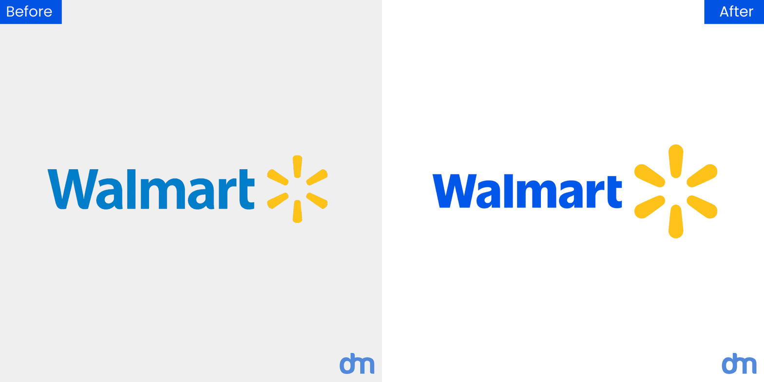
Walmart Logo – Old vs. New
While the Walmart logo redesign seems like a simple design update at first glance, we’re all wondering: is this just a fresh coat of paint, or is there something deeper at play?
Let’s figure out.
Behind the Scenes of the Walmart Logo Redesign
Walmart last tweaked its logo in 2008, when the retail giant faced slumping sales and rising competition. At the time, the world was on the cusp of a digital revolution, and Walmart was just beginning to feel the heat from emerging rivals like Amazon.
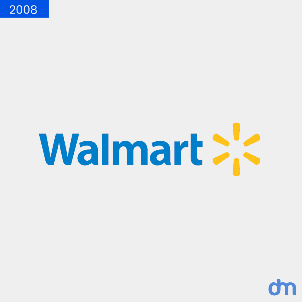
Walmart Logo – 2008
Fast forward to today, and Walmart has not only weathered those storms but emerged stronger, smarter, and more adaptable. With innovations like the Walmart+ subscription service, an app, and forays into healthcare and advertising, Walmart has reinvented itself to meet the demands of a new era.
With $158 billion in revenue in 2024 and soaring e-commerce sales (revenue topping $100 billion, a 27% increase in Q3 of 2024 alone), Walmart is no longer just a brick-and-mortar giant; it’s a modern retail ecosystem.
So why change the logo now? In a world where brands are constantly vying for attention, Walmart’s new logo is its statement of identity. This update signals evolution and blends its rich history with a forward-looking vision. For retail startups, this highlights the value of a great logo design.
As the new design rolls out, we know it’s much more than a cosmetic change. It’s about staying ahead in a game where the rules are always changing. And if history is any indication, Walmart knows how to play that game better than most.
The Evolution of Walmart’s Logo
When iconic brands transform their identity, they are always worth a closer look. Walmart’s logo has also seen quite an evolution.
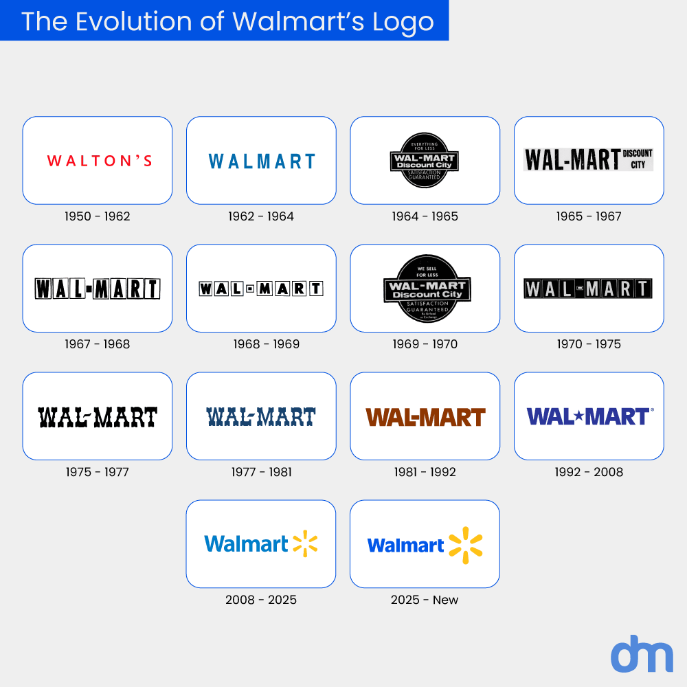
Walmart Logo Evolution
Let’s see what Walmart’s logo redesign journey looks like over the years.
Reliability and Trust (1962): The story starts with a simple blue wordmark logo. It’s a straightforward yet strong representation of Walmart’s commitment to affordability and accessibility.
Rooted in Rural America (1964): As Walmart expanded, so did its identity. The introduction of a hyphen and the bold Frontier font reflected its deep connection to small-town America, where it first flourished.
A Bolder Presence (1981): With expansion came confidence. Walmart dropped the rustic aesthetic for a commanding, all-caps sans-serif typeface in brown—strong, no-nonsense, and built for business.
The Blue Star Era (1992): The hyphen was replaced by a star in the logo design, marking a period of rapid growth. Walmart was no longer just a regional giant but solidifying itself as a household name across the US and beyond.
A Spark of Change (2008 – 2025): The familiar navy blue wordmark and the iconic six-pronged spark symbolized Walmart’s modernization. This fresh look aligned with its digital transformation, global expansion, and evolving customer experience.
A Brighter Tomorrow (2025 – Today): Now, Walmart is embracing change once again. The new ultramarine blue signals freshness, vibrancy, and adaptability—qualities essential in today’s fast-paced retail world. It’s a subtle yet powerful update to ensure Walmart remains as relevant and recognizable as ever.
Breaking Down Walmart’s New Logo
On the surface, Walmart’s new logo update might not seem like a dramatic shift. But look closer, and you’ll see a refined, intentional evolution that blends heritage with modernity.
Let’s break down Walmart’s new logo components.
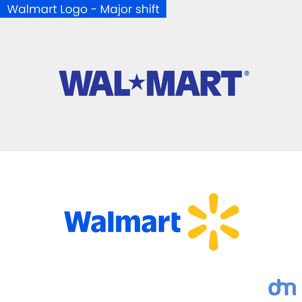
Walmart Logo – Major shift
Walmart’s timeless logo underwent two major changes, including the bold new blue and refreshed yellow spark symbol. These changes have been carefully considered to reinforce Walmart’s identity in a digital-first world. Blue represents trust and reliability, while yellow adds warmth and optimism—values that have defined Walmart for decades.
Rounding the Six-Pronged Spark
Walmart’s iconic yellow spark is not a decorative element. It’s the brand’s face. This year’s redesign subtly refines its shape by making it more balanced and approachable, with smoother edges that soften its industrial feel.
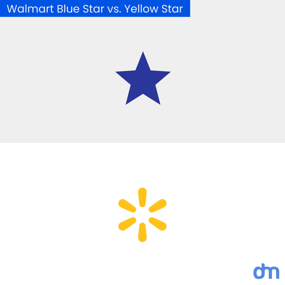
Walmart Blue Star vs. Yellow Star
“We aimed to add more depth and significance to it, creating a stronger sense of Walmart’s energy that acts as a symbol for the brand,” explains William White, Walmart’s Chief Marketing Officer.
Beyond aesthetics, the spark is also taking on a bigger role. While previously situated beside the wordmark, it will now stand on its own in more branding materials—just the way Target’s bullseye or Amazon’s smile have become instantly recognizable, even without text. This shift reinforces Walmart’s brand equity, making the spark a shorthand for everything the company represents.
Have you ever wondered what’s the meaning behind the spark?
Let us tell you. According to The Walmart Digital Museum, each point of the spark symbolizes one of Walmart’s six core values: customer, respect, integrity, associates, service, and excellence. It also embodies the entrepreneurial spirit that fueled Walmart’s journey from a single discount store in Arkansas to the world’s largest retailer.
True Blue: A Bold New Color Statement
Walmart’s signature blue, a color commonly used in retail industry logos, got a refresh. The updated True Blue in Walmart’s new logo is deeper, more vibrant, and designed to create a stronger emotional connection with customers.

Walmart Blue Color
However, the choice of True Blue isn’t random. This richer shade was selected to resonate across various customer touchpoints, particularly in categories like Fashion and Home, where Walmart has been expanding its presence. It’s a modern, confident color that helps Walmart stand out in an increasingly competitive retail space.
A Cohesive Color Palette
True Blue may be the hero, but Walmart has also introduced a supporting cast of complementary shades to create a more flexible and strategic branding system. Bentonville Blue adds a deeper navy tone, while lighter accents like Sky Blue and Everyday Blue offer versatility across different applications.
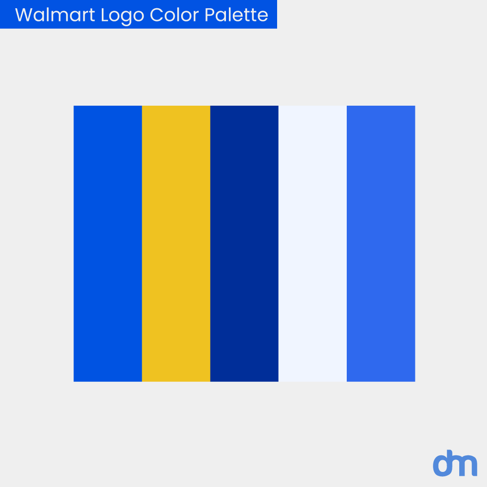
Walmart Logo Color Palette
This move toward a more consistent and strategic color palette is a response to past inconsistencies in Walmart’s branding. White acknowledges, “You may have observed that we’ve been somewhat inconsistent in utilizing our brand assets. While developing a new design system, we’re putting greater consideration and attention into how these assets are applied and utilized.”
A New Wordmark Rooted in Heritage
A particularly nostalgic touch in Walmart’s logo redesign is the updated wordmark, inspired by a trucker hat famously worn by Sam Walton, including on the cover of his book “Made in America.”

Walmart Logo – Wordmark
The Walmart creative team explored the company’s archives to find a way to connect past and present. This led to the creation of a custom typeface called Everyday Sans. This new font is based on the classic Antique Olive, modernized for today’s branding needs while maintaining a subtle nod to Walmart’s history.
To bring this new vision to life, Walmart partnered with Jones Knowles Ritchie (JKR)—the agency behind major rebrands for Burger King, Chobani, and Impossible Foods—along with Landor for in-store branding.
Walmart’s Chief Marketing Officer, William White, says that this update, rooted in the legacy of our founder, Sam Walton, demonstrates our evolving capabilities and long-standing commitment to serve our customers of today and tomorrow.
He also adds, “As our customers evolve, we will too. Our Walmart will always be their Walmart, and our brand will always be a testament to how we innovate and change alongside them.”
Here’s What People Are Saying
When a major brand like Walmart gives its logo design a makeover, you can bet the internet has something to say. From fans praising the modern touch to a few playful jabs, the reactions have been all over the place. Take a look at the chatter!
Designer-clean-
Walmart; we need to be more bold and vibrant.
Design department; say no more.
Honestly that’s all they did. Blue is more vibrant then before and the icon is just thicker/bolder.
Comment
byu/adamknowsdesign from discussion
ingraphic_design
masmoose1
Just curious if anyone knows how long this revamp has been in the making?
Comment
byu/adamknowsdesign from discussion
ingraphic_design
Positive-Feedback-lu
Instead of blue & yellow its now yellow & blue
Comment
byu/Alarmed-Analysis-152 from discussion
inunusual_whales
Life_Grade1900
So it looks basically the same, but is shorter and fatter. So, it’s basically America
Walmart, $WMT, unveiled a rebranded logo, and updated their brand identity.
byu/Alarmed-Analysis-152 inunusual_whales
last-saturn
Still looks like six Twinkies in a circle. Now with more blue!
Good enough…
So, it turns out opinions will always vary. While some love the new update, others might joke about it. But in the grand scheme of things, Walmart’s logo redesign marks a smart, strategic move and reflects the brand’s evolution as a trusted, innovative, and customer-driven leader in the retail world. Walmart is clearly ready for the next chapter, and this logo is a bold step in that direction.
Do you want to create a timeless store logo like theirs? Keep up with the logo design trends of 2025 to give your brand a much-needed glowup!

