Logo designs represent what a brand is all about.
As brands transform, logo designs reflect these transformations via changes in colors, fonts, shapes, and other elements. Usually, only a few things change while staying true to the original ideas.
But sometimes, an overhaul is needed to demonstrate something big. A change so immense that a design reconstruction is the only thing justified.
In this post, we look at logo design transformations of both kinds. Changes, subtle as well as huge.
We’ll use 50+ logo designs to chronicle these changes. These design evolutions will give you a deeper look into each brand’s psychology. You’ll see brands that have hardly changed in over a century. From Coca-Cola to Cartier, these ageless brands are few and far between but their insistence on originality distinguishes them from the rest.
Then we have more open brands that embrace change and use visual design tweaks to show that off. They experiment with colors, fonts, and other details to keep pace with the times, refresh their visuals, and keep things moving.
Which idea do you connect with the most?
- Quiet confidence in having a consistent visual character
- Or having a more robust identity that’s exciting and new every 10 years?
Take a look below and see which brands think like you.

Embed in your site:
These 50+ brands belong to a wide range of market segments — auto industry, food and beverage, jewelry and fashion, and many more. Each brand is at least 100 years old so you can see comprehensive design evolutions instead of mere year-on-year changes.
Let’s begin.
1. Coca-Cola
Established In: 1886
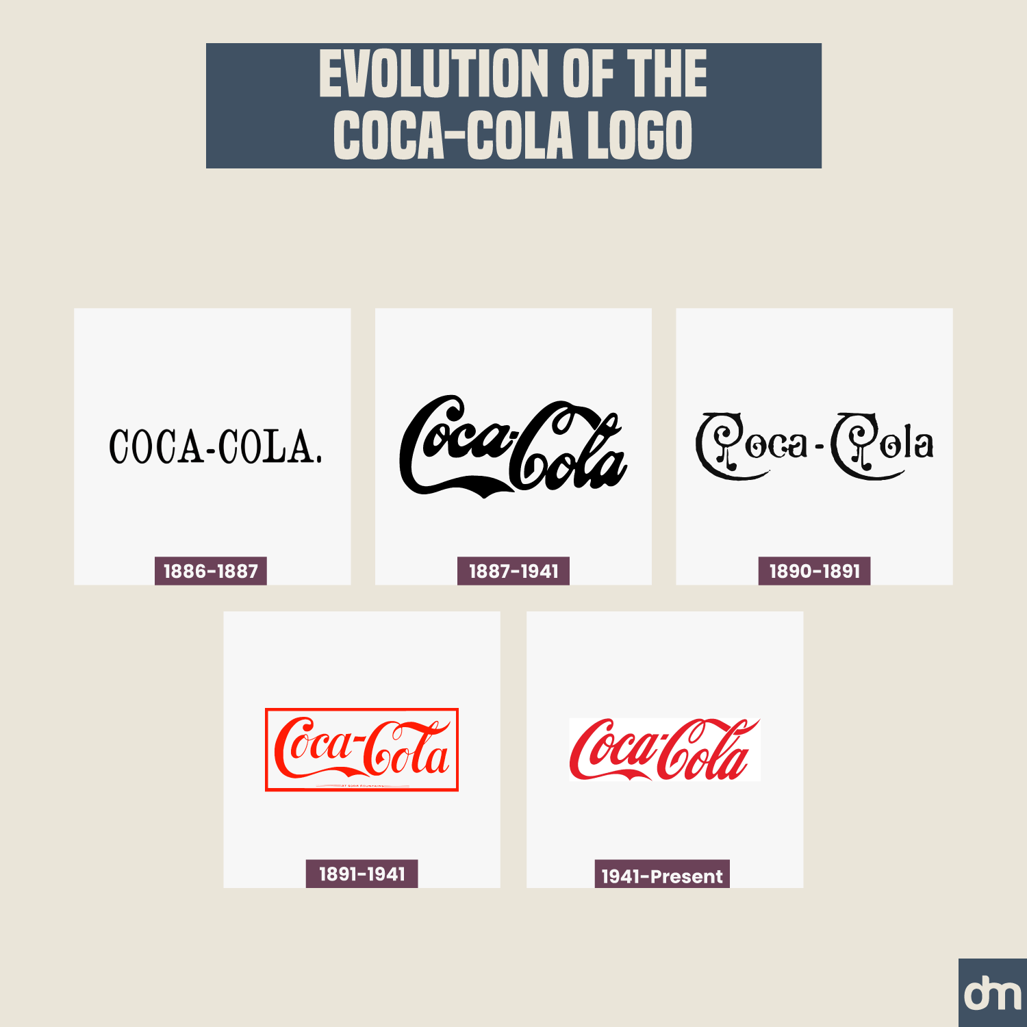
Coca-Cola Logo Evolution
The Coca-Cola logo evolution has been one of the most consistent as it’s one of the most ageless brands on this list. The brand arrived on the scene with a stylishly chic serif wordmark but quickly adopted a new design in 1887, just a year later.
Since then, Coca-Cola has always appeared in its now-iconic handwritten logo font in its signature cheery red. Its logo design is so widely known and recognized that Coca-Cola went logo-less a few years ago during one of its marketing campaigns and never suffered any dips in its brand recognition.
2. Pepsi
Established In: 1898
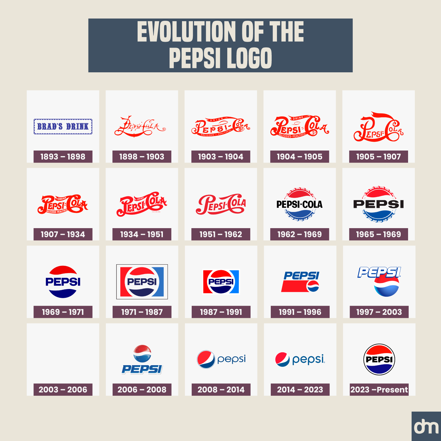
Pepsi Logo Evolution
Pepsi has not been that lucky. The brand is known for its weird marketing campaigns and lackluster logo designs. Always playing second-fiddle to Coca-Cola, the evolution of the Pepsi logo has not been up to the mark. The brand has struggled to create and establish an iconic design presence, a feat it has yet to achieve.
Though its present retro logo design in vintage red and blue is a great thing of beauty.
3. Ford
Established In: 1903
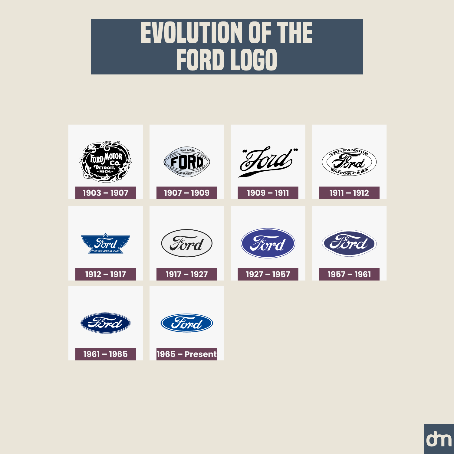
Ford Logo Evolution
Ford had a bumpy first few years as a new automobile brand. Its first logo design was an emblem with the brand name inscription inside. Ford quickly ditched it for a sleeker wordmark in a script font. Then it ditched that one too and brought on a shield of a whole new design three years later.
Things calmed down in 1912 when Ford settled on its present oval-shaped seal logo. The design hasn’t changed much since then, except for a few color experiments with the shade of blue.
4. General Electric
Established In: 1892
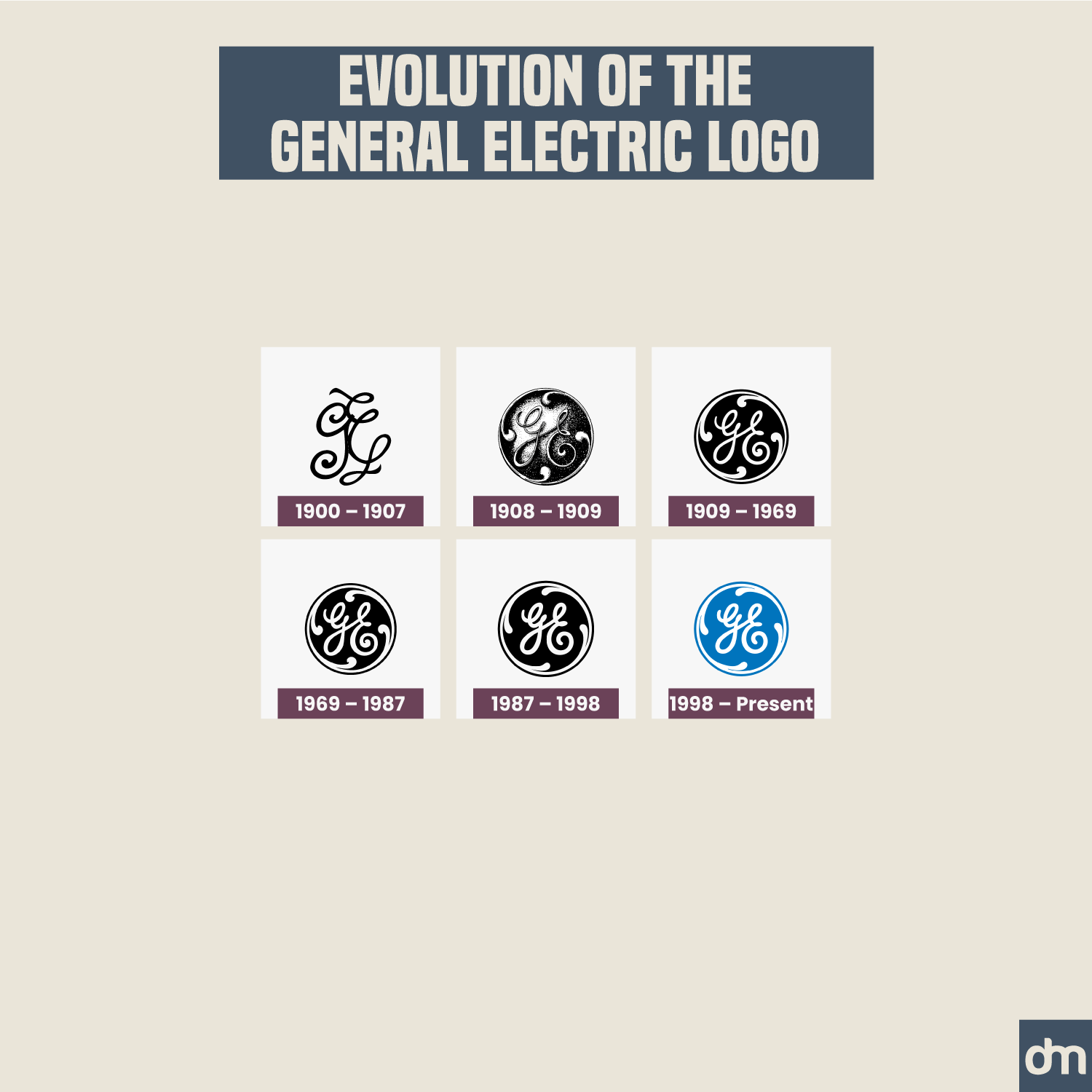
General Electric Logo Evolution
GE is another brand with a consistent logo design since its inception. Like Coca-Cola, it ditched its first logo design fairly quickly but stayed loyal to what it designed next. This second iteration was a circular shield with the GE monogram in a black-and-white color.
General Electric still uses that logo design with blue replacing black as the only change in over 130 years.
5. General Motors
Established In: 1908
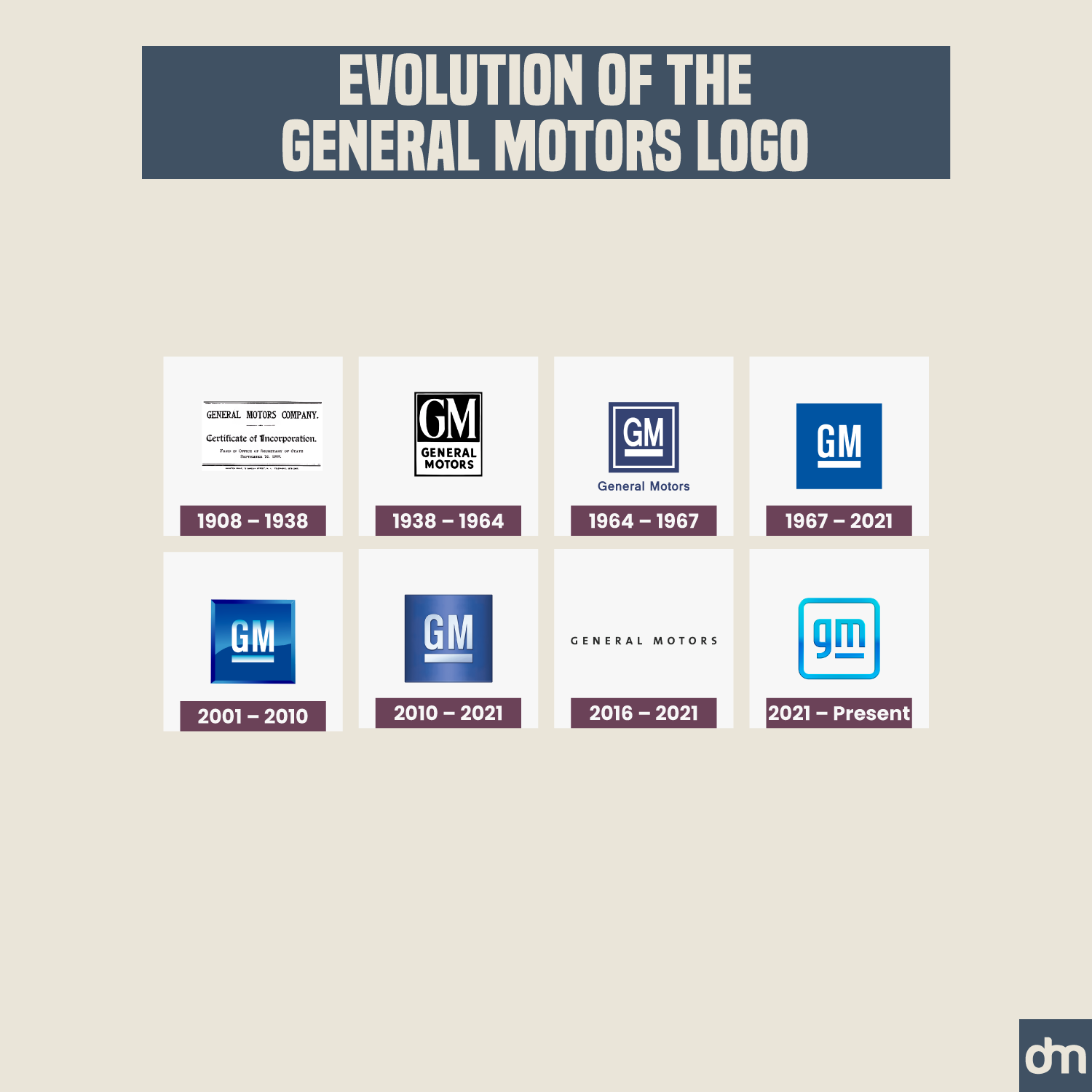
General Motors Logo Evolution
General Motors has tried a few different things with its logo design. It’s probably the only company on the list that existed without a traditional logo for the first thirty years. Instead, it used its certificate of incorporation as its official brandmark.
Since then, the GM logo has gone through a few redesigns. Color changes, shape adoptions, font restyling, 3D effects, and more gripped the company logo. In 2016, the brand adopted a bland wordmark logo before returning to its square shape again. It now sports a negative space logo design that houses a hidden electric plug detail in the logo.
6. IBM
Established In: 1911
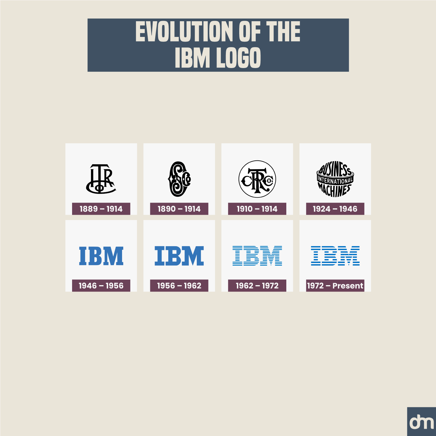
IBM Logo Evolution
IBM has had a brand facelift like no other on the list. While its current logo is a clean and minimal flat design concept, the company’s first logo was a multi-layer bonanza.
It was designed by Paul Rand when the company was called The International Time Recording Company. The brand kept changing names and logo designs as owners explored different things to do with the business.
IBM, when it was first established under this brand name, sported a globe-shaped computer company logo to demonstrate its worldwide appeal.
7. John Deere
Established In: 1837
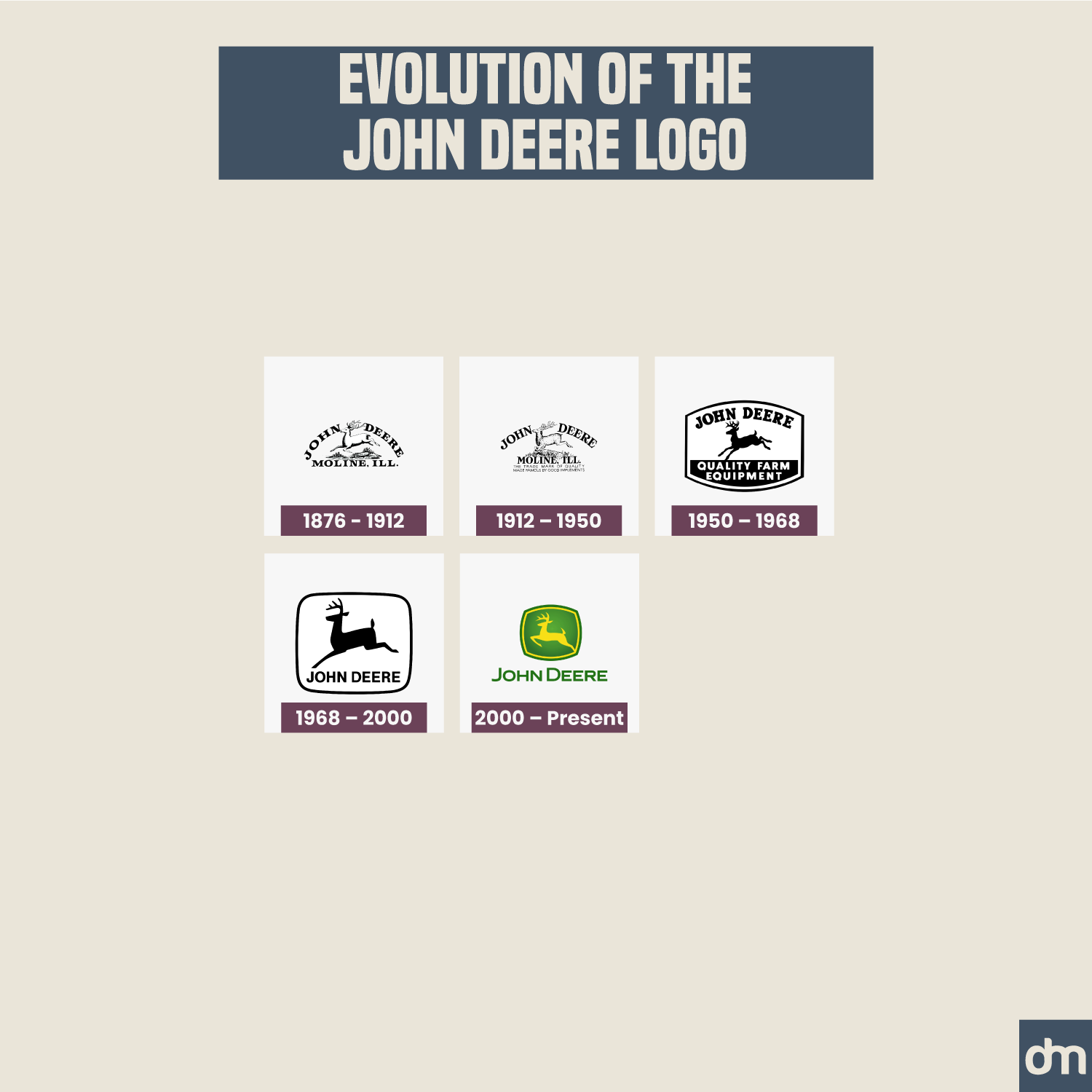
John Deere Logo Evolution
The leaping deer is the most iconic detail in the John Deere logo. The deer icon serves as the brand’s greatest logo design asset, giving the brand a meaningful idea and a central figure to iterate around.
8. Heinz
Established In: 1869
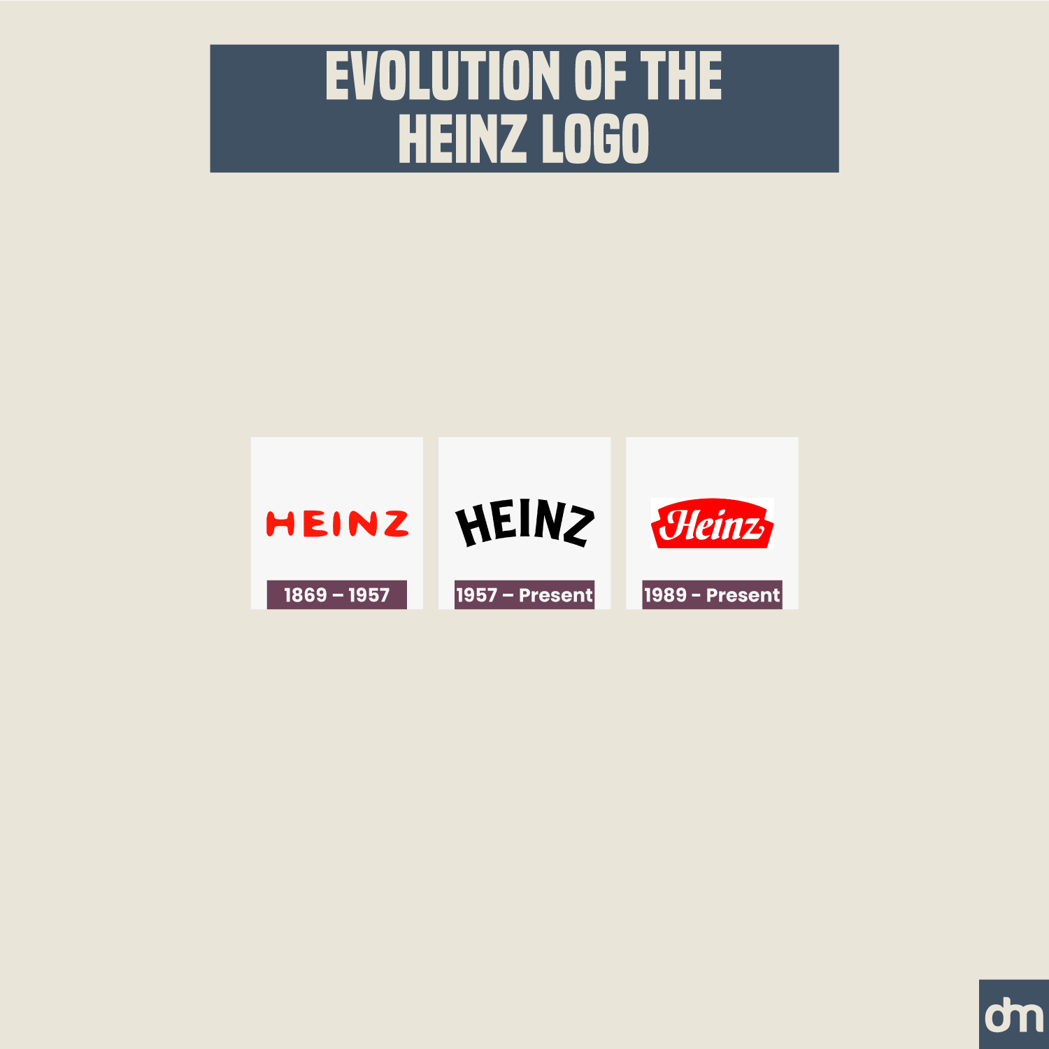
Heinz Logo Evolution
Heinz has always been a wordmark logo with a signature red color. It had handwritten details in the first iteration of the logo but then adopted script fonts to design its visual identity from 1957 onward.
9. Cadbury
Established In: 1824
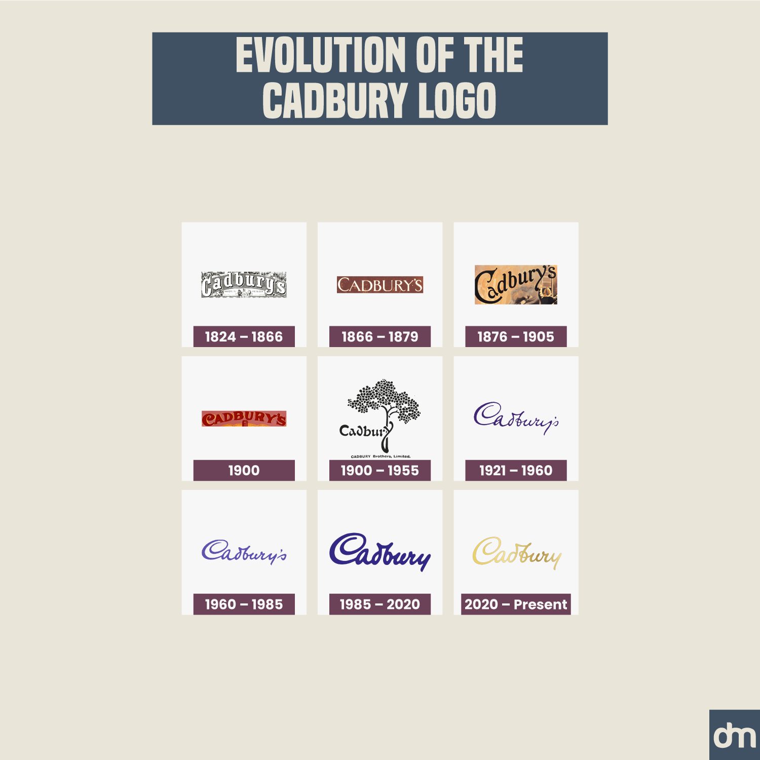
Cadbury Logo Evolution
What do the latest Wonka movie logo and Cadbury logo have in common?
They both sport a shiny golden color as their primary color palette.
What else do they share? They are both chocolate brands — Wonka being a short-lived one — and also feature purple heavily in their branding.
10. Nestlé
Established In: 1866
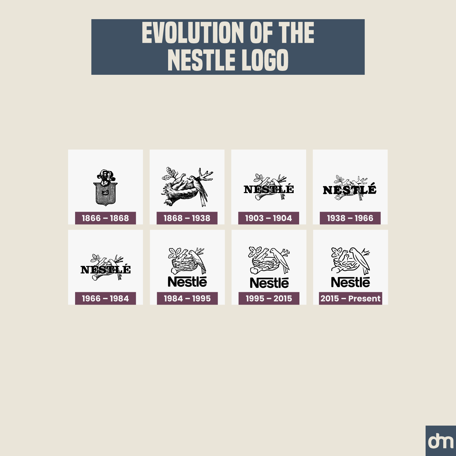
Nestlé Logo Evolution
The Nestlé logo transformed from a complex shield design to a cleaner combination logo across 100 years of history. It uses a nesting bird icon to highlight the themes of care, nutrition, and family.
11. Shell
Established In: 1907
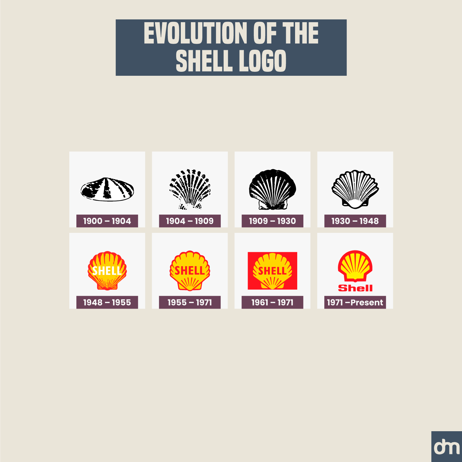
Shell Logo Evolution
Shell used to have a literal shell icon as the company seal. The brand now uses a more stylized red and yellow shell symbol as a transformed brand identity.
12. Levi’s
Established In: 1853
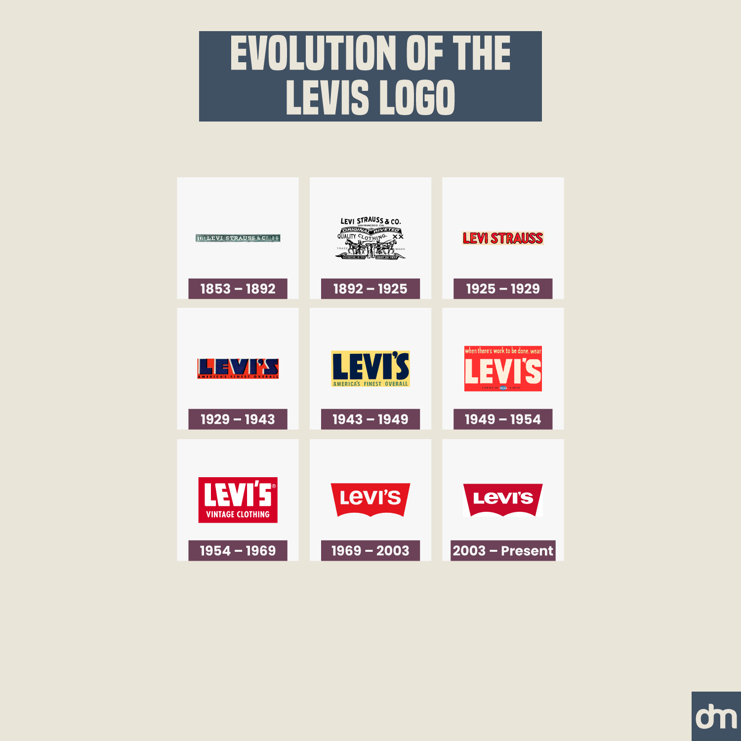
Levi’s Logo Evolution
Levi’s has been one of the most transformative brands of our times. It turned miner workwear into style statements and revolutionized our everyday essentials. Its logo design has kept pace with time, refreshing every few decades.
13. Mercedes-Benz
Established In: 1926
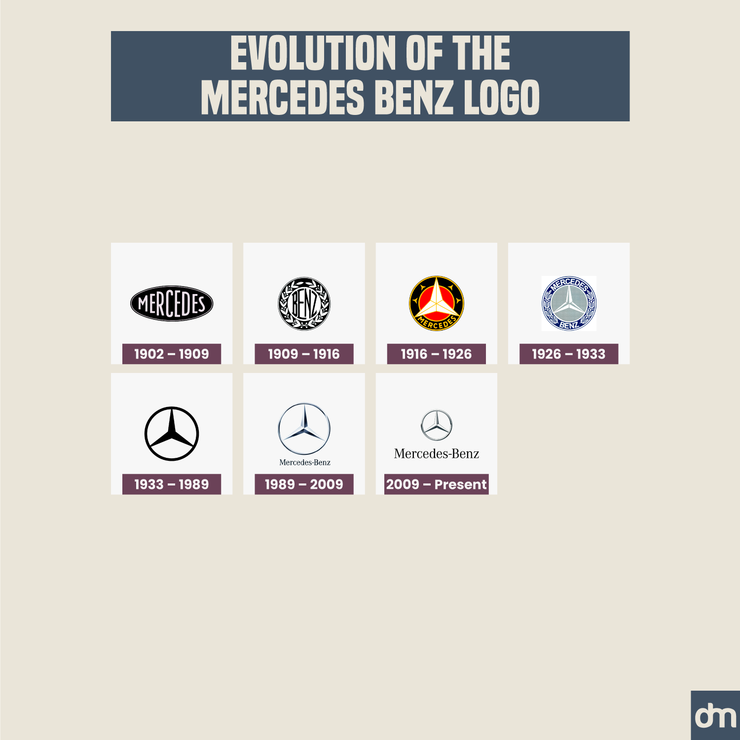
Mercedes-Benz Logo Evolution
Before it was Mercedes-Benz, the Mercedes logo was a simple wordmark inside an oval seal. The company then transformed its logo into a brandmark before settling on both text and mark details for its current logo design.
14. Peugeot
Established In: 1896
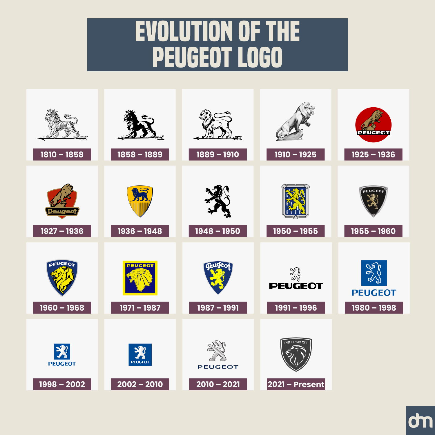
Peugeot Logo Evolution
As you can see, Peugeot has been busy. The automobile brand has tried a ton of different logo designs, never settling on one. The Peugeot lion has been the only consistent detail in this maze. If you are also struggling with your logo design and fail to find the one you want, let Peugeot be your hope.
If billion-dollar brands can suffer from a lack of focused design, our local SMBs have nothing to worry about. To get your creative wheel turning, get in touch with our AI logo maker and see what it can do to help you get the car logo of your dreams.
15. Tiffany & Co.
Established In: 1837
Tiffany & Co. Logo Evolution
Consistency is one of the keystones of luxury branding. Tiffany & Co. keeps true to it by never wavering from the brand’s original logo. And why should it, the Tiffany & Co. logo design is exquisite! Every bit as fancy as the bespoke jewelry they make.
16. Johnson & Johnson
Established In: 1886
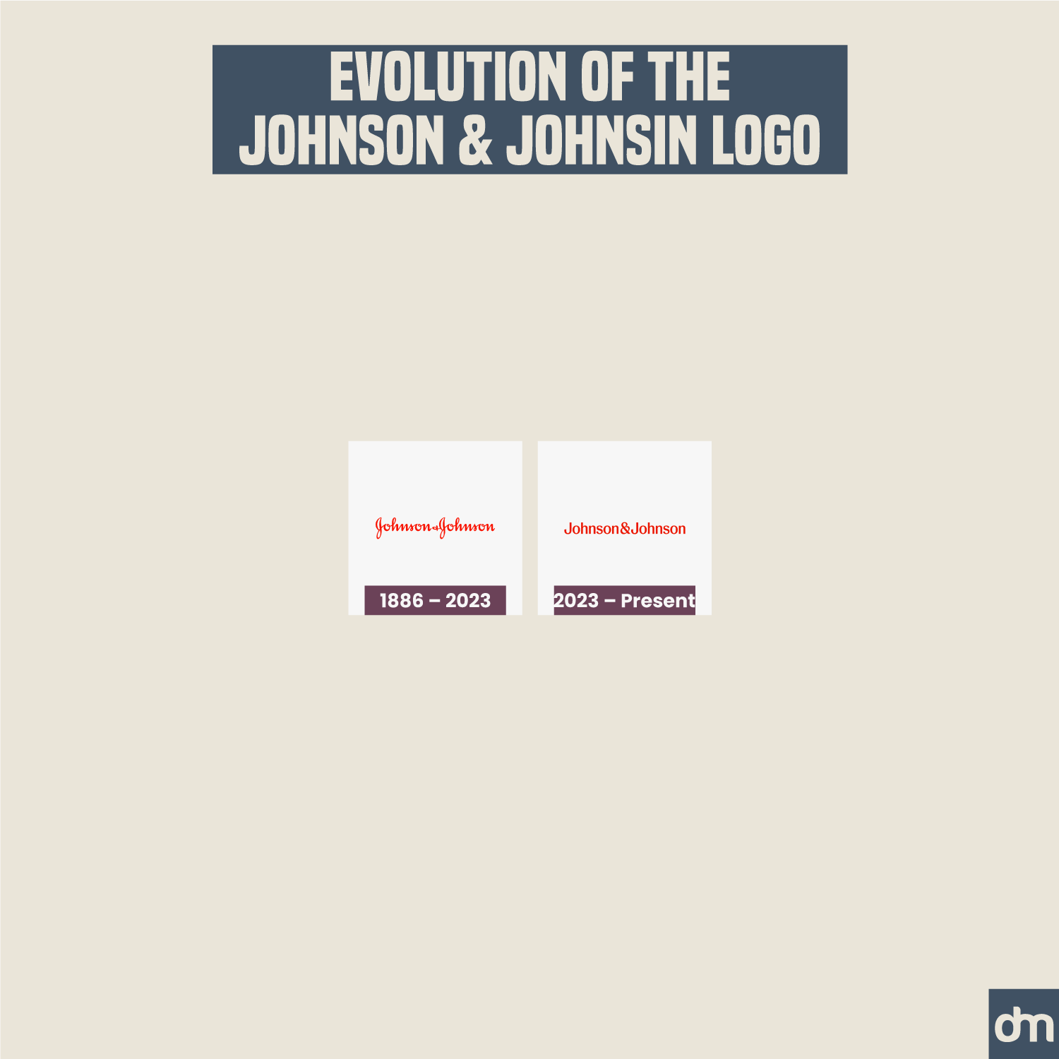
Johnson & Johnson Logo Evolution
Johnson and Johnson recently rebranded its logo after sticking with the original design for over 130 years. This rebrand has seen several subtle and major changes to the logo — color, font, and details included.
17. Brooks Brothers
Established In: 1818
Brooks Brothers Logo Evolution
In line with luxury branding rules, the Brooks Brothers’s ornate logotype has remained consistent with the brand for over two hundred years. Its sheep mascot logo has roots in French aristocracy where a famous duke adopted the sheep symbol to represent his elite wool flocks.
18. Heineken
Established In: 1864
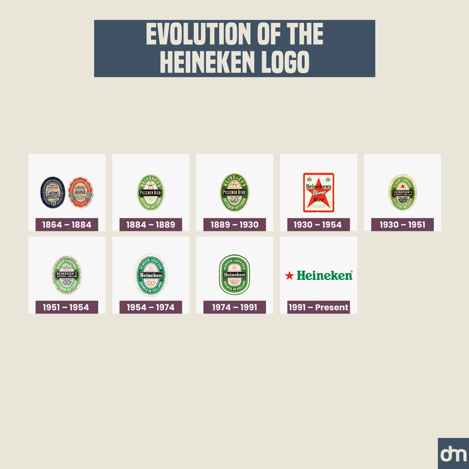
Heineken Logo Evolution
Heineken probably has the world’s most famous brewery logo. The brand had a traditional emblem logo design but moved to a simpler logotype in 1991 to adopt a cleaner and modern brand identity.
19. Pabst Blue Ribbon
Established In: 1844
Pabst Blue Ribbon Logo Evolution
Pabst Blue Ribbon is another brand on the list that never deviated from its design roots. While the design may be somewhat busy according to modern standards, its audience favors the classical details that set this vintage logo design apart.
20. L’Oréal
Established In: 1909
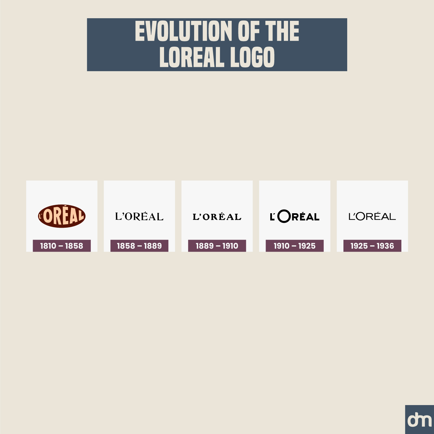
L’Oréal Logo Evolution
Loreal has enjoyed a stable logo design evolution with its world-famous logotype. If you want to replicate this design consistency, create a logotype with a simpler font that can endure time changes and give your brand identity a longer shelf life.
21. Pittsburgh Pirates
Established In: 1882
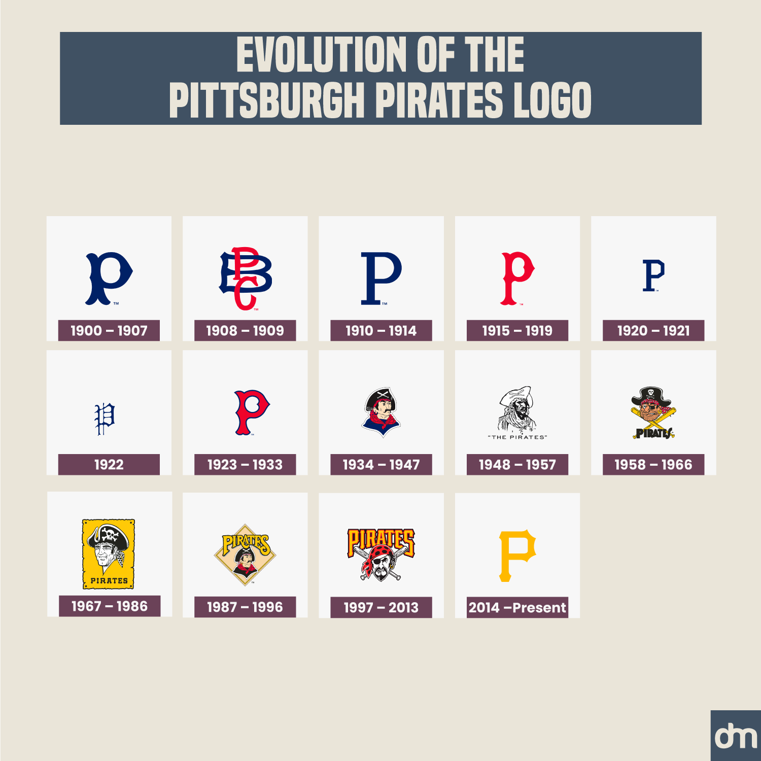
Pittsburgh Pirates Logo Evolution
The Pittsburgh Pirates brand identity has oscillated between two design styles — monograms and mascots. Mascot logos are great at humanizing a brand but monograms bring class and crispness to the design. Which of these two style leanings do you favor?
22. Tissot
Established In: 1853
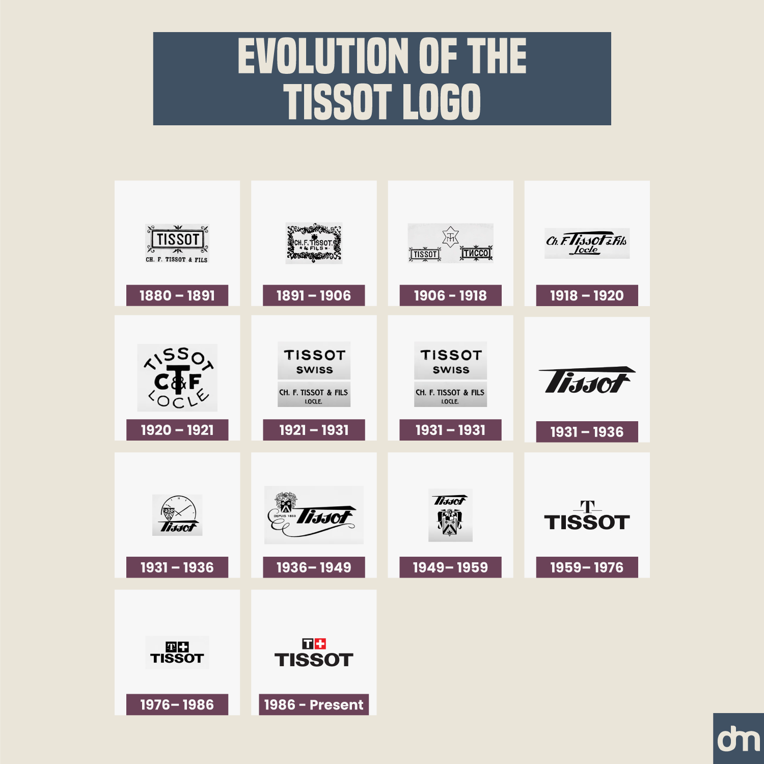
Tissot Logo Evolution
Tissot is a famous watch company logo and uses a display sans serif in its brand identity. Display fonts add not only legibility but also character to the logo ensuring the brand message is heard loud and clear.
23. Cartier
Established In: 1847
Cartier Logo Evolution
Another brand identity design that has consistently favored its original design directions is Cartier. Its beautiful handwritten wordmark is globally recognized and lends the brand credibility across cultures.
Want to know how great wordmarks are made? Consult this wordmark dos and don’ts guide to get clarity.
24. Prudential
Established In: 1875
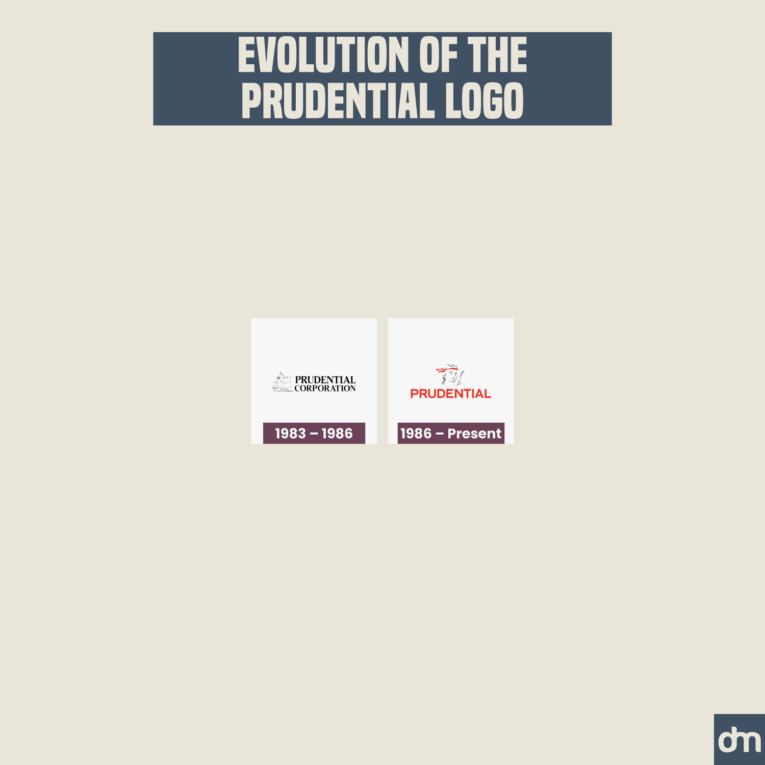
Prudential Logo Evolution
Major transformations in the Prudential logo design have been in the realm of font scale changes. The ratio of the font size to the mascot size keeps fluctuating to demonstrate brand identity shifts.
25. Singer
Established In: 1851
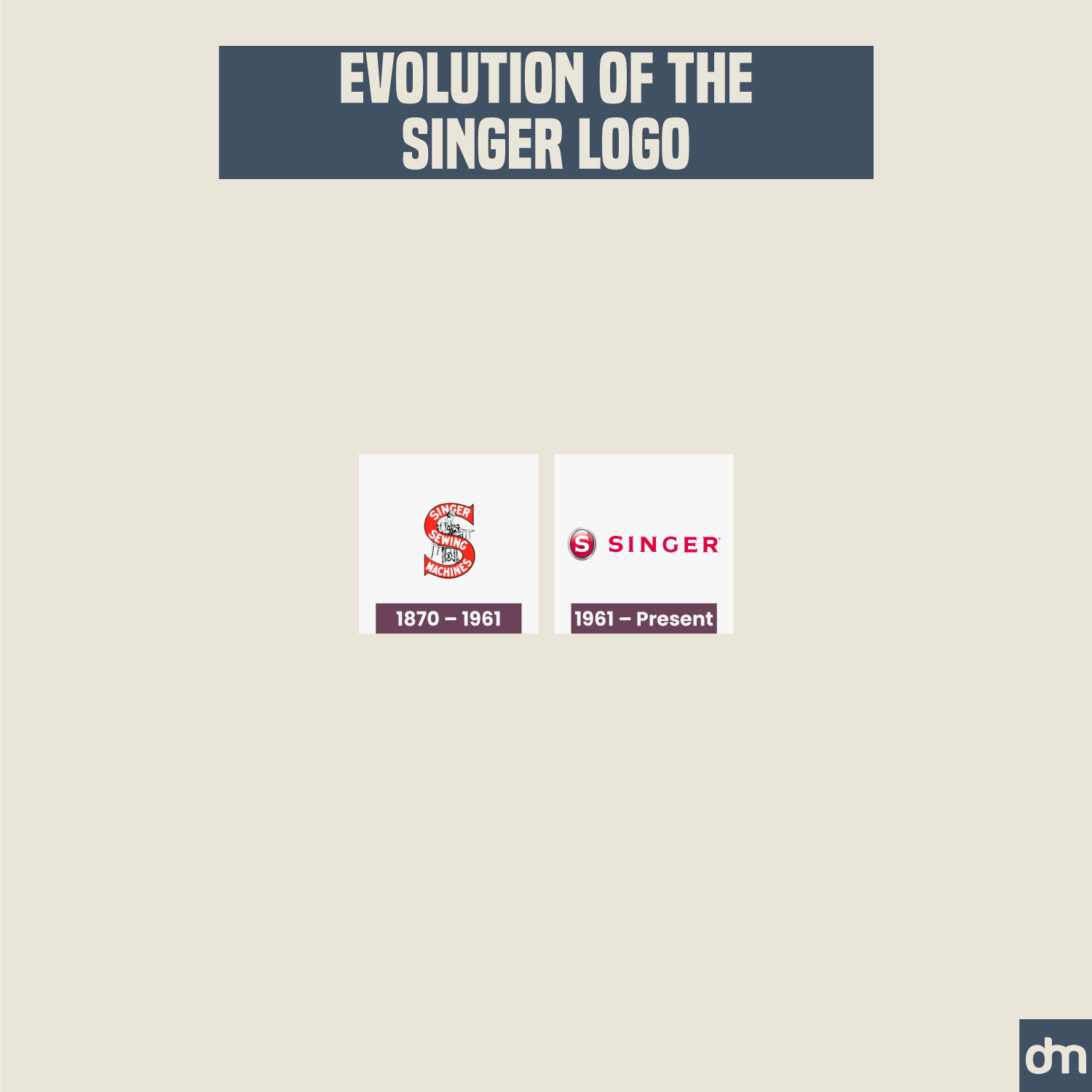
Singer Logo Evolution
Singer used to have a banner logo design with the brand name strewn across the curves. The brand now boasts a simpler logo, much in tune with the times.
26. Carlsberg
Established In: 1847
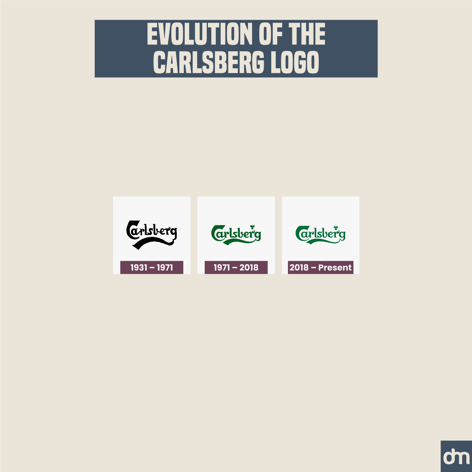
Carlsberg Logo Evolution
Carlsberg has experimented with color changes but since the 1980s uses a forest green color to show its connection with nature and abundance, and also because green has been an iconic color in brewery thanks to the traditional beer bottles in signature green.
27. Guinness
Established In: 1759
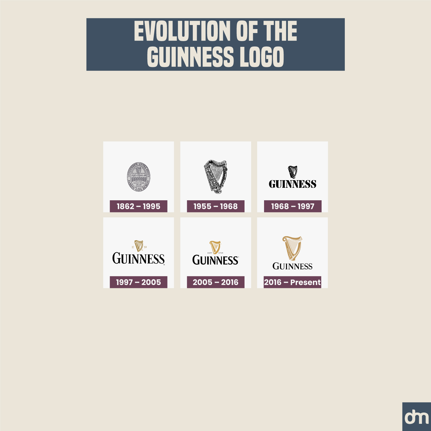
Guinness Logo Evolution
As iconic details go, Guinness’ harp logo is a seal of trust and excellence in the industry. It sets apart the Guinness brand from the rest and allows the brand to enjoy a place of prestige among its peers.
28. American Express
Established In: 1850
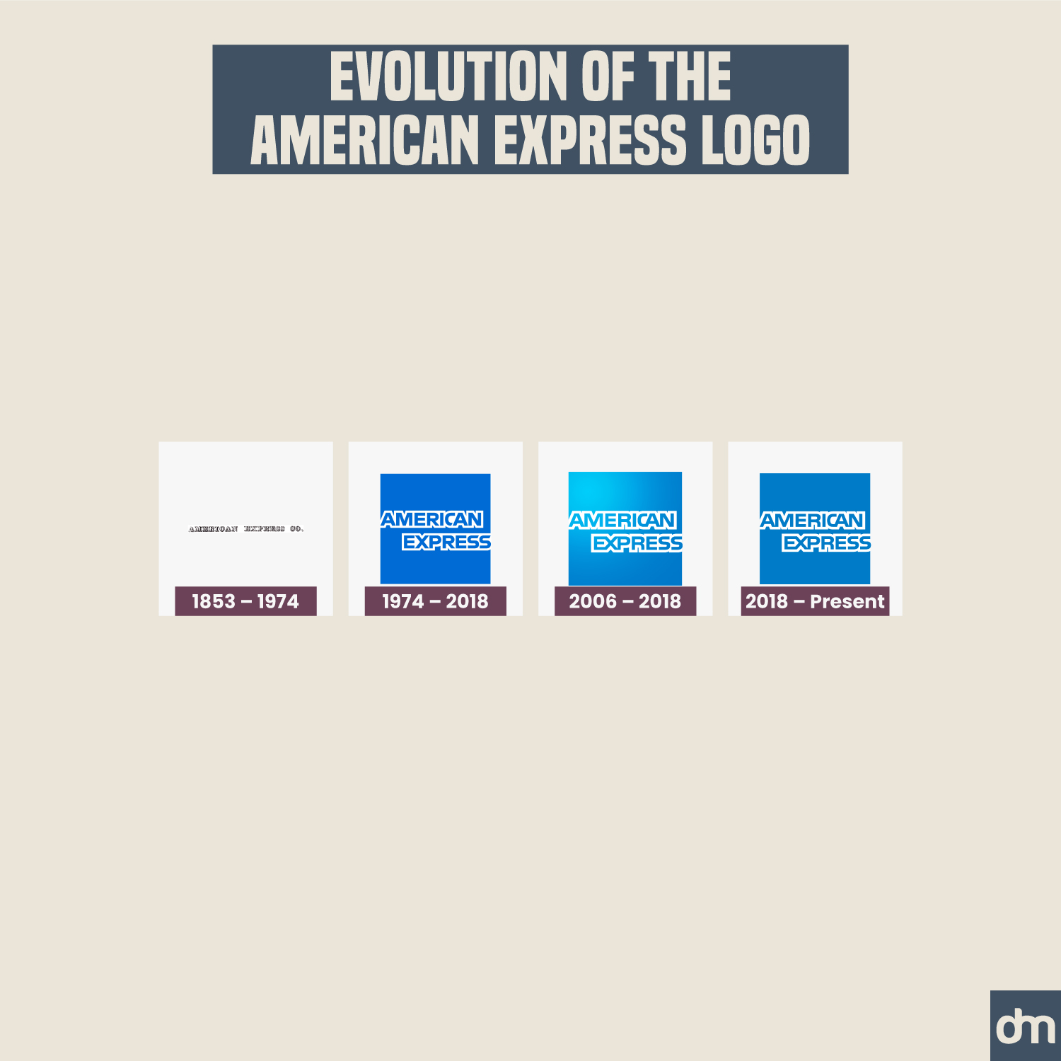
American Express Logo Evolution
As a financial services logo, American Express has transformed its visual identity from black to blue to achieve harmony with the rest of its industry which favors blue as a color of stability and longevity.
29. Bacardi
Established In: 1862
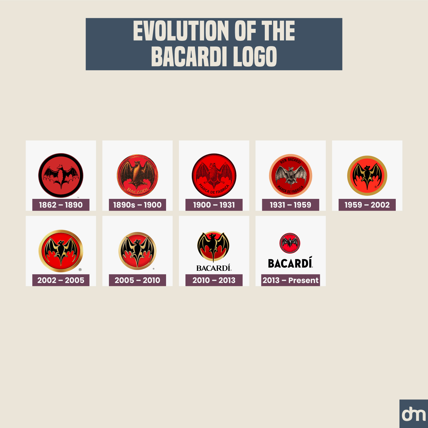
Bacardi Logo Evolution
When you see the Bacardi bat logo design, you not only think of great taste but also an experience and a lifestyle choice. That’s why Bacardi has remained loyal to its iconic bat symbol and refuses to part with it as it transforms its brand identity.
30. Kellogg’s
Established In: 1906
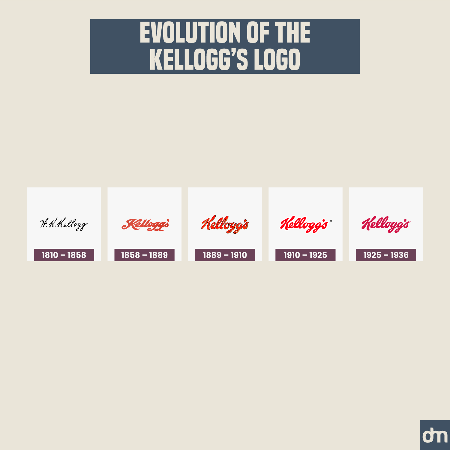
Kellogg’s Logo Evolution
While the official Kellogg’s logo is a wordmark, offering the company instant brand recognition, the most lovable bit of its brand identity is its Tony the Tiger mascot — which we sorely miss in the brand’s official logo.
31. Bayer
Established In: 1863
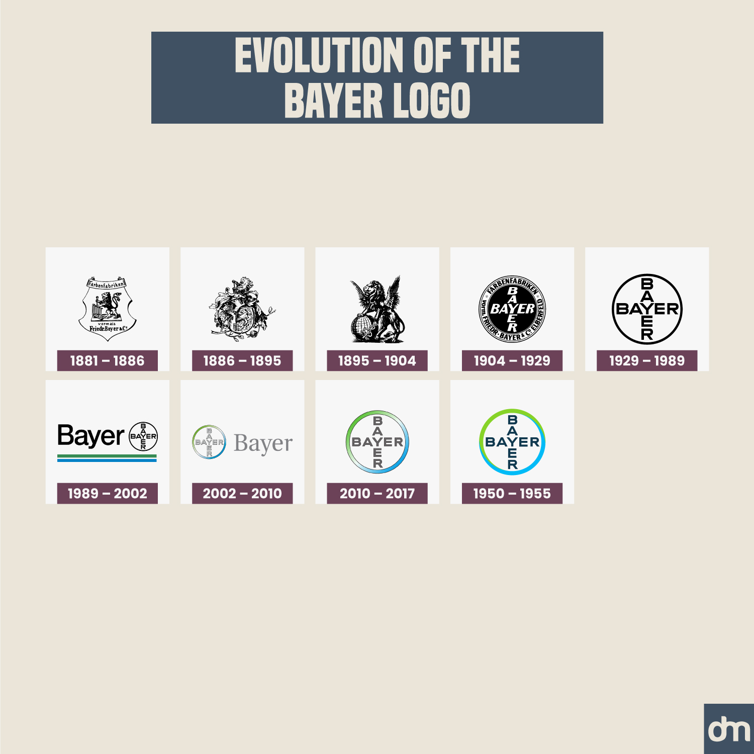
Bayer Logo Evolution
The healthcare industry has always struggled with identity design challenges, and the Bayer logo is no exception. They have tried to adopt a blue-green gradient color palette to appear more modern and updated, but the cross wordmark is one of the design trends from the past and must stay there.
32. AEG
Established In: 1883
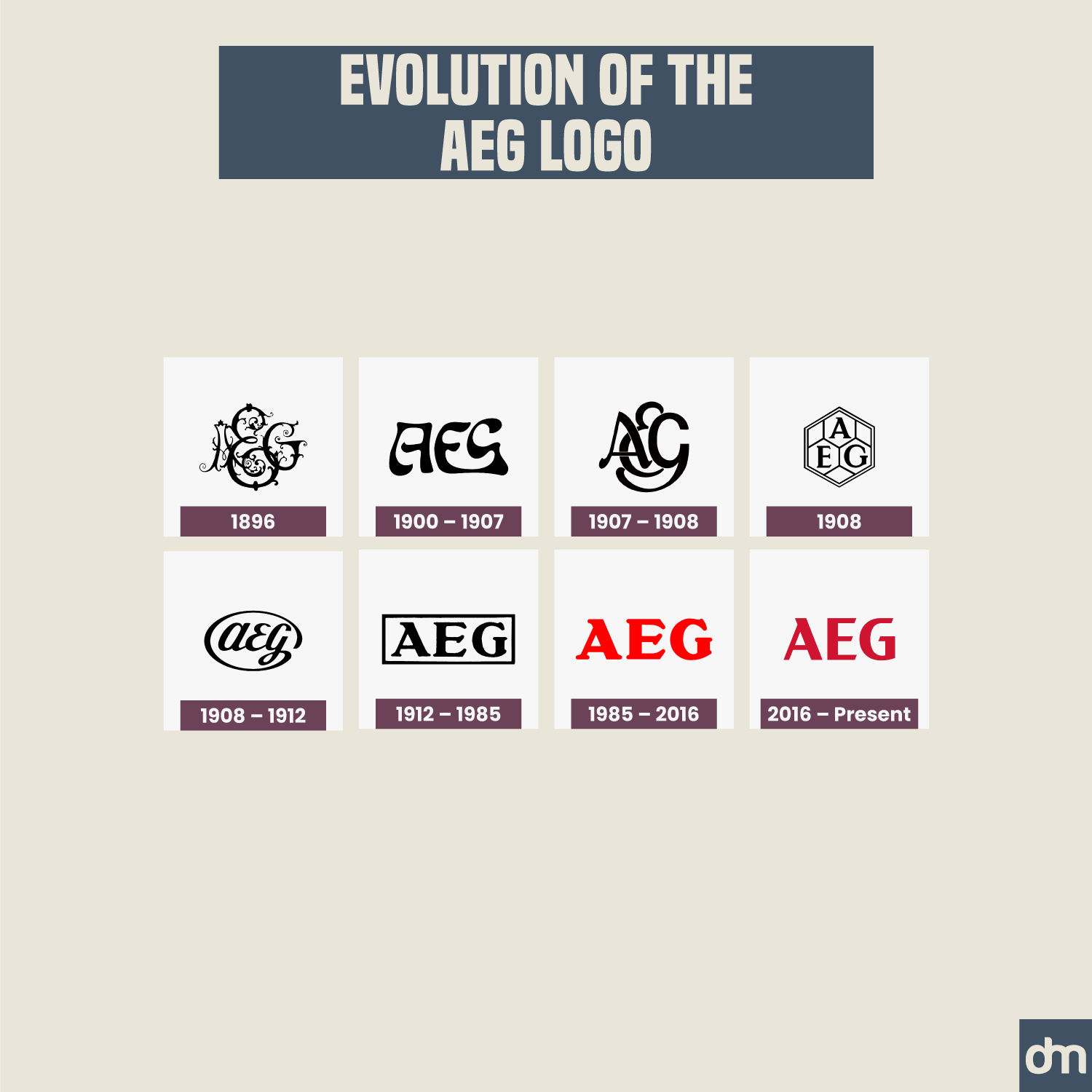
AEG Logo Evolution
AEG has always been a lettermark logo, and for good measure. The brand name is somewhat long and may pose challenges in global advertising and modern digital spaces. If you too have a complicated brand name, look to your brand initials to create a minimal logo design. BBC, BMW, HBO, and several others lead with the idea.
33. Chanel
Established In: 1910
Chanel Logo Evolution
Like many other luxury brands on this list, Chanel’s loyalty to its iconic interlocking Cs has been a delight to watch. The identity design for Chanel has always rested on this single logo design which continues to serve Chanel by being simple, modern, and meaningful.
34. Bosch
Established In: 1886
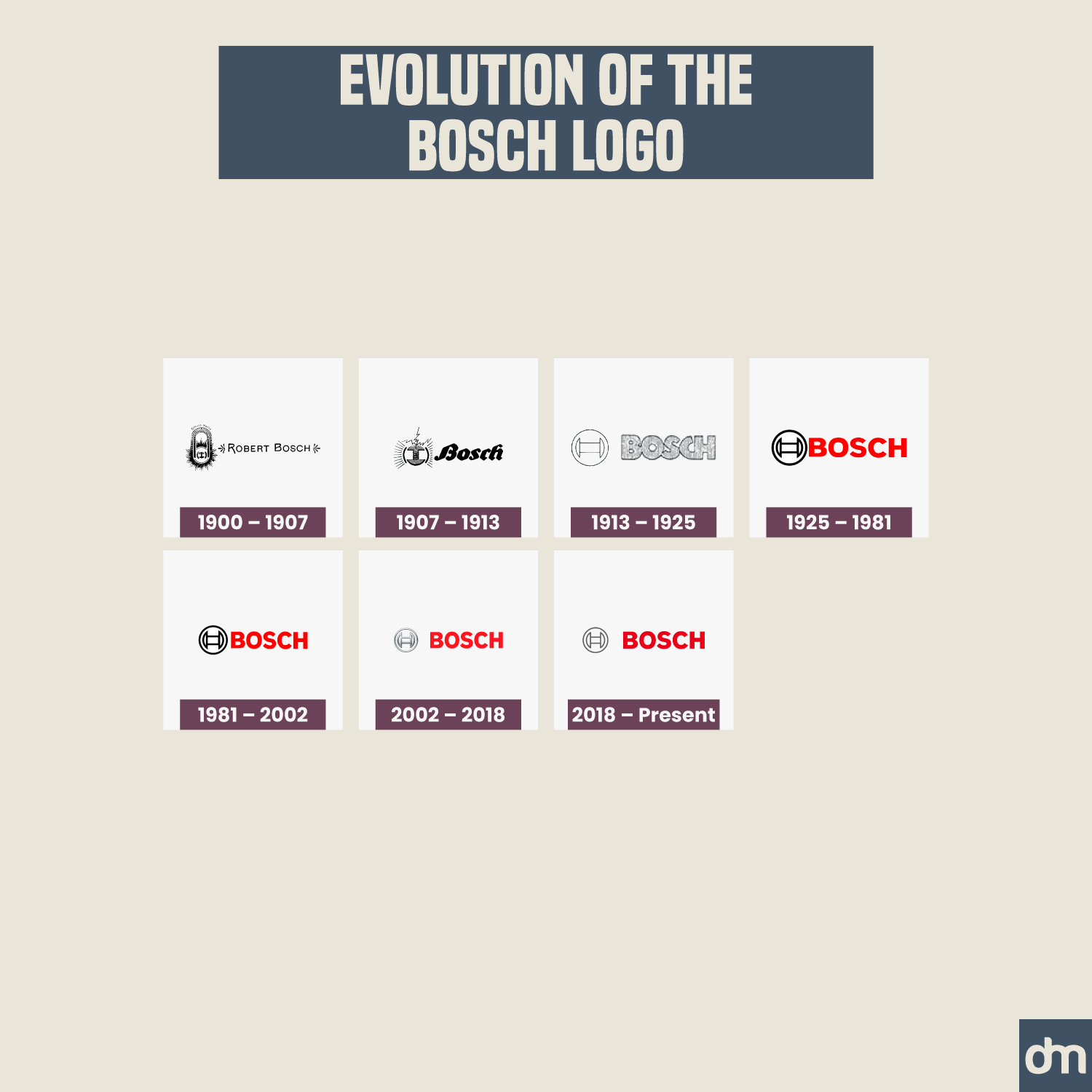
Bosch Logo Evolution
Brands often struggle to decide whether to update the logo design radically or stay close to the roots. Bosch has achieved a design balance via a consistent color palette and updated symbology.
35. Nokia
Established In: 1865
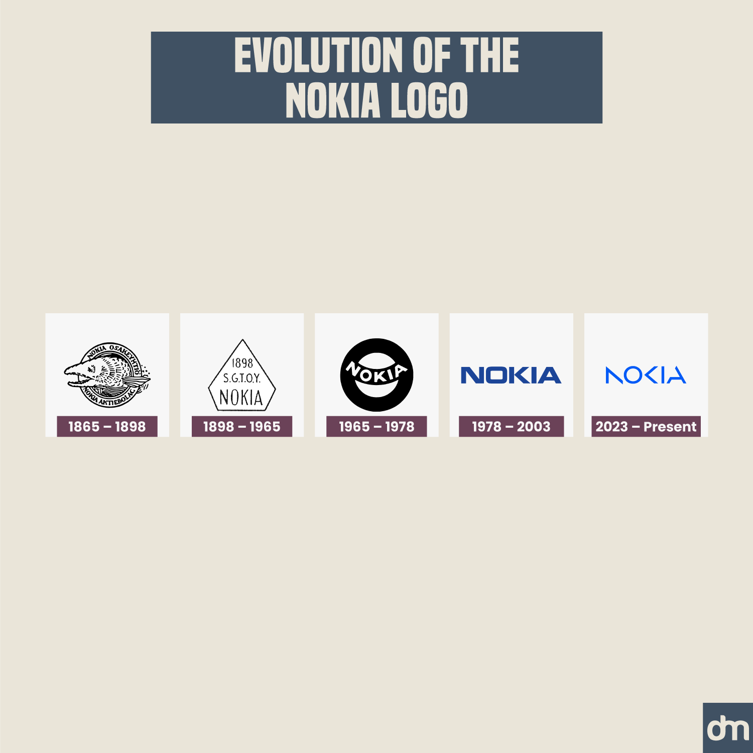
Nokia Logo Evolution
Just for the record, we love the Nokia logo redesign and wrote about it in our logo revamps of 2023. The Nokia logo successfully maneuvered the field from being a clunky shield design to an imposing wordmark to the present finesse of being a sharp and refreshing thing of design beauty.
36. Burberry
Established In: 1856
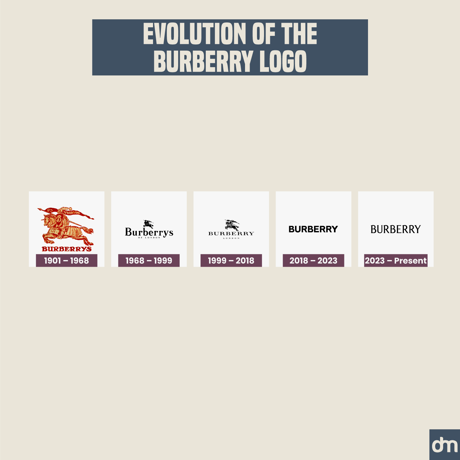
Burberry Logo Evolution
Burberry recently went back to its vintage roots and ditched its bland minimal logo design that it had adopted in 2018.
37. Michelin
Established In: 1889
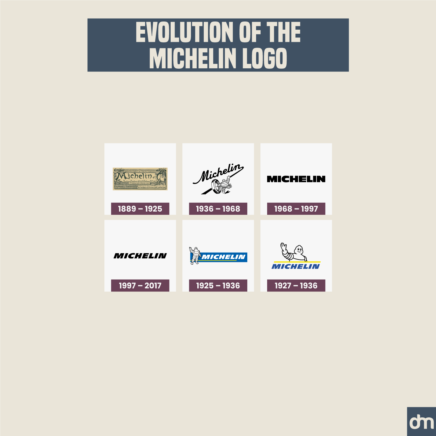
Michelin Logo Evolution
During its brand identity evolution, Michelin has tried a few different things. Its current mascot logo design is its most successful attempt and has allowed Michelin to become a trustworthy automotive manufacturing brand.
38. Dupont
Established In: 1802
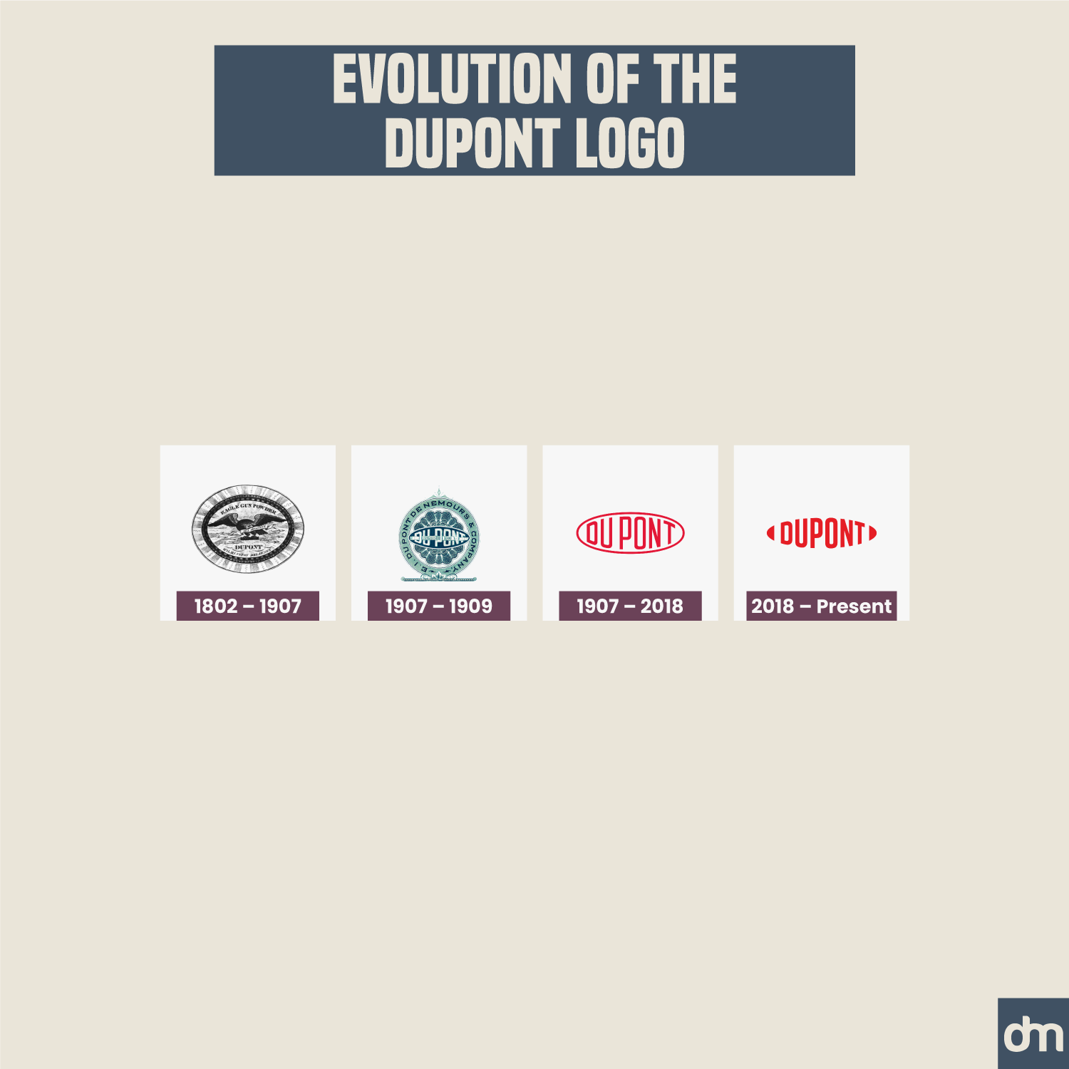
Dupont Logo Evolution
Take a stroke of genius from the Dupont book and use a bespoke font design to create your wordmark. This will ensure longevity to your identity design and give it the distinct character it needs.
39. Guerlain
Established In: 1828
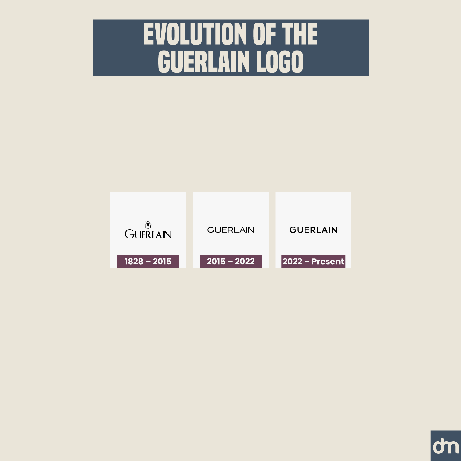
Guerlain Logo Evolution
Brands have historically used wordmarks to put all emphasis on their brand names. Guerlain has chosen to do the same by letting its symbol go, focusing solely on the power of its brand name.
40. Turkish Air Force
Established In: 1911

Turkish Air Force Logo Evolution
Luxury brands aren’t the only thing demonstrating a strong brand appeal with a consistent logo evolution. The Turkish Air Force logo has never changed from the time it was first conceptualized during the Ottoman Empire. Talk about longevity and class!
41. Patek Philippe
Established In: 1839
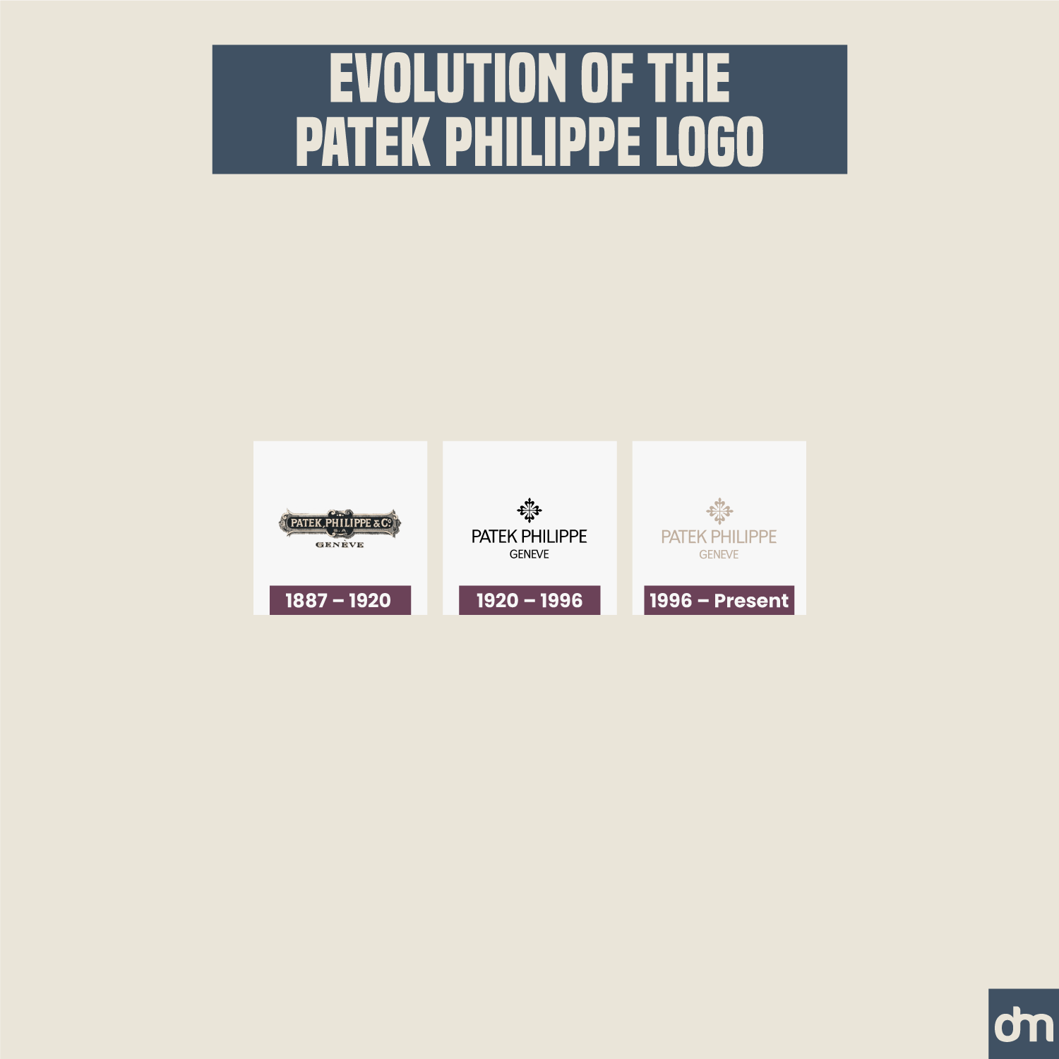
Patek Philippe Logo Evolution
Patek Philippe has let all the colors go from its logo as it transformed its brand identity over the years. It currently has a beige logo which may not give sufficient contrast to the design, affecting its accessibility but it provides a touch of soft elegance that the luxury watchmaker clearly preferred.
42. Wrigley’s
Established In: 1891
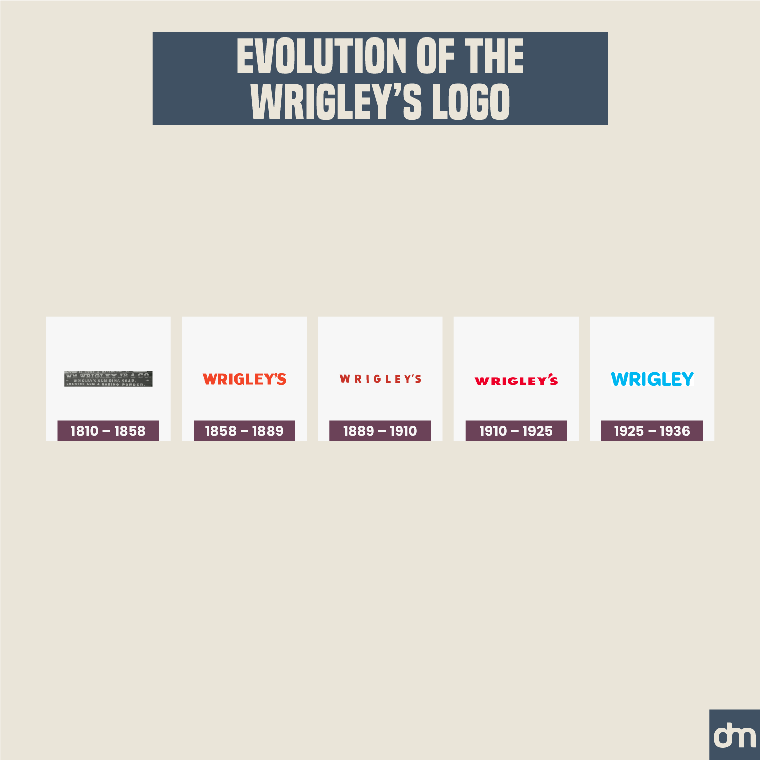
Wrigley’s Logo Evolution
Wirgley’s is known for its spearmint gums so it never made sense for the brand to have a red logo design. In marketing design, spearmints are either portrayed in green or blue to communicate their cool and fresh taste. The current blue logo, therefore, is the right one to hold the brand mantle now.
43. Louis Vuitton
Established In: 1854
Louis Vuitton Logo Evolution
Do you see the pattern? Brands that fall in the traditional category of luxury and exclusivity hardly ever mess with their classic logos. Since they start with clean and simple designs from the get-go, they usually sail through the decades without a problem because these classic fonts never go out of style — allowing them to remain accessible and convey their coveted timelessness too.
44. J.C. Penny
Established In: 1902
J.C. Penny Logo Evolution
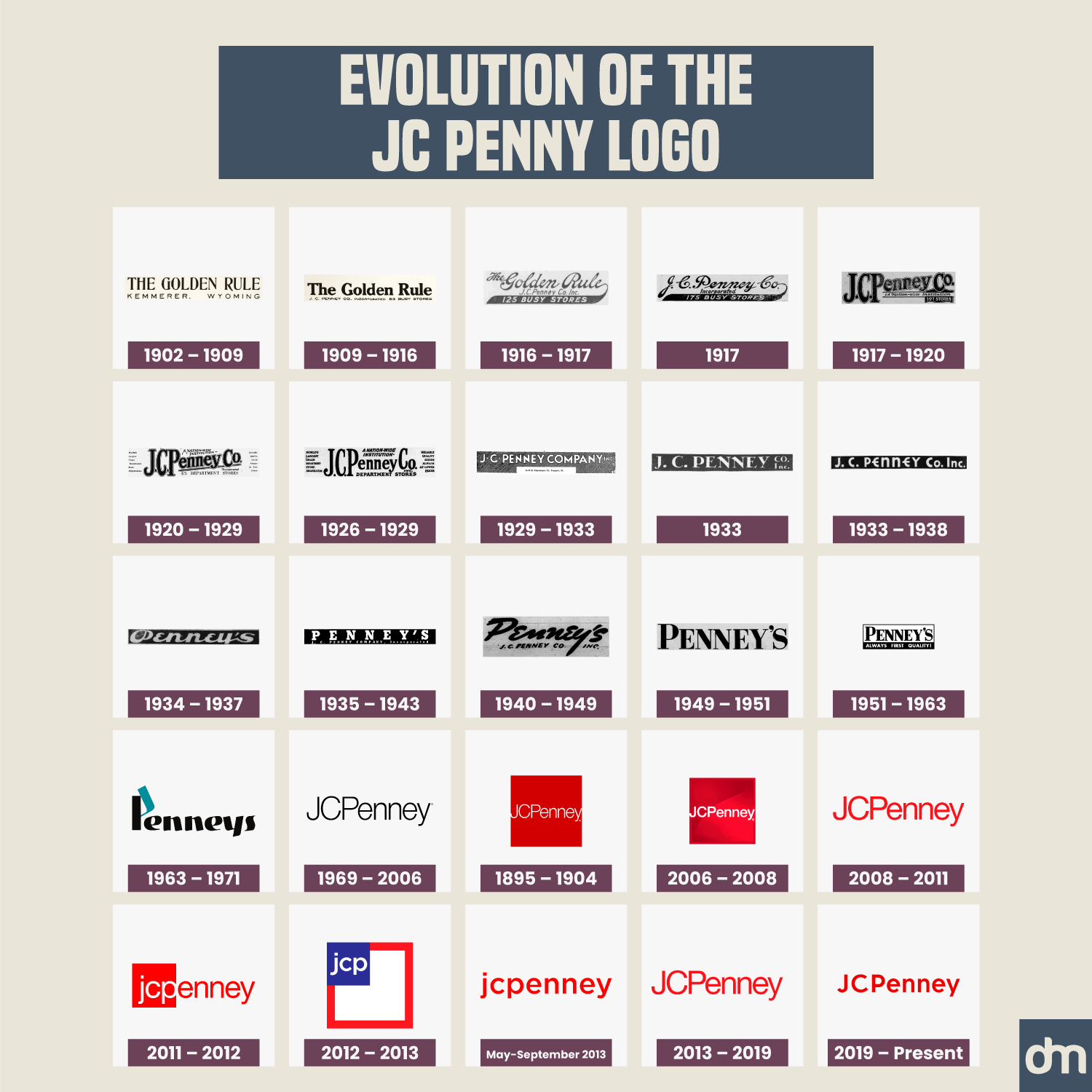
See the contrast? While the Chanels and the Louis Vuitton of the world stay timeless and unchanging, fast fashion brands like J.C. Penny continue to update their design identities. Make of that what you will.
45. UPS
Established In: 1907
UPS Logo Evolution
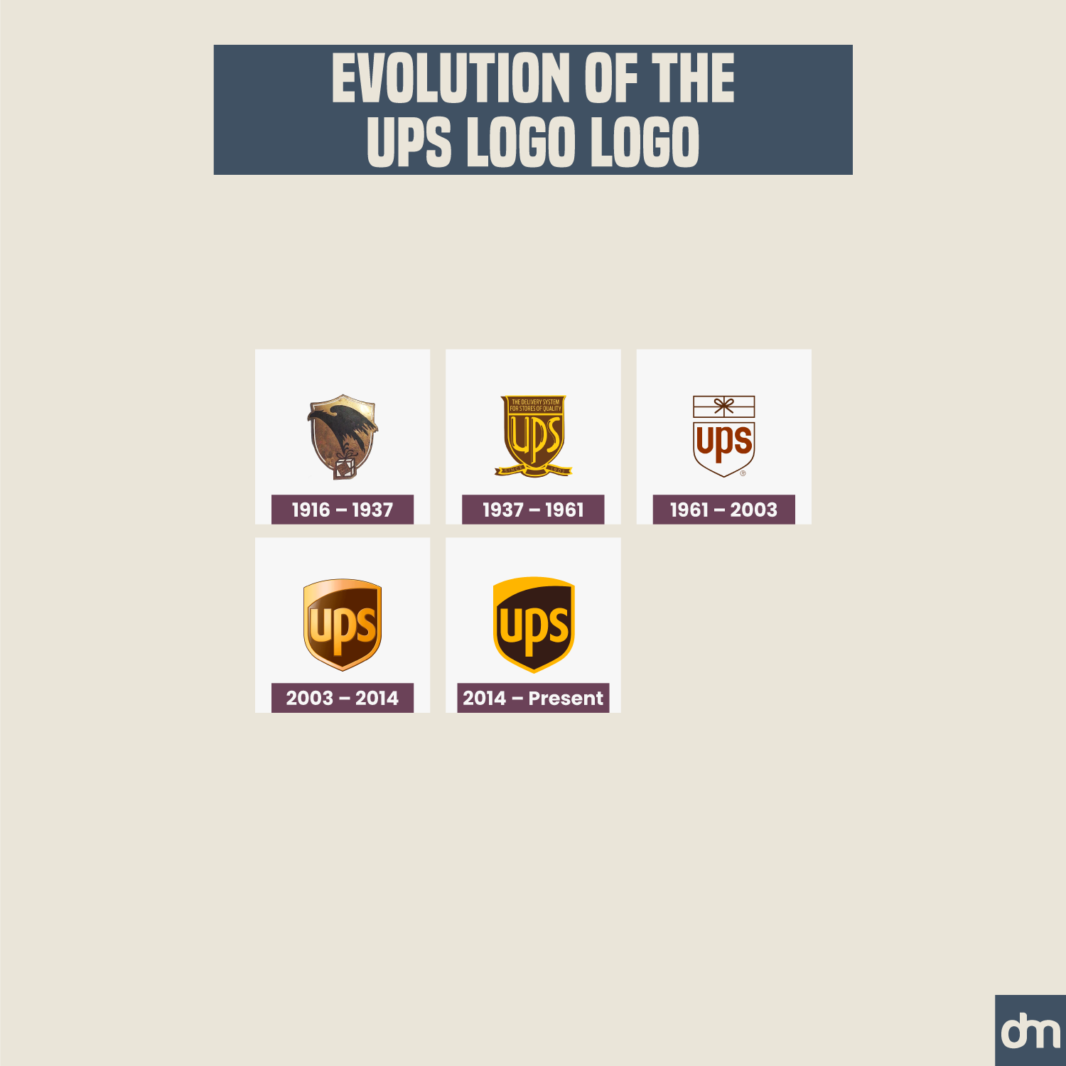
The UPS logo used to feature an eagle icon on its shield to demonstrate its swift and accurate parcel delivery services. The eagle was removed the from logo but the iconic shield remains. We kinda wish it was the other way around if losing either was a must. What do you think?
46. Boeing
Established In: 1916
Boeing Logo Evolution
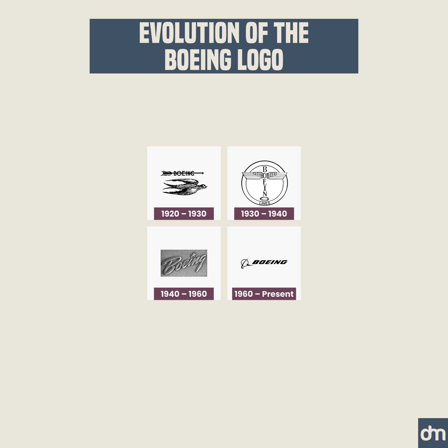
The Boeing logo evolution also started with an animal logo — a bird symbol — but quickly turned into a wordmark. The brand currently features a combination logo with some feather symbology to retain a connection with its original logo design.
47. Target
Established In: 1902
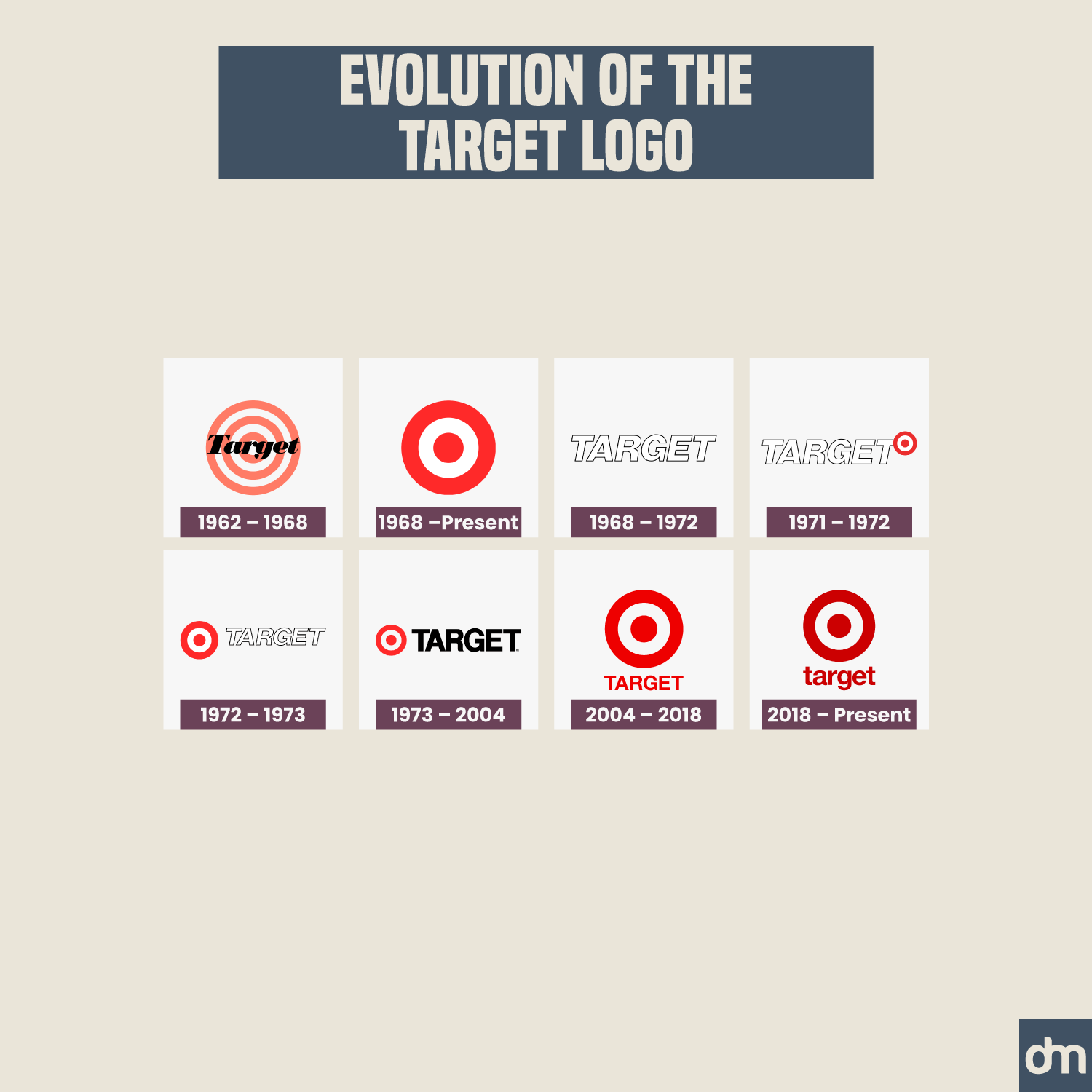
Target Logo Evolution
The Target logo evolution reflects the company’s frequent changing hands. It has gone through a few different ownerships since its start but now offers a more stable and durable brand identity.
48. Kraft Foods
Established In: 1903
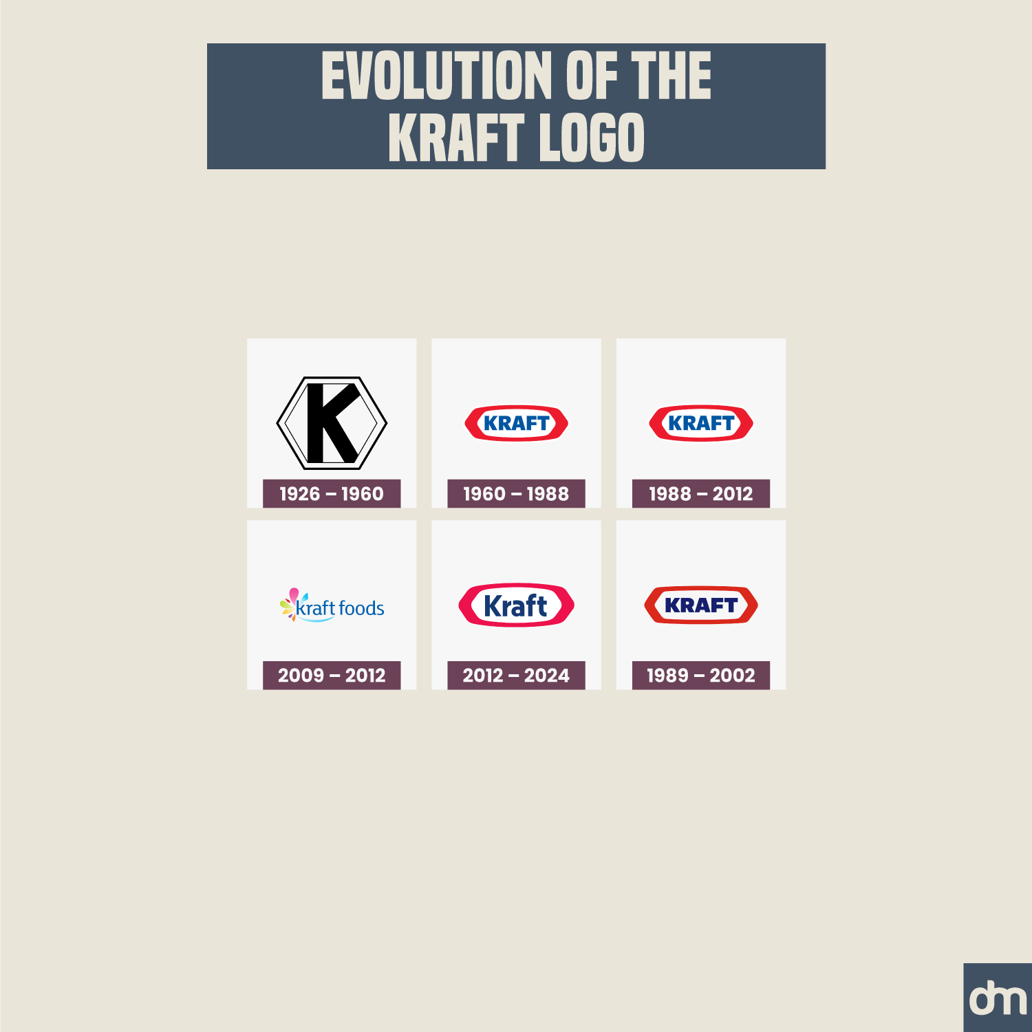
Kraft Foods Logo Evolution
The Kraft Foods logo evolved from a simple one-letter monogram to a more extended brand identity manifestation. Except for a few logo design changes here and there, the brand has presented a steady and uniform brand identity overall.
49. HSBC
Established In: 1865
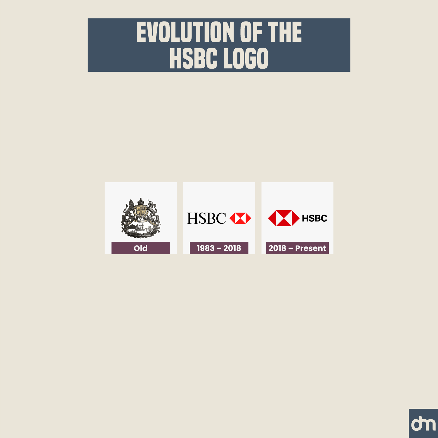
HSBC Logo Evolution
The HSBC logo transformation is a great example of how brands should evolve. Instead of jumping from one style to the next or trying lots of different new things, the HSBC logo remained clear in what kind of identity design change it needed and walked confidently toward that when the time came.
50. Colgate
Established In: 1806
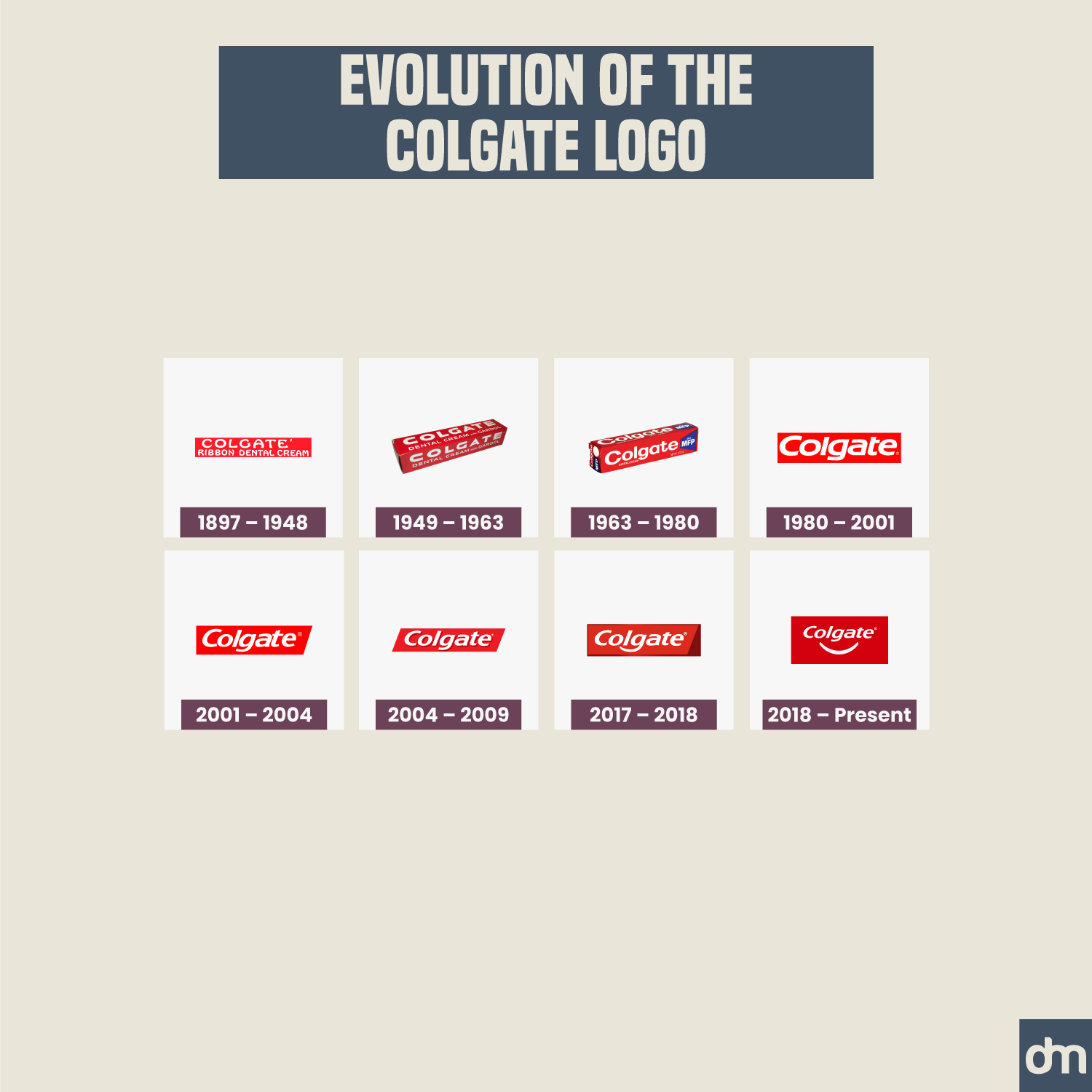
Colgate Logo Evolution
Colgate briefly tried to see how a smile icon would look with its logo but quickly dropped the idea. We agree with their design team because the smile looked very similar to Amazon’s a-to-z detail.
51. Mobil
Established In: 1866
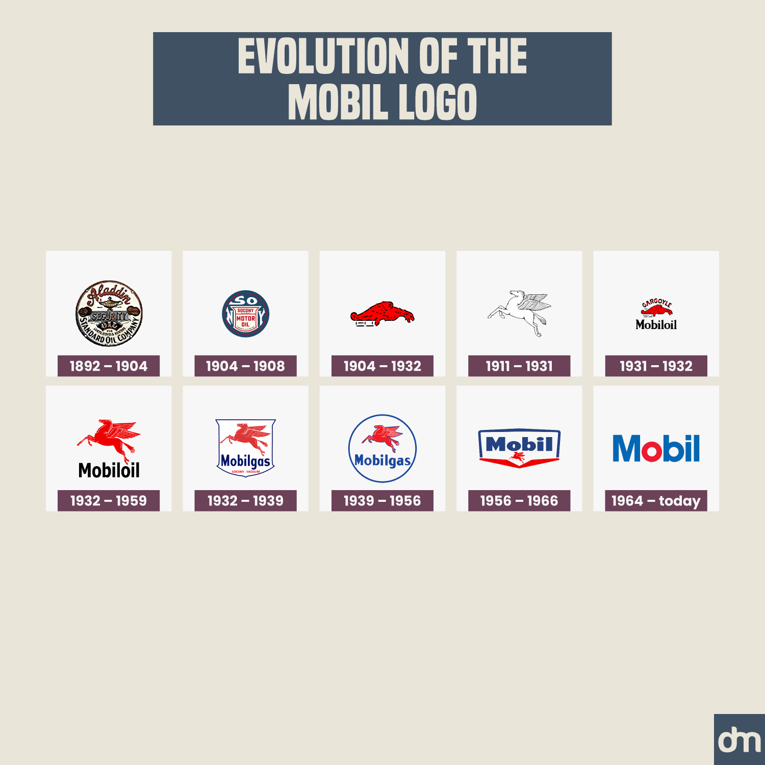
Mobil Logo Evolution
The best thing about the research on Mobil logo evolution was the fact that the company was once called Aladdin. How did that happen? Do you think we should do a logo history post about this?
52. AFC Ajax
Established In: 1900
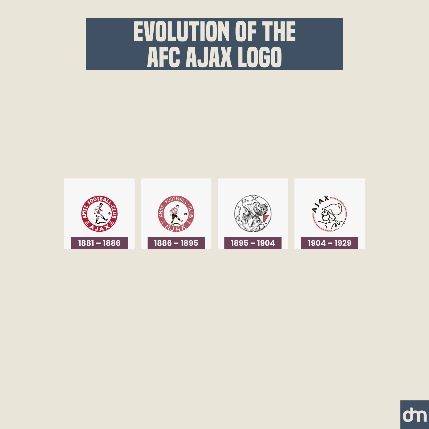
AFC Ajax Logo Evolution
If you are a vintage design fan, you will probably agree that the AFC Ajax logo transformation from an ornate shield design to a simplified illustration has been a tragedy. While we know they needed to do that for a print-ready digital logo that worked on all marketing platforms, seeing the vintage logo leave has been unfortunate.
53. NASA
Established In: 1958
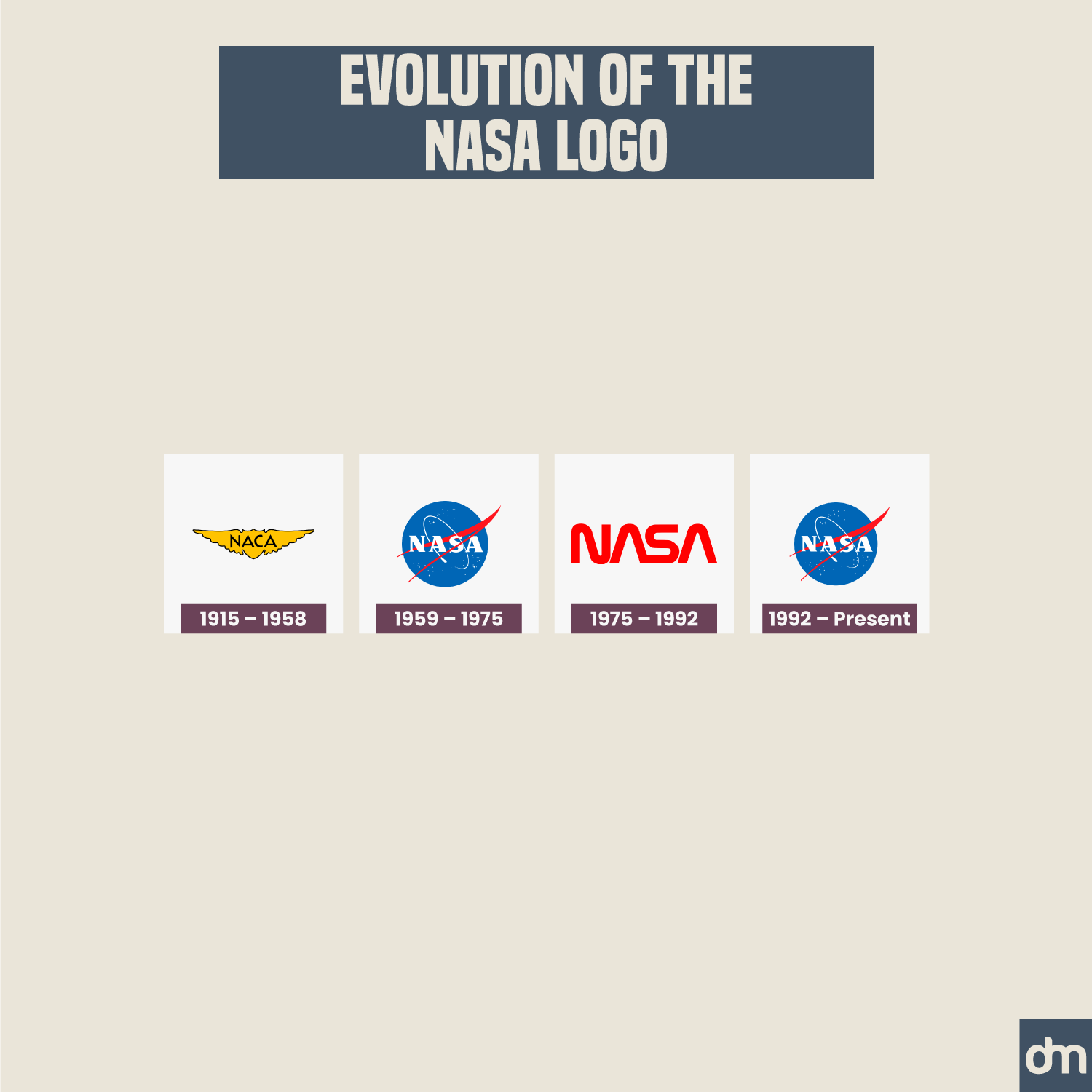
NASA Logo Evolution
Speaking of simplified logos, NASA doesn’t have one. If anything, the NASA logo evolution shows that a great logo design doesn’t have to give up ionic details just to look good on Instagram.
54. Goldman Sachs
Established In: 1869
Goldman Sachs Logo Evolution
When you begin with simple details, you can spend hundreds of years in the business marketing realm and never suffer from an outdated design. Something to learn from the Goldman Sachs logo evolution.
55. Esso
Established In: 1926
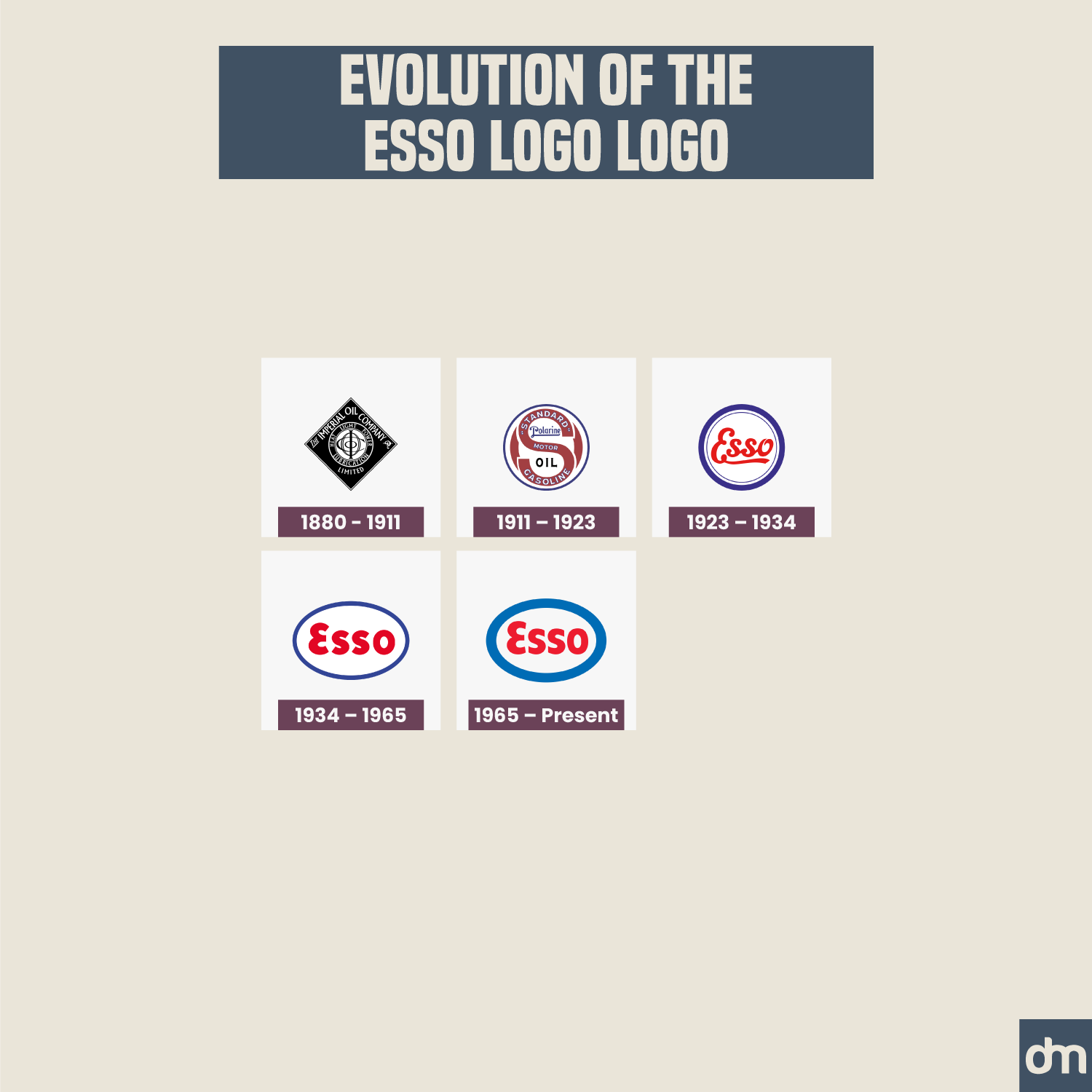
Esso Logo Evolution
While the Esso logo transformation has allowed it to become clear and modern, the red and blue design gives it a juvenile appeal. Dare we prefer more saturated shades for a more mature and professional brand identity?
What’s the lesson here?
If we can leave you with some insights after going through these 50+ logo transformations, here they are:
- Design a future-proof logo. Use simple logo design elements that align naturally with your brand values, market trends, and growth plans. This way, your design will enjoy a long shelf life and continue to make sense to the market long after trends have fizzled away.
- Stick to your roots. When you must change your logo design, make sure you take the spirit of the first design to all your future iterations. For example, don’t give up an iconic shield because the social media profile space is limited. Simplify your details without giving up the essence.
- Keep it consistent. Make sure your logo transformation is consistent and even. Huge fluctuations in design directions represent chaotic conversations behind the scenes. Don’t change your logo design too often and resist the temptation to always follow the trends. We don’t like saying it but don’t be a Pepsi logo minefield when you can be a Coca-Cola logo marvel.
Check out our AI-powered logo maker to design your business logo on a strong footing.

