Are you a ramen-tic at heart or here to find the most pho-bulous logo design for your newly launched noodle shop? Whatever your noodle logo design needs, we have the perfect ramen icons and pho logo designs to satiate your appetite.
If you have been in the restaurant industry for any length of time, you know that not all food logos are created equal. Some are more descriptive than others, and some food entrepreneurs lean towards abstract branding and highly conceptual designs more than simple logos. So which way should you sway?
A well-made meaningful restaurant logo, a swanky food wordmark, or an abstract logo for your fancy new sushi bar?
The truth is that each of these has its benefits. Depending on your brand personality, restaurant name, and the vibe you want to communicate, the best noodle logo for your restaurant may look different than a similar food brand’s.
Let’s look at these elements in detail.
3 Keys to Unlocking the Perfect Food Branding
With the whole universe of noodle logo designs open to you, how do you find the one that represents you the best? Three keys unlock this mystery.
• Your Brand Personality:
Brand personality is a mix of how you present yourself to the world through visuals, tone of voice, and values and how your customers feel when they interact with you. When both are in harmony, a balanced brand personality is formed. If your noodle bar is an upscale eatery, its visual expression will be much different than a corner shop selling the world’s best udon but with rickety chairs outside and the bustle of the street a part of the experience.
• Your Restaurant Name:
Your noodle shop branding may also depend on its name. While most restaurant logos are combination logos, if you’ve got a fun name or an elegant name, you might want to highlight it with a wordmark logo. Wordmark logos will also suit a noodle house logo if it’s promoting a legacy brand or a generational business. Conversely, combination logos designs suit a wider area of food branding. From exquisite noodle illustrations to simple designs like the Maruchan ramen logo, there’s a lot you can do when you work with noodle icons in the design.
• Your Restaurant Vibe:
The vibe of your restaurant is determined by its overall look and feel. Everything counts — from the color of the walls to the cutlery design and quality. People look at these things and form opinions. That’s your restaurant vibe. So take charge and use your logo design to be the most effective vibe checker. If you’re going for warm and casual, a handwritten logo may be just the thing. Retro food logos are also a raging trend and fit the warm and casual vibe. And if you going for modern and classy, elegant serif fonts with glossy and neutral palettes may be closer to the mark.
Tie all three elements together to create a polished and premium brand identity.
50+ Noodle Logo Ideas for Oodles of Inspiration!
To make sure you always have access to the most appropriate icons and symbols for your Asian restaurant branding, we have brought you the best noodle logo ideas from Behance, Dribble, and DesignMantic.
Take a look and Pinterest your favorite logos!
1. Sizzlea logo
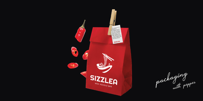
Sizzlea packaging by Iryna Vovchenko at Behance
A spicy red packaging design for a saucy restaurant branding!
2. A red noodle bowl
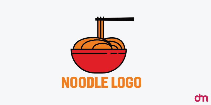
A red and orange noodle bowl logo by DesignMantic
Sometimes you want things simple, and this crimson noodle bowl fits the order.
3. Snake Wok logo
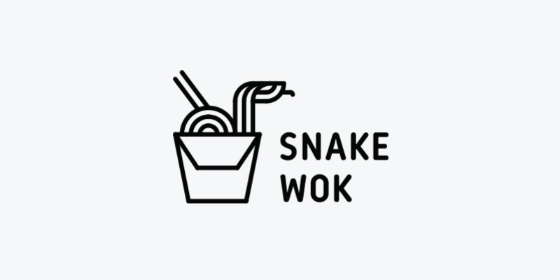
The Snake Wok logo designed by Dribbble/Nikita Golubev
The white and black line art perfectly curves this noodle bowl logo.
4. Some dizzying noodles
Chinese noodles logo designed by Dribbble/A Sky
The elongated fonts help create the illusion of chopsticks holding the wordmark.
5. Hao Mao logo
Hao Mao logo designed by Dribbble/graph_uvarov
In this Chinese noodle logo design, the cultural heritage of the restaurant is vividly expressed by the vibrant red background.
6. A swan-shaped logo
Noodle logo design in the shape of the swan by DesignMantic
If your noodle shop name starts with an S, this is the perfect lettermark logo to brand your eatery.
7. A swish in the bowl
3D Japanese noodle logo by DesignMantic
The 3D logo design of the bowl is exquisite and contests perfectly well with the elaborate swirls in the serif typeface.
8. A tempting identity
Noodles in the wok logo design by DesignMantic
The clean wok logo is a beautiful background to the drama happening inside. It gives the perfect canvas to the logo and ensures that the final look is pristine and refined.
9. A steaming bowl of soup
Soup bowl logo design by DesignMantic
Do you like soup with your noodles? Use this noodle soup logo to show off your broth-making abilities to the world!
10. Ready for the next course?
Chopsticks and bowl logo design by DesignMantic
A restaurant with a flavorful brand identity might be a great client for this logo. The shadows here are nice and create a multi-dimensional logo.
11. The broth in the bowl
A ramen logo for an Asian restaurant branding by DesignMantic
Give your customers a look into your food with appropriate textures and shadows.
12. The land of the rising sun
A Japanese noodle logo design by DesignMantic
If you are launching an authentic Japanese restaurant, nothing will do but the most authentic Japanese logo design on the list!
13. A color affair
Turtle Ramen restaurant logo designed by Dribbble/marvadesign_
Nobody said your noodle logo design should be boring. Add colors and personality to make your fun logo design pop and delight.
14. A panda-stic brand!
Noodle Lover Club logo by Dribbble/Irma Shonia
With a name as fantastic as Noodle Lover Club, we had to get a logo design that knows the drill.
15. A fun typeface
The Noodle House logo by Dribbble/Davie Ross
My favorite thing about this noodle house logo is the typeface, which is equal parts approachable, and upscale.
16. A cultural icon
A Korean restaurant logo designed by Dribbble/Borchak
Don’t go for subtle branding when competing in a tough and crowded market. Use cultural symbols and icons to show your expertise and relevance.
17. A flavorful brand
Final Noodle logo designed by Dribbble/Kate Freeman
Rich colors such as golden, beige, and black are popular in restaurant branding as they signal cozy environments, dark lounges, and laidback food joints.
18. Clever symbology
Noodle Kevin logo designed by Dribbble/Jonathan Rudolph
Turn your restaurant’s full name or initial letters into unique shapes to create wordmarks or lettermarks that are more effective than simpler logos at conveying your voice.
19. Red says hungry

Ramen logo designed by Dribbble/Alberto Bernabe
In color psychology applications, red is often used to signal feelings associated to heightened emotions such as hunger, passion, energy, and drama.
20. Why go bland when you can go bold?
Mie Kedaton logo designed by Dribbble/Ogi Latoh
Why choose only a few colors when you can use them all?
21. The serene side of branding
Noodle Bay logo designed by Dribbble/Elke Nelen
Though teal may not often be seen on many food brands, it’s a beautiful and calming color, ideal for seafood restaurant logos, capturing the azure of the oceans.
22. Cheerful noodles
Instant Noodles Near Me logo designed by Dribbble/Designecore
The playful typeface is the perfect partner for an equally fun noodle bar logo.
23. That’s some busy branding!
Perfect Ramyeon designed by Dribbble/Cosmic Cat Creatives
Only the most talented designers can handle a crowded design like this and make it look brilliant.
24. Something Blue

Bowl Noodles logo designed by Dribbble/SmileGoodHope
If you like life on the simpler side, how about this noodle restaurant logo in clean lines and a reserved palette?
25. A dramatic turn
Noodle logo design by Dribbble/Designrar
The color palette in this rice noodles logo is all about drama and intrigue! Not for the faint of heart, it’s the logo design for those who like their noodles spicy and their sauces hot!
26. Wrapped around ramen
Ramen logo designed by Dribbble/gaga_vastard
This fork logo is playful while the monospaced text is professional. It’s a nice logo design that would work for a catering company mark or a restaurant training school.
27. A fresh and fragrant logo
Yummy Pho logo designed by Dribbble/grapixbylis
Whether or not you like vegetables, they are an essential ingredient in this design creating a fresh and light food brand.
28. A luxuriant font
Umami Ramen logo designed by Dribbble/Taslima rahman
A picture may be worth a thousand words but a nice font beats them all. This beautiful maroon typeface is a testimony to the versatility and pizzaz of fonts.
29. A hand-drawn design
Full Send Ramen logo designed by Dribbble/Nirupama_Chumki
While this isn’t a hand-drawn logo in the strictest of technical terms, it has that homely, casual feel in its simple structure and layout that communicates a fun and laidback vibe at the Full Send Ramen shop.
30. Put it in the name!
Slurp Noodles logo designed by Dribbble/vikram J R
When you name your noodle bar ‘Slurp Noodles’, you won’t have much trouble attracting noodle lovers to your tables. 10/10 branding in our books!
31. An owl apart
Bakmi Owl logo designed by Dribbble/fachriza
Use distinct details from your brand name and incorporate them into your logo design to ensure the design stands out and gives your restaurant a unique appeal.
32. A pattern emerges
Ramen-Ya logo designed by Dribbble/tom seidler
Line art is a popular pattern in modern noodle logos as it provides a clean brand identity and polished final look.
33. Line art to rule them all
Noodle logo design by Dribbble/ZunaZuun.
Noodles look and taste good when thick and meaty!
34. A hidden detail
Chicken noodle logo design by Dribbble/Amam N.
Can you spot the chicken in the logo? Look at the noodle loops!
35. Yi Wan
Yi Wan Chopsticks logo design by Dribbble/Ellen de Veth
This noodle illustration defies the norms of Asian food branding — dominated by warm tones of rich red, orange, and yellow — and creates a unique design with blue and lavender.
36. Working in the white space
Chops House logo designed by Dribbble/Rifat Hosen
We are great fans of functional white spaces. Learn how they work with this easy tutorial.
37. Filled to the brim
Chinese noodles logo by Dribbble/Daniel Cientifica
The logo design incorporates the colors of the Chinese flag to improve the brand message and its cultural relevance.
38. Noodles redesigned
M2M Logo by Behance/Claunicornios.
Though there are multiple icons in the design, the overall look is clean. To achieve a similar look in your final drafts, try to pick symbols that resemble each other in their forms so there’s visual harmony and balance in the layout.
39. An aromatic brand identity
Umami Instant Ramen logo designed by Behance/Urna Mondal
Seek to get as close to the original culture as you can when creating a brand identity rooted in that culture. Restaurants that promise authentic cuisines must create visual identities that represent those roots clearly in the design.
40. Shadows and effects
Spiral II logo designed ByBehance/Pablo Prat
For old-timey authentic noodle logo vibes, create shadowwork in your design and a simple layout.
41. Anime in the Ramen Bowl
Kiorimie Premium Ramen logo designed by Behance/Bequeenbe design
Anime is a strong part of the Japanese culture. Empower your Japanese noodle logo with a fair bit of anime and a hearty color palette.
42. A brand from the past
Korean ramen restaurant logo design by Behance/toqa Khalil
Vintage logo designs signal nostalgia and show legacy in design. Utilize that by avoiding major redesigns and instead opting for simpler tweaks in your original restaurant logo.
43. A bit outside
Noodle Mode logo design by Behance/Abby
Not all of your logo elements must be perfectly aligned in the center. Move things around a bit to find a balance that works.
44. Asian font systems
Yum Yum Noodle logo design by Behance/Liliya Chabanenko
When going for ‘vibrant’ in your brand identity, just some bright colors won’t do. Explore the typography space to find the perfect fonts to sound out your message.
45. A modern noodle shop
Daeko logo design by Behance/Xưởng Đồ Họa FPL Cần Thơ
Did anybody say the modern noodle logo? It doesn’t get more modern than a clean sans-serif font, a thin line art design, and a pale background inviting you in for a nice cup of soup.
46. Top-down branding
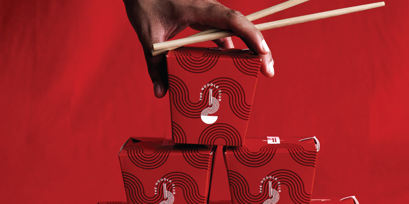
The Noodle Club logo design by Behance/Aziz Alfraih
Vertical logo designs don’t make a lot of appearances in restaurant branding. But a noodle restaurant logo is a great place for them to find a home.
47. Bubble gum branding for an Asian noodle bar
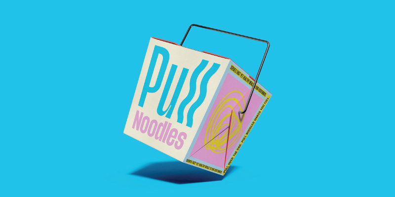
Pull Noodles logo Behance/studio le_m
Contrast is a great tool in design to highlight elements and convey emotions. In a visual environment of Asian food branding where the sky is dotted with red and yellow, the lovely pink and blue ensure the logo stands out automatically.
48. Line art but with more lines
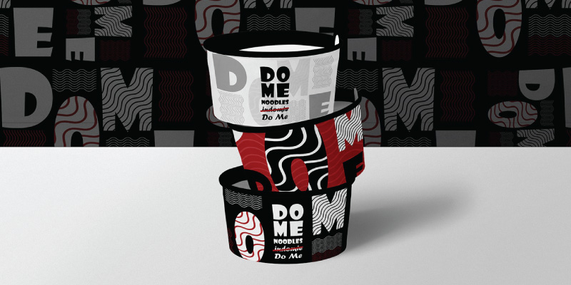
Dome noodle logo design by Behance/Mohamed Refaat
The new Dome Noodle logo design uses the element of repetition to create beautifully harmonious patterns and an exciting brand identity.
49. The personal wholesome touch
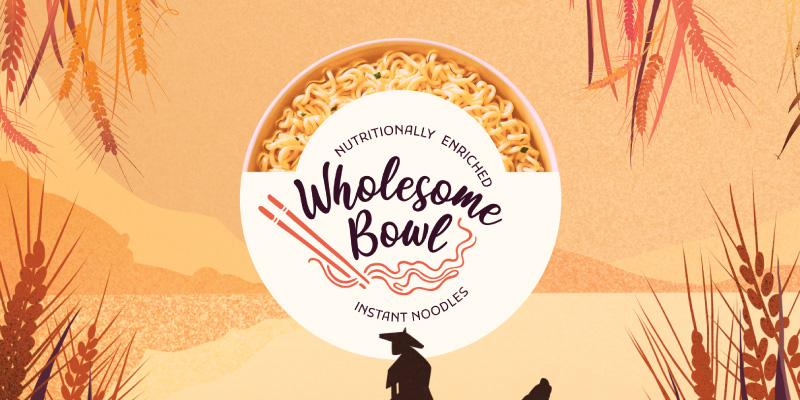
Wholesome Bowl logo design by Behance/Multiple Owners
The star of the logo design — the font — was created from scratch to highlight the brand’s messaging of organic, healthy, convenient, and affordable. Restaurant logos that wish to communicate a similar message may do well to avoid commercial fonts and opt for original, handwritten designs.
50. A sealed noodle logo
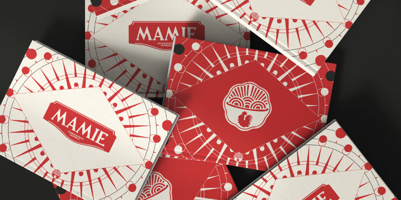
Mamie logo design by Behance/Multiple Owners
The seal detail is a great way to show that the brand is more than just a cozy noodle restaurant. It denotes care and professionalism along with a sense of discipline to seep through the design.
51. A comforting icon
A circular logo design with noodle and spoon icon by DesignMantic
Noodle food branding is about showing comfort and ease. Since circular shapes are the most natural shapes to convey the sentiment, using them along with other Chinese symbols in your Chinese restaurant logo helps convey the message effectively.
52. Star of the bar
Chef icon for a noodle bar logo by DesignMantic
A noodle bar is nothing without a brilliant chef running a successful show. Put your star on the logo and create a winning mark.
53. A red sushi bar
A sushi logo design by DesignMantic
Sushi is an iconic Japanese food symbol and in this design, it is made to look more appealing and familiar by its smudged edges and textured details.
Try our DIY Noodle Logo Maker
Feeling sufficiently inspired? Take the next step and start designing your noodle restaurant logo today. We’ve got tons of free templates plus loads of custom editing options so you’re never stranded for choice. Explore our design gallery to find the perfect noodle logo idea. All of our designs are editable and our logo maker is easy on the pocket.
Try now.


