Rough around the edges. Stubborn as steel. Raw, crude, and plain.
There are some ways to describe brutalism in web design, but perhaps short-lived is the most appropriate. While design trends are generally fickle by nature, none more so than brutalist web design.
It comes and goes, attracts a lot of attention at its peak, and then sizzles out to exist as a niche web design style appropriate only for a handful online.
Why is it so? What is so inherently temperamental about brutalist web design? How can I know if this is the right style for my website?
We answer this and more questions in this guide below. As brutalism leaves its corner of the web and comes into the mainstream, we are excited to see what it can do. Use this guide to understand what is brutalism, how is it applied in web design, what are its limitations, and how can you make it work for you.
What is Brutalist Web Design?
Brutalist web design is simple, plain, and non-ornamental. It’s very function-oriented and has no time to charm you, nor any wish to appeal to you to engage with it. It’s there — and if you want to come over and visit, that’s fine, but if not, no harm done.
It’s content over aesthetics and function over form.
Brutalist web designs prize usability above everything. Monospaced text, exposed user interface, blue hyperlinks, and plainly laid-out buttons are all there to ensure users can find their way around a website easily. No flashy graphics distract you on a brutalist website and since only the most necessary elements are there, you know each can be trusted to help you find what you need quickly and easily.
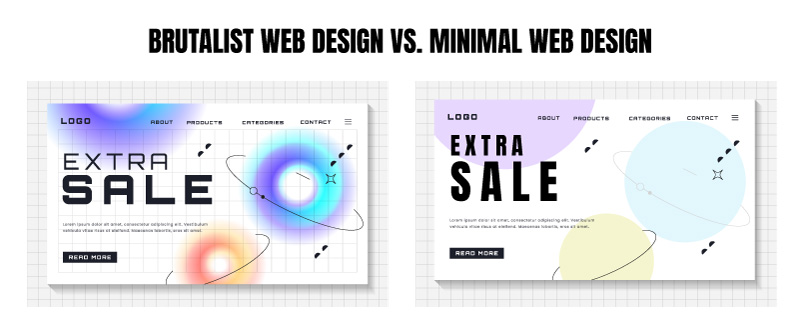
Image Source: iStock/Hanna Siamashka – Brutalism in website design embraces a raw, bold approach, offering a stark contrast to the sleek and refined nature of minimalism.
For this very reason, brutalist websites aren’t for everyone. They promote quick decisions and aren’t suited for extended site visits.
Disruptive ventures that want to challenge the status quo can find their home in brutalist web architecture. But if you sell homemade shoes and want people to learn more about your products on the website, an online store builder offers professional templates and customization options to enhance your brand’s online presence.
A Brief History of Brutalism
Brutalism originated in European architecture in the 1950s. Rooted in function, resource efficiency, and rejection of empty aesthetics, it helped Europe rebuild quickly after World War II. Brutalist buildings were characterized by large and looming structures, exposed concrete, and grey color palettes.
While not pretty, these buildings were functional. They ensured Europe’s quick revival after the war and assisted its social, governmental, and educational infrastructure to resume working. Across countries that had participated in the war, brutalism gained momentum as an honest and resource-efficient form of design. It helped avert several housing crises in those countries and became a popular architectural style in the 1960s and 70s.
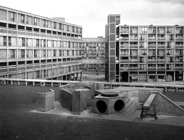
Image Source: austinsmithlord.com – Park Hill State, London. An example of brutalist housing.
While brutalism was mostly applied to build necessary buildings resource-efficiently, architects and designers worldover fell in love with its honest lack of ornamentation. It became wildly popular in North America and even became a cutting-edge and innovative form of architecture in the West.
Whitney Museum in New York City and Hayward Gallery in London are prominent examples of brutalist architecture created with love and passion.
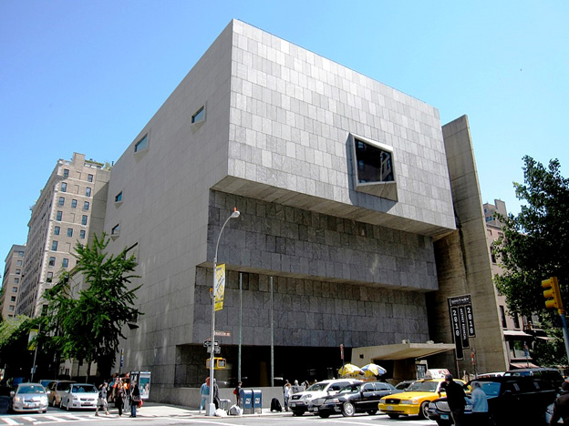
Image Source: wikipedia.org – Built in 1966, this building as home to the Whitney Museum till 2104. The museum has since moved to a downtown location in the West Village.
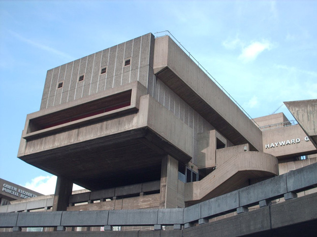
Image Source: architectuul.com – Hayward Gallery, London. Built in 1968
But then it started dying out. Several reasons are possible, including:
- Brutalism became largely associated with cheap housing that looked decrepit.
- It produced buildings that were massive in form but had no aesthetics to offer.
- While some brutalist buildings were beautifully crafted, most were ill-made, almost anti-design in their look.
Brutalism in web design has seen a similar trajectory. It comes and goes every few years, often resurfacing in reaction to garish and flashy visuals that offer no usability or functional advantages.
Emergence of Neo Brutalism
Human beings are visual beings and we like things that look pleasing. While brutalism serves much-needed information quickly and easily, there’s a limit to how many stark and bare sites we can consume before feeling restless.
Neo brutalism is a modern approach to brutalism where we take the brutalist philosophy of function-over-form but we infuse it with a large amount of character and personality. These web designs are delightful, lively, and provocative.
It is also highly usable and easy to navigate.
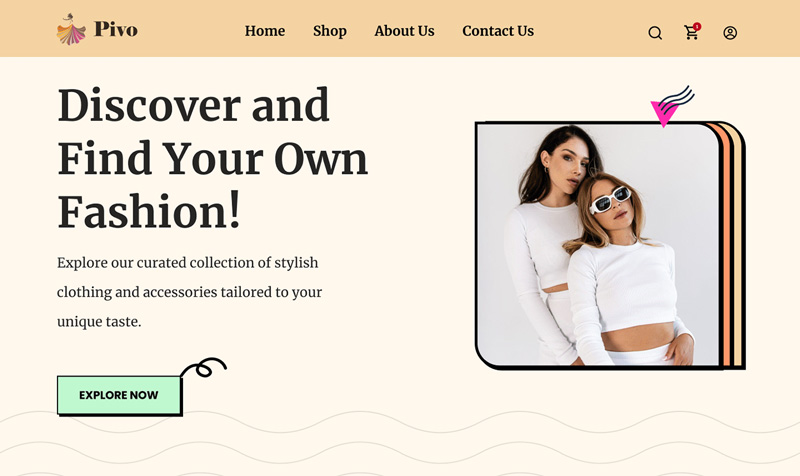
Neo-Brutalism Style Landing page by Joseph Gift/Behance
Some common features of a neo-brutalist website include:
- Images with background colors
- Drop shadows
- Saturated colors
- Large photography
- Open navigation (as opposed to collapsed menus)
- Outlined buttons
Neo Brutalism exists at the intersection of minimalism and brutalism. It offers the best of both worlds and is the perfect way to break through the despairing sameness of minimalist design. Brands with a creative and adventurous audience must explore neo-brutalism as a potential way to announce their arrival with a bang.
Characteristics of Neo-Brutalist Web Design
Brutalist web design is identifiable via some distinct traits that can be grouped under 3 categories:
- Color
- Visual forms and images
- Typography
Let’s discuss each.
1. Colors in Neo-Brutalist Websites
Similar to minimalism, color has immense power in neo-brutalism. Since the material to work with is already less, the gap is filled by maximizing what the existing elements can do. How does it manifest in color scheme treatments on neo-brutalist websites?
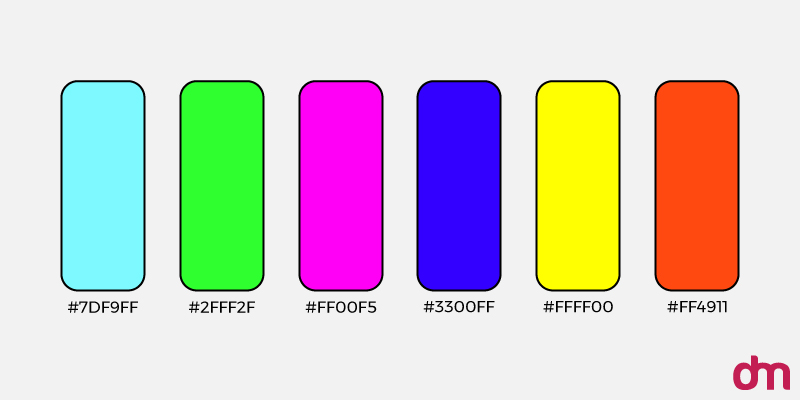
Neo-Brutalist Color Palette
- High-intensity colors take center stage. Lots of saturated colors in magenta, yellow, purple, and orange to make strong brand statements.
- Backgrounds become vibrant with texture and color treatments.
- Retro colors that make you think of Pop Art find a home here. These colors contain both muted and loud shades.
- Gradients are almost non-existent because the intention is to be confidently present rather than pleasantly aesthetic.
- Monochromatic palettes are extremely popular on neo-brutalist websites. Different versions of the same color are used to promote and display resource efficiency.
Neo-brutalist sites have a distinct and lively color palette with more saturation and less tint.
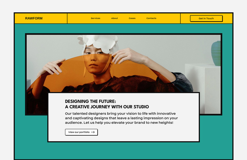
Neo-Brutalist Design with vivid teal and orange-yellow accents by Diana Keplin/Behance
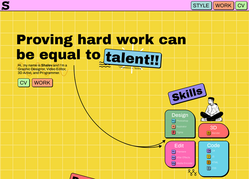
Personal portfolio web page with muted colors with bold black accents by Shalev Aviv/Behance
2. Visuals in Neo-Brutalist Websites
Neo-brutalist websites have an unmistakable visual style. Unadorned navigation bars, raw images, effective photography, and an overall chaotic feel are hallmarks of this style.
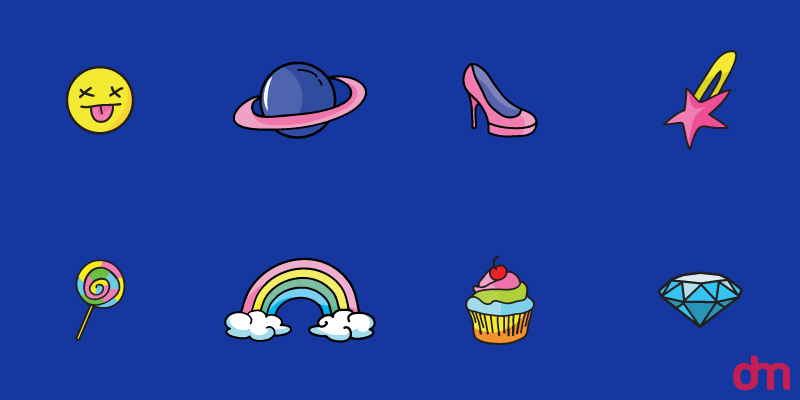
Neo-Brutalist Icons and Visuals
Some others include:
- Unfiltered imagery to show a distaste towards polished and ‘faked’ photography.
- Inconsistent treatment of photos where some graphics appear with outlines while others don’t, increasing the visual entropy.
- Outlines are popular with drop shadows in them.
- Minimal white spaces create a chaotic and overwhelming visual feel. Where white spaces are abundant, they are extremely stark and create a desolate visual environment.
- Exposed UI where content is contained within tables and sections, dividing lines are prominent, and navigation buttons are open (as opposed to collapsed menus)
Designers walk a tight line when creating visuals for neo-brutalist websites. The images must look attention-grabbing without trying too hard and untreated but not abandoned.
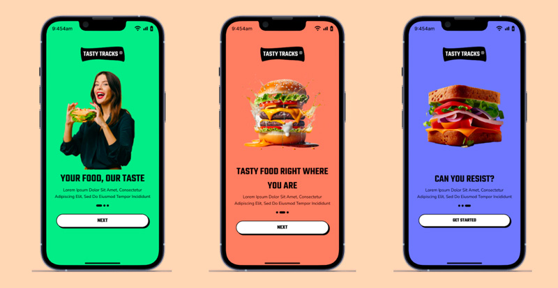
Bold and edgy visuals in a neo-brutalist mobile app design UI by Praveen Kumar/Behance
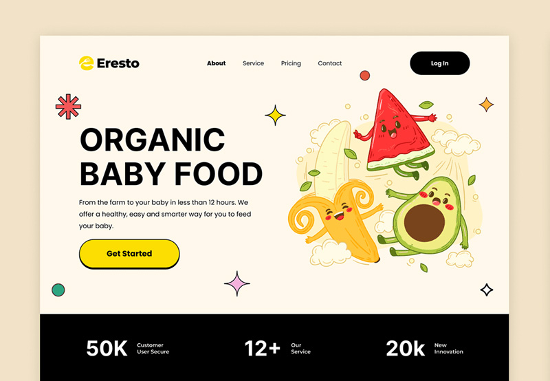
Quirky graphics for a neo-brutalist organic food website by Tejash Modi and Mihir Vaghani/Behance
3. Typography in Neo-Brutalist Websites
Neo-brutalist websites, with their dark colors and chaotic visuals, do not make for the best reading experiences. So, what role does typography play here? Fonts are used to complement the brand’s visual style and to display the information as simply and instantly as possible.
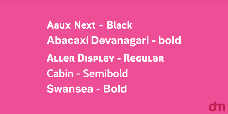
Neo-Brutalist Fonts
- Large, screen-size headings replace the looming facades of brutalist architecture. Meant to inform and announce, these gigantic headings serve the dual purpose of being loud and prominent too.
- Sans serif fonts emphasize the neo-brutalist appeal of being simple and plain and eschewing unnecessary details such as embellished strokes.
- Typography is used to decorate the pages without resorting to wasteful aesthetics like nonessential graphics and photography.
- Experimentation in line height and spacing allows content to be presented in more interesting ways.
While typography serves only as a function in brutalist web design (example: Drudge Report), the neo approach injects humanity and flair into the practice and creates more engaging user experiences.
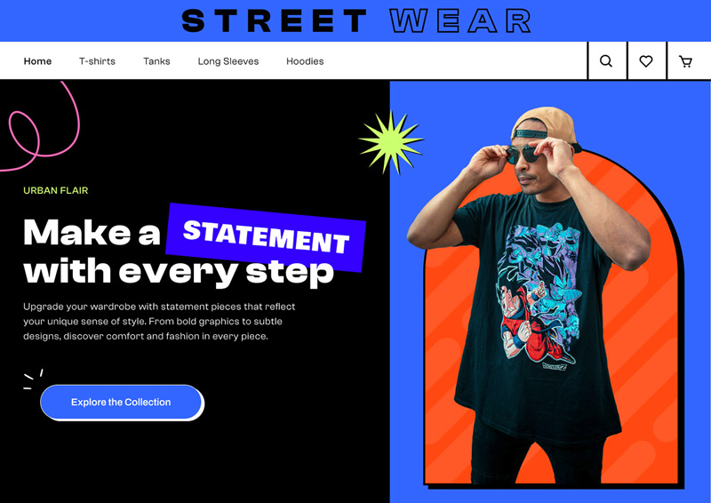
Bold typography in streetwear web design by Cathy McClure and Lotus Designs/Behance
Examples of Neo Brutalist Web Design
Enough theory. How does neo-brutalism look in actual web design? Here are some of the best brutalist websites making it look good online.
1. Whitney Museum — a museum website
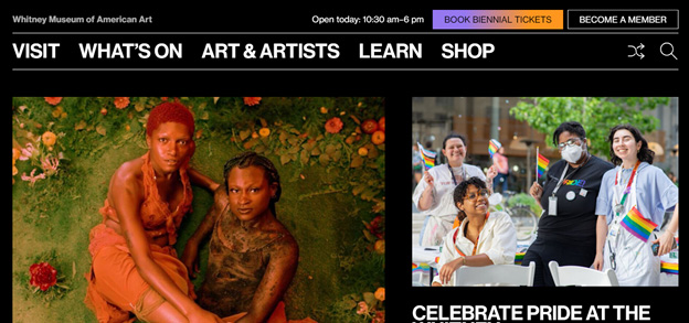
With page-wide grid systems, clear dividers, and open navigation, this site is as neo-brutalist as they come.
2. Balenciaga — a fashion website
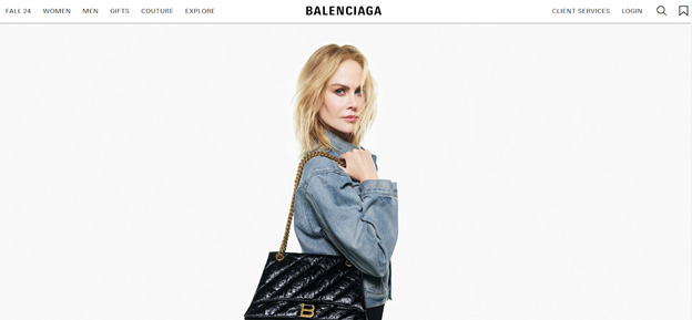
The Balenciaga website is more brutalist than neo-brutalist. With a spartan architecture and mono-spaced visuals, the site is clean, muted, and very industrial.
3. Secession — a visual arts institute website
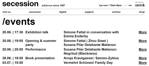
Secession displays its content in clean tables and columns. It promotes easy navigation with very little cognitive load, even with those constant-moving visuals.
4. Alicia Keys — artist website
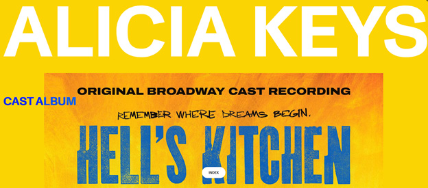
Alicia Keys features a parallax scrolling website which isn’t a popular fixture of neo-brutalism but aligns with its maximalist approach perfectly.
5. A2-Type — a font gallery
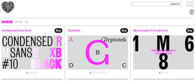
The website contains almost no graphics but short pops of animations make a welcome surprise in an otherwise font-filled canvas.
6. Studio Job — a design studio in The Netherlands
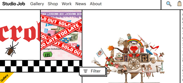
This is one of the most provocative neo-brutalist websites on our list. It’s evocative, daring, and not for the faint of heart brands.
7. Four Sets — another design studio website
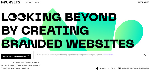
Remember we told you color gradients seldom appear on neo-brutalist sites? This is one of the rare occasions where subtle gradients do make an appearance and steal the show.
Best Practices When Adopting Brutalism in Web Design
Brutalism web design isn’t for everyone and can be tricky to handle. To make sure it works for you, here are some web design guiding principles to keep in mind.
• Consider your audience
Whether you are leading with brutalism or neo-brutalism, the web design style is power-packed with personality and principles. From the naked structure of brutalism to the in-the-face aesthetics of its modern sibling, the style has a niche audience.
It’s ideally suited for designers, artists, entertainers, and other creative professionals. It can also work for startups that intend to make a lot of noise and want to create a reputation as disruptors and challengers.
A regular SMB with traditional audiences may struggle to connect with its customer base with something as divisive as a brutalist website.
• Content > aesthetics
Brutalism embraces stark, open, and bare spaces. It’s very similar to minimalism in that sense. But where minimalism looks pristine and pretty, brutalism considers aesthetics unnecessary and dishonest. Do you have a business where these principles of function over form tie naturally to your core offer?
If so, lean confidently into the brutalist sphere with your content ready to take center stage. While nice visuals can join you on the journey, they must stay in the background and commit to serving your primary product or service.
• Simplicity conveys transparency
Customers continue to favor brands that offer transparent management and operational practices. Sustainability has moved beyond environmental action. Customers expect brands to be upfront about their products and services, labor practices, financial involvements, user data, and much more.
A brand that makes a conscious effort to reject pleasant graphics in favor of stark truths automatically stands out.
When most websites in your market try to attract customers with extravagant visuals, your brutalist website with its open UI, straightforward text, and unfiltered essential graphics can instantly gain attention and interest.
• Don’t do it for the sake of it
Brutalism is rooted in purpose, function, and honesty. Everything available is laid out in the open, no holds barred, and that creates trusting relationships between brands and audiences. People know they can trust you because you are not holding anything back.
But if you are doing it because everyone else is doing it or because you’re bored or because you think it’s a quick way to gain distinction and distinguishment, think again.
Any branding move you make for reasons other than your brand’s genuine need for it will not live for long and even that short life will be profitless. Customers will be able to see through it, the switch from your current visual style to the stark rawness will be intense, and thus open to suspicion.
• Strike a balance
Brutalism can be a harsh design choice if you already have a website and people are familiar with it. As we said, the switch can feel too much and too quick. If you truly feel Brutalism serves your brand message more effectively than other web design styles, ease into it steadily.
Instead of going from colorful to stark, explore the different ways neo-brutalism can help.
Neo-brutalism is much closer to other forms of web design without sacrificing its commitment to function. It makes more sense to move your website from a retro design or minimal design to neo-brutalism and enhance its appeal than suddenly give up everything and jump onto the brutalist bandwagon.
Key Takeaways — When To Use Brutalism in Web Design
Brutalism in web design is an extreme form of style. Think raw, rough, and plain. It isn’t suitable for everyone and not all brands should embrace brutalism without considerable thought. Below are three ideal scenarios for using brutalism in web design:
- When you are a creative professional with a cutting-edge unrestrained visual style
- When you have an audience comprised of creative professionals who’ll appreciate an extravagant style and won’t be put off by it
- When you are promoting arts and entertainment
So, ready to create your first brutalist web design? Experiment with our AI web builder with tons of unique styles to choose from. It’s free to try and offers easy customization.

