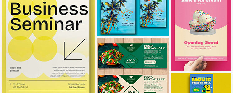
Printed flyers may seem a bit of a relic in the digital age but they’re actually still really common, and super useful. Companies use flyers for lots of reasons — such as to explain their services, announce their newest ventures, or promote their events. Different designs and styles are incorporated in the flyers to achieve different goals.
For example, a single-sided flyer for event promotions or a double-sided one to announce a new project.
Flyers assist marketing both in the digital and physical worlds. What functions as a handout at a physical event also works for a social media image. For this reason, flyer design is now more important than ever. One design can potentially reach more potential customers and thus has a bigger marketing burden to carry.
So, let’s look at flyer designs today and see how they help brands achieve their marketing goals.
Types of Flyers: The Digital Revolution
Flyer is a word that conjures images of car dealerships and travel agents, but it’s so much more. When we talk about flyers, we can only go as far as to say that it’s a visual representative of a product, service, or similar. Outside of that, we can’t say any more. But, that’s good — loose definitions give us more rope to play with. A flyer can be many things, and to a designer that’s a golden ticket.
Single-sided Flyers
Single-sided flyers are just what they sound like. They’re usually big, glossy images that convey information via text and photographs. You’ll see a lot of these online, especially on social media or ad banners. They’re to the point, light in information, heavy on impact. Single-sided flyers are often crafted using a photo editor to create visually striking designs that quickly capture attention. A well-executed flyer relies on the photo editor to blend impactful images with concise text for maximum effectiveness.
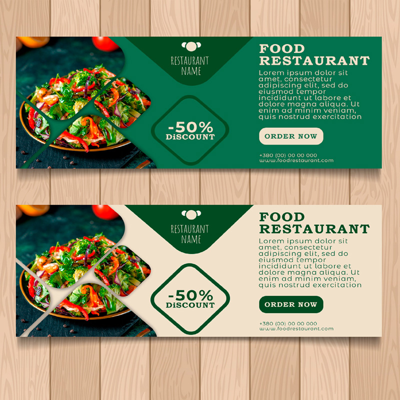
Image Source: behance.net/Nataliia Novikova
Fancy upgrading to the #OnePlus6? Get a great price on our latest flagship when trading-in any smartphone. Special offers on OnePlus 3 and newer devices run till the end of May. 🏃♂️ https://t.co/qMs0J1Ip56 pic.twitter.com/8RXxx3DM23
— OnePlus Europe (@OnePlus_Europe) May 10, 2018
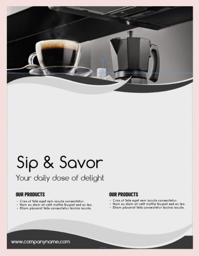
Sip & Savor – Your daily dose of delight
Double-sided Flyers
Double-sided flyers carry information on both front and back. They’re reasonably cheap to produce, easy to design, and allow for a wide variety of different styles. If you need to make quick adjustments or customize the content, it’s simple to make and edit it as a PDF first, ensuring your flyer always meets your specific needs.
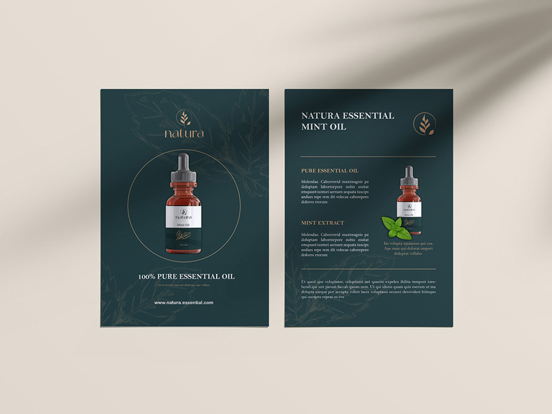
Image Source: dribbble.com/Laslovici Andreea
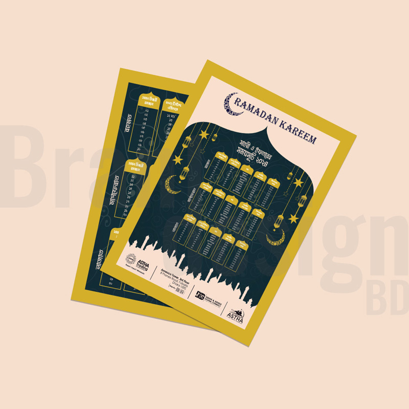
Image Source: behance.net/brandesign bd
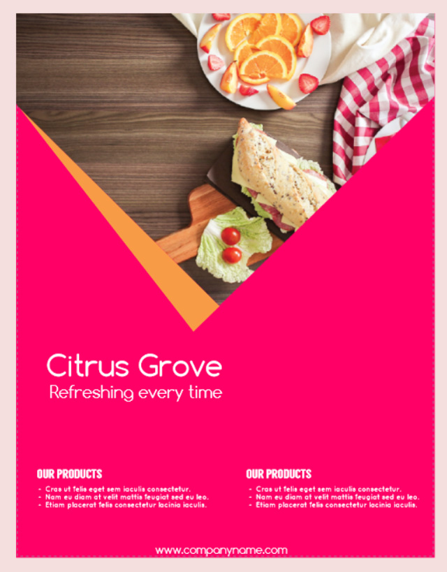
Citrus Grove – Refreshing every time
Elements of an Impactful Flyer Design
The following are the fundamental design elements for a successful flyer design.
An eye-catching headline
The headline is the first thing people see as they hurriedly grab a flyer from you on a crowded street corner, event hall, or company-wide conference. Make it count and make it catchy!
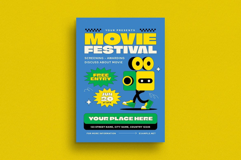
Image Source: behance.net/Nancyee Mwilson
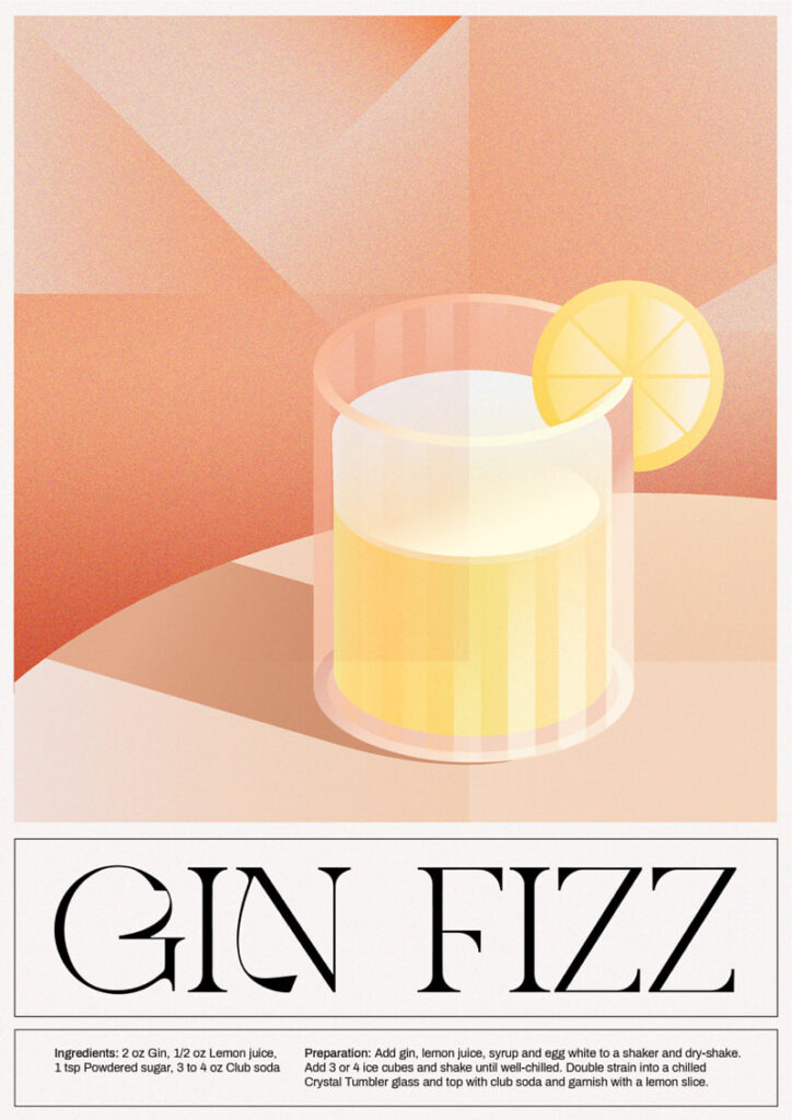
Image Source: behance.net/Tugba Ozcan
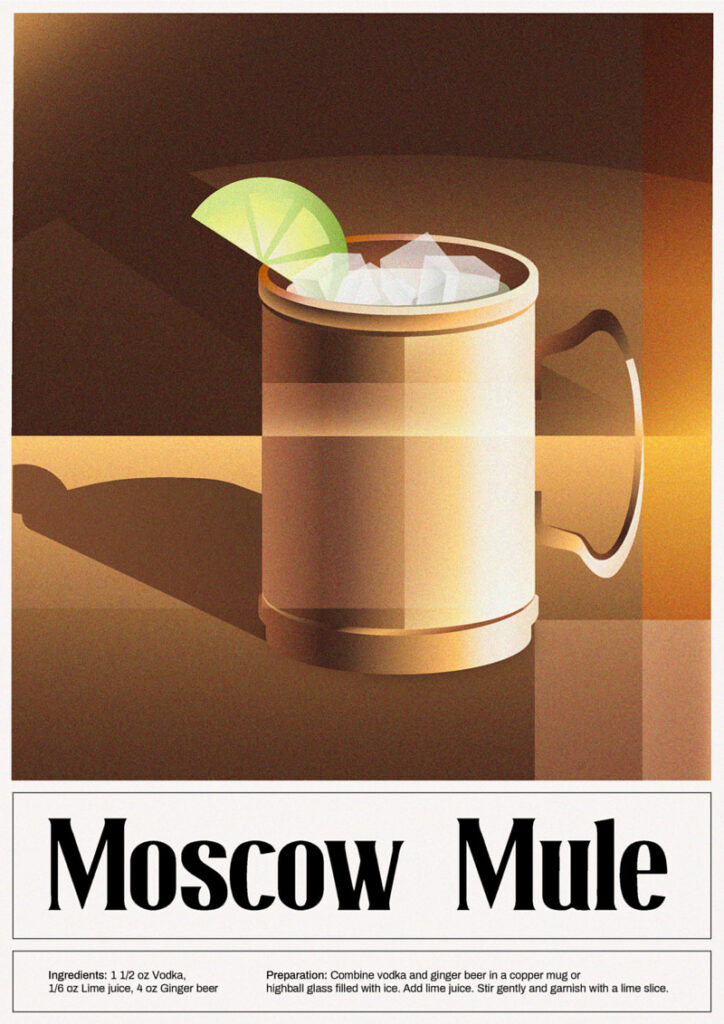
Image Source: behance.net/Tugba Ozcan
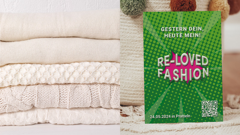
Image Source: behance.net/Nadya Ramstein
Use big fonts and bright colors to make people notice it. Ideally, your headline should be worded to immediately convey the gist of the flyer. Instead of being coy and cryptic, be confident in your approach.
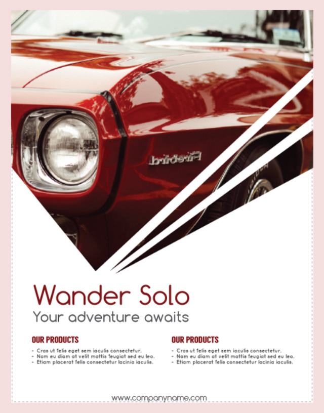
Wander Solo – Your adventure awaits
Communicate your message clearly and have faith in your product and your marketing to get people to the door.
Clear Visual hierarchy
Visual Hierarchy is a term that’s thrown around a lot. The long and short of it is that your design guides the eye.
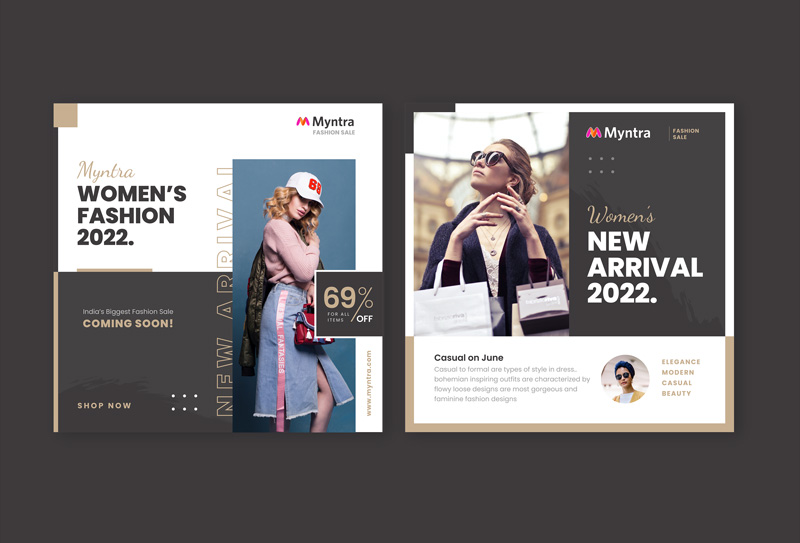
Image Source: Behance/Myntra Fashion

Bread Crumbs
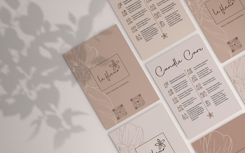
Image Source: behance.net/Elena Karavaikina
Large elements that are bold and set aside from the rest, well contested, or differently textured from others will attract the eye.
The main concerns of the visual hierarchy are:
- Color: Color effectively guides the eye where you want it to go. Bright colors bring the eye to headings, key facts, and main information about the message. You can also use Gamma AI for presentations for flyer design suggestions to ensure that key information is always highlighted effectively.
- Contrast: Contrast doesn’t always have to be black or white, but it can always put the eye exactly where you want. The highly contrasted color schemes and bold numbers push you to those points. The eye doesn’t like to move quickly across different tones or shades, so it’ll skate across white and stop at black, and vice-versa.
- Proximity and Space: Proximity can be confusing to the eye. When things are spread out, with space around them, they’re easier to focus on and easier to absorb.
- Texture: Much in the way that the eye doesn’t like to move slowly across different colors, it doesn’t like to move slowly across texture either. Our eyes will fly across block colors too but will take note of texture, even if the colors are in the same palette.
Balanced
Balance refers to the symmetry and alignment of your design. While it’s okay to present your content in an asymmetrical style to make it look more dynamic and exciting, don’t do it for the sake of it. That’s empty and shallow and may not get you any friends.
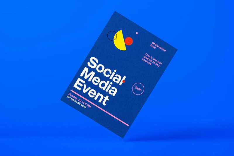
Image Source: Behance/Robertja Alopez
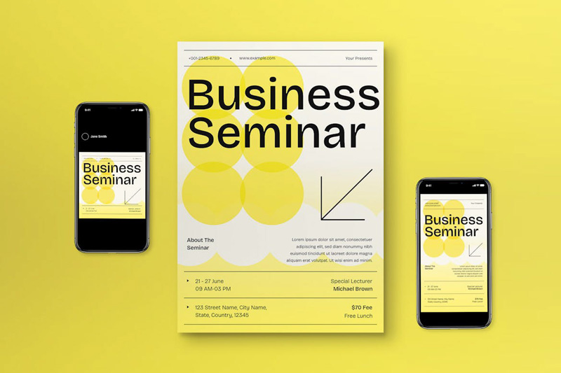
Image Source: behance.net/Pubric Folio
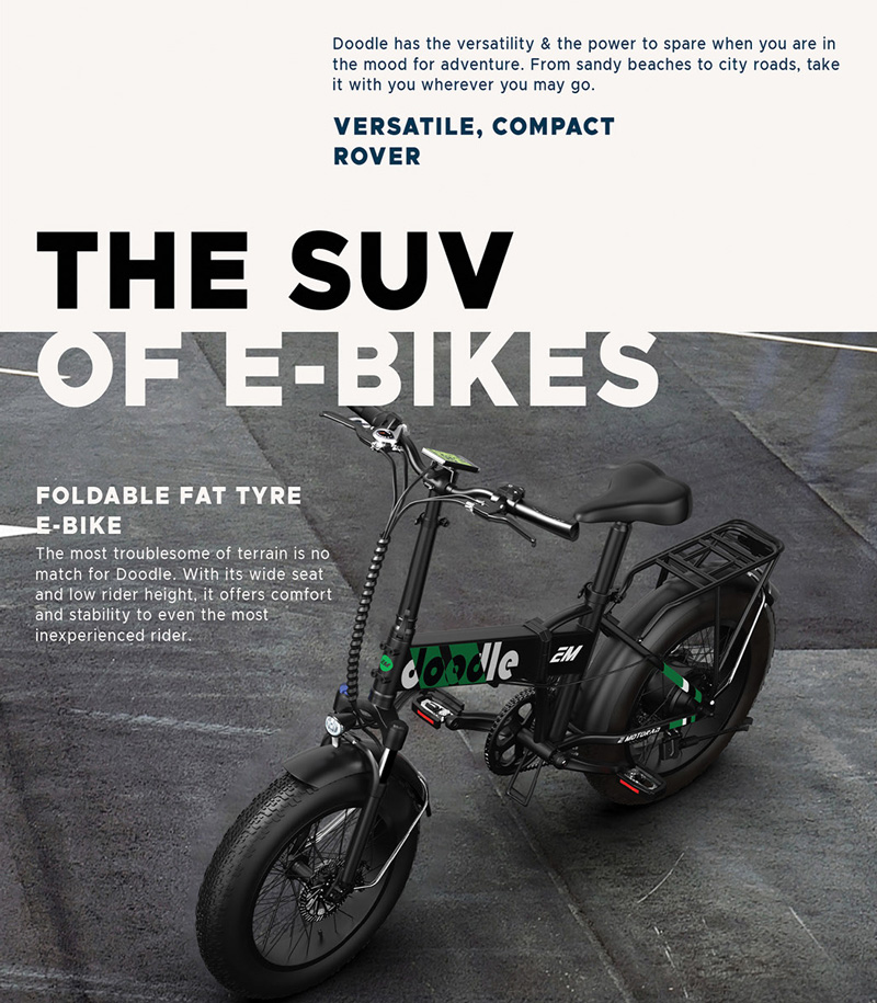
Image Source: behance.net/MANDAR KULKARNI
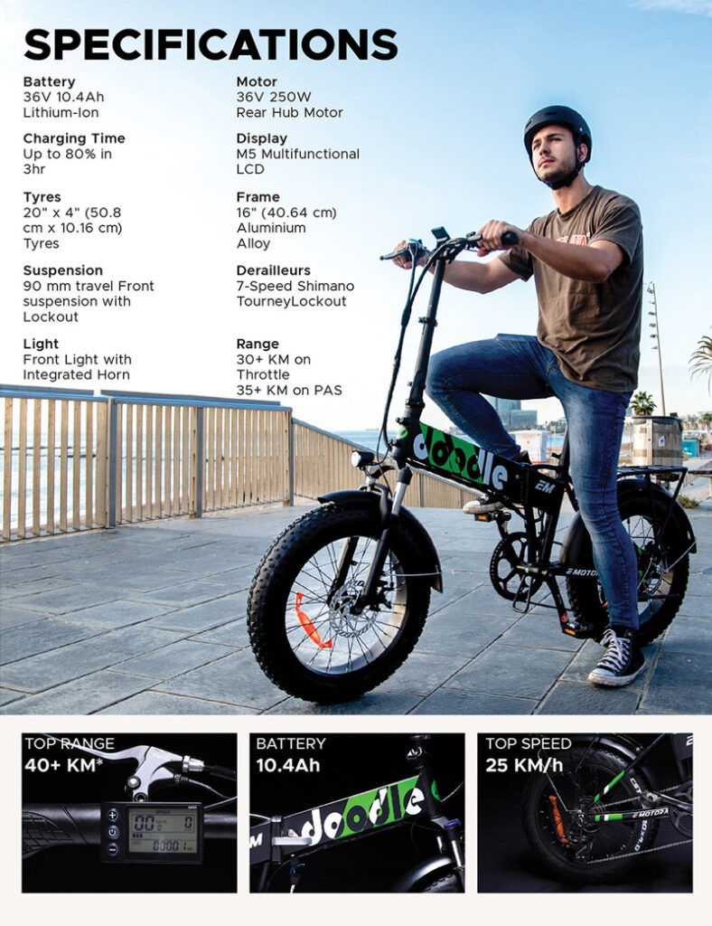
Image Source: behance.net/MANDAR KULKARNI
Instead, root your design choices in function and see what kind of balance and layout works best for your specific message.
Typography
Fonts can be as tricky as any other element. Should you go with an elegant and prominent serif or an easy and laidback sans-serif? Because of flyers’ limited real estate, it’s best to opt for a light font that maximizes space. Therefore, most modern brands go for sans serif fonts as their primary typeface in their branding and marketing.
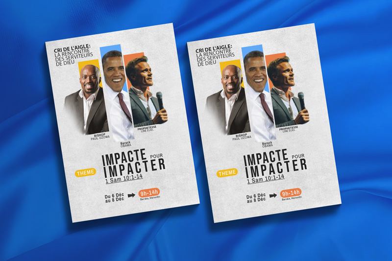
Image Source: behance.net/Aliyan Shah
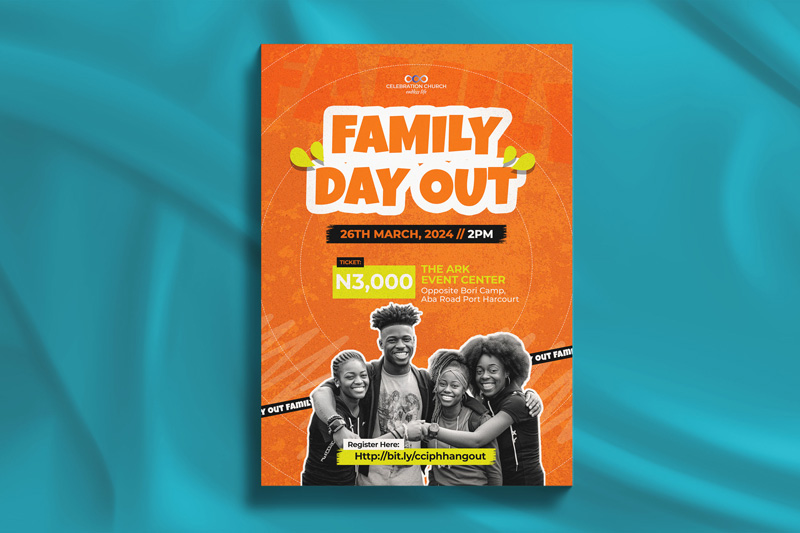
Image Source: behance.net/Salman Laqani
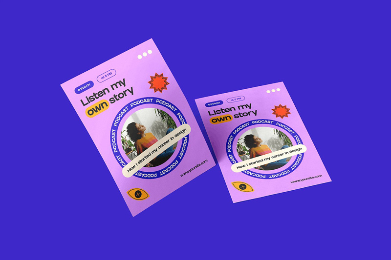
Image Source: behance.net/Kimberlyen Twright
A good font pairing is also handy and can help you market your brand message with more variety. However, you should always prioritize your brand voice and style when choosing marketing fonts and font pairs.
One key message
Stay with the program as you design your flyer. What is the main purpose of your flyer? Is it to announce an event? Promote your services? Describe a product?
Always focus on a single message for every flyer marketing campaign. The standard flyer size is limited in scope. Adding more information can be tempting but it can confuse the customers and dilute the effect of your campaign. Customers may not be sure whether they are supposed to call you, hire your services, or meet you at an event. To clarify the next step, include a clear call-to-action and a link to online forms for easy registration or inquiries, guiding customers towards taking action.
Design the flyer with a single call-to-action and remove all the fluff. Not only will it create a crisp and impactful brand message but will also help your customers know what you expect them to do next. Consider professional editing services to refine your flyer’s content. An editor can help streamline your message, ensuring clarity and impact. They can also optimize language and layout to effectively engage your target audience and reinforce your call-to-action, enhancing the overall success of your campaign.
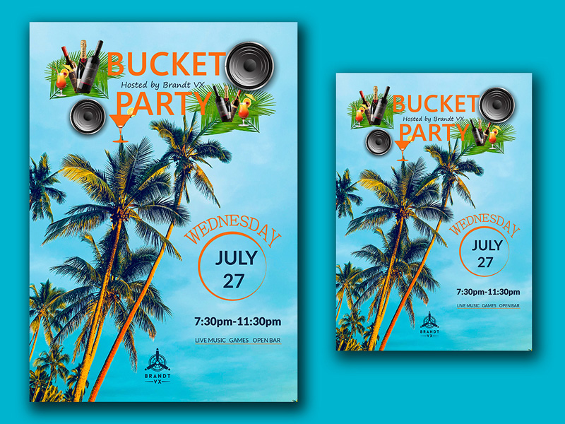
Image Source: dribbble.com/Rifat Hossain
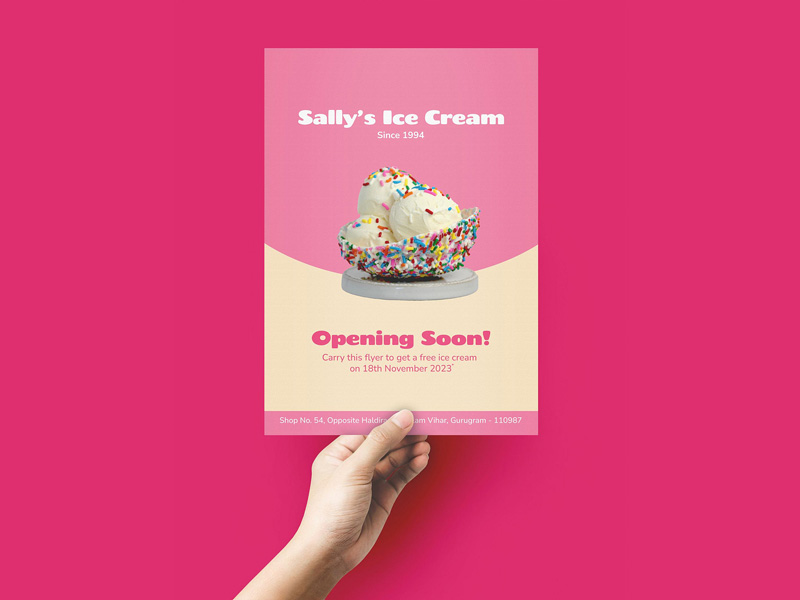
Image Source: dribbble.com/Cheshta Dua
On-brand imagery
Minimal has been a design standard for several years now but it must exist in context. If you are a loud and brash brand with an exciting brand voice, should you really be muted in your color and font selections?
Keep your flyer design (and overall brand identity design) close to your brand spirit. If it’s bold and confident, let the world see that. Customers respond to brand voices that sound authentic. So, don’t adopt minimalism just because. Go loud and proud if that’s where your heart lies.
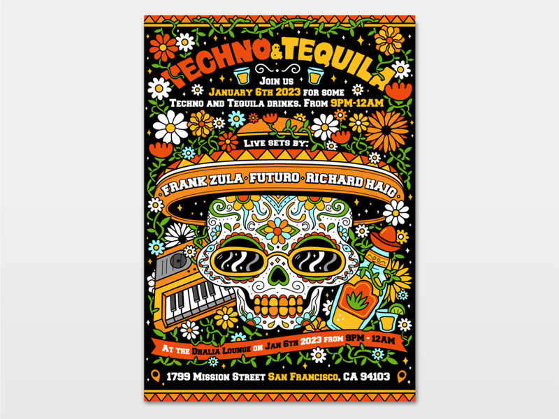
Image Source: dribbble.com/Slavko Kahovsky
Design your flyer with our superpower AI
We offer full-featured branding and marketing services to small and medium-sized businesses looking to outsource their graphic design woes. And that includes flyer design. Whether you are here in search of a good marketing flyer or want it as an extension of a brand launch, we’ve got your back.
Just visit our flyer design services page and look through tons of free templates. Pick the one you like the best and follow the simple steps to design your flyer. Give it a go, it’s free to try!

