Last October, Google released updates announcing changes to the mobile search page layout. These changes included the site name, an updated ads label (now “Sponsored”), and most relevant to us, the appearance of favicons next to site names.
Favicons are an incredibly important part of a website’s overall branding and help in the identification, recall, and improved credibility of the brand.
Now that they have become a part of the search results page, too, what does it mean for your branding and online visibility, not to mention SEO?
Let’s find out.
What Is A Favicon
Known by many names — the URL icon, shortcut icon, website icon, and more — a favicon is a tiny icon associated with a particular website.
Think of it as a shortened version of your logo design. You add it to your site’s structured data and every time people visit your site, the icon is displayed in their browser’s tab next to your page title.
Favicons are also found in bookmarks, browser history, toolbars, and more.
Here you can see DesignMantic’s favicon in all its glory.
![]()
As you can see, we have remained loyal to our original logo and just reduced its size. It doesn’t hurt the legibility of the logo and offers a consistent CX to the user. But if your logo is more elaborate or just cannot fit into such a tiny space as this, we highly recommend creating a whole separate icon that you can use as your favicon.
Bear in mind that your favicon is an important part of your overall brand (and has become even more so in 2023). So, make sure you don’t muck it up and get all the elements right on the first try.
The evolving role of a Favicon
While the primary purpose of the favicon is to represent your brand and assure audiences that they’ve landed on the correct page, it serves many additional roles, too. We’ll talk about them in detail a bit later, but here’s a brief look.
- A favicon improves user experiences
- Helps brand recall
- Increases brand recognition and trust
- Solidifies brand credibility
- Improves web traffic
Looking at the list it is clear to see that favicons always had a lot to offer, so why weren’t they ever given their due importance?
Compared to other branding signals — logo designs, brand colors, brand fonts, and more — favicons were considered secondary characters. Most businesses just designed them, put them up on the website, and then never bothered. Perhaps because of their tiny stature, but mostly because not many businesses recognized their full potential.
But things are changing.
Why have favicons become front-page material in 2023?
Google has recently changed its search page layout, and what was once considered secondary has assumed its rightful place at the center of the stage.
Favicons are now integral to your SEO, branding, and digital marketing.
How so?
Take a look.
![]()
As per the Google Search updates, site favicons are now prominently placed next to site names on the search results page.
Google has made these changes to give users more information about the websites that are appearing in the search results. The intent is to help users click on the results that they feel more helpful and confident about.
In other words, Google believes your favicons are critical indicators of what your site is about and users need to look at them to decide whether they want to click on your search result or not.
This means if you have created a click-worthy article that Google has chosen to display on its SERPs, but it accompanies a favicon that looks dated or illegible, users (being visual creatures) may deem it unworthy and choose not to engage with it.
It not only hurts your SEO but impacts your digital marketing too, and doesn’t say many good things about your branding either.
So, How Do You Create A Click-Worthy And Confidence-Boosting Favicon Design?
We are taught from an early age not to be influenced by looks or judge a book by its cover, but a significant part of our impression formation takes place subconsciously, and visuals impact how we feel about things.
So, give your brand a fighting chance in this rapidly changing landscape by making your favicon as visually appealing as possible. You can easily come up with a standout favicon to fulfil these requirements without hiring a seasoned graphic designer. All you need to do is find an efficient favicon generator and use it to create a standout favicon that looks impressive and leaves its mark in the target audience’s mind.
Here’s how you do it.
● Branding Your Website: Designing a Favicon that Represents Your Brand
The available space for your favicon is a bit limited: typically 16×16 pixels. While it’s recommended to create your favicon in multiple sizes to fit on larger screens, even those are cramped compared to a standard logo size.
So, working with a smaller space, choose your colors and shapes wisely.
Stick with the original look of your logo design, even if you don’t or cannot match it exactly.
Twitter, Mailchimp, and Facebook are some of the many brands doing exactly that.
But then we have sub-brands of Google like Google Docs and Sheets. Both sites use their unique signature icons as favicons. Docs has a blue square with white lines indicating a document. Sheets is a green background with a wonky plus mark indicating rows and columns.
![]()
A huge advantage of following a branded theme is that when users follow your favicon from SERPs to the main site, the similarity of shapes and sizes will augment brand identity and portray a professional feel.
It will also improve user experience, and aid brand recall. When the user might need to look for your site’s tab in a sea of open tabs, they’ll be able to spot you quickly and come back to it with ease.
● Standing Out in a Crowd: Choosing the Right Colors and Shapes for Your Favicon
If you have to make your favicon look different from your logo, ensure not to deviate too much. Follow along closely but add personalization spins to give it a unique feel.
Take BBC’s favicon as an example.
To combat the space constraints, BBC chose to forego its initials in the favicon and decided to go with the three black tiles that have become as much a part of BBC as its high standards of journalism.
Not only the scaled-back, minimalized BBC favicon is ultra utilitarian, but it’s also pretty chic.
![]()
Working cleverly with negative space and making smart choices about what to keep and what to let go in the favicon can help you create some fantastic favicons.
● Tips and Tricks for a Killer Favicon Design
Some general tips when designing or updating your website favicon:
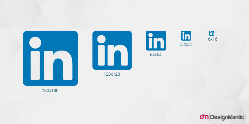
- Create your favicon in multiple sizes so you always have the most suitable size variations for all the different platforms your favicon will go on.
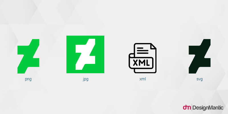
- Make sure your favicon is available in different file formats for optimal use: SVG, PNG, JPG, and Windows ICO.
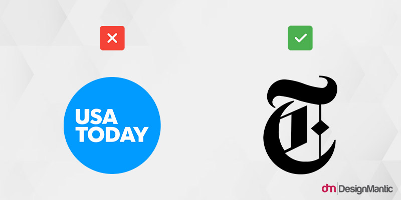
- As a general rule of thumb, avoid including text. Brand initials are fine as long as they are not more than three letters. To see how badly it can affect your favicon game, look at what it did to USA Today. Can’t even see the words.
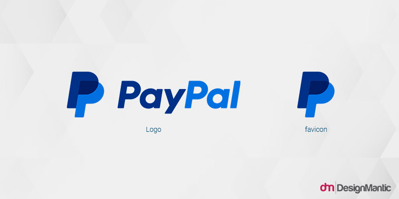
- In the same vein, don’t stuff your favicon with pointless, intricate coat-of-arms designs. They are doing as much disserve to your favicon as long lines of text.
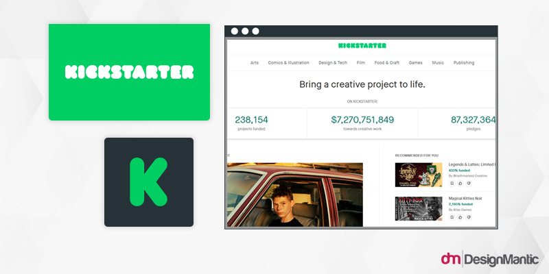
- If you don’t have a designer to help you create a custom favicon, take advantage of an AI favicon generator to get the ball rolling.
Takeaway
Favicons might be tiny but the sudden amplification of power they have gotten should make them your new best friends in branding. You can easily come up with a standout favicon to fulfil these requirements without hiring a seasoned graphic designer. All you need to do is find an efficient favicon generator and use it to create a standout favicon that looks impressive and leaves its mark in the target audience’s mind.
Using the strength of simplicity and clever use of elements, we wish you luck as you go on to create favicons that enhance your brand recognition, improve UX, solidify website credibility, and increase website traffic.

