What is beautifully designed, looks soothing, and encourages you to book an appointment? A great spa and massage logo, that is. To understand how you can design such a spa and massage logo, we are presenting this beautiful logo collection for your inspiration and knowledge.
These logos not only contain great visuals for effective branding but are cohesive in their design approach with colors, font styles, and symbols, all complementing each other.
1. Female Silhouette For Spa Logo
A female silhouette gently cradled between two caring hands. The colors are soothing and the shape is smooth which adds to the gentle image of the design.
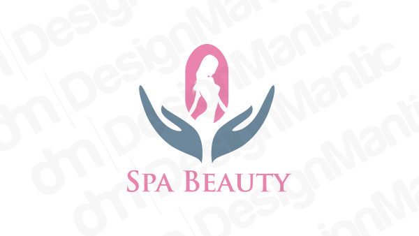
Lady Silhouette logo Design
2. Woman’s Face In Negative Space
Negative space is a great design tool that is expertly used in this logo design. The beautiful strands of hair make the logo look extra feminine.
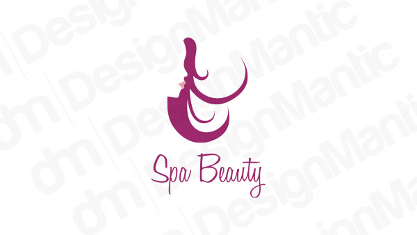
Beauty logo design with silhouette face
3. Lotus Flowers And Massage Stones
Massage stones and lotus flowers are a traditional staple of massage and spa logos. Use them in your designs to send an instant branding message.
Spa logo idea with lotus leaves and stones
Related: How To Start A Home-Based Beauty Business – A Comprehensive Guide For Beauty Startups!
4. Bamboo Sticks With Massage Stones
Similar to massage stones, bamboo sticks also add to the organic feel of the logo. If you want your audience to immediately think of soothing tunes of wind chimes as they enjoy a relaxing massage, think of featuring bamboo in your spa logos.
Sugarcane logo with sticks and stones
5. Massage Stones In The Shape Of Lotus Petals
A great way to showcase your logo design is to mix images that are relevant to your industry. In the following design, massage stones are formed together into the shape of a lotus flower.
Massage stones in a lotus logo
6. Spa Logo In Rainbow Colors
A great way to make your spa logo pop is to infuse it with rainbow colors. Make it hard to miss!
Image Source: LogoPond/astinso2
7. Luxury Spa Logo In Black
Not a fan of colors? Decorate your luxury spa in all black and white and make it shine differently.
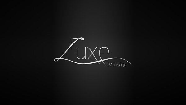
Image Source: LogoPond/jayhollywood
8. Wordmark Spa Logo
Your spa logo doesn’t have to be decorated with icons and symbols only. You can even go with a wordmark design and make your logo stand out.
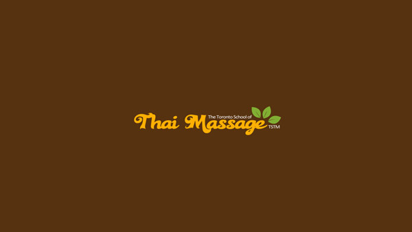
Image Source: LogoPond/chisharizushi
9. Spa Logo In Naturalistic Illustration
Illustrative logos are popular in 2020 and going with a naturalistic illustration can be a great way for your logo to make its mark.
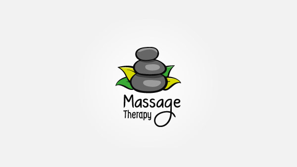
Image Source: LogoPond/nBarna
10. Spa Logo In Soft Lettering
Make your spa logo look infinitely more soothing by using type design that is softer and cleaner.
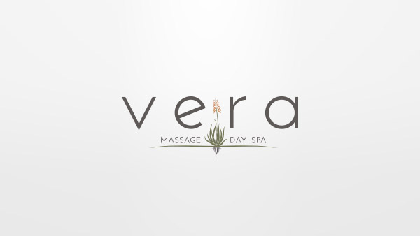
Image Source: LogoPond/truenorthe
Related: Beauty Logos: Setting New Standards For Future
11. A Fairytale Spa Logo
This logo design adds a fairytale feel to the image. Using butterfly wings, delicate strokes that showcase female silhouette, and other images that evoke such softer feels can all be great imagery for a spa logo design.
Image Source: LogoPond/archipelogo
12. Cheer It Up With Orange
Using brighter and bolder colors in your spa logo is another way to make an impression. Muted oranges, for example, can be a great way to transform your logo.
Image Source: LogoPond/grendzinski
13. Use All Small Letters For An Intimate Effect
Small case letters make branding look more intimate than corporate. If you want to make your design look approachable, small case letters may be the way to go.
Image Source: LogoPond/MotifCreativeDesign
14. Featuring Hands With The Lettermark
This logo design features the brand initial ‘S’ in the negative space between both hands. Design tricks like these can be effective in making people retain your brand name more strongly.
Image Source: LogoPond/jereford
15. Spa Logo With Nature Effects
Use this massage and spa logo example for a design that looks even more organic and nature-oriented with flying leaves and visible roots.
Image Source: LogoPond/christjalu
16. Use Mandala Designs In Spa Logos
Mandala designs are a popular feature in spa and massage logos. Give center stage to one in your logo design and take advantage of a popular trend.
Image Source: Behance/Anuja Kanani
17. Spa Branding In Green & White
Talking about popular features of spa logos, green and white colors are another famous trait of spa and wellness designs. Using the colors sparingly can make your traditional logo look up to date.
Image Source: Behance
18. Infuse The Design With Cultural Markers
Adding cultural markers, like this African mask as the prime feature of your spa logo can give it a distinctive space in the market.
Image Source: Behance/Mint Mockups
19. A Leaf Can Make A Difference
Clean layout, modern typography, and a single icon – the recipe for an effective spa visual identity.
Image Source: Behance/Insigniada .
20. Minimal Design Spa Logo
Although most spa logos are minimal in their designs, this one takes the cake due to its bare, grey background that lets the logo shine.
Image Source: Behance
21. Use The Soothing Green
This shade of green is popularly used in spa logos due to its soothing properties. It makes you think of forest moss, cool afternoons, and refreshing streams.
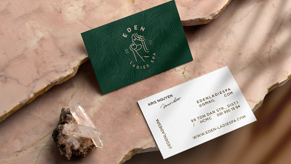
Image Source: Behance/Kris Nguyen
22. Use A Bit Of Golden To Luxe It Up!
Want to make it look more expensive? Add a splash of gold in your design.
Image Source: Behance
Related: The Secret Behind Beauty Brands Unveiled
23. A Simple Wordmark
It doesn’t get simpler than this. For brands that are confident in their branding and their standing in the market, a simpler design with a clean type is enough to seal the deal.
Image Source: Behance/Cam Diamond
24. Pretty As A Peach
For a nail spa, this peach design steals the show. You can also use this palette for a wellness or health spa logo.
Image Source: Behance/Mustafa Ghuneim
25. Use Handwriting Type
Want to personalize your spa logo design? Use a handwriting or signature type instead of a graphic one.
Image Source: Behance
26. Feature Candles in Your Spa & Massage Logo
Using imagery that’ll make people think of your spa and its soothing massages is a great way to design your logo.
Candle logo with hands icon
27. Fresh As Flowers
Keep your health and wellness logo looking fresh and breathable by featuring some flowers in lavender!
Purple flower logo for spa businesses
28. Illustrated Beauty
Decorate your logo with a beautiful illustration. A woman’s image is a great idea.
Beauty logo with woman in pink
29. Soothing Floras
Logos that look a mixture of hand-drawn details and graphic design add an entirely new level of relevance to the imagery.
White flower logo
30. Yoga And Lotus
Add a yoga pose to your lotus flower. Such a pose would act as a beacon to your potential customers, cutting through all the noise.
Yoga logo with lotus icon in the background
31. Keep It Interesting
Don’t let your logo become boring. Add interesting details. Do some line art, some cool curves, and a bang-on color theme.
Image Source: Dribbble/Daniel Niebla
32. Vertical Type
In a world of horizontal types on logo designs, be a vertical type on your spa logo.
Image Source: Dribbble/Samantha Madeo
33. Trees In The Logo
If your spa is known by a famous location, why not add that location (or a part of it) on your establishment’s logo?
Image Source: Dribbble/Simon Lürwer
34. Moon Goddess In The Logo
Is it a moon? Is it a goddess? It’s both actually, in this luxurious rendition of logo design.
Image Source: Dribbble/Burak Bal
35. Wordmark Logo In Modern Type
The broken letters make any design look modern. So try the trick for your spa logo, especially if it’s a wordmark.
Image Source: Dribbble/Dimitrije Mikovic
Related: Do’s and Don’ts of Wordmark Logos: A Guide for Businesses!
36. A Luxurious Approach
A flower icon with a water drop. The logo design not only looks impeccable, but it also looks modern and sophisticated.

Image Source: Dribbble/Nemanja Vilovski
37. Lavender Suits The Design
Lavender is perhaps the most famous color in a spa and wellness logo. Not only the color is soft with a hint of luxury, but it also looks clean and refreshing.
Image Source: Dribbble/Andrea Maxwell
38. A Modern Aspect
A line art logo adds a level of modernity. The accompanying teal color makes the design look even more refreshing.
Image Source: Dribbble/Mélanie Vautier
39. Keep It Simple
To make your logo design memorable, you don’t have to litter it with unnecessary details. The simpler designs are usually more effective.
Image Source: Dribbble/Jack Royle
40. Beautify It With Black And White
When in doubt, go with black and white. The combination is modern, sophisticated, and looks absolutely suitable on several logo designs, including spa logos.
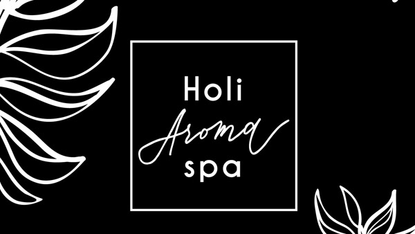
Image Source: Dribbble/Irina Nosova
Concluding…
So which design did you find the most fascinating? Let us know in the comments and also tell us which idea is closest to your personal style.

