If you are here as a serious business owner looking to understand how to design your Chinese restaurant logo that advertises your authentic food without looking like every other Chinese restaurant logo design, well, welcome. You’ve arrived at the right location.
Here, we are going to share a collection of some of our favorite logo designs for Chinese restaurants. These designs are a mix of designer-made and AI-created. No matter your budget, these designs help inspire you and guide you on what to look for when designing a restaurant logo.
Symbols & Imagery:
What do culture and design have in common? We’re sure ‘a lot’ but for this discussion, we’re going to stick with just one common thread: their love of symbols.
The design has at its disposal symbols, imagery, and colors to present visually what it, due to its very nature, cannot say vocally. Culture is the same way. Members of a culture use thematic colors and symbols to declare their cultural affiliations.
Related: Foodsutra: The Restaurant Logo Guide To Guarantee A Foodgasm!
Understanding these common connections becomes super helpful when you have to create designs that represent a culture. Today, when we are discussing designs that represent Chinese culture, what better symbol than the mighty dragon with auspicious powers that’s so highly regarded in the Chinese culture?
Unlike the Western understanding of dragon – aggressive, fire-breathing monster – the Chinese dragon is peaceful and bringer of wealth and wellness. It is one of the most readily recognized symbols in the Chinese culture and can be a part of your restaurant logo too.
A few other symbols that you can use to create authentic imagery for your Chinese restaurant logo are wok, chopsticks, noodles, and a take-away.
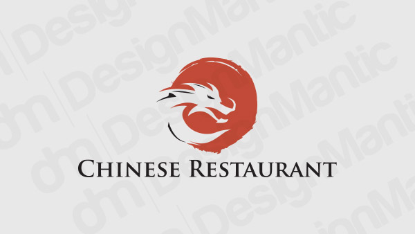
Dragon logo in red background
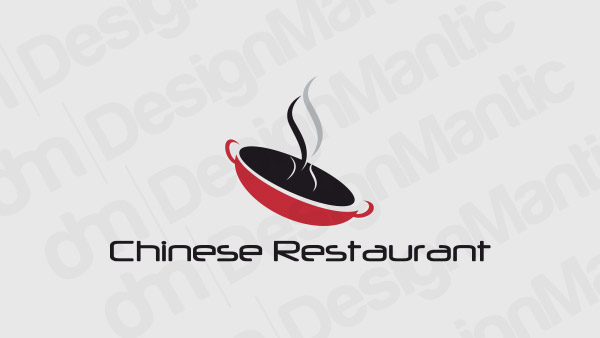
Chinese wok logo in red and black
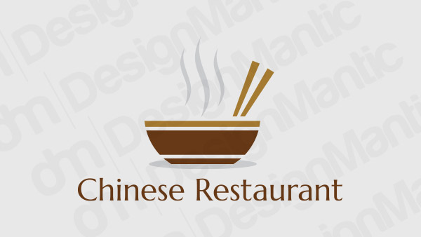
Chinese restaurant logo with bowl and chopsticks
Image Source: Dribbble/last spark
Image Source: Dribbble/Akash Mhaske
Color And Its Connotations:
When you want to create ethnic imagery, you need to make sure you get all the details right. Color is one of the details that are pretty easy to get right as its examples are readily available. In Chinese culture, red, yellow, gold, and green are highly valued colors. Red is so big in Chinese culture that you’ll find it in every Chinese restaurant no matter if it’s a small corner café or a luxury food boutique.
Since yellow and red are already in-demand colors in restaurant logos generally, consider the stars aligned. As per Color Psychology principles, red signifies excitement, drive, hunger, and passion, while yellow is cheerful, inviting, warm, and happy. In Chinese culture, red symbolizes fire and the bounty of summer and yellow is their color of royalty. Representing power and prosperity.
Can it be any more perfect? Hard to imagine.
Chef hat logo for an authentic Chinese restaurant
Red and gold shield logo to depict traditional Chinese colors
Image Source: Dribbble/Jenn
Image Source: Dribbble/graph_uvarov
Image Source: Dribbble/Oggy Lab
Fonts & Letters:
The font is the third side of the design triangle that makes up logo design principles. We will feature letter mark logos and wordmark logos here to show you the variety that fonts can add in the logo design. As evident by the name, letter mark logos use letters (ranging from a single letter to business acronyms containing 4-5 letters) while wordmarks contain complete business names on the logo design. Think of Olive Garden and Denny’s etc.
Related: Past, Present And The Future Of Wordmark Logos – A Study
The font-based logos are effective in a way that they ensure the brand’s name is center-stage and not overlooked in the design brilliance of the icon in the logo. If you are going for an authentic Chinese restaurant with a family and neighborhood feel, use the traditional Script fonts in your logo design. For a high-end establishment, we recommend using something leaner, more stylish.
Letter C logo for a Chinese restaurant
Image Source: Dribbble/Alexandra Walker

Image Source: Behance/Reflex Design
Image Source: Dribbble/Ahsan Alvi

Image Source: Dribbble/Fre Lemmens
So, What Do You Think?
Design inspirations properly roused yet? We hope that our assembly of these stunning visual identities created by professional designers as well as AI software will help you get a good look at what’s available and nudge you in the right direction in your own design choices.
Related: Turning Your Restaurant Into A “Brand”: Branding Elements To Get Right
If you are going for a symbol-based logo, smart choice. A symbol helps you scale. With just a small icon, you can say a lot and make that icon truly yours. Remember the bitten-apple of Apple, anyone? But do not let it take anything away from the word-based logos. I’m a fan of letter marks and wordmarks. As a writer and as a designer, I think the font-based logos challenge your creativity more, and I love that.
But since it’s your restaurant logo, make sure you design something that represents you – the vision behind the whole thing. Add your spirit and your character into the design to truly make the logo imbibe your personality and become unique.
Try Our Customized Logo Design Tool:

