As simple as minimal design is, it isn’t as easy to explain it. When it started, it started as an art movement, in the 60s. Pretty soon, it was everywhere; morphing into a philosophy that penetrated multiple levels of culture and society.
Today, the application of minimal design is present in every facet of life: art, music, architecture, design, even lifestyle itself.
In a nutshell, minimal design is an objective, utilitarian, and a highly aware approach to design – and art, on the whole. Working with minimal design principles, you discard everything that isn’t needed to make the design work/utilized, reduce it to its bare-minimum essentials, and present the concept in as simple a form as possible.
Minimal design doesn’t use any unnecessary frills, embellishments, and trappings of other design approaches – realism and abstract expressionism, for example – and forces you to create art and design that can stand on its own, with no swooshes and swirls and 50 different textures.
As perhaps you can appreciate now, creating a minimal design isn’t easy. It forces you to be original, neutral, and creative. With nothing else to rely on, it’s your creativity as a designer that’ll carry the design forward.
But wait – aren’t you curious how minimal design evolved? Let’s face it: in the 50s, abstracts were raging everywhere. Cut to a decade later, and it was sparse furnishings, cleaner spaces, angular architecture, and objective art representation in galleries. How did that happen?
Origin And Brief History
It may look like, especially to the Millennials and Gen X and Z people that minimal design just always was. It isn’t so. The 50s, as I said above, were all about abstract expressionism. Art was considered an extension of the artist. It said things about him, represented bits, pieces, and parts of him, and you could only interpret the art piece through the lens of its creator.
Then came artists such as Donald Judd, Anne Truitt, Agnes Martin, Dan Flavin, Robert Morris, and Frank Stella.
The wanted to explore art as an entity separate from the artist. So gravitation towards geometric abstraction emerged. Geometric abstraction was the use of mostly geometric forms in non-representational structures. Interestingly, geometric abstraction itself emerged from the Islamic artistic tradition of not depicting religious figures in illustrations, and some form of artistic representation of faith and spirituality was needed.
Related: The Geometry Of Logo Design – Once Upon A Shape
Since geometric abstraction was already using non-representational objectivity, it became the tool of choice for pioneering minimalist artists. The movement was further influenced by European, Russian, Romanian, and other global art figures.
The more it started gaining momentum as a movement, the more it began to seep into the cultural fabric of the society. It influenced music, architecture, sculpture, interior design, fashion, literature, and the subject of our discussion today, graphic design.
Minimalism In Digital And Graphic Design:
The aim of graphic design is to communicate a specific visual message to a wide range of audiences with impeccable effectiveness. Due to the forever shortening attention spans of the human species, and becoming ever more selective, the graphic artist doesn’t have much time to gain and hold the attention of the passerby. Therefore, the message being communicated must be instantly engaging, attention-grabbing, concise, clear, and memorable.
With such a tall order of expectations to fulfill, there is only one design approach that seems equipped to handle such a feat: minimal design.
Minimal design is concise and clear. It throws away all the distractions, focusing only on the essence of the message, and presents it in the most confidently attention-grabbing way (bold colors, gutsy typography, and stark backgrounds).
And this is why the minimal design works across websites, professional logo designs, user interfaces and more. Because it is so simple, clear, and striking, it requires so little of your cognitive resources. All it needs is your fleeting attention – even the tenth of a second – and it will convey its message to you.
Due to these enduring characteristics of minimal design, it has become a staple of not only modern graphic design but has found its applications in all forms of UI design too: gaming, apps, websites, you name it.
It is due to the minimal design that we now encounter websites that are cleaner, engaging, quick, and to-the-point on their vital messages. You can get help from various web design tools to create a minimal website. Even when we look at them just as fans of visual arts, and not particularly studying them, they are a delight to look at. Even if you overdid it with your customizations, it’s always an option to reset WordPress and give yourself a clean, fresh start.
Come. Let’s see what features are essential to creating a website on minimal design principles.
Essential Features Of A Minimal Web Design:
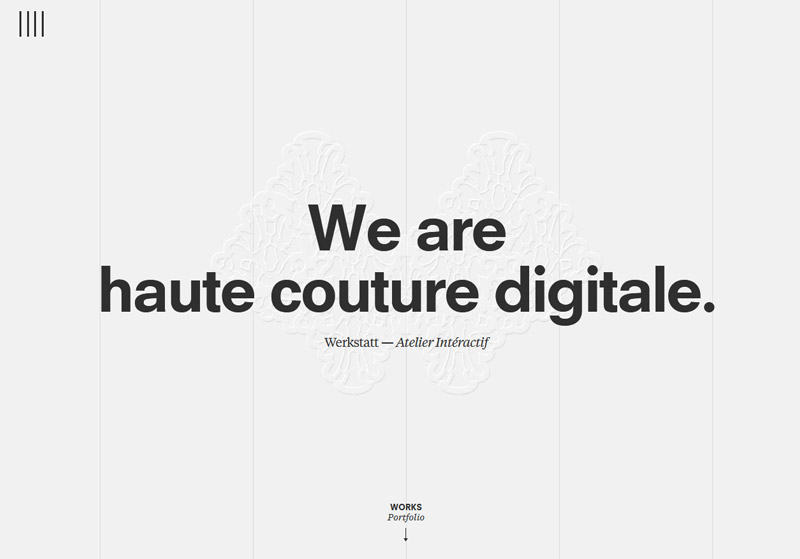
Image Source: Werkstatt
Minimalist design is a utilitarian design in its approach. Anything it doesn’t need, it forsakes. When we apply the principles of minimal design in graphics and web design, some common defining characteristics pop up. Such as:
Flat Design
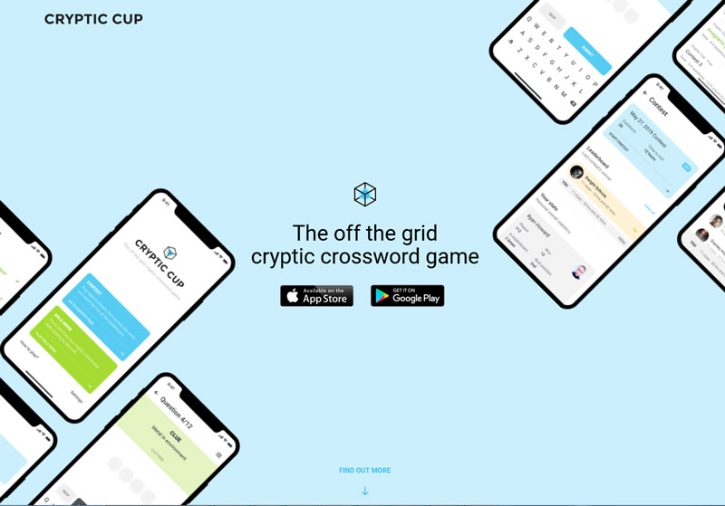
Image Source: CrypticCup
Flat design is a style of design employed to create graphical user interfaces. The icons, buttons, images, flat logo designs, and other elements that you see on the website – features that you use to interact with a site or an app – make up elements of a UI. When we use flat design in a UI, you’ll notice that icons or images or buttons will not have any texture, shadows, gradients or other (unnecessary) elements that users don’t really need to use the website/app.
Flat design UIs are far cleaner, streamlined, and less distracting than their Skeumorphic cousins. Every minimalist design website that you’ll see will have used a flat design UI.
Related: Material Design – Going where Flat Design Hasn’t Gone Before!
Plenty Negative Space
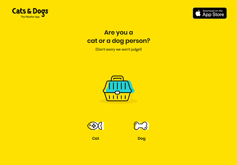
Image Source: CatsAndDogs
If we could consider one key feature as the defining feature of minimalist design, it would be the generous and maximum use of negative (or white) space. Minimal design works with using fewer and fewer elements in the design – making sure only those are kept that serve the end user tasks. Resultantly, we are left with a lot of extra space.
Instead of using this space, minimal design lets it be. And the abundance of it actually becomes a prominent element itself.
Related: 20 Best Websites Making Use Of Negative Space In A Positive Way
If you are new to web design or graphic design and have trouble spotting minimal web pieces, look for pages sporting lots of white space or negative space in graphic design.
Limited Color Palette
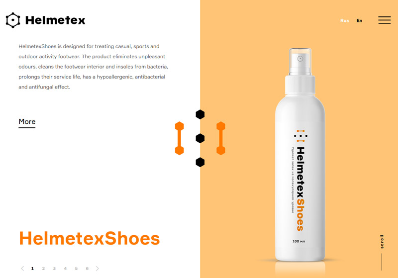
Image Source: Helmetex
When we are stripping down a design of its elements that it doesn’t need, it then makes sense to also apply the utilitarian principles in color schemes too. Therefore, you’ll be hard pressed to find a modern website design, most particularly a minimalist one that features more than 3 colors in the entirety of the design.
Most minimalist website UIs however, create stunning work with only two colors from the palette: a primary color and an accent color, often contrasting shades. Monochromes are also a popular minimalist design choice, especially the pastel and earthy shades, to be consistent with the cleaner and streamlined visual of the website.
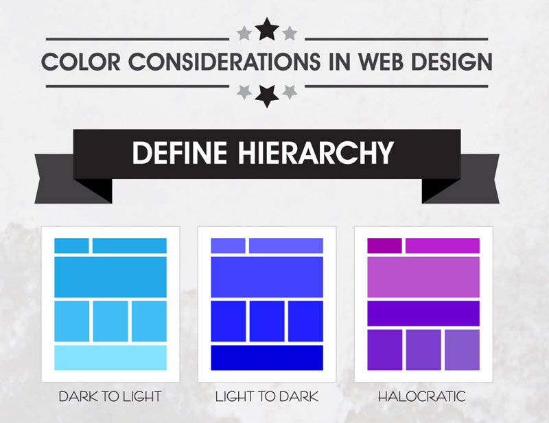
Using the colors strategically, end user tasks are streamlined, design is better organized, and information is stacked with more hierarchy.
Related: Color Philosophy and System In Web Design – A Brief Account
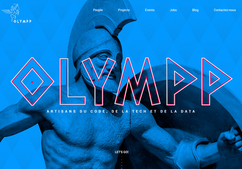
Image Source: Olympp
Bold typography is a necessary staple of all modern designs – including minimal. Since we limit the use of artistic elements available to us, we naturally make more, bolder uses of features that we do decide to use.
Hence, bold, dynamic, dramatic, and interesting typography.

Furthermore, logos that use letters can be animated to have a 3-dimensional shape. For instance the logo for Urban Splatter is a U-shape teal and green box like graphic. This architectural logo was designed by the young architect and blogger Justin Ankus.
Like color, this intentional use of bolder typography conveys meaning to the user, adds visual appeal, and make the design more impactful. This feat is achieved by modifying the size, style, alignment, shape, and weight of the letters and words. In cases where the minimalist design guidelines permit, colors and type are combined to create a stronger impact.
Fewer But Purposeful Elements And Features
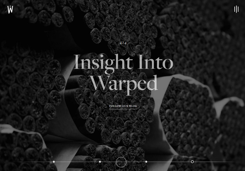
Image Source: Warped Cigars
Creating an effective minimal design UI we focus on buttons, menus, links, pages, and other UI elements that we consider crucial to the user journey. Everything else is either subtracted from the end design or concealed in collapsible menus.
It is this reason that you now see only a couple of clickable buttons on web pages, or why the menu bars feature only a handful of links. Some of these links are only accessible via a menu bar. Some will only come alive (become clickable) if you hover your cursor over them. Emergency Recovery Script for WordPress helps you get access to essential functions and features in case there’s a problem with the login.
Related: The Art Of Alignment In Graphic Design
The idea is to provide a better organized, clean looking, and non-distracting website to the user. For a more curious visitor, an efficient minimalist design allows the exploration of the website by keeping the lesser visited areas of the site only hidden and not deleted.
What essential elements does a website following minimal design principles contain? Let’s find out through this Infographic.

Now that you know what minimal design is and how it enhances the core message, would you like to learn if it has any limitations?
Limits Of Minimal Design
Much like the art of any kind, minimal design isn’t for everyone. It has its limitations – boundaries – which make it more suitable for certain kinds of platforms and applications than others. However, these limitations may be more due to the ill use of minimal design than any inherent limitations in the design philosophy itself.
Still, let’s take a look at how minimal design can backfire when not done right and what you can do to make it work.
Dos:
- Contrast: Employ various forms of contrasts (color, size, shape, type) in the design to make sure important information is always presented in a non-distracting and visually appealing way.
- Bold type: Be creative when choosing typography for your minimal website. Use it cleverly to increase the functionality of the design without overwhelming it.
- Colored negative space: The negative space doesn’t have to be a stretch of blank white. Fill it with blocks of solid color wherever the design and brand aesthetics allow increasing the visibility of important information and features.
Don’ts:
- Don’t make it too simple: Albert Einstein’s principle of making scientific models simpler states: ‘everything should be made as simple as possible, but not simpler.’ Remember this designing a minimal website. Don’t sacrifice function for the purpose of design. Or you’ll end up with a website that’ll look unfinished, empty, and hurried.
- Don’t hide important information: Minimal design doesn’t offer too much space to say a lot of things. So with the available space, be selective and smart about what the core message is, and make sure it is always presented prominently. If it can’t be done with your minimal design theme or by using a WP plugin to make elements sticky, it is okay to use another design approach.
- Don’t make it difficult to read: People come online to consume content. If you are presenting content in pastel shades, greyscale themes, and in wide banks of negative space, you aren’t doing yourself any favors. Make the text legible; use contrasts. Present products and features in ways that make navigating to them easy. As said above, don’t hide precious material.
So, Is Minimal Design Right For Your Website?
Let’s just say, minimal design is more right for some websites than others. If you are operating an online store where you need to show off a huge variety of products in a multitude of categories, you may be better suited for another kind of design approach than minimal design.
The same goes for content-rich websites that need a lot of interaction from readers and visitors.
For others, where the content is filtered, and where products and services have fewer categories, or for personal websites or portfolios, minimal design may just be the thing. You can also checkout this post from Pixpa for some great graphic design portfolio ideas.
Before I take your leave, however, here is some love your way:
Learn to Create a Design Logo Using DesignMantic’s Online logo-maker, absolutely FREE:
Conclusion:
As a design choice, minimalism is highly effective for web design as it snaps the focus of the viewer on the core visual message of the communication, and strips away every distraction. To make this choice work for you, however, there is a learning curve. If you are willing to put in the effort, though, minimalism comes with lots of efficiency, panache, and impact.
Try Our Personalized Logo Maker Tool:

