When patients come across a medical clinic or hospital’s logo, they need to be assured that the facility is something that they can trust their lives with. After all, a picture is worth a thousand words. So, if you’re about to start your own healthcare organization, it should have a medical logo that plants a sense of care and health restoration in the minds of your target audience.
You may think that it is only the services that people opt for in the end more than a good-looking picture, which is a widely accepted fact. But having a healthcare brand logo can save you the trouble of missing out on your market in many ways.
For one thing, a logo acts as a means of brand identity, so that people may recognize the face of their healthcare service provider. Another thing is that a logo with a strong brand builds credibility, a competitive edge against rival clinics, and an honest practitioner-patient relationship.
Just so you know, the healthcare industry is becoming highly competitive, given the increasing human population. This means that there are several cases of people contracting diseases, injuries, childbirth and more. So, how are you going to design a medical research logo that stands out from the rest of your competitors? We’re happy to inform you that the answers you seek, lie in the contents of this article.
Icon
For so long, icons have served as one of the most defining factors in motivating people’s behavior. However, not everything used as an icon will give the perfect results. Icons can be relevant to the type of business that the brand represents, but that does not make it mandatory. An example can be viewed below in the icon of the well-known multinational technology.
According to late co-founder Steve Jobs, he was inspired to name the company Apple because it was ‘fun, spirited, and not intimidating.’ The bite was meant to differentiate the apple from any other fruit, like a cherry or a tomato, and that it complimented the company’s punned tagline “Byte into an Apple.”
Related: 9 Lessons Every Designer Should Learn From Apple’s Design Journey
Apple illustrates a great example of creating an icon with a deep meaning and relevant purpose. Anyhow, you can also create an icon logo that is only enticing to the eye without going deeper into a wider context such as McDonald’s.
As you can see, McDonald’s logo only shows the letter ‘M’ that is the first initial of its brand name in a unique font, styled in the form of two golden arches. The logo was designed simple and impactful and that is why it works so well even to this day.
Related: McDonald’s Goes Gaga With The New Packaging!
Similarly, you too can incorporate the aforementioned elements in your logo design. These elements can help you get distinguished from your rivals, evoke an immediate response from customers, and motivate the consumer behavior and choices.
Now let’s not drift from the medical logo line here. It’s time to view things from your audience’s perspective and think about what people want to see in a medical logo icon.
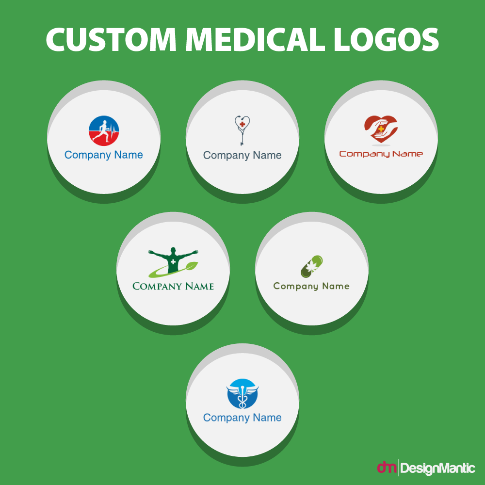
Here is what most of the world’s medical icons look like:
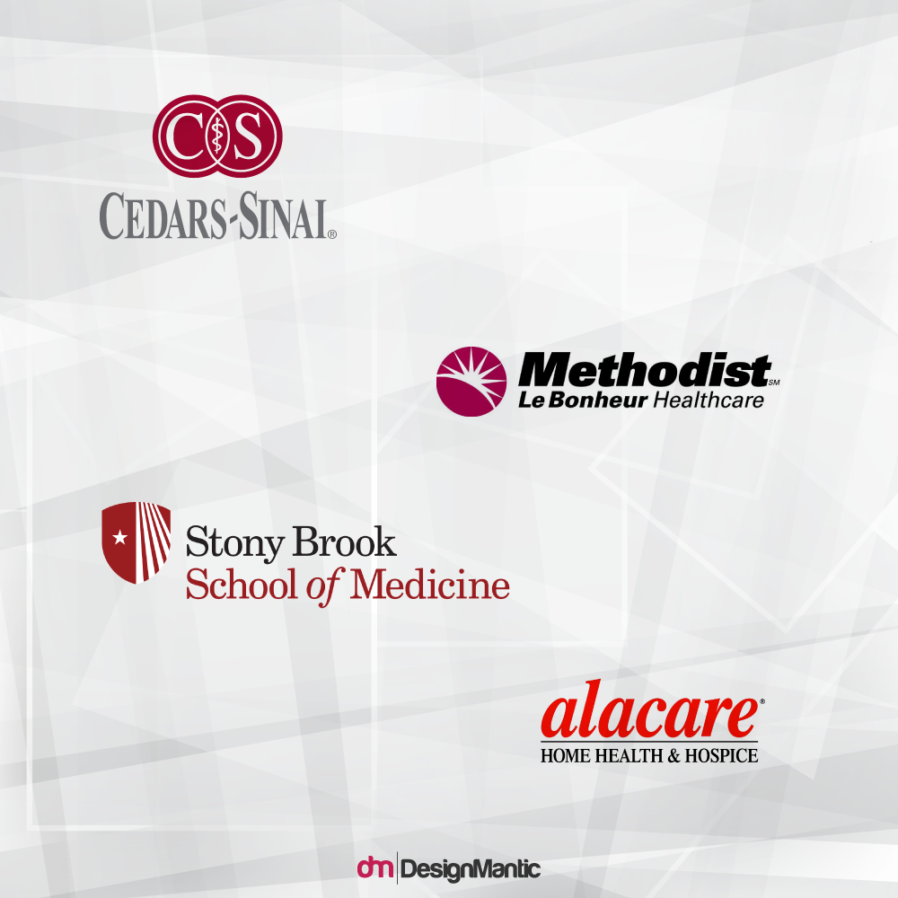
Each of these custom logos incorporates relevant components, such as a cross, a pill, the caduceus, a heart, and a microscope. Most of the world’s renowned facilities use popular icons in their logos, such as the American Red Cross and the Rod of Hermes.
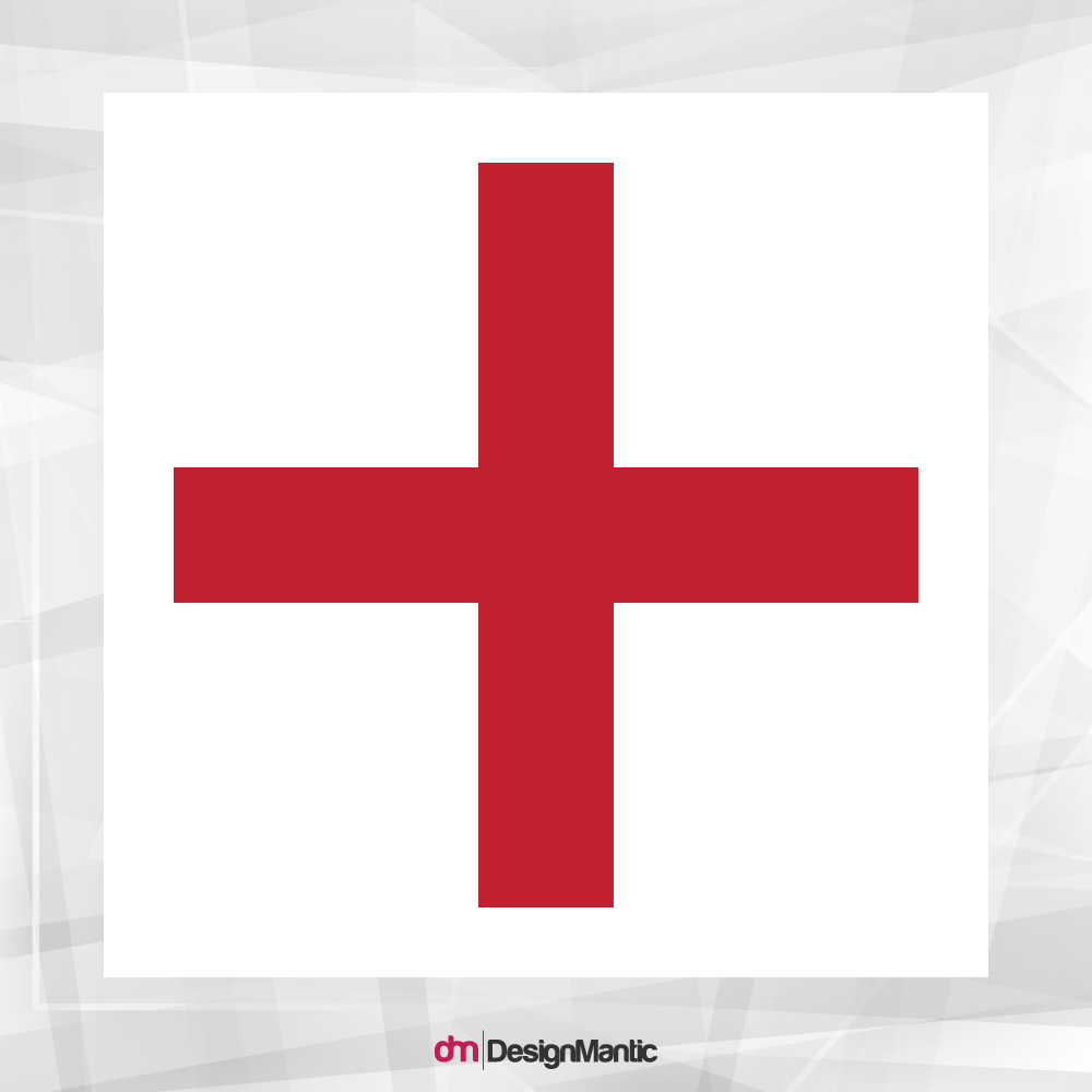
The emblem showing the Red Cross was designed originally by Henri Dunant in 1863. The cross icon was popularized as a symbol of the 1864 Geneva Conventions. It was also used to represent the US army’s medical services during the Second World War. As such, the symbol became a hallmark of health care services during the wartime.
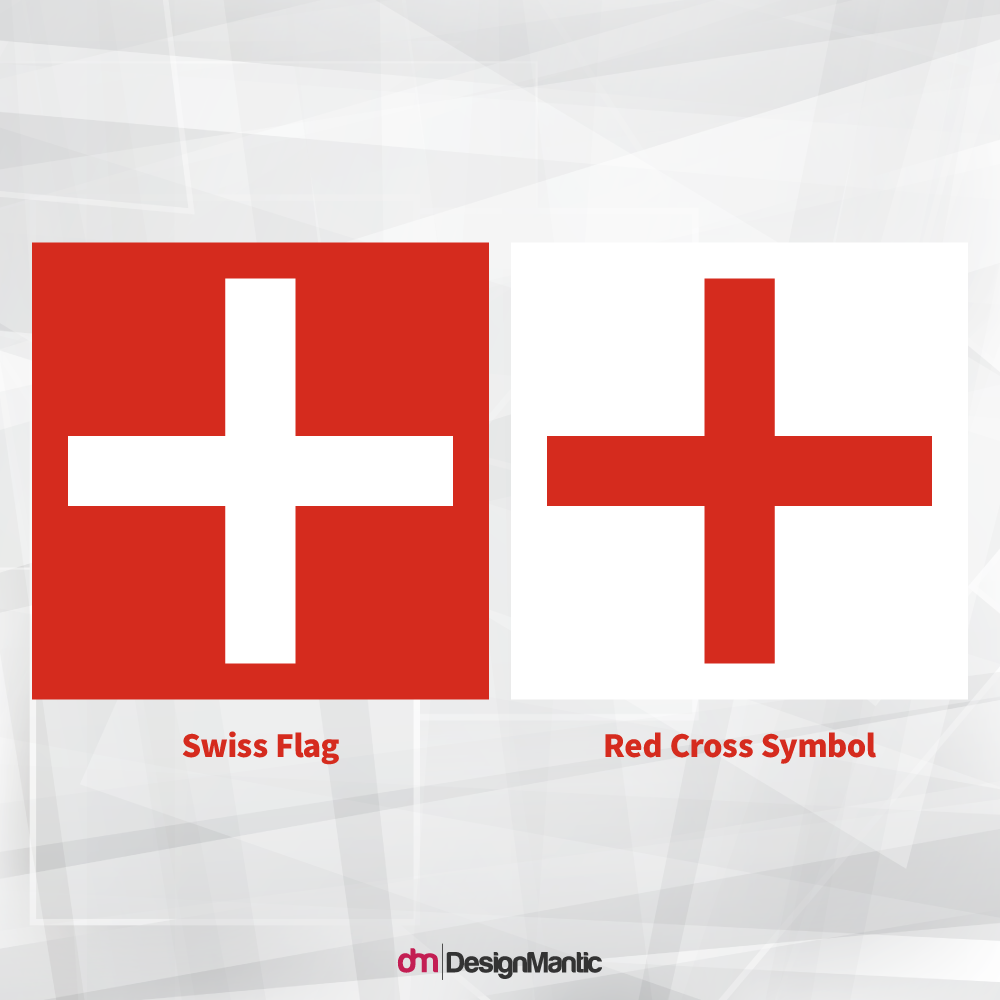
According to the International Committee of the Red Cross, the emblem was inspired by the Swiss flag by inverting its colors as seen below:
This makes sense as the designer and founder of the Red Cross, Dunant, was also Swiss. The symbol also recognizes the link between the 1964 Geneva Convention and Switzerland.
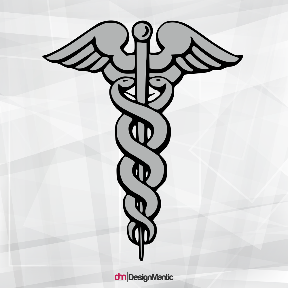
Another common symbol in the healthcare industry is the Caduceus symbol, used mainly by the American Cancer Society.
The icon depicts a winged rod with two snakes spiraling around it. Although the symbol has been used to represent care and healing, the historical truth tells another tale.
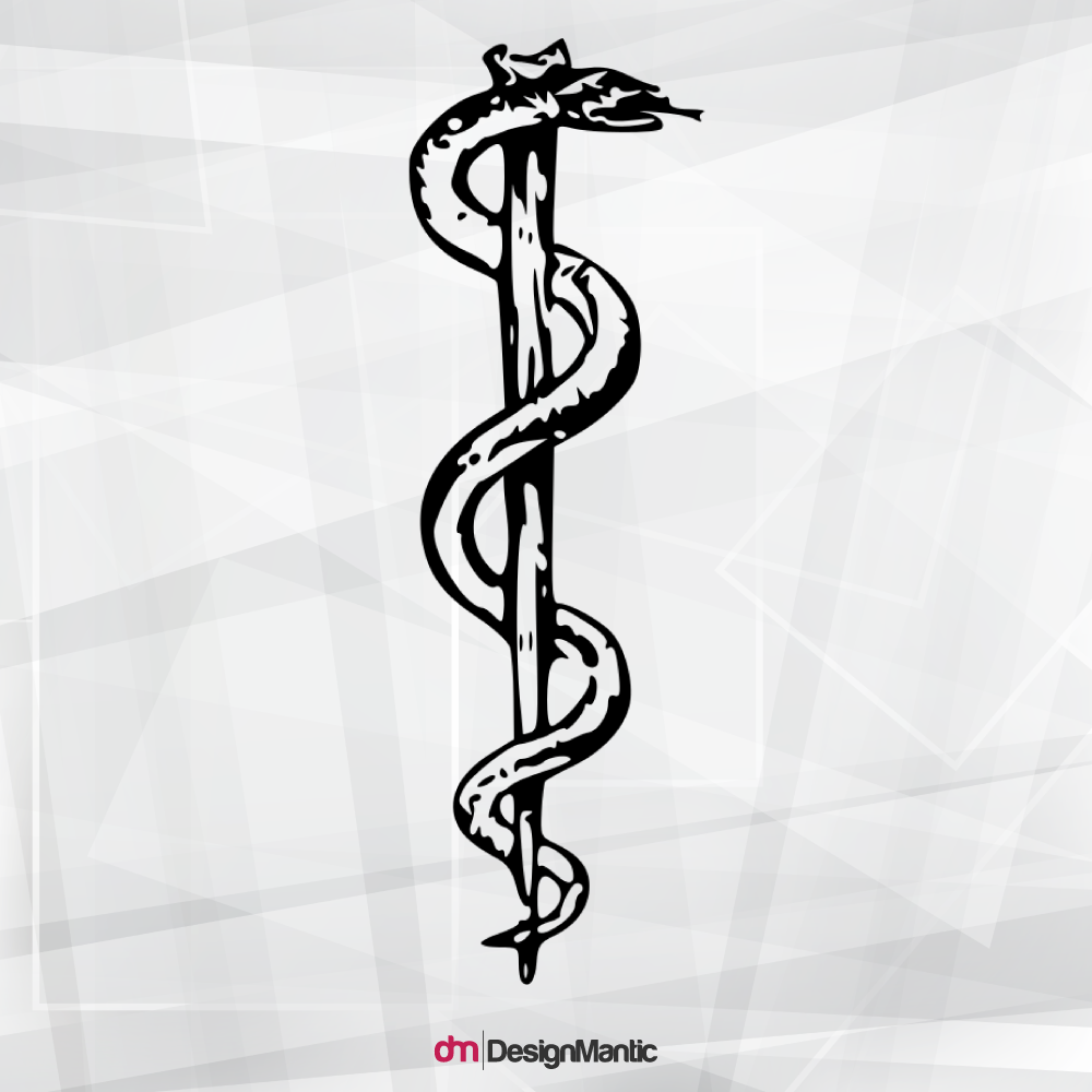
The caduceus is the symbol of the Greek god Hermes, which represents eloquence, trade, wisdom, and alchemy. Whereas, it is the Rod of Asclepius, a Greek god that is associated with medicine and healing.
For whatever reason, the United States decided to opt for the caduceus as the primary symbol for medicine, which has been used for more than a century now. Since then, the medicine logo has been changed many times and the current version of the American Cancer Association looks like this:
This logo shows the two serpents coiling around a sword instead of a winged rod. According to the official website’s history page, the sword symbolizes growth, aspiration, and movement. The snakes, on the other hand, have forever been associated with medicine and healing. It has been emphasized so many times that the US population now affiliates it with anything but health care.
The general idea is to invoke a sense of reliability, trust, and medical cooperation in the audience’s mind whenever they’re exposed to your brand.
Use the images above as inspiration when creating your own unique medical logo. Don’t think that you can get away with being like Dunant when he splashed a bunch of colors on the Swiss flag. If you’re going to dip your hands into graphic design for the first time, then let it be.
Typography
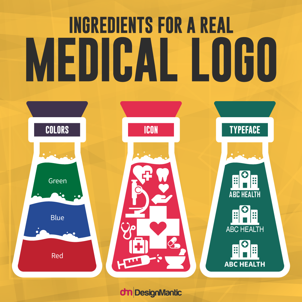
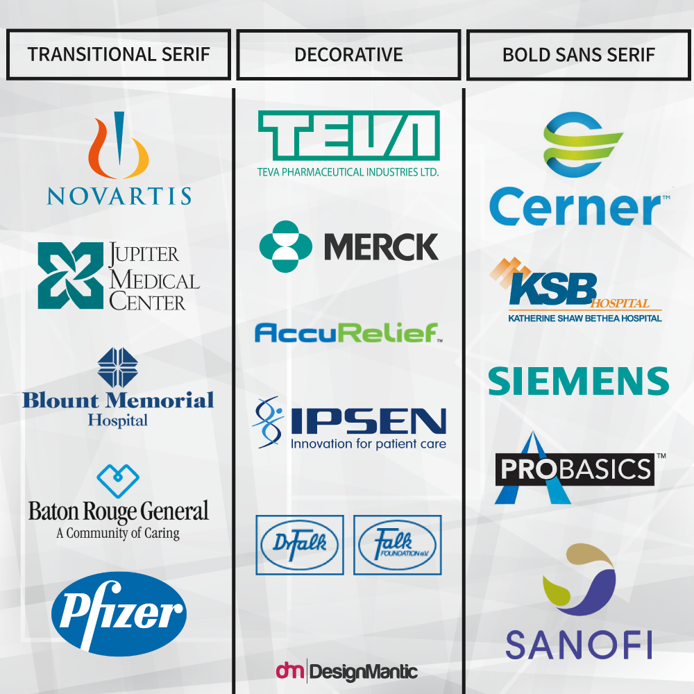
Typography is just as crucial as the clinic logo design itself. The typography you use for your logo has to be unique and professional, but most of all, attractive in appearance – this includes the font style and the font color. There are various font styles to choose from, such as:
When you pick a font for your medical logo, you must make sure it covers all aspects of your medical business. It must appear clean, professional, and authoritative. Just like the type of clothes you wear, typefaces reflect your personality and the intent of your brand.
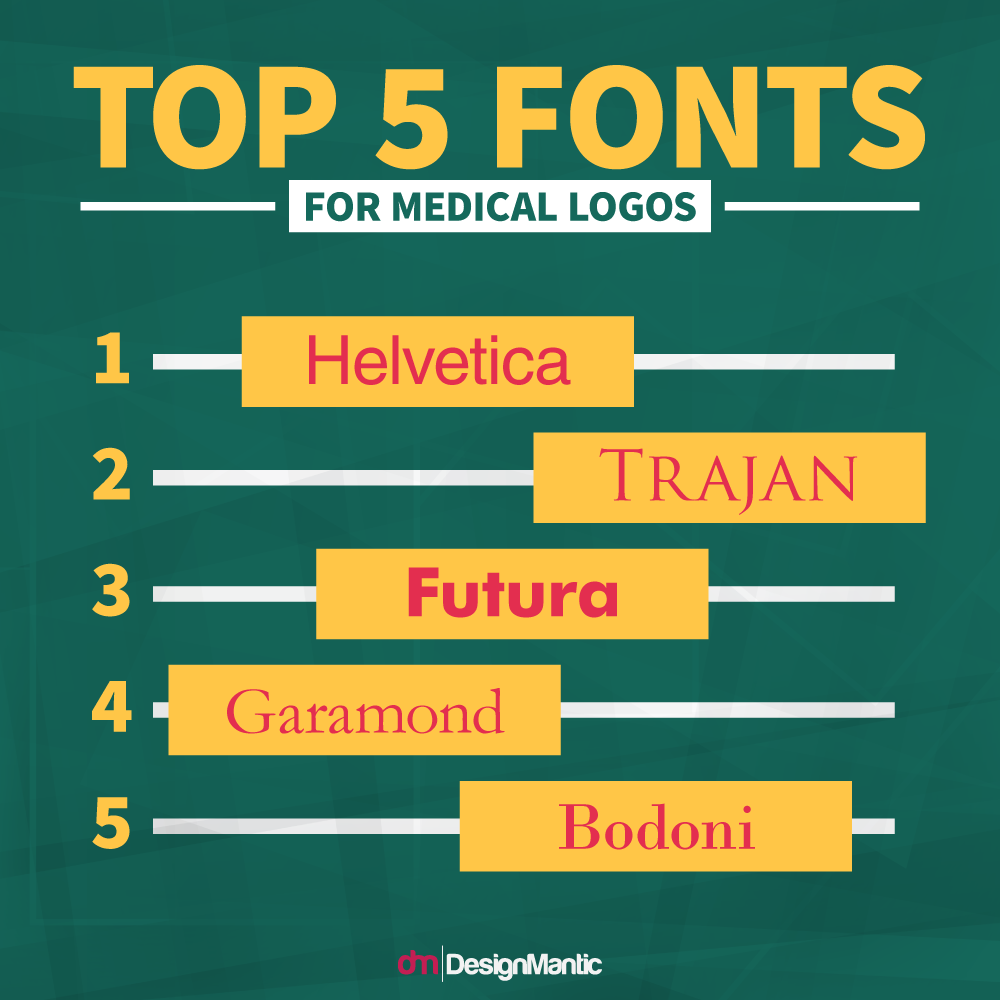
We don’t expect you to pick something flashy with exaggerated and italicized serif. It is vital that you maintain simplicity in your fonts. Usually, a sans-serif font does the job well as shown below:
We believe that Helvetica would be the most suitable font style for your medical business. Either that, or you can opt for other simple sans-serif style fonts, such as Verdana, Geneva, or Calibri. But above all, make sure that your font is easily legible and appealing.
Colors
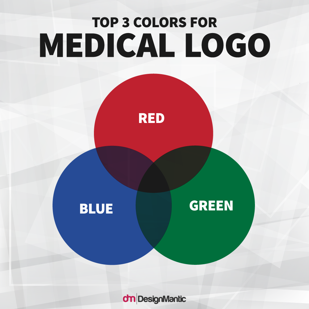
Colors set the mood and tone for your logo. They evoke many emotions in the minds of the audience. For a private medical centre logo, it is advised that you choose the colors that come as warm, hospitable, and welcoming. You may have noticed how most of the world’s renowned medical brands use blue, red, and green in their logos.
• Blue
Blue is as common as the clear blue sky. It represents loyalty, trust, faith, haven, confidence, and sincerity. It’s just the kind of message that you would want your medical logo to convey. Blue color logo has exceptionally positive effects on the mind and allows your body to produce chemicals that exhibit soothing and calming sensations.
• Red
Red is associated with several emotions that signify love, passion, desire, sensitivity, and romance. But it also represents courage, determination, confidence, action, and joy – something that patients with serious injuries or surgeries require.
• Green
Green is perhaps one of the most refreshing colors you can use for your medical supplies logo. While green can be negatively associated with greed, jealousy, sickness, and cowardice, it is mostly related to nature, energy, freshness, and growth. It also reduces depression, nervousness, and anxiety. These qualities are absolutely befitting of a medical facility.
Takeaways
• Icons can have a deep meaning that conveys a brand’s message or they must simply look appealing and memorable. You can use common elements such as a heart, a cross, a stethoscope, or even a pill as your logo’s icon.
• Typography should be simple, clean, and professional. Do not use overemphasized serif or the audience will lose the focus of the logo.
• Use lighter shades of blue, red, or green to evoke a sense of comfort in the audience, so that they trust your medical brand with their lives.
Try Our Personalized Logo Maker Tool:
Design Medical Insurance Logo
Logo Maker For Medical Laboratories
Mental Health Centres Logo
Nurse Logo Design Ideas
Occupational Health Logo Generator
Nursing Homes Logo Creator
Make Pharmacy Logo Designs
Logos For Foot Health
Health and Fitness Logos
Hearing Care Logo Templates


