Ever thought about connecting to masses through emotions and the impact of this strategy if taken into account while branding? Not every brand keeps in view the feeling or emotion that their logo or an ad campaign might spur amongst the customer but if they do the results might be drastically different. For every customer is a human and humans are, of course, bound together with a set of emotions and feelings, branding should not be any different than this if one is targeting for a humane look for its brand.
Emotional branding is not something about what your brand dictates people to do but about how it dictates people’s feeling.
There are a list of reasons to consider the emotions of masses in branding and there is no reason not to consider them. It is a proven fact that people respond to emotions, especially when making purchases and who they follow. Features and benefits matter, of course, but an emotional connection is what keep your audience intact for a long time.
What Is A Humane Brand?
According to Seth Godin, an American entrepreneur and marketer, “There are only two types of emotional categories, you’re either in a positive one or a negative one. They don’t have anything to do with success they’re just the categories that emotions will fall under.”
Keeping this in view, let’s explore the world of brands that are taking positive emotions into account around their ads, campaigns every message. Love, affection and care, empowerment, happiness, friendliness, courage, optimism, hope are some positive emotions that all stand for humanity. There are brands that are taking every possible measure to connect with their audience in a positive way and know the science of happy design to make their brand thrive.
Your first and foremost priority should be your audience. Do think about them and their feelings before giving them a message and how it relates to their lives. It should hit the right note about how you serve them. Only then there is a possibility of coming up with an emotion that they should feel about you.
The Strategy
Once the message and target audience is decided, next in line should be your services or products and how they help that audience, in a positive way. Going for a particular emotions comes at the final stage that your audience would feel about them in relation to your service or product. It is only when you get clear on that emotion, you will be more than half way to branding your business, emotionally.
Aarron Walter, VP of Design Education at InVision, explains in his book ‘Designing for Emotion,’ “emotion creates an experience for users that makes them feel like there’s a person, not a machine, at the other end of the connection.”
The elements that you can incorporate into your designs should be associated with different emotions so that people can relate to them by just having look at them. Think about the emotional impacts of color, sound, photo style, logo shape etc. Also there are some font styles that elicit different emotions.
Have you ever experienced a surge of emotions the moment you have a look at a brand’s advertisement or a brochure? Following is the list of some brands that are making the right use of emotions in their design campaigns.
Empowerment
The world is echoing with NGOs raising voices for women empowerment. There is nothing flashy than a well-crafted campaign that speaks volumes and connects the masses instantly to the cause.
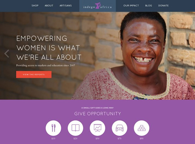
Indego Africa
Founded in 2007, Indego Africa has a simple idea of empowering women artisans in Africa by showcasing their beautiful craft and investing in the power of education and the organization believes that it is spreading happiness through its humanity based efforts for the betterment of African society.
Happiness
People share happiness. Believing the notion, most of the brands are thriving on the fact that people want to share it with others. With a positive emotional association, people are more open to connect with others when happy.
Amazon
Keeping true to the smiley in its logo, Amazon is attracting a lot of eyes lately, which explains why it’s in the lead list of YouGov (an international Internet-based market research firm). Amazon really stepped up its game in the recently passed holiday season. It managed to deliver over 200 million packages to over 185 countries from around the world, all while sales for top brick-and-mortar stores had dropped by 20 percent.
Related: The Emotion Guide Of Popular Brand Logos
Friendliness
The quality of being friendly. With the youngsters going gaga over the emotions that come with friendliness, the brands are not lagging behind in making the full use of it lure their audience.
Coca Cola
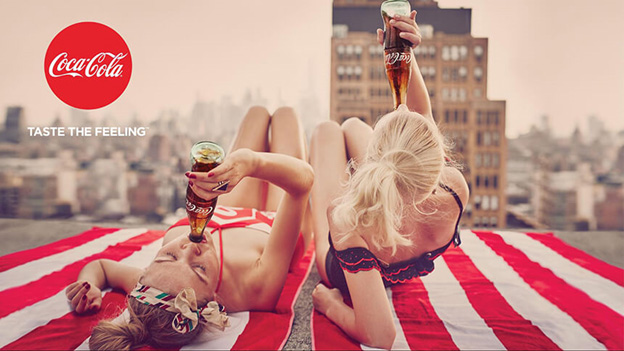
Take into consideration Coca-Cola’s new ‘Taste the Feeling’ campaign where they make the use of red in beach towels, models’ outfits, and nail colors as well for their print ad to complement their logo. The effect is friendly and eye-catching.
“There is not a person alive who can hold a can of Coke and not have a fond memory,” says PR executive and author, Richard Laermer.
Affection & Care
There is no better expression than love, care and affection that keeps the universe going. People around the world are bound by these emotions and that is the reason, various brands are incorporating these values into their branding tools.
Johnsons’ & Johnsons’
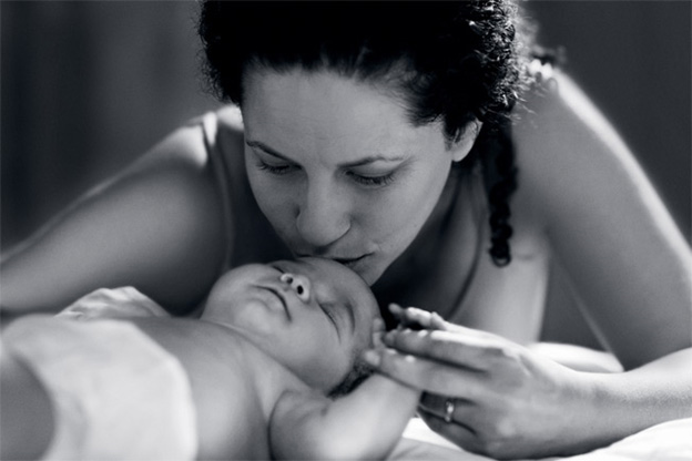
There is not a better brand than this that is made around the emotions of affection and care and the emotions cannot be expressed in a better way than the affection a mom shows to her child. For a hundred years, Johnsons’ has spoken to the real emotion of care and that is a big reason why it has become a brand that evokes care.
Johnson & Johnson’s new corporate image work, from TBWA\Chiat\Day efforts eschew color for black and white and capture small, loving moments within families.
Love
“I love that brand!” You must have said this to yourself a thousand times if not less. People, especially younger generation, are all for the idea of brands that evoke the feeling of love.
Ikea
Sometime back, Ikea, released an ad on Valentine’s Day provoking the feeling of love through it, a pair of BORJE chairs in a pretty compromising position. The ad was launched via social media and was also displayed in stores.
In another Valentine’s Day campaign, the store came up with the fascinating love stories of elderly couples who have been together ever since the opening of the first IKEA store in 1958. They obviously know what it takes to stay in love.
Related: Love Vs. Hate: A Valentine’s Day Lesson In Emotional Branding
Hope
The world revolves around this very word, hope. There is a very thin line between trust and hope that can be crossed easily and to keep the matters in control while designing a campaign can sometimes become a daunting task.
Walgreen’s
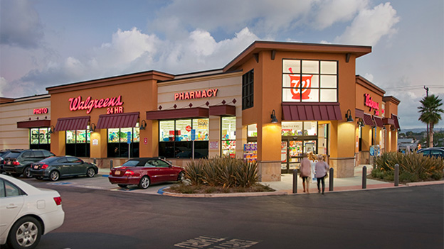
Early this year, Pharmacy giant Walgreens, second biggest pharmacy chain in the US, released a new campaign, Lets Grow Old Together, featuring HIV-positive genuine customers, which sheds a positive light on all those who are living with HIV.
They are featured in print magazines, such as one with customer Gregg, which has the tagline “Three decades positive, one positive outlook.”
The campaign also features a number of interactive video interviews with all of the customers.
Optimism
Who does not want to look good and be optimistic in life? But one requires a heavy dose of self-confidence to get to that level of optimism. There have been numerous campaigns that run around the idea of optimism but our choice is this one.
Dove Real Beauty Sketches | You’re More Beautiful Than You Think
Dove has always been a harbinger of positive emotions. This ad campaign by the brand took the internet by storm in 2013. The campaign made women define their facial feature to a sketch artist. Then an accomplice was asked to define features of the same woman for another sketch. How we perceive ourselves as compared to the others was the main idea behind the campaign. When the pairs of sketches are revealed at the end, the participants’ emotions have a powerful impact.
The Art of Story Telling
Most of the brands these days are relying on the power of storytelling. It is the more human way to connect with the masses through the power of stories.
Always #LikeAGirl
This commercial from Always has over 59 million views on YouTube. The 3-minute short commercial, highlights a story about the notion that girls aren’t as strong as boys. The message it gives through relatable actors is very powerful. And the concept speaks directly to Always’ target audience.
Leica -100
Camera brand Leica ran a beautiful campaign to celebrate their centennial anniversary that tells its story without featuring the brand. The narration pulls the experience of recreating, some key moments in human history, with Leica technology. This results in an interesting story that celebrates the brand’s 100 years of business.
Have you ever come across a design or a campaign whose message is more inclined towards humanity? You can share with us the brands that are taking into account positive emotions while designing their campaigns.

