In the modern times, running and managing a hospital is like any other business. Not only do healthcare facilities need to follow the best practices of people management and business propagation, they also need same marketing and branding essentials that are required to build a corporate identity and paving the way to improve brand experiences. And the first step in this process is a well-designed logo.
If you’re wondering why it is important for a hospital to have a well-concocted branding package that incorporates a memorable logo, you need to know that:
- having a clear logo gives your hospital a professional touch.
- it signifies the organized approach of your hospital as it appears on souvenirs, letterheads, envelopes, sign boards etc.
- it builds an identity.
- it serves as your brand icon in a number of campaigns initiated by your hospital.
Tips For Designing Children’s Hospital Logo
Before moving onto discussing the different styles your hospital logo can take, and how to select the best one, following are three factors to consider while crafting a memorable logo for a Children’s Hospital.
1. Be Very Specific
Designing a logo for a children’s hospital is just like one for any other business niche. You need to be specific when you need to cater to your audience needs. This means your logo should clearly convey the type of facilities your hospital provides and the age group of the patients. In this case, it will be a health care facility dedicated to children. The fact that parents need to be with children at hospitals, neglecting an adult touch while designing a logo will never be a good idea.
2. Include The Community
While your hospital welcomes the visitors from every walk of life, its location and services might serve a certain community. And your logo needs to be based on this element i.e. community service. How you are going to do this is by making your logo adapting the tastes of visitors. This means refraining from styles and symbols that are considered taboos in certain communities. When you include the element of community service in your logo design, it helps in instilling a sense of safety in your visitors thus increasing the footfall at your hospital. The fact that you don’t de-alienate them signifies that you care about them.
3. Embody Care
Having a friendly and warm logo for a children’s hospital is important. It embodies care and does not intimidate the people. Using playful colors, fonts, styles and geometrical shapes in logo design gives children and parents a secure feeling. Whereas, too much text in the logo gives a feeling of intimidation. This is why the color of your logo design and font selection is important in designing a logo for children’s hospitals. The color scheme is important because most interior designers base their concepts on the color scheme and design of your logo so that your logo matches the overall environment of the hospital to have a lasting impact.
INFOGRAPHIC: Color your Brand Industry-wisely!
How To Design A Viable Children’s Hospital Logo?
We can categorize logo styles in different categories. They can either be broken down into technique styles for example; negative space logos, hand-drawn logos etc. or they can be divided into compositional styles. Here we are going to discuss the different compositional styles that might be suitable for your hospital logo.
Logo compositions are made up of symbols or typography or a combination of both. The magic of composition is that different arrangements will give a different feel and use to your logo. Here are six composition styles that may be used for in a children’s hospital logo.
1. Lettermarks
Lettermarks, also known as initials, usually utilize the initials of a brand’s name rather than going for a complete name, means it is purely a text-based logo. The typography becomes very significant here as it is the typography, along with the initials, that build the brand identity amongst the consumers. Lettermarks also utilize simplicity and the idea behind is to say more with less.
Queensway Carleton Hospital Logo
Image: Qch.On.Ca
Queensway Carleton Hospital uses the lettermark as its logo. Sometimes, they go for complete name of the hospital, means a combination logo; however, the above mentioned is their more popular option.
Children’s Hospital Of Philadelphia

Image: Chop.Edu
Children’s hospital of Philadelphia uses this lettermark as its logo combined with a child’s symbol so it can also be called a combination mark. However, because it utilizes the initials of the hospital only, and not the full name, it is more appropriate to include it in the letter mark category.
Advantages Of A Lettermark
If you’re contemplating using a lettermark for your children’s hospital, here are some key benefits:
- It makes the name of your hospital easier to read and creates a user-friendly brand identity based on the initials.
- Because of the text-only element, it is easier for them to appear good in black and white as there are few elements that might contradict each other when not in color.
- It creates a unique brand identity because your lettermark becomes a substitute for the full name of your hospital and may be used in place of the full name by the people.
How Do I Know If Lettermark Is Suitable For My Hospital?
Related: The Complete Beginners’ Guide To Medical Logos
Go for a letter mark if:
- your hospital has a long name. Using a lettermark will simplify the design process and also makes it easier for people to remember.
- the hospital is already an established one and people are already aware of the complete name.
- you are confident your designer can handle the text-only challenge and make the logo memorable without the use of symbols or other words.
2. Wordmarks
A wordmark logo can work wonders for the recognition of a children’s hospital. A wordmark utilizes the hospital’s name to make it into a logo. And just like a lettermark, it is again text-based. This means good font selection is imperative to this logotype. You will make or break the message of your logo through the typeface that you select. For children’s hospital logo, you can select playful and unique fonts that convey the feelings of warmth, friendliness, and care. Here are some examples.
Children’s Hospital St. Louis
Image: StlouisChildrens
Children’s Hospital St. Louis does not have a unique name. However, they have made their logo quite memorable with the use of a playful typeface that looks good in color as well as in black and white! Notice how it is a wordmark logo, yet the playful characters of the font make it so fun loving. Also, the wordmark is used in distinct color styles at different occasions. For example, this is how the holiday version of their logo looks like:
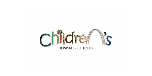
Image: StlouisChildrens
Advantages
So why should you choose a wordmark really? Here are some reasons:
- The wordmark logo is very versatile and adaptive. It can be given new looks for different occasions or to include different aspects of your programs or campaigns as the hospital expands and grows. For example, you can dress it up for cancer awareness campaign in specific colors or add relevant props!
- Wordmark logos can function as great dynamic logos because of their adaptive nature but beware of the dos and donts of wordmark logos to avoid designing a logo that fails to impress.
- A wordmark is a great way to reinforce the full name of your hospital. Especially if you are a new setup.
How Do I Know If It Is For My Hospital?
Not sure if wordmark is for you? Consider the following:
- If you have a distinctive hospital name, a wordmark is a great way to put it out to the world.
- If your hospital name is very generic, a wordmark is again a great way to make it distinctive, with the use of special fonts and characters that just draw attention to a very mundane name, but make it unique through representation.
- If you are a new hospital, a wordmark is a good way to get your name out into the world.
- And of course, if you have a great designer who can handle the challenge of a wordmark, go for it!
3. Pictorial Mark
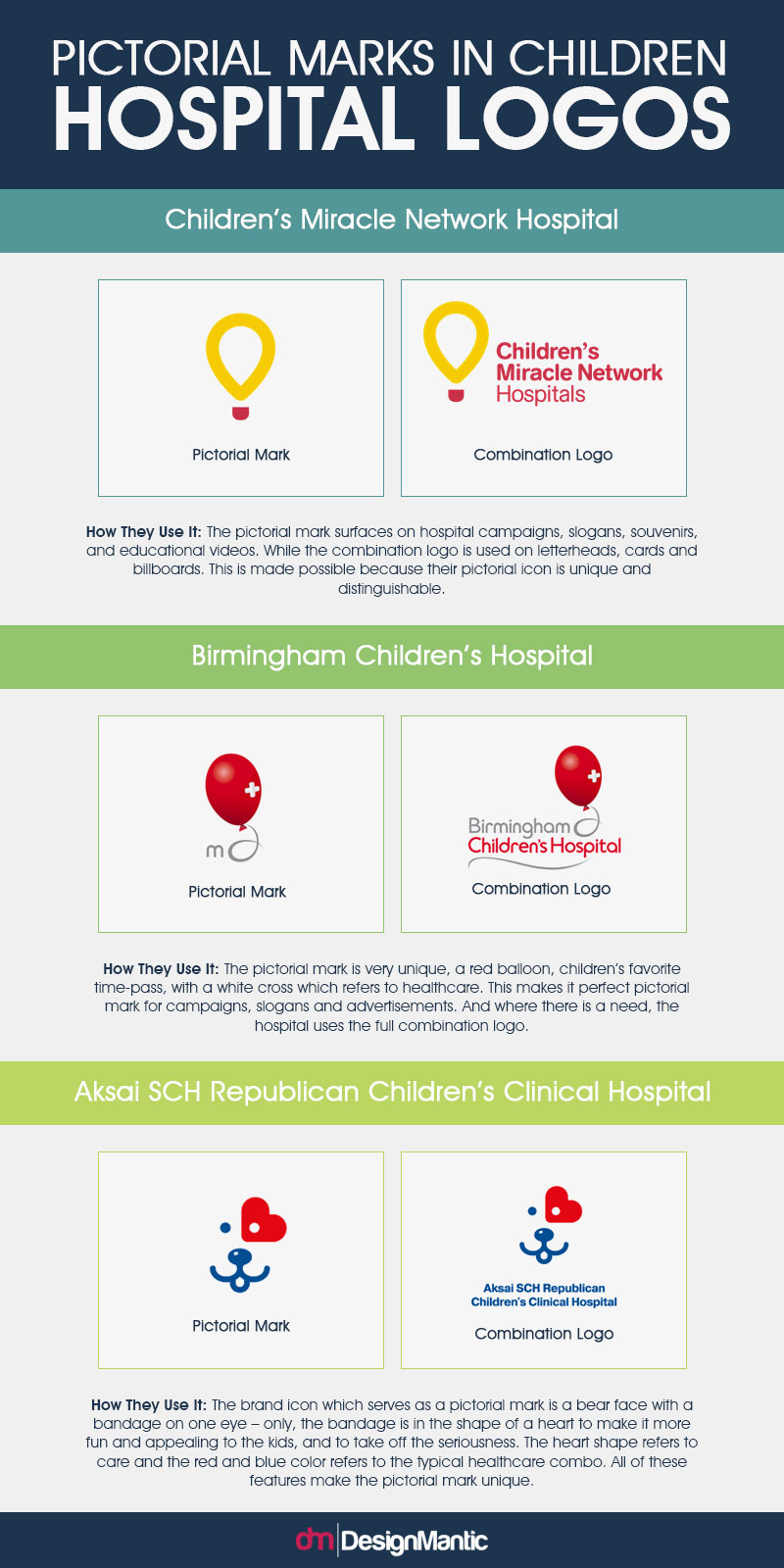
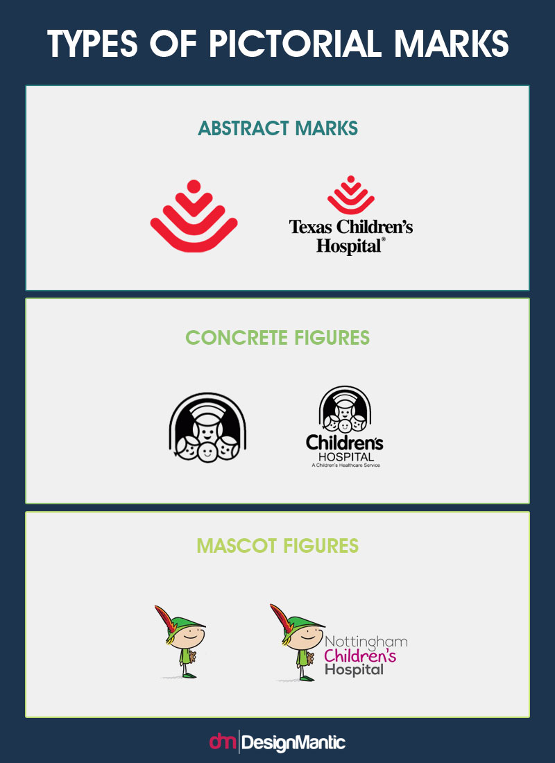
A pictorial mark is exactly what the name suggests; a logo with a symbol or a picture. Usually, pictorial mark logos are brand icons that are so unique they can function as logos on their own without the use of any text. And when a pictorial mark is accompanied by a text, it becomes a combination logo.
However, keep in mind that sometimes you can use the icon of a combination logo as a pictorial mark. You can do this if your pictorial icon is unique and very specific. For example, these hospitals use both, pictorial marks as well as combination logos. Here is how they do it:
Related: Create A Unique Brand with Custom Logo Templates!
Advantages:
- A pictorial mark serves as a great brand identity even without the long hospital name and other additional text.
- You can use the pictorial mark to evoke emotion, create a pun or convey a deeper meaning.
- It can also serve as a dynamic logo that can help you incorporate changes to your business model.
How Do I Know If It Is For My Hospital?
Using a pictorial logo alone can be tricky. In fact for hospitals, we would not recommend it. However, designing a brand icon that can serve as a pictorial logo as well as in a combination logo is highly recommended. You can choose to go down the pictorial icon path if:
- You are sure your icon is unique, specific and very clear. It is important it is not confused with something else.
- If you have a long hospital name and would like a brief representation as well.
4. Combination Logos
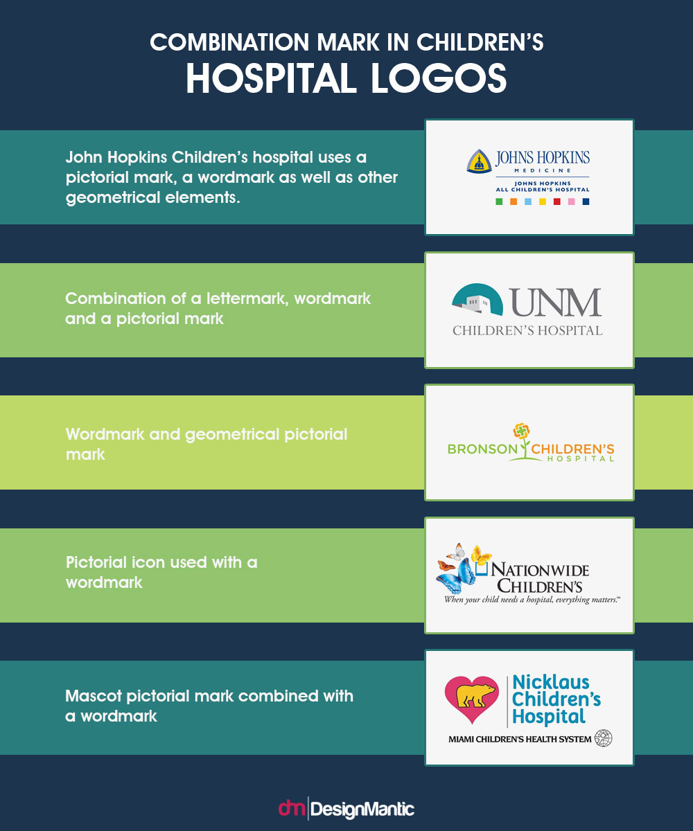
Combination mark logos are exactly as the name suggests – a combination of everything; letter marks, wordmarks, pictorial marks, abstract pictorial marks etc. All these elements can either be stacked upon each other, laid side by side, or the designer may choose to integrate them together.
Here are some examples of combination marks for a children’s hospital:
Advantages
Combination logos have a lot of advantages. Here are a few of them:
- Combination logos offer a more distinct logo because the symbol combined with the text serves as a unique image.
- Can be used in a variety of ways; as a combo or as a standalone pictorial logo
- It is easier for people to grasp your identity with a combination logo.
- You can embed more messages and info in a combination logo. For example, you can include a tagline that conveys your message; include an icon that evokes emotion, while using a text that conveys what you do.
- You can convey more playfulness when using it for Children’s hospital because there are lots of elements to play with – colorful font, a fun icon or a warm tagline.
How Do I Know If It Is For My Hospital?
Combination logos are great for all and any business! A combination logo will always work for your hospital. If you don’t want to opt for any other style, a combination logo is perfect for your children’s hospital.
5. Emblem Logos
The last type of logo style that can work for your children’s hospital is an emblem logo. Emblem logo is a combination logo that is set inside an icon. For example a crest, a seal or a badge-shaped icon. These icons are great for conveying a traditional and professional message. Here are some examples of emblem logos:
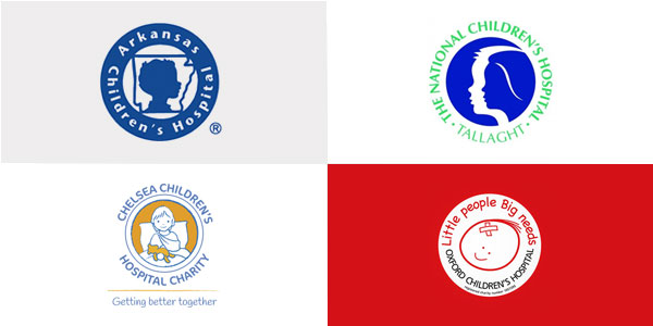
Image: Arkansas Children’s Hospital | Chelsea Children’s Hospital | The National Children’s Hospital, Tallaght | Oxford Children’s Hospital
Advantages
An emblem logo has the same advantages as a combination logo, however, it is not possible to pull it apart and use as a brand icon only. With an emblem logo, you will have to use it completely, as it is.
How Do I Know If It Is For My Hospital?
- If you want to stick to the traditions of logo design and your hospital’s legacy, an emblem logo is a good option.
- If your adult’s hospital already has an emblem logo and is looking to open up a separate children’s wing – you can use the new emblem as an extension of your previous logo.
Pick A Style That Is Memorable And Adaptive
These were just some of the styles you can use in your hospital logo. However, while utilizing these styles always remember to analyze your final layout and see if they are memorable and adaptive, and if you look good in both color and print!


